Introduction to Python Data Visualization

Introduction to Python Data Visualization

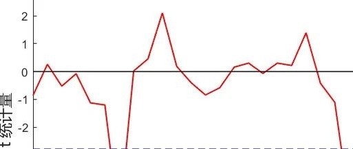
What is Data Visualization? Data visualization is aimed at making data more efficiently reflect the situation of the data, facilitating readers to read more efficiently, and highlighting the patterns behind the data to emphasize important factors within the data. If you are using Python for data visualization, it is recommended to master the following four … Read more
Basics of Python Data Analysis and Practical Tips

Basics of Python Data Analysis and Practical Tips

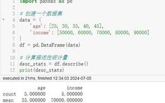
Follow👆the public account and reply with 'python' to get the zero-based tutorial! Source from the internet, please delete if infringing Introduction to Python Data Analysis Basics 1. Descriptive Statistics (descriptive statistics) Descriptive statistics is the first step in understanding the basic characteristics of a dataset, including statistics such as mean, median, and standard deviation. [Tutorial … Read more

Visualizing the Relationship Between Capacitor Charge and Voltage Using ESP32 and Phyphox

Visualizing the Relationship Between Capacitor Charge and Voltage Using ESP32 and Phyphox

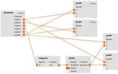
Experimental Scene 1 Introduction Since learning Bluetooth communication with ESP32 and Phyphox during the National Day holiday in 2020, the author has been eager to solve the visualization problem of the relationship between capacitor voltage and charge, attempting to derive the charge amount by integrating the charging current, and then depict the charge-voltage relationship graph. … Read more

Creating a Combined Bar Graph in MATLAB

Creating a Combined Bar Graph in MATLAB

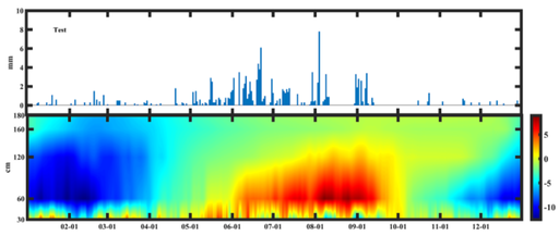
Creating a Bar Graph Combined Graph Author: Li Zhi, Eighth Galaxy Contact Email: [email protected] Precipitation Bar Chart clear;clc % Precipitation Bar Chart subplot(2,1,1)% Group chart 2 rows 1 column first chart x1=xlsread('Temperature_Precipitation.xlsx','Date','A2:A366');% Read x-axis y1=xlsread('Temperature_Precipitation.xlsx','Precipitation','A2:A366');% Read y-axis bar(x1,y1,1)% Draw bar chart ylabel('mm')% y-axis label axis([0,365,-1,10]) % Set axis size text(20,8,'Test','fontname','Times New Roman','fontsize',12,'fontweight','bold')% Set title parameters … Read more

Live Editor: A Powerful Interactive Programming Tool in MATLAB

Live Editor: A Powerful Interactive Programming Tool in MATLAB

When using MATLAB for scientific computing, data analysis, and engineering development, we often need to debug code, visualize results, and document the entire workflow. At this point, MATLAB Live Editor acts like a Swiss Army knife, helping developers seamlessly integrate code, charts, and documentation to create clear and intuitive interactive workflows. If you haven’t tried … Read more

Comprehensive Guide to Drawing Taylor Diagrams with Python, R, and MATLAB

Comprehensive Guide to Drawing Taylor Diagrams with Python, R, and MATLAB

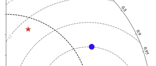
Click to Follow | Making Scientific Research Simpler Star us for easier access to practical tutorials! Introduction A Taylor diagram is a commonly used visualization tool for comparing the performance differences between model simulations and observations. It displays correlation, standard deviation, and root mean square error in one chart, making it a powerful assistant in … Read more

Overlay Point Graph and Color Band on Contour Plot in MATLAB

Overlay Point Graph and Color Band on Contour Plot in MATLAB

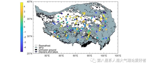
MATLAB Overlay Point Graph and Color Band on Contour Plot Author: Galaxy 8 – Chen Xiaoben Contact Email: [email protected] Data:Meteorological data, random custom defined by rand function Part 1 clear;clc %%%% Overlay continuous colors (within the range of meteorological data) on the original filled contour plot and display an independent colorbar for meteorological data (not … Read more

Using MATLAB for MK Test

Using MATLAB for MK Test

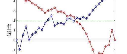
The Eighth Using MATLAB for MK Test —— Complete code attached at the end Star System Author: Eighth Star System – Stone Man Email: [email protected] Read Data clc;clear;close all; load data1.mat year = data1(:,1); data = data1(:,2); Trend Test s = 0; len=size(data,1); for m=1:len-1 for n=m+1:len if data(n) > data(m) s = s+1; elseif … Read more

MATLAB Plotting Secrets: Enhance Your Data Visualization

MATLAB Plotting Secrets: Enhance Your Data Visualization

Today, let’s discuss how to create beautiful charts using MATLAB. Attractive charts not only make your papers more eye-catching but also make data analysis more intuitive. I have compiled several practical tips to ensure that you can create impressive charts after learning. Color Matching Matters To make charts visually appealing, color matching is key. The … Read more

Performing Sliding T-Test Using MATLAB

Performing Sliding T-Test Using MATLAB

First Eight Performing Sliding T-Test Using MATLAB —— Complete Code at the End Star System Author: Eighth Star System – Stone Man Email: [email protected] Performing Sliding T-Test Using MATLAB clc;clear;close all; %% Read Data load data.mat % Read data time = data(:,1); % Time series data sw = data(:,2); % Corresponding data Sliding T-Test step … Read more