What is Data Visualization? Data visualization is aimed at making data more efficiently reflect the situation of the data, facilitating readers to read more efficiently, and highlighting the patterns behind the data to emphasize important factors within the data. If you are using Python for data visualization, it is recommended to master the following four Python data analysis packages:
Pandas, Matplotlib, Seaborn, Pyecharts

01. Pandas
Official website: https://www.pypandas.cn/
Pandas is the core data analysis support library for Python, providing fast, flexible, and clear data structures aimed at handling relational and labeled data simply and intuitively. It is widely used in the field of data analysis and is suitable for handling tabular data similar to Excel tables, as well as ordered and unordered time series data.
The main data structures of Pandas are Series (one-dimensional data) and DataFrame (two-dimensional data). These two data structures are sufficient to handle most typical use cases in finance, statistics, social sciences, engineering, etc. The data analysis process using Pandas includes stages of data organization and cleaning, data analysis and modeling, data visualization, and tabulation.
-
Flexible grouping function: group by data grouping; -
Intuitive merging function: merge data connections; -
Flexible reshaping function: reshape data;

The pandas library can not only perform some data cleaning tasks but also create plots using pandas, and it can easily plot with a single line of code. Detailed plotting methods can be found in the comments within the code.
# Import the pandas library
import pandas as pd

# Generate a Series
s=pd.Series([1,3,3,4], index=list('ABCD'))

# If no chart type is specified in parentheses, a line chart is generated by default
s.plot()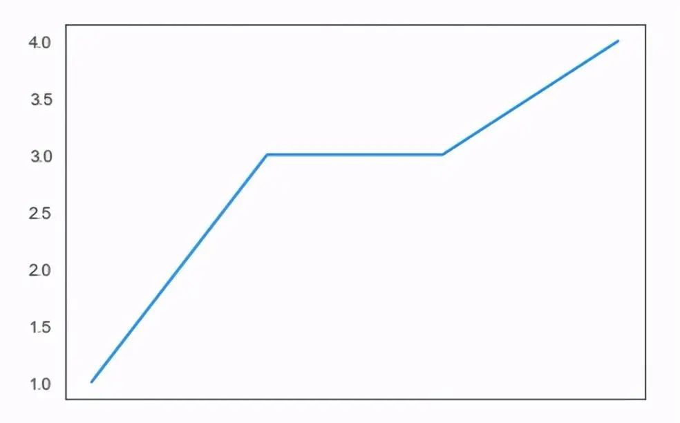
# Bar chart
s.plot(kind='bar')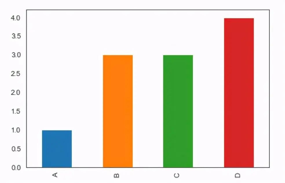
# Horizontal bar chart
s.plot.barh()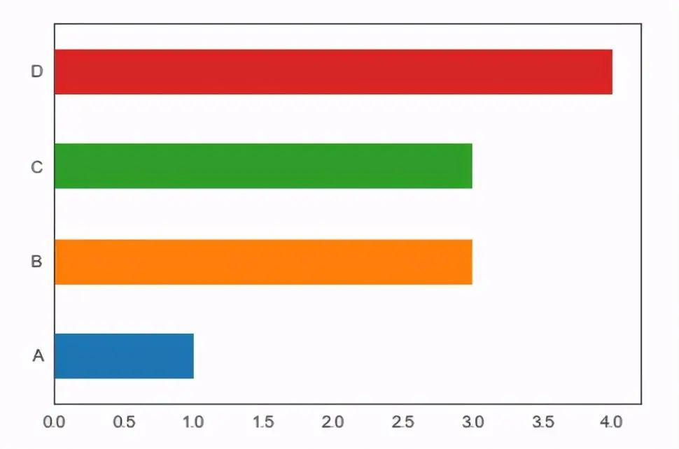
# Pie chart
s.plot.pie()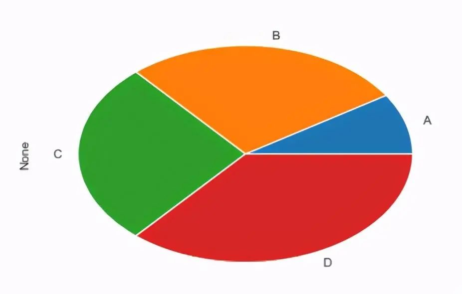
# Histogram
s.plot.hist()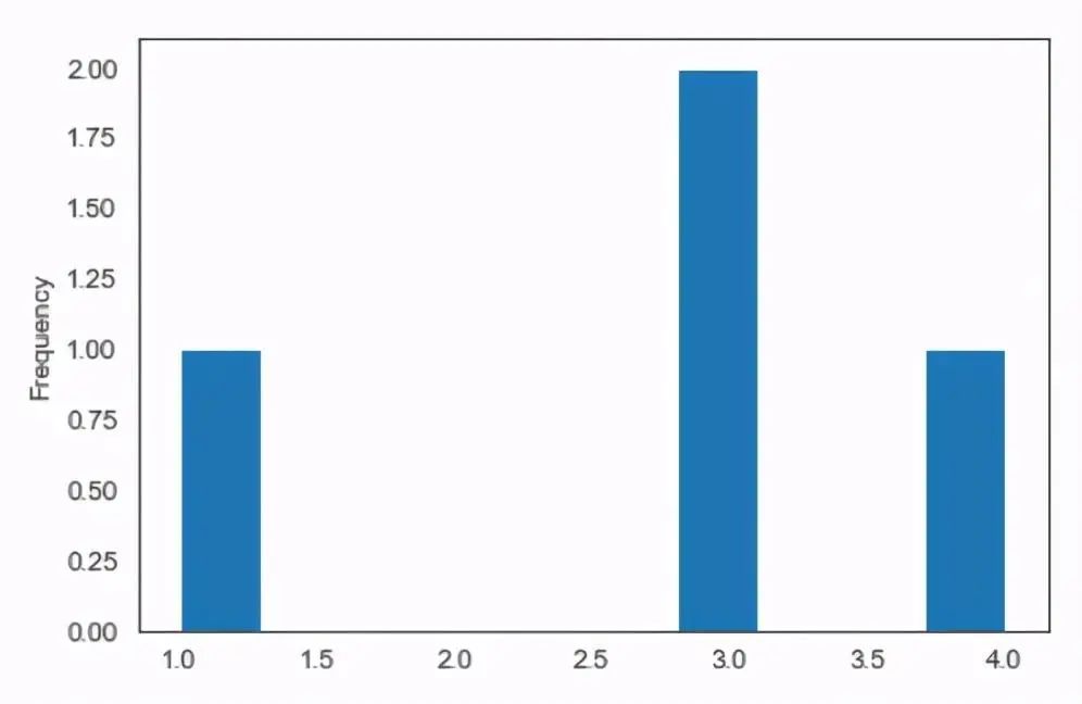
# Density plot
import numpy as np
s=pd.Series(np.random.randn(1000))  # Generate a column of random numbers
s.plot.kde()
s.plot.density()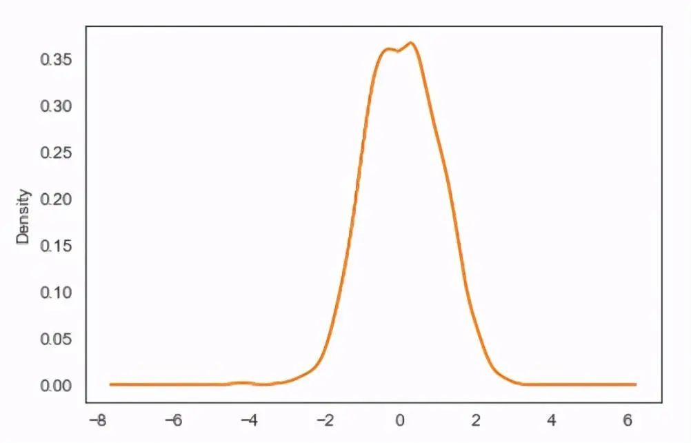
# Scatter plot
import numpy as np  # Generate a DataFrame
df=pd.DataFrame(np.random.randn(1000,2), columns=['X1','Y'])
df.plot.scatter(x='X1',y='Y')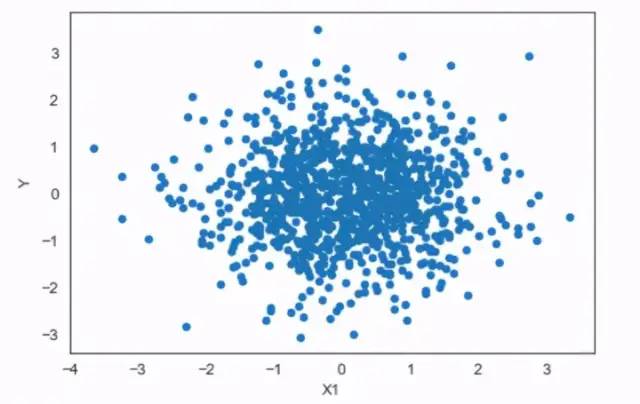
# Hexbin plot
df.plot.hexbin(x='X1',y='Y',gridsize=8)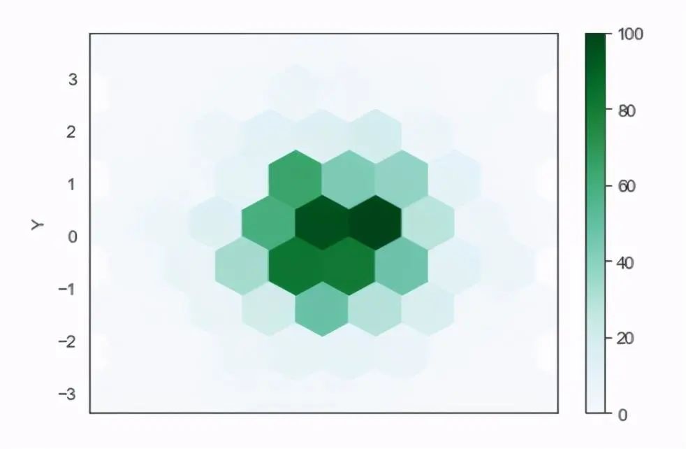
# Box plot
df=pd.DataFrame(np.random.rand(10,2),columns=['A','B'])
df.plot.box()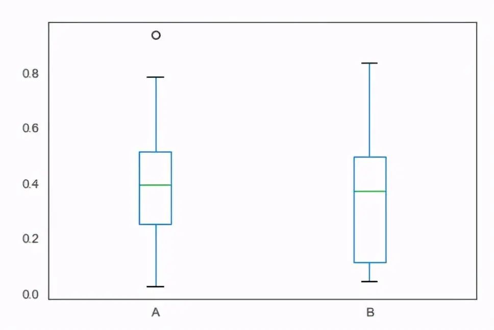
# Area plot
df=pd.DataFrame(np.random.randint(10,size=(4,4)),
                 columns=list('ABCD'),
                 index=list('WXYZ'))

df.plot.area()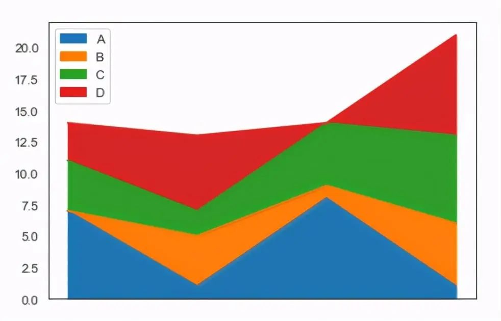
02. Matplotlib
Official website: https://www.matplotlib.org.cn/
Matplotlib is a 2D plotting library for Python that generates publication-quality graphics in various hardcopy formats and interactive environments across platforms. Matplotlib can be used in Python scripts, Python and IPython Shells, Jupyter notebooks, web application servers, and four graphical user interface toolkits.
Matplotlib tries to make easy things easier and hard things possible, with just a few lines of code to generate charts, histograms, power spectra, bar charts, error charts, scatter plots, etc.
For simple plotting, the pyplot module provides an interface similar to MATLAB, especially when used in conjunction with IPython. For advanced users, you can have complete control over line styles, font properties, axis properties, etc., through an object-oriented interface or a set of functions familiar to MATLAB users.

Below is an introduction to the usage of matplotlib. In addition to plotting, matplotlib can also adjust the parameters of the charts to make them more aesthetically pleasing. Regarding the use of matplotlib, it is advisable to create some common chart templates, and by changing the data source in the code, you can generate charts without adjusting parameters one by one.
# Import module
import matplotlib.pyplot as plt

# Set style
plt.style.use('seaborn-white')

# Chinese display issue. Without this code, the chart will not display Chinese characters
plt.rcParams['font.sans-serif'] =['SimHei']
Here, we first import the matplotlib library and use the seaborn-white chart style. You can use plt.style.available to view the available chart styles and choose one that you like. If Chinese characters cannot be displayed in the chart, a snippet of code can fix that.
# Build a DataFrame
import pandas as pd
import matplotlib.pyplot as plt
df=pd.DataFrame({'X':[1,3,5,7]})
df['Y']=df['X']**3
df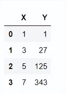
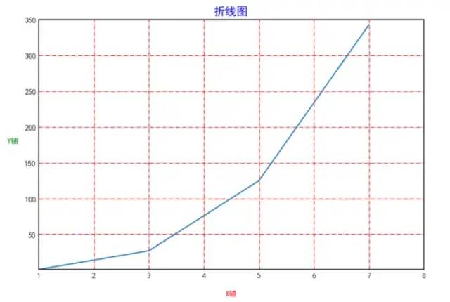
# Set the size of the image
plt.figure(facecolor='white',figsize=(9,6),dpi=100)
plt.plot(df['X'],df['Y'])

# Set the title of the image
plt.title('Line Chart',fontsize=15,color='b')
# Set the X and Y axis title size, color, and distance from the axes
plt.xlabel('X-axis',fontsize=10,color='r',labelpad=15)
plt.ylabel('Y-axis',fontsize=10,color='g',rotation=0,labelpad=15)

# Set starting coordinates
plt.xlim([1,8])
plt.ylim([1,350])
# plt.xticks([1,2,3,4]) only shows 1,2,3,4
# plt.yticks([50,150,250,300]) only shows 50,150,250,300
# Set grid lines for the image
plt.grid(color='r', linestyle='-.')
Here, we first set the size of the image, similar to choosing the size of the paper for drawing. The same principle applies here, then we set the axes, starting coordinates, grid lines, etc.
Sometimes, you may want to draw multiple lines on a single chart.
# Method for plotting multiple graphs
import numpy as np
import matplotlib.pyplot as plt
x=np.array([1,3,5])
y1=x
y2=x * 10
y3=x * 20
y4=x * 30
You can continue adding another plt.plot command after one plt.plot command to create another line on the same chart.
plt.figure(facecolor='white')
plt.plot(x,y1,label='A')
plt.plot(x,y2,label='B')
plt.plot(x,y3,label='C')
plt.plot(x,y4,label='D')
plt.legend()  # Show legend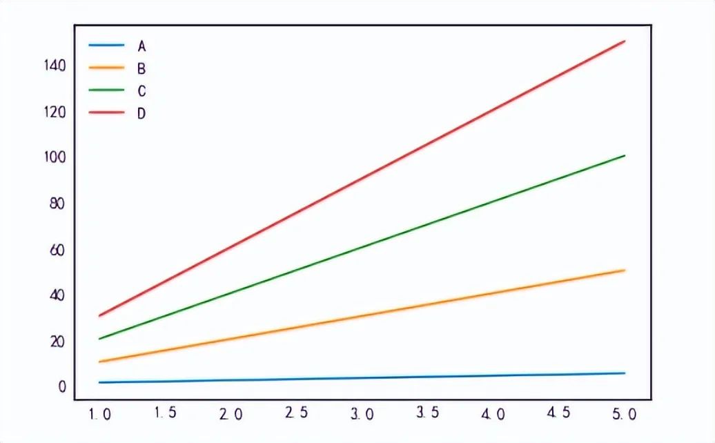
Using the plt.subplots command can also produce the same chart.
# Object-oriented plotting
fig,ax=plt.subplots(facecolor='white')
plt.plot(x,y1,label='A')
plt.plot(x,y2,label='B')
plt.plot(x,y3,label='C')
plt.plot(x,y4,label='D')
plt.legend()  # Show legend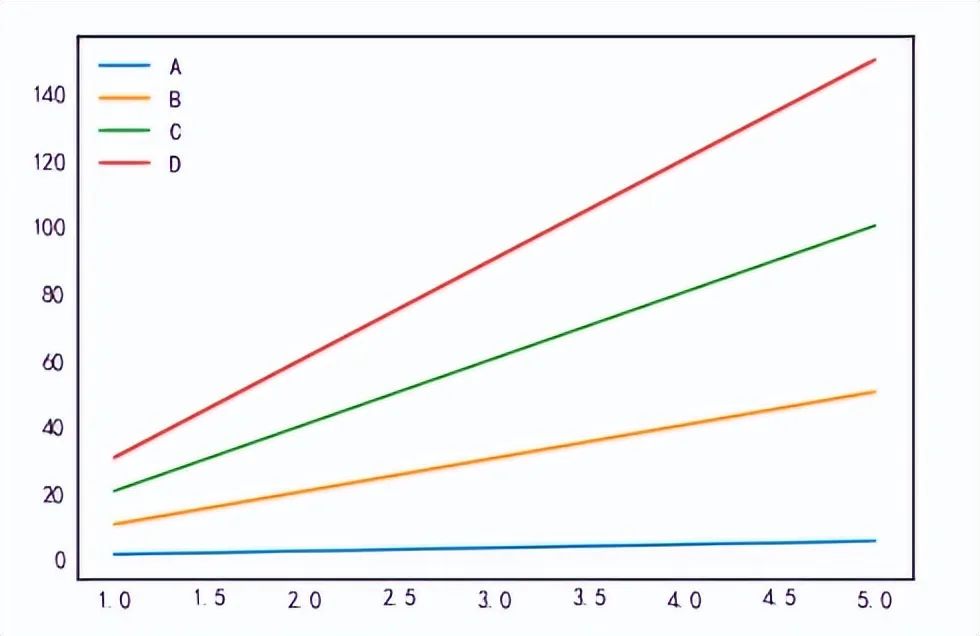
Next, we will introduce how to plot different line types at different positions on a single chart, using the plt.subplot command to first determine the plotting position. For example, plt.subplot(223) indicates the third position in a 2×2 distributed chart, with the remaining plotting commands being similar.
plt.figure(facecolor='white',figsize=(9,6))
plt.subplot(221)
plt.plot(x,y1,label='A',color='r')
plt.xticks(fontsize=15)
plt.legend()  # Show legend
plt.subplot(222)
plt.plot(x,y2,label='B',color='y')
plt.xticks(fontsize=15)
plt.legend()  # Show legend
plt.subplot(223)
plt.plot(x,y3,label='C',color='b')
plt.xticks(fontsize=15)
plt.legend()  # Show legend
plt.subplot(224)
plt.plot(x,y4,label='D',color='g')
plt.xticks(fontsize=15)
plt.legend()  # Show legend
plt.tight_layout()  # Compact display
In addition to using the plt.subplot command to determine the plotting area, you can also use the axs[] command for plotting, which is an object-oriented plotting approach.
# Object-oriented multi-plotting
fig,axs=plt.subplots(2,2,facecolor='white',figsize=(9,6))
axs[0,0].plot(x,y1,label='A',color='r')
axs[0,1].plot(x,y2,label='B',color='y')
axs[1,0].plot(x,y3,label='C',color='b')
axs[1,1].plot(x,y4,label='D',color='g')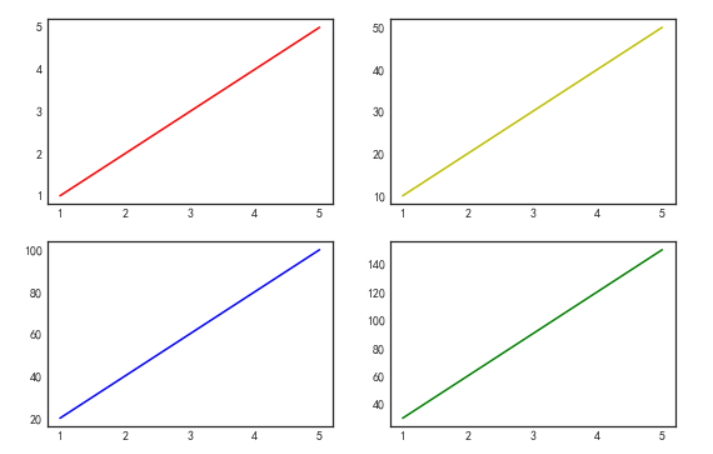
Sometimes when plotting multiple charts, you may need to share a coordinate axis. You can use the sharex=’all’ command.
# sharex='all' to share X-axis
fig,axs=plt.subplots(4,1,facecolor='white', figsize=(9,6), sharex='all')
axs[0].plot(x,y1,label='A',color='r')
axs[1].plot(x,y2,label='B',color='y')
axs[2].plot(x,y3,label='C',color='b')
axs[3].plot(x,y4,label='D',color='g')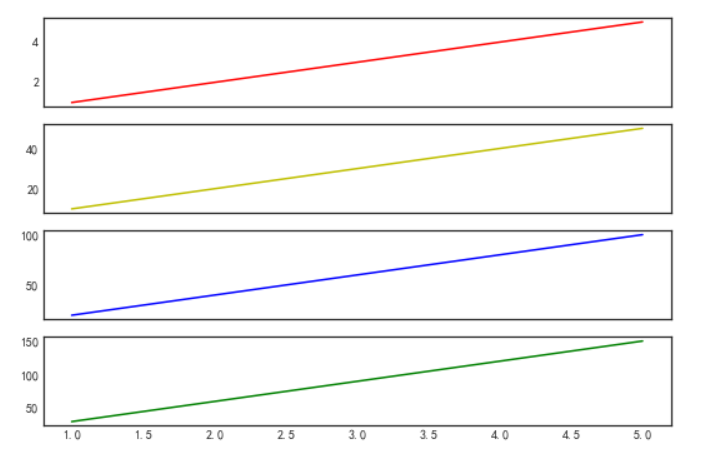
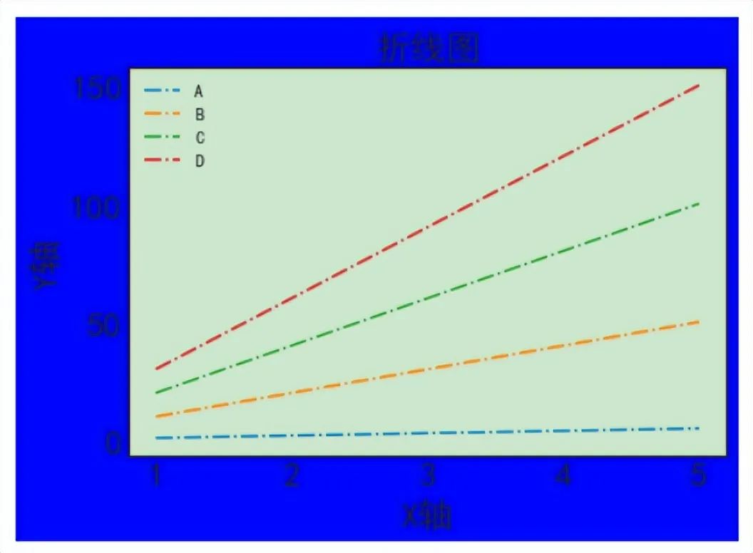
Use the plt.rcParams command to set global variables, including character display, Chinese display, background color, title size, axis font size, line styles, etc.
# Import module
import matplotlib.pyplot as plt

# Set style
plt.style.use('seaborn-white')

# Set global variables
plt.rcParams['axes.unicode_minus'] = False  # Character display
plt.rcParams['font.sans-serif'] =['SimHei']  # Chinese display
plt.rcParams['figure.facecolor'] = 'b'  # Set chart background color
plt.rcParams['axes.facecolor'] = (0.8,0.9,0.8)  # Set RGB color
plt.rcParams['axes.titlesize'] = 20  # Set title size
plt.rcParams['axes.labelsize'] = 20  # Set axis size
plt.rcParams['xtick.labelsize'] = 20  # Set X-axis size
plt.rcParams['ytick.labelsize'] = 20  # Set Y-axis size
plt.rcParams['lines.linestyle'] = '-.'  # Set line style

plt.plot(x,y1,label='A')
plt.plot(x,y2,label='B')
plt.plot(x,y3,label='C')
plt.plot(x,y4,label='D')
plt.title('Line Chart')
plt.xlabel('X-axis')
plt.ylabel('Y-axis')
plt.legend()  # Show legend
The chart below is created by setting global variables. Personally, I find it not very aesthetically pleasing. For other charts, global variable settings can be explored to create better-looking charts.
03. Seaborn
Official website: http://seaborn.pydata.org/
Seaborn is a Python data visualization library based on matplotlib, built on top of matplotlib and closely integrated with Pandas data structures, providing a high-level interface for drawing attractive and informative statistical graphics.
Seaborn can be used to explore data, and its plotting capabilities operate on data frames and arrays containing entire datasets, performing necessary semantic mapping and statistical aggregation internally to generate informative graphics. Its dataset-oriented declarative API allows focusing on the meaning of different elements of the plot rather than the details of how to draw them.
While matplotlib has a comprehensive and powerful API that allows changing almost any property of the graphics according to personal preferences, the combination of Seaborn’s high-level interface and matplotlib’s deep customizability makes it possible to quickly explore data and create graphics that can be customized into publication-quality final products.
Variables can be plotted in a multi-line format using the sns.FacetGrid command.
import numpy as np
import pandas as pd
import seaborn as sns
import matplotlib.pyplot as plt
sns.set_theme(style="white", rc={"axes.facecolor": (0, 0, 0, 0)})
rs = np.random.RandomState(1979)
x = rs.randn(500)
g = np.tile(list("ABCDEFGHIJ"), 50)
df = pd.DataFrame(dict(x=x, g=g))
m = df.g.map(ord)
df["x"] += m

pal = sns.cubehelix_palette(10, rot=-.25, light=.7)
g = sns.FacetGrid(df, row="g", hue="g", aspect=15, height=.5, palette=pal)
g.map(sns.kdeplot, "x", bw_adjust=.5, clip_on=False, fill=True, alpha=1, linewidth=1.5)
g.map(sns.kdeplot, "x", clip_on=False, color="w", lw=2, bw_adjust=.5)
g.refline(y=0, linewidth=2, linestyle="-", color=None, clip_on=False)
def label(x, color, label):
    ax = plt.gca()
    ax.text(0, .2, label, fontweight="bold", color=color,
            ha="left", va="center", transform=ax.transAxes)
g.map(label, "x")
g.figure.subplots_adjust(hspace=-.25)
g.set_titles("")
g.set(yticks=[], ylabel="")
g.despine(bottom=True, left=True)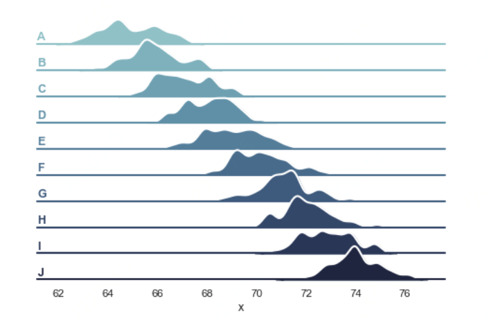
The size of the data can be presented using a heatmap, using the sns.heatmap command.
import matplotlib.pyplot as plt
import seaborn as sns
sns.set_theme()

# Load the example flights dataset and convert to long-form
flights_long = sns.load_dataset("flights")
flights = flights_long.pivot("month", "year", "passengers")

# Draw a heatmap with the numeric values in each cell
f, ax = plt.subplots(figsize=(9, 6))
sns.heatmap(flights, annot=True, fmt="d", linewidths=.5, ax=ax)
04. Pyecharts
Official website: https://pyecharts.org/#/
Echarts is an open-source data visualization library developed by Baidu, recognized by many developers for its good interactivity and exquisite chart design. Python, being an expressive language, is well-suited for data processing. When data analysis meets data visualization, Pyecharts was born.
Pyecharts has a simple API design, allowing for smooth usage, supporting chain calls, and encompasses more than 30 common chart types, covering a wide range of needs. It supports mainstream notebook environments, Jupyter Notebook and JupyterLab, and has highly flexible configuration options to easily create beautiful charts.
Pyecharts’ powerful data interaction capabilities make data expression more vivid, enhancing human-computer interaction effects, and the data presentation can be directly exported as an HTML file, increasing opportunities for data result interaction, making information communication easier.

Pyecharts has a rich collection of chart materials, supporting chain calls. Below is an example of using Pyecharts’ geographical chart functionality to visually display data visualization effects spatially.
from pyecharts import options as opts
from pyecharts.charts import Map
from pyecharts.faker import Faker

c = (
    Map()
    .add("Vendor A", [list(z) for z in zip(Faker.provinces, Faker.values())], "china")
    .set_global_opts(
        title_opts=opts.TitleOpts(title="Map-VisualMap (Segmented)"),
        visualmap_opts=opts.VisualMapOpts(max_=200, is_piecewise=True),
    )
    .render("map_visualmap_piecewise.html"))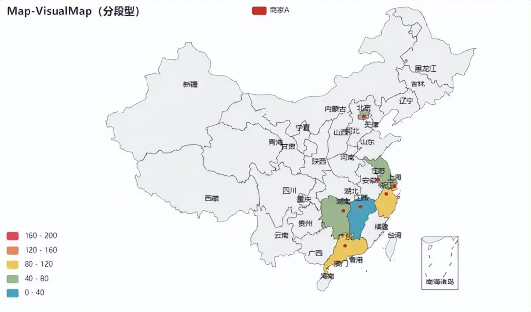
Use the Radar command to plot radar charts, which are used to display multivariate data graphically.
from pyecharts import options as opts
from pyecharts.charts import Radar

v1 = [[4300, 10000, 28000, 35000, 50000, 19000]]
v2 = [[5000, 14000, 28000, 31000, 42000, 21000]]
c = (
    Radar()
    .add_schema(
        schema=[
            opts.RadarIndicatorItem(name="Sales", max_=6500),
            opts.RadarIndicatorItem(name="Management", max_=16000),
            opts.RadarIndicatorItem(name="Information Technology", max_=30000),
            opts.RadarIndicatorItem(name="Customer Service", max_=38000),
            opts.RadarIndicatorItem(name="Research and Development", max_=52000),
            opts.RadarIndicatorItem(name="Marketing", max_=25000),
        ]
    )
    .add("Budget Allocation", v1)
    .add("Actual Expenses", v2)
    .set_series_opts(label_opts=opts.LabelOpts(is_show=False))
    .set_global_opts(
        legend_opts=opts.LegendOpts(selected_mode="single"),
        title_opts=opts.TitleOpts(title="Radar-Single Instance Mode"),
    )
    .render("radar_selected_mode.html"))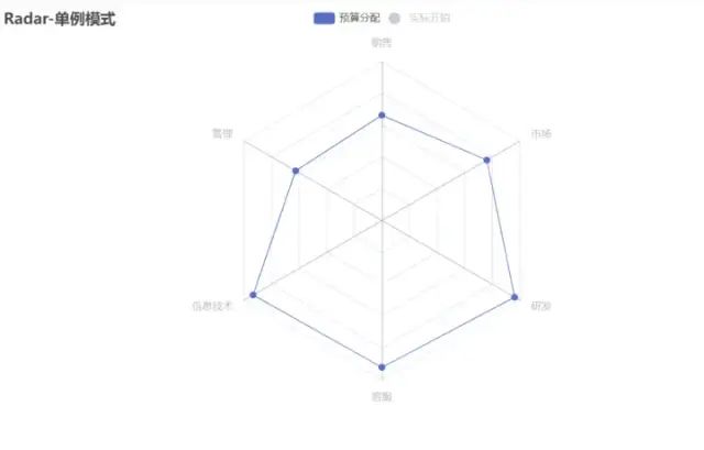
— The End —