
Today, let’s discuss how to create beautiful charts using MATLAB. Attractive charts not only make your papers more eye-catching but also make data analysis more intuitive. I have compiled several practical tips to ensure that you can create impressive charts after learning.
Color Matching Matters
To make charts visually appealing, color matching is key.
The built-in colors in MATLAB are somewhat outdated, but don’t worry, we have solutions.
% Custom color scheme
colors = [0.8 0.2 0.1; % Red
          0.2 0.7 0.3; % Green
          0.1 0.4 0.8]; % Blue

x = 0:0.1:2*pi;
y1 = sin(x);
y2 = cos(x);
y3 = tan(x);

plot(x, y1, 'Color', colors(1,:), 'LineWidth', 2)
hold on
plot(x, y2, 'Color', colors(2,:), 'LineWidth', 2)
plot(x, y3, 'Color', colors(3,:), 'LineWidth', 2)
hold off

legend('sin', 'cos', 'tan')
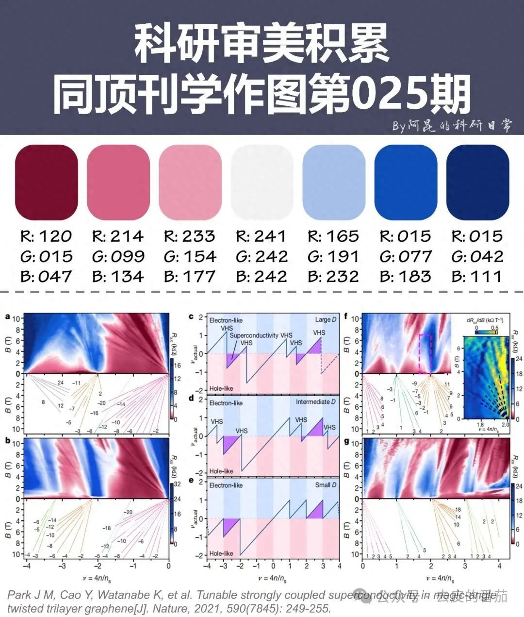
In this code, we defined three custom colors using RGB values ranging from 0 to 1. This way, the generated charts are much more visually appealing than the default colors.
Tip: When choosing colors, consider color blindness. The red-green combination is common but may not be friendly for color-blind individuals.
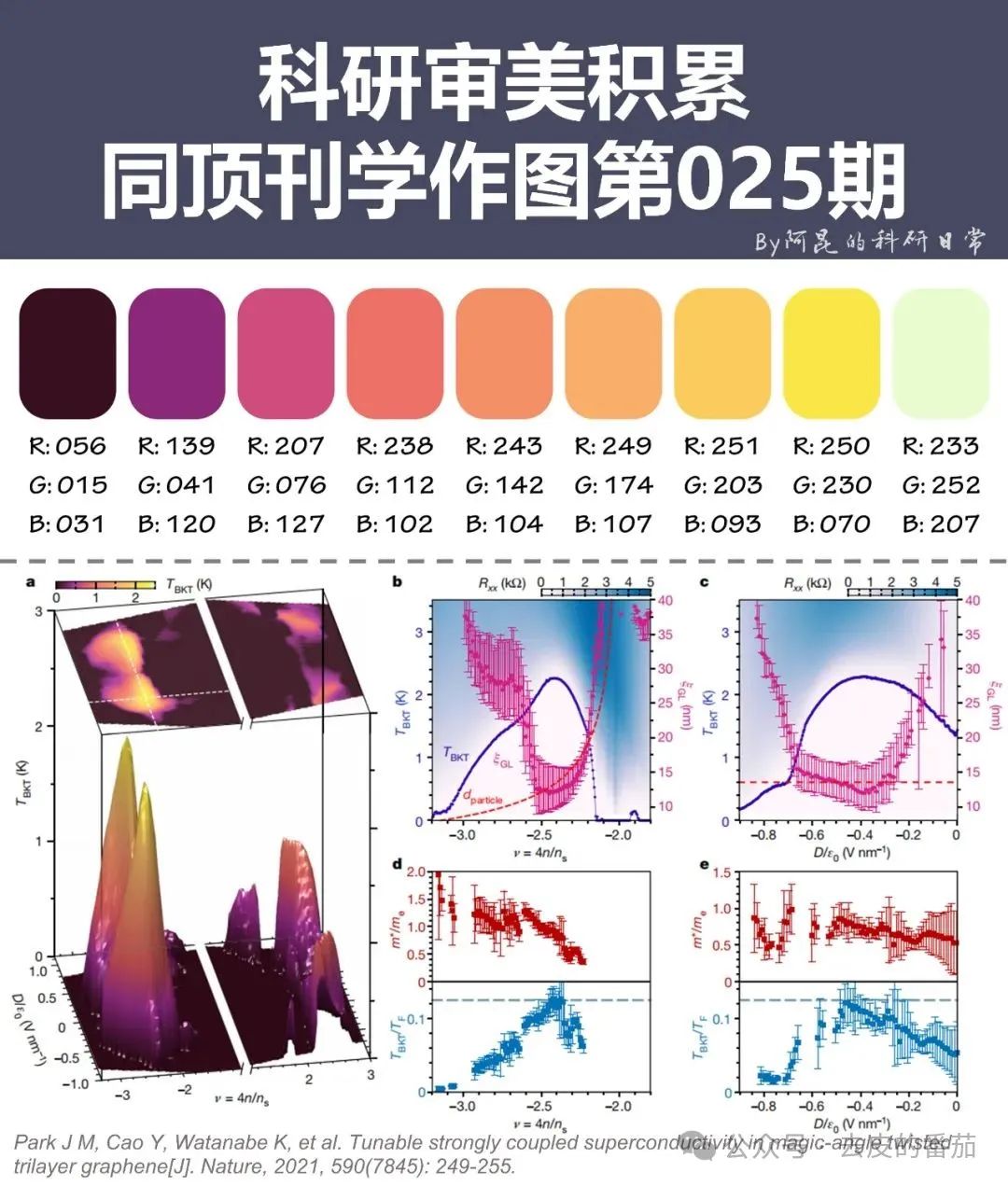
Mastering Axes
Axes may seem simple, but they hold great significance.
Proper adjustments can make charts clearer.
x = linspace(0, 10, 100);
y = exp(x);

semilogy(x, y)
grid on
xlabel('X-axis')
ylabel('Y-axis (Log Scale)')
title('Exponential Function')

ax = gca; % Get current axis object
ax.XAxis.Color = 'red';
ax.YAxis.Color = 'blue';
ax.XAxis.LineWidth = 1.5;
ax.YAxis.LineWidth = 1.5;
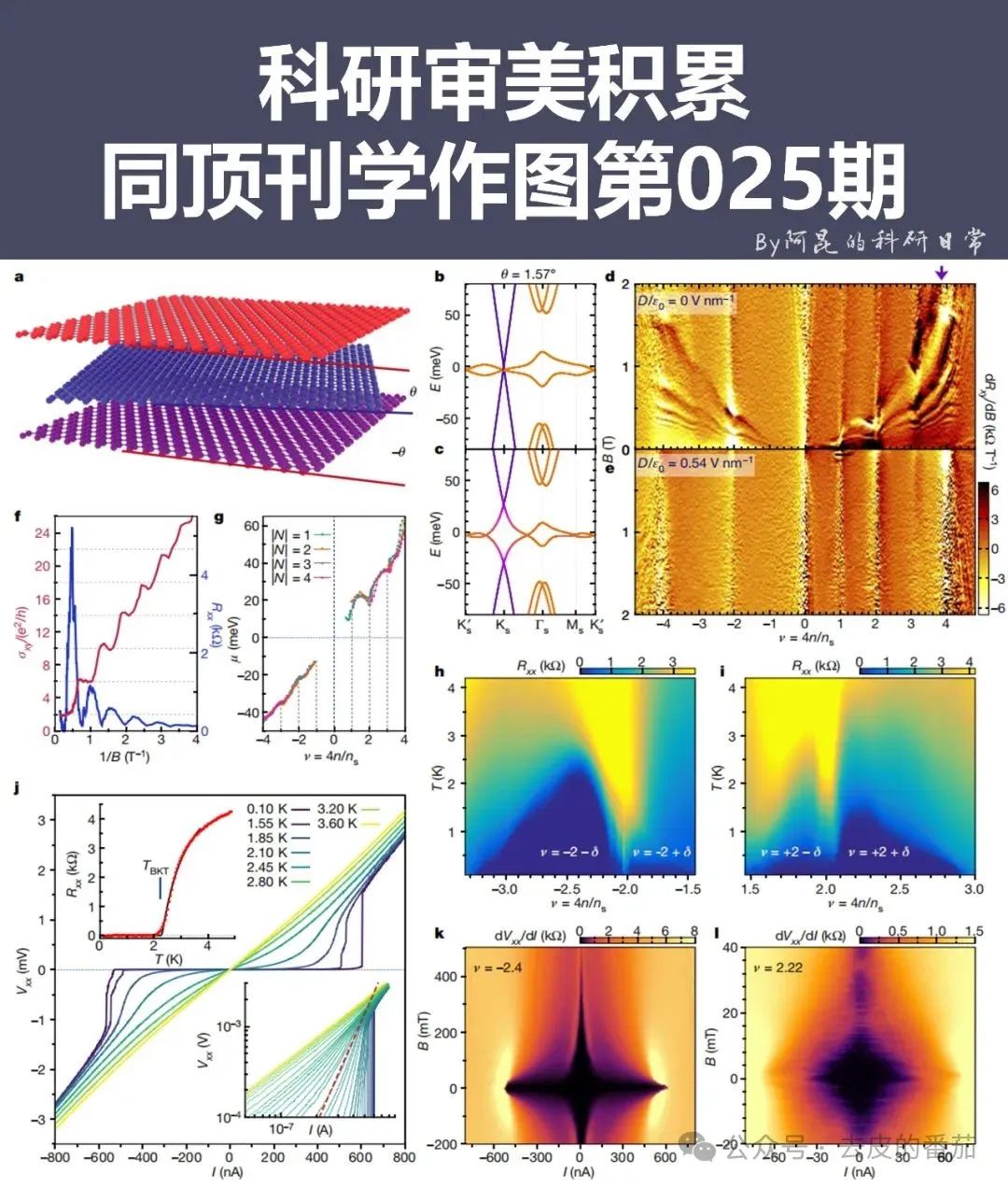
This code uses the semilogy function, applying a logarithmic scale to the Y-axis, which is suitable for displaying rapidly growing data. gca stands for “get current axis,” allowing for fine adjustments to the axis properties.
Add Some Flair to Your Charts

Just having lines can be monotonous?
Let’s add some style!
x = 1:10;
y = randi([1 20], 1, 10);

bar(x, y)
hold on
plot(x, y, 'r-o', 'LineWidth', 2, 'MarkerSize', 8, 'MarkerFaceColor', 'r')
hold off

text(x, y, num2str(y'), 'VerticalAlignment', 'bottom', 'HorizontalAlignment', 'center')

title('Combination of Bar and Line Charts')
xlabel('X-axis')
ylabel('Y-axis')
This code combines a bar chart and a line chart, adding specific values above each data point. This combination chart can simultaneously showcase the data’s discreteness and trends.

3D Charts Aren’t Hard Either
Don’t be intimidated by 3D; it’s not that complicated.
[X, Y] = meshgrid(-2:0.2:2);
Z = X .* exp(-X.^2 - Y.^2);

surf(X, Y, Z)
colormap('jet')
colorbar

title('3D Surface Plot')
xlabel('X-axis')
ylabel('Y-axis')
zlabel('Z-axis')

% Adjust view
view(-37.5, 30)
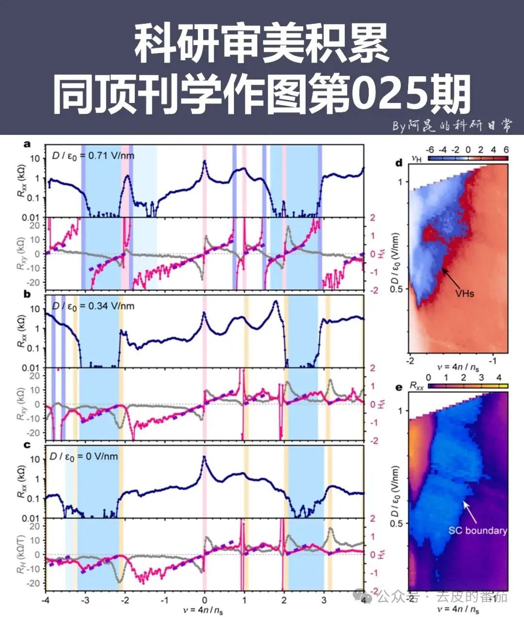
surf function is used to draw 3D surface plots, colormap changes the color scheme, and view adjusts the perspective. Mastering these functions will allow you to create stunning 3D charts.
Export High-Quality Images
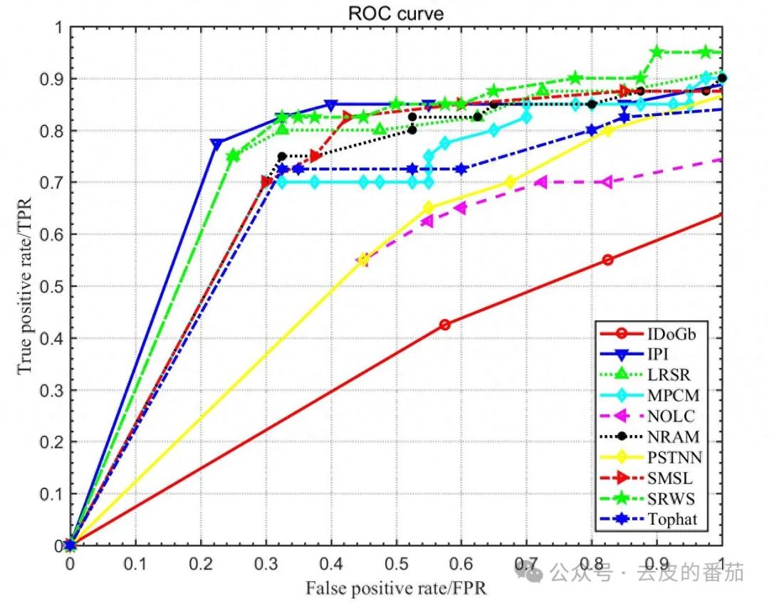
Once you create a chart, saving it well is also a skill.
% Set figure size
fig = gcf;
fig.Position = [100 100 800 600];

% Export as high-resolution PNG
print('-dpng', '-r300', 'my_awesome_plot.png')
This code first adjusts the figure size and then exports it as a PNG image with a resolution of 300 dpi. This way, the exported image won’t blur when enlarged, making it suitable for use in papers or reports.
That’s it for today’s plotting secrets. Practice more, try different things, and you can also become a MATLAB plotting expert. Remember, beautiful charts not only make your data more convincing but also make your work stand out. Go ahead and see if you can create charts that impress your colleagues or teachers!