Ready-to-Use Academic-Level Plotting 4: Bar Chart (MATLAB Implementation, Foolproof Data Replacement)

Ready-to-Use Academic-Level Plotting 4: Bar Chart (MATLAB Implementation, Foolproof Data Replacement)

4. Bar Chart 4.1 Effect Display 4.2 Detailed Explanation The bar chart uses the height of rectangles to represent data values and is a common tool for comparing discrete categorical data. Key interpretation points are as follows: Value Comparison:The height of the bars is proportional to the data values; within the same group (e.g., the … Read more
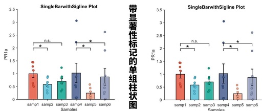
Advanced Matlab Plotting Issue 89 – Single Group Bar Chart with Significance Markers

Advanced Matlab Plotting Issue 89 - Single Group Bar Chart with Significance Markers

In previous articles, we shared methods for creating single group bar charts (Matlab Paper Illustration Drawing Template – Bar Chart (Single Group Multi-color)): Single group bar chart with error bars (Matlab Paper Illustration Drawing Template Issue 70 – Bar Chart with Error Bars): Bar chart with jitter points (Advanced Matlab Plotting Issue 88 – Bar … Read more

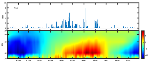
Creating a Combined Bar Graph in MATLAB

Creating a Combined Bar Graph in MATLAB

Creating a Bar Graph Combined Graph Author: Li Zhi, Eighth Galaxy Contact Email: [email protected] Precipitation Bar Chart clear;clc % Precipitation Bar Chart subplot(2,1,1)% Group chart 2 rows 1 column first chart x1=xlsread('Temperature_Precipitation.xlsx','Date','A2:A366');% Read x-axis y1=xlsread('Temperature_Precipitation.xlsx','Precipitation','A2:A366');% Read y-axis bar(x1,y1,1)% Draw bar chart ylabel('mm')% y-axis label axis([0,365,-1,10]) % Set axis size text(20,8,'Test','fontname','Times New Roman','fontsize',12,'fontweight','bold')% Set title parameters … Read more