

Star us for easier access to practical tutorials!

Introduction
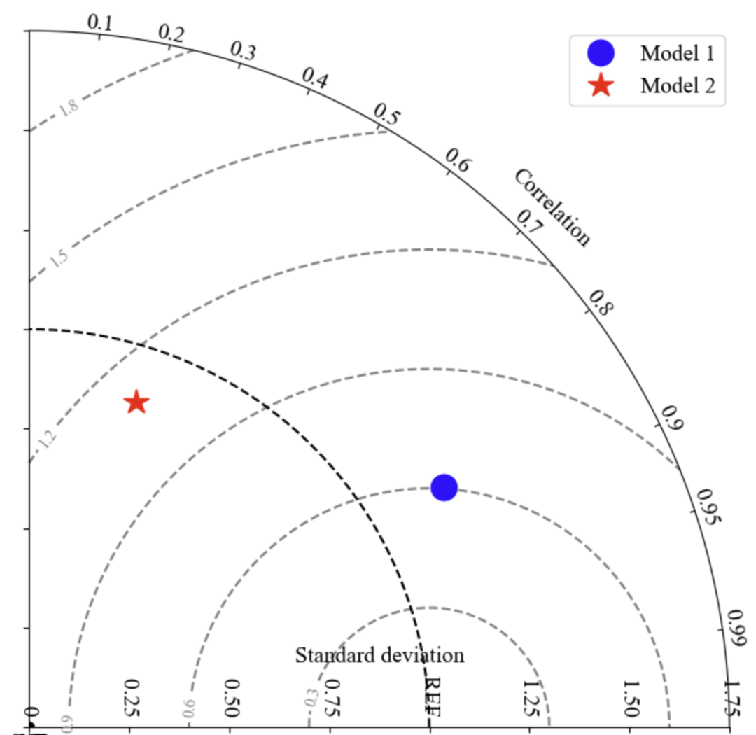
A Taylor diagram is a commonly used visualization tool for comparing the performance differences between model simulations and observations. It displays correlation, standard deviation, and root mean square error in one chart, making it a powerful assistant in scientific research and model evaluation.
This article will comprehensively explain how to draw Taylor diagrams using Python, R and MATLAB, helping you master this skill.

Python is a powerful tool in the field of data analysis, and its flexibility makes drawing Taylor diagrams possible. Here is an implementation based on matplotlib.
import numpy as np
import matplotlib.pyplot as plt
from matplotlib.projections import PolarAxes
from mpl_toolkits.axisartist import floating_axes
from mpl_toolkits.axisartist import grid_finder
# Set up Taylor diagram axes
def set_tayloraxes(fig, location):
trans = PolarAxes.PolarTransform()
r1_locs = np.hstack((np.arange(1, 10) / 10.0, [0.95, 0.99]))
t1_locs = np.arccos(r1_locs)
gl1 = grid_finder.FixedLocator(t1_locs)
tf1 = grid_finder.DictFormatter(dict(zip(t1_locs, map(str, r1_locs))))
r2_locs = np.arange(0, 2, 0.25)
r2_labels = [‘0 ‘, ‘0.25 ‘, ‘0.50 ‘, ‘0.75 ‘, ‘REF ‘, ‘1.25 ‘, ‘1.50 ‘, ‘1.75 ‘]
gl2 = grid_finder.FixedLocator(r2_locs)
tf2 = grid_finder.DictFormatter(dict(zip(r2_locs, map(str, r2_labels))))
ghelper = floating_axes.GridHelperCurveLinear(
trans, extremes=(0, np.pi / 2, 0, 1.75),
grid_locator1=gl1, tick_formatter1=tf1,
grid_locator2=gl2, tick_formatter2=tf2)
ax = floating_axes.FloatingSubplot(fig, location, grid_helper=ghelper)
fig.add_subplot(ax)
ax.axis[“top”].set_axis_direction(“bottom”)
ax.axis[“top”].toggle(ticklabels=True, label=True)
ax.axis[“top”].major_ticklabels.set_axis_direction(“top”)
ax.axis[“top”].label.set_axis_direction(“top”)
ax.axis[“top”].label.set_text(“Correlation”)
ax.axis[“left”].label.set_text(“Standard deviation”)
polar_ax = ax.get_aux_axes(trans)
rs, ts = np.meshgrid(np.linspace(0, 1.75, 100), np.linspace(0, np.pi / 2, 100))
rms = np.sqrt(1 + rs**2 – 2 * rs * np.cos(ts))
CS = polar_ax.contour(ts, rs, rms, colors=’gray’, linestyles=’–‘)
plt.clabel(CS, inline=1, fontsize=10)
polar_ax.plot(np.linspace(0, np.pi / 2), np.ones_like(np.linspace(0, np.pi / 2)), ‘k–‘)
return polar_ax
# Plot points on the Taylor diagram
def plot_taylor(axes, refsample, sample, *args, **kwargs):
std = np.std(sample) / np.std(refsample)
corr = np.corrcoef(refsample, sample)
theta = np.arccos(corr[0, 1])
axes.plot(theta, std, *args, **kwargs)
# Data construction and plotting
x = np.linspace(0, 10 * np.pi, 100)
obs = np.sin(x)
model1 = obs + 0.4 * np.random.randn(len(x))
model2 = 0.3 * obs + 0.6 * np.random.randn(len(x))
fig = plt.figure(figsize=(8, 8))
ax = set_tayloraxes(fig, 111)
plot_taylor(ax, obs, model1, ‘bo’, markersize=16, label=’Model 1′)
plot_taylor(ax, obs, model2, ‘r*’, markersize=16, label=’Model 2′)
plt.legend()
plt.show()

In R, the plotrix package can easily draw Taylor diagrams.
# Load necessary packages
library(plotrix)
# Construct data
obs <- sin(seq(0, 10 * pi, length.out = 100))
model1 <- obs + rnorm(100, sd = 0.4)
model2 <- 0.3 * obs + rnorm(100, sd = 0.6)
# Draw Taylor diagram
taylor.diagram(ref = obs, model = model1, col = “blue”, pch = 19, main = “Taylor Diagram”)
taylor.diagram(ref = obs, model = model2, col = “red”, add = TRUE, pch = 17)
legend(“topright”, legend = c(“Model 1”, “Model 2”), col = c(“blue”, “red”), pch = c(19, 17))

MATLAB provides dedicated toolbox support for drawing Taylor diagrams, and it can also be implemented manually.
% Data construction
obs = sin(linspace(0, 10 * pi, 100));
model1 = obs + 0.4 * randn(1, 100);
model2 = 0.3 * obs + 0.6 * randn(1, 100);
% Draw Taylor diagram
taylor_diagram(obs, model1, ‘Marker’, ‘o’, ‘MarkerEdgeColor’, ‘b’);
hold on;
taylor_diagram(obs, model2, ‘Marker’, ‘^’, ‘MarkerEdgeColor’, ‘r’);
legend(‘Model 1’, ‘Model 2’);

-
Python: High flexibility, customizable and aesthetically pleasing Taylor diagrams, suitable for scientific plotting and customization needs.
-
R: Quickly draw using the plotrix package, suitable for lightweight analysis and presentation.
-
MATLAB: Strong functional support, aesthetically pleasing graphics, suitable for engineering and research purposes.
Through this article, you can choose the appropriate tool to draw Taylor diagrams according to your actual needs and flexibly adjust parameters to showcase the core features of the data. Give it a try!


All articles, images, data, and other content published by this public account are for academic exchange, knowledge sharing, and discussion purposes only. The copyright of the papers involved belongs to the original authors and publishing institutions. We only analyze and share within legal limits. If there is any infringement, please contact us for processing. When reprinting articles from this public account or using part of the content, please indicate the source and author information. Any form of malicious alteration, distortion, or use for commercial profit without written authorization from this public account is prohibited. Violators will be held legally responsible.