Graphing Basics
1. Basic XY Plane Plotting Commands
MATLAB is not only skilled in matrix-related numerical computations but is also suitable for various scientific visualizations.
This section will introduce the basic plotting commands in MATLAB for the XY plane and XYZ space, including the plotting, printing, and saving of one-dimensional curves and two-dimensional surfaces.
The plot function is the fundamental function for drawing one-dimensional curves, but before using this function, we need to define the x and y coordinates for each point on the curve.
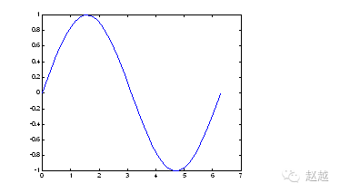
The following example can plot a sine curve:
close all;
x=linspace(0, 2*pi, 100); % 100 points for x coordinates
y=sin(x); % Corresponding y coordinates
plot(x,y);
Summary: Basic MATLAB Plotting Functions
plot: Both x-axis and y-axis are linear scales
loglog: Both x-axis and y-axis are logarithmic scales
semilogx: x-axis is logarithmic, y-axis is linear
semilogy: x-axis is linear, y-axis is logarithmic
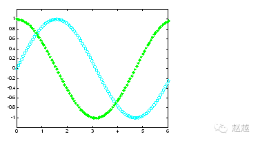
To plot multiple curves, simply input the coordinate pairs sequentially into the plot function:
plot(x, sin(x), x, cos(x));
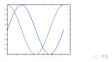
To change the color, add the corresponding string after the coordinate pairs:
plot(x, sin(x), ‘c’, x, cos(x), ‘g’);
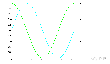
To change both the color and line style, add the corresponding strings after the coordinate pairs:
plot(x, sin(x), ‘co’, x, cos(x), ‘g*’);
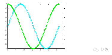
Summary: Parameters for the plot function’s color, marker, and line style: y yellow. Point k black o circle w white x xb blue + +g green * *r red – solid line c cyan : dotted line m magenta -. dash-dot line — dashed line
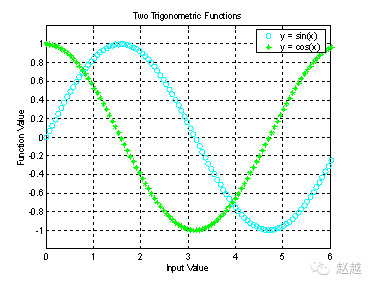
After completing the graph, we can use the axis([xmin,xmax,ymin,ymax]) function to adjust the range of the axes:
axis([0, 6, -1.2, 1.2]);
Additionally, MATLAB can add various annotations and processing to the graph:
xlabel(‘Input Value’); % x-axis annotation
ylabel(‘Function Value’); % y-axis annotation
title(‘Two Trigonometric Functions’); % Graph title
legend(‘y = sin(x)’,’y = cos(x)’); % Graph annotations
grid on; % Show grid lines
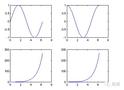
We can use subplot to plot multiple small graphs in the same window:
subplot(2,2,1); plot(x, sin(x));
subplot(2,2,2); plot(x, cos(x));
subplot(2,2,3); plot(x, sinh(x));
subplot(2,2,4); plot(x, cosh(x));
MATLAB also has various other two-dimensional plotting functions suitable for different applications, detailed in the table below.
Summary: Other Two-Dimensional Plotting Functions
bar bar chart
errorbar adds error range to the graph
fplot more accurate function graph
polar polar coordinate graph
hist cumulative graph
rose polar cumulative graph
stairs staircase graph
stem stem graph
fill filled graph
feather feather graph
compass compass graph
quiver vector field graph
Below, we will provide examples for each function.
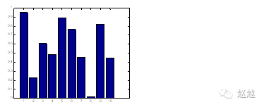
When the number of data points is few, bar charts are a very suitable representation:
close all; % Close all graphic windows
x=1:10;
y=rand(size(x));
bar(x,y);
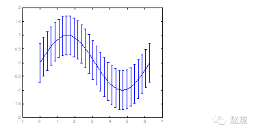
If the error amount of the data is known, we can use errorbar to represent it. The following example uses unit standard deviation as the error amount:
x = linspace(0,2*pi,30);
y = sin(x);
e = std(y)*ones(size(x));
errorbar(x,y,e)
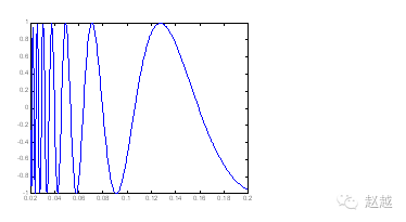
 For functions with rapid changes, fplot can be used for more accurate plotting, which will take denser samples at points of rapid change, as shown in the following example:
fplot(‘sin(1/x)’, [0.02 0.2]); % [0.02 0.2] is the plotting range
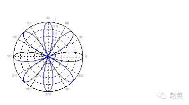
To create polar coordinate graphs, we can use polar:
theta=linspace(0, 2*pi);
r=cos(4*theta);
polar(theta, r);
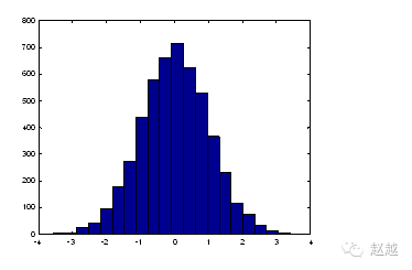
For a large amount of data, we can use hist to display the distribution and statistical characteristics of the data. The following commands can be used to verify the Gaussian random numbers generated by randn:
x=randn(5000, 1); % Generate 5000 Gaussian random numbers with m=0, s=1
hist(x,20); % 20 represents the number of bars
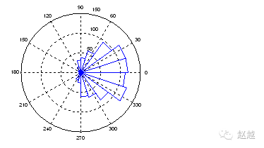
rose is quite similar to hist, except it treats the size of the data as angles, the number of data as distances, and draws them in polar coordinates:
x=randn(1000, 1);
rose(x);
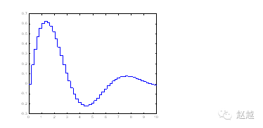
stairs can draw staircase graphs:
x=linspace(0,10,50);
y=sin(x).*exp(-x/3);
stairs(x,y);
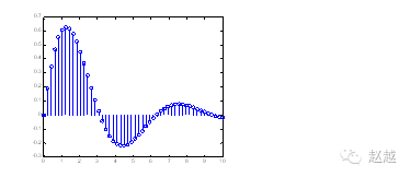
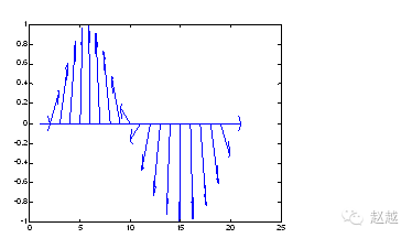
stem can produce stem graphs, often used to plot digital signals:
x=linspace(0,10,50);
y=sin(x).*exp(-x/3);
stem(x,y);
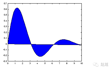
stairs treats data points as vertices of a polygon and fills this polygon with color:
x=linspace(0,10,50);
y=sin(x).*exp(-x/3);
fill(x,y,’b’); % ‘b’ is blue
feather treats each data point as a complex number and draws arrows:
theta=linspace(0, 2*pi, 20);
z = cos(theta)+i*sin(theta);
feather(z);
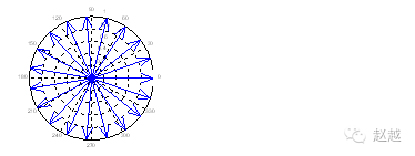
compass is similar to feather, except each arrow starts at the origin:
theta=linspace(0, 2*pi, 20);
z = cos(theta)+i*sin(theta);
compass(z);
2. Basic XYZ 3D Plotting Commands
In scientific visualization, 3D plotting is a very important skill. This chapter will introduce the basic XYZ 3D plotting commands in MATLAB.
mesh and plot are the basic commands for 3D plotting; mesh can draw 3D mesh plots while plot can draw 3D surface plots, both of which will have different colors based on height.
The following commands can draw a 3D mesh plot formed by the function:
x=linspace(-2, 2, 25); % Take 25 points on the x-axis
y=linspace(-2, 2, 25); % Take 25 points on the y-axis
[xx,yy]=meshgrid(x, y); % xx and yy are both 21×21 matrices
zz=xx.*exp(-xx.^2-yy.^2); % Calculate function values; zz is also a 21×21 matrix
mesh(xx, yy, zz); % Draw the 3D mesh plot
 surf has a similar usage to mesh:
x=linspace(-2, 2, 25); % Take 25 points on the x-axis
y=linspace(-2, 2, 25); % Take 25 points on the y-axis
[xx,yy]=meshgrid(x, y); % xx and yy are both 21×21 matrices
zz=xx.*exp(-xx.^2-yy.^2); % Calculate function values; zz is also a 21×21 matrix
surf(xx, yy, zz); % Draw the 3D surface plot
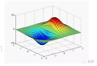
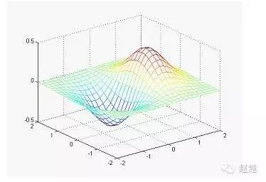
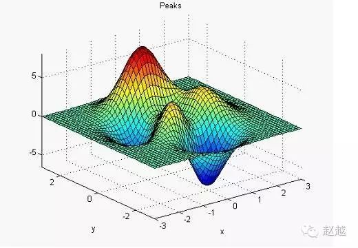
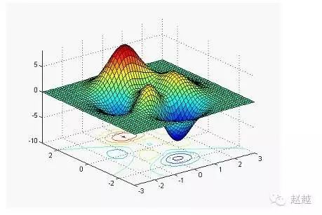
To facilitate testing 3D plotting, MATLAB provides a peaks function that produces a surface with peaks and valleys, including three local maxima and three local minima.
The fastest way to plot this function is to simply type peaks:
peaks
z = 3*(1-x).^2.*exp(-(x.^2) – (y+1).^2)…
– 10*(x/5 – x.^3 – y.^5).*exp(-x.^2-y.^2)…
– 1/3*exp(-(x+1).^2 – y.^2)
We can also sample points from the peaks function and plot them in various ways.
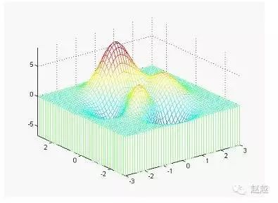
meshz can add a skirt to the surface:
[x,y,z]=peaks;
meshz(x,y,z);
axis([-inf inf -inf inf -inf inf]);
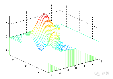
waterfall can create a waterfall effect in the x or y direction:
[x,y,z]=peaks;
waterfall(x,y,z);
axis([-inf inf -inf inf -inf inf]);
The following commands produce a waterfall effect in the y direction:
[x,y,z]=peaks;
waterfall(x’,y’,z’);
axis([-inf inf -inf inf -inf inf]);
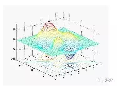
meshc simultaneously draws the mesh plot and contour:
[x,y,z]=peaks;
meshc(x,y,z);
axis([-inf inf -inf inf -inf inf]);
surfc simultaneously draws the surface plot and contour:
[x,y,z]=peaks;
surfc(x,y,z);
axis([-inf inf -inf inf -inf inf]);
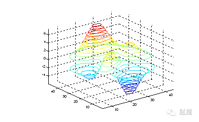
contour3 draws contour lines of the surface in 3D space:
contour3(peaks, 20);
axis([-inf inf -inf inf -inf inf]);
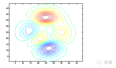
contour draws the projection of contour lines of the surface on the XY plane:
contour(peaks, 20);
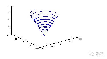
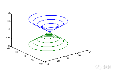
plot3 can draw curves in 3D space:
t=linspace(0,20*pi, 501);
plot3(t.*sin(t), t.*cos(t), t);
 You can also plot two curves in 3D space at the same time:
t=linspace(0, 10*pi, 501);
plot3(t.*sin(t), t.*cos(t), t, t.*sin(t), t.*cos(t), -t);
3. Advanced Processing of 3D Mesh Plots
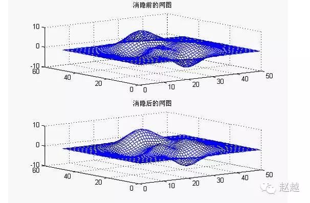
3a. Hidden Surface Removal
Example: Compare the mesh plot before and after hidden surface removal
z=peaks(50);
subplot(2,1,1);
mesh(z);
title(‘Mesh Plot Before Hidden Surface Removal’)
hidden off
subplot(2,1,2)
mesh(z);
title(‘Mesh Plot After Hidden Surface Removal’)
hidden on
colormap([0 0 1])
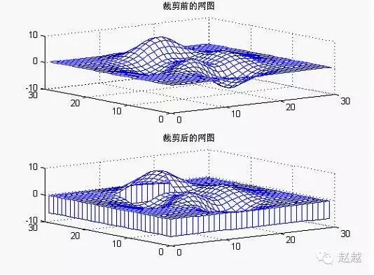
 3b. Clipping Processing
Using the undefined number NaN’s characteristics, we can perform clipping processing on the mesh plot
Example: Clipping Processing of the Plot
P=peaks(30);
subplot(2,1,1);
mesh(P);
title(‘Mesh Plot Before Clipping’)
subplot(2,1,2);
P(20:23,9:15)=NaN*ones(4,7); % Create holes
meshz(P) % Vertical mesh plot
title(‘Mesh Plot After Clipping’)
colormap([0 0 1]) % Blue mesh lines
4. Drawing 3D Solids of Revolution
To make it easier for some professional users to draw 3D solids of revolution, MATLAB specifically provides two functions: the cylindrical function cylinder and the spherical function sphere
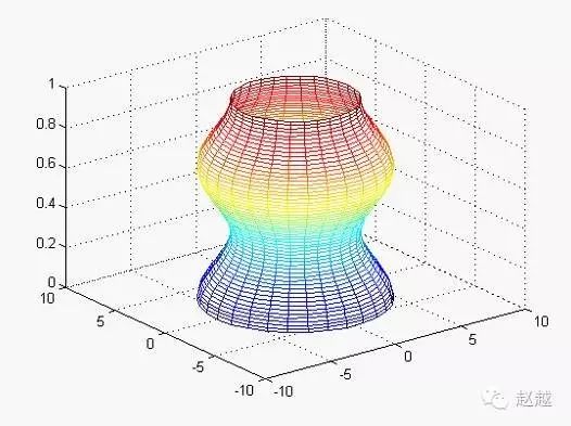
(1) Cylinder Plot
The cylinder plot is implemented by the cylinder function.
[X,Y,Z]=cylinder(R,N) This function generates a unit cylinder using the line vector R. The line vector R is defined on a unit height at equal intervals. N is the number of lines of division on the circumference of the rotation. You can use surf(X,Y,Z) to visualize this cylinder.
[X,Y,Z]=cylinder(R) or [X,Y,Z]=cylinder defaults to N=20 and R=[1 1]
Example: Cylinder Function Demonstration
x=0:pi/20:pi*3;
r=5+cos(x);
[a,b,c]=cylinder(r,30);
mesh(a,b,c)
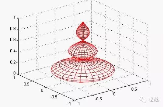
 Example: Rotating Cylinder Plot.
r=abs(exp(-0.25*t).*sin(t));
t=0:pi/12:3*pi;
r=abs(exp(-0.25*t).*sin(t));
[X,Y,Z]=cylinder(r,30);
mesh(X,Y,Z)
colormap([1 0 0])
 (2) Sphere Plot
The sphere plot is implemented by the sphere function
[X,Y,Z]=sphere(N) This function generates three (N+1)*(N+1) matrices, and using the function surf(X,Y,Z) can produce a unit sphere.
[X,Y,Z]=sphere This form uses the default value N=20.
Sphere(N) only plots the sphere without returning any values.
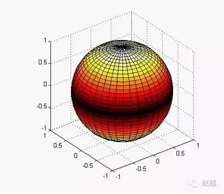
Example: Drawing a temperature distribution map of the Earth’s surface.
[a,b,c]=sphere(40);
t=abs(c);
surf(a,b,c,t);
axis(‘equal’) % These two statements control the size of the axes to be the same.
axis(‘square’)
colormap(‘hot’)
This article is reproduced from Zhao Yue’s WeChat public platform.
To facilitate academic discussions among researchers, Research to Achieve Reasoning has also created its own QQ group. Group 1: Full; Group 2: Full; Group 3: 585629919. Welcome everyone to join in for intense academic discussions!
This article is copyright of Research to Achieve Reasoning. Please contact us via QQ for reprinting. Please do not pirate without permission. Thank you!
Long press the image below to identify the QR code in the image or search for the WeChat number rationalscience to easily follow us. Thank you!