3. Line Graph
3.1 Effect Display
3.2 Detailed Explanation
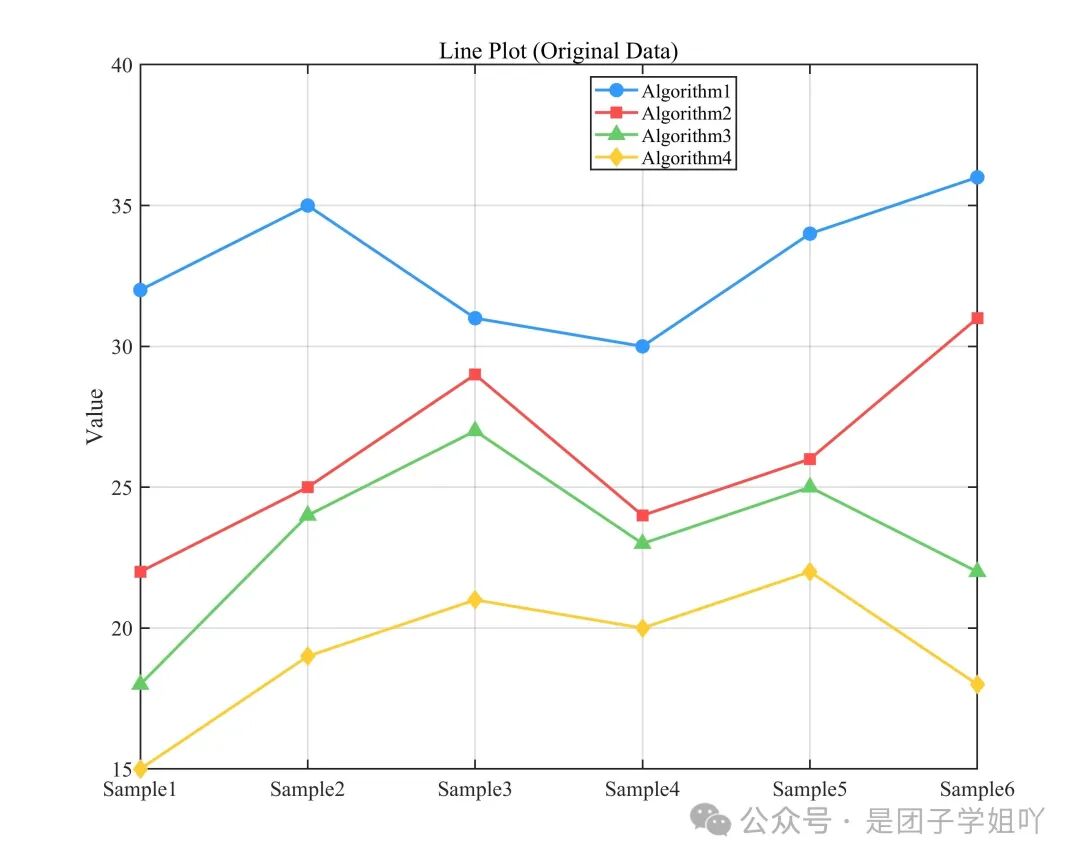
The line graph connects data points with line segments, primarily used to display the trend of data changes with ordered variables (such as sample numbers), suitable for comparing multiple sets of data. Key interpretation points are as follows:
Trend Judgment:The slope of the line segment reflects the rate of change, a positive slope indicates an upward trend, a negative slope indicates a downward trend, and a slope close to 0 indicates stable data.
Inter-group Comparison:Line segments marked with different colors/labels can intuitively compare the differences in height and trend consistency of multiple data sets (such as different algorithms), with the group whose line is consistently higher corresponding to better metrics.
Data Details:Data point markers (such as circles, squares) can highlight specific values, avoiding interpretation biases caused by overlapping line segments, and grid lines can assist in quickly reading values.
3.3 Complete Code
Copy to MATLAB to run.
|
clc; clear; close all;
% ============================== % Example data of 4×6 (can be modified to your own data) % ============================== data = [ 32 35 31 30 34 36; 22 25 29 24 26 31; 18 24 27 23 25 22; 15 19 21 20 22 18 ];
% Data normalization option normalize_data = false; % Do not normalize
% Data normalization processing if normalize_data data = (data – min(data(:))) ./ (max(data(:)) – min(data(:))); ylabel_text = ‘Normalized Value’; else ylabel_text = ‘Value’; end
% Definex axis labels (6 samples) xlabel_name = {‘Sample1’,‘Sample2’,‘Sample3’,‘Sample4’,‘Sample5’,‘Sample6’};
% Create figure figure(‘Position’, [100, 100, 1000, 800]);
% Define 4 colors colors = [ 0.2 0.6 1.0; % Blue 1.0 0.3 0.3; % Red 0.4 0.8 0.4; % Green 1.0 0.8 0.2 % Gold ];
% Define 4 different markers markers = {‘o’,‘s’,‘^’,‘d’};
% Draw line graph hold on; for i = 1:size(data,1) y = data(i,:); plot(1:size(data,2), y, … ‘-‘,‘Color’,colors(i,:), … ‘LineWidth’,2, … ‘Marker’,markers{i}, … ‘MarkerSize’,8, … ‘MarkerFaceColor’,colors(i,:)); end
% Get current axis handle ax = gca; ax.XTick = 1:size(data,2); ax.XTickLabel = xlabel_name; ax.TickLabelInterpreter = ‘tex’;
% Set axis labels and title % xlabel(‘Data Categories’); ylabel(ylabel_text); if normalize_data title(‘Line Plot (Normalized Data)’); else title(‘Line Plot (Original Data)’); end
% Add legend legend_names = {‘Algorithm1’,‘Algorithm2’,‘Algorithm3’,‘Algorithm4’}; legend(legend_names, ‘Location’,‘best’);
% Add grid lines grid on; set(gca, ‘Box’, ‘on’, ‘LineWidth’, 1.2);
% Set font set(gca, ‘FontSize’, 15, ‘FontName’, ‘Times New Roman’);
% Save files jpg_filename = ‘line_plot.jpg’; fig_filename = ‘line_plot.fig’; print(jpg_filename, ‘-djpeg’, ‘-r300’); savefig(fig_filename);
disp(‘Image and figure files have been saved successfully!‘); |