4. Bar Chart
4.1 Effect Display
4.2 Detailed Explanation
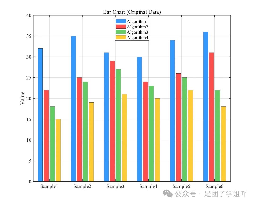
The bar chart uses the height of rectangles to represent data values and is a common tool for comparing discrete categorical data. Key interpretation points are as follows:
Value Comparison:The height of the bars is proportional to the data values; within the same group (e.g., the same sample), the taller the bar, the better the corresponding metric; different groups (e.g., different samples) can compare the stability of performance for the same category (e.g., the same algorithm).
Layout Types:A “grouped bar chart” (e.g., comparing multiple algorithms under multiple samples) requires color differentiation for groups, and the legend must correspond one-to-one with the bars; a “single group bar chart” is suitable for displaying data with a single categorical dimension.
Readability Design:Consistent bar widths ensure fair comparisons, and axis labels should indicate units (e.g., “Performance Value”); when data differences are small, specific values can be annotated at the top of the bars.
4.3 Complete Code
Copy to MATLAB to run
|
clc; clear; close all;
% ============================== % Example data of 4×6 (can be modified to your own data) % ============================== data = [ 32 35 31 30 34 36; 22 25 29 24 26 31; 18 24 27 23 25 22; 15 19 21 20 22 18 ];
% Data normalization option normalize_data = false; % Do not normalize
% Data normalization processing if normalize_data data = (data – min(data(:))) ./ (max(data(:)) – min(data(:))); ylabel_text = ‘Normalized Value’; else ylabel_text = ‘Value’; end
% Definex axis labels (6 samples) xlabel_name = {‘Sample1’,‘Sample2’,‘Sample3’,‘Sample4’,‘Sample5’,‘Sample6’};
% Create figure figure(‘Position’, [100, 100, 1000, 800]);
% Draw grouped bar chart h = bar(data’,‘grouped’); % Transpose to show6 samples per group hold on;
% Define 4 colors colors = [ 0.2 0.6 1.0; % Blue 1.0 0.3 0.3; % Red 0.4 0.8 0.4; % Green 1.0 0.8 0.2 % Golden ];
% Set the color of each group of bars for i = 1:length(h) h(i).FaceColor = colors(i,:); end
% Get the current axis handle ax = gca; ax.XTick = 1:size(data,2); ax.XTickLabel = xlabel_name; ax.TickLabelInterpreter = ‘tex’;
% Set axis labels and title ylabel(ylabel_text); if normalize_data title(‘Bar Chart (Normalized Data)’); else title(‘Bar Chart (Original Data)’); end
% Add legend (4 categories) legend_names = {‘Algorithm1’,‘Algorithm2’,‘Algorithm3’,‘Algorithm4’}; legend(legend_names,‘Location’,‘north’);
% Add grid lines grid on; set(gca, ‘Box’, ‘on’, ‘LineWidth’, 1.2);
% Set font set(gca, ‘FontSize’, 15, ‘FontName’, ‘Times New Roman’);
% Save file jpg_filename = ‘bar_chart.jpg’; fig_filename = ‘bar_chart.fig’; print(jpg_filename, ‘-djpeg’, ‘-r300’); savefig(fig_filename);
disp(‘Image and figure files have been saved successfully!‘); |