Introduction
ECharts is an open-source pure JavaScript charting library developed by Baidu, currently comparable to Highcharts. It supports 12 types of charts including line charts (area charts), bar charts (column charts), scatter plots (bubble charts), candlestick charts, pie charts (doughnut charts), radar charts (filled radar charts), chord diagrams, force-directed layout charts, maps, dashboards, funnel charts, and event river charts. It also provides 7 interactive components such as titles, detail bubbles, legends, value ranges, data areas, timelines, and toolboxes, supporting the linkage and mixed display of multiple charts and components. Meanwhile, Pyecharts is a Python extension package that allows the invocation of ECharts within Python (Reference: https://zhuanlan.zhihu.com/p/358632139)
1. JSON Data Format
15.1.1 Definition
<span>JSON</span> is a lightweight data interchange format that organizes and encapsulates data according to the specified <span>JSON</span> format. Essentially, it is a string with a specific format that can be circulated, transmitted, and interacted with across various programming languages. The data formats in <span>Python</span> (lists, dictionaries) can seamlessly switch with <span>JSON</span>. Note: When <span>JSON</span> is a list, the list must contain dictionaries.
15.1.2 Conversion Between Python and JSON Data
# Import json module
import json

# Prepare Python data
mydict = {"name":"Biomamba","Date":2023,"major":"Bioinformatics"}
print(f"mydict's data type is {type(mydict)}")

# Convert Python data to JSON
## mydict's data type is<class 'dict'>my_json = json.dumps(mydict, ensure_ascii=False) # ensure_ascii ensures readability for Chinese characters
print(f"my_json's data type is: {type(my_json)}")
# As mentioned, the data type of json is essentially a string## my_json's data type is: <class 'str'>my_tran = json.loads(my_json)
print(f"The data type after converting json back to Python is: {type(my_tran)}")## The data type after converting json back to Python is: <class 'dict'>2. Pyecharts
<span>ECharts</span> is developed by the Baidu team, and its official website has a wealth of Chinese tutorials: https://pyecharts.org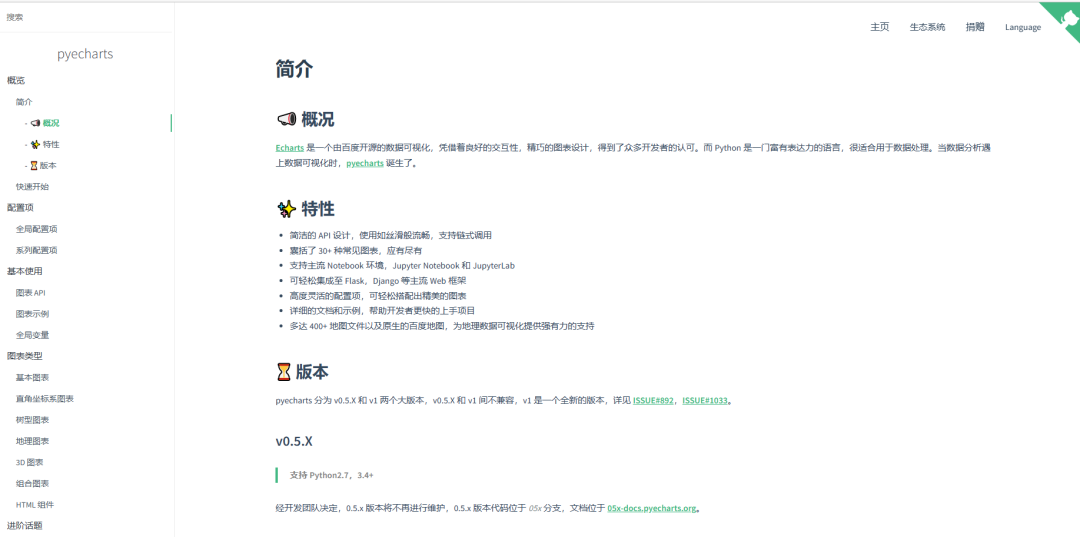
15.2.1 Line Chart Demonstration
from pyecharts.charts import Line

# Create line object
my_line = Line()
print(type(my_line))
## <class 'pyecharts.charts.basic_charts.line.Line'># Add X-axis data
my_line.add_xaxis(["SampleA","SampleB","SampleC"])
# Add Y-axis data## <pyecharts.charts.basic_charts.line.Line object at 0x000001AFF3AABD68>my_line.add_yaxis("Reads number", [10, 20, 30])
# Render and generate chart## <pyecharts.charts.basic_charts.line.Line object at 0x000001AFF3AABD68>my_line.render()## 'F:\公众号\Python学习\render.html'The resulting chart is as follows: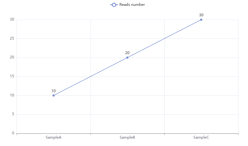
15.2.2 Global Configuration Options
# Set title name
from pyecharts.options import TitleOpts
my_line.set_global_opts(
    title_opts =
        TitleOpts(title ="I am a title"  # Control title name
                     )
)

# Render and generate chart
## <pyecharts.charts.basic_charts.line.Line object at 0x000001AFF3AABD68>my_line.render()## 'F:\公众号\Python学习\render.html'We can see the newly generated title: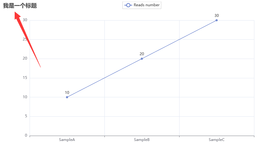
# Adjust title position
from pyecharts.options import TitleOpts
my_line.set_global_opts(
    title_opts =
        TitleOpts(title ="I am a title",  # Control title name
                     pos_left ="center",  # Control horizontal position of title
                         pos_bottom ="1%"  # Control vertical position of title
                 )
)

# Render and generate chart
## <pyecharts.charts.basic_charts.line.Line object at 0x000001AFF3AABD68>my_line.render()## 'F:\公众号\Python学习\render.html'We can see that the title position has changed: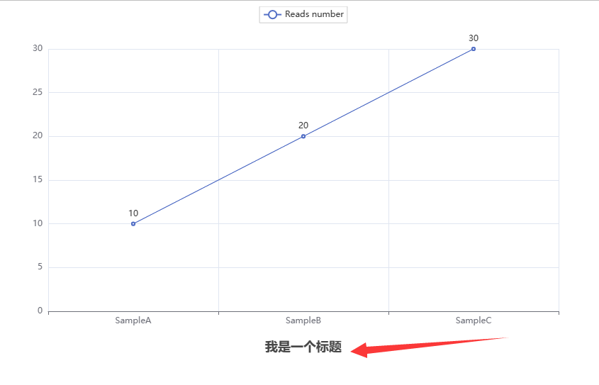
# Set whether the legend is displayed
from pyecharts.options import LegendOpts
my_line.set_global_opts(
  legend_opts = LegendOpts(is_show = False)
)

# Render and generate chart
## <pyecharts.charts.basic_charts.line.Line object at 0x000001AFF3AABD68>my_line.render()## 'F:\公众号\Python学习\render.html'The legend can be turned off: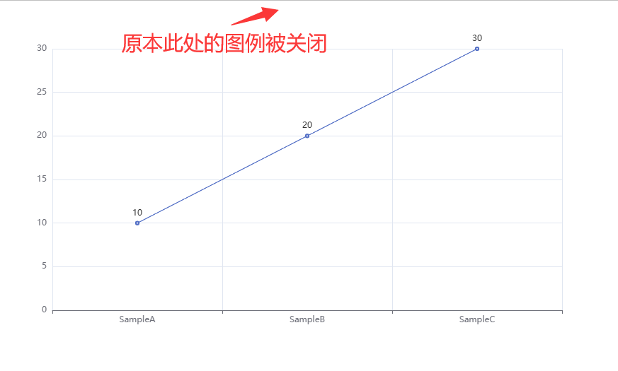
# Set whether the visual map is displayed
from pyecharts.options import VisualMapOpts
my_line.set_global_opts(
        visualmap_opts = VisualMapOpts(is_show = True)
)

# Render and generate chart
## <pyecharts.charts.basic_charts.line.Line object at 0x000001AFF3AABD68>my_line.render()## 'F:\公众号\Python学习\render.html'Additional visual mapping: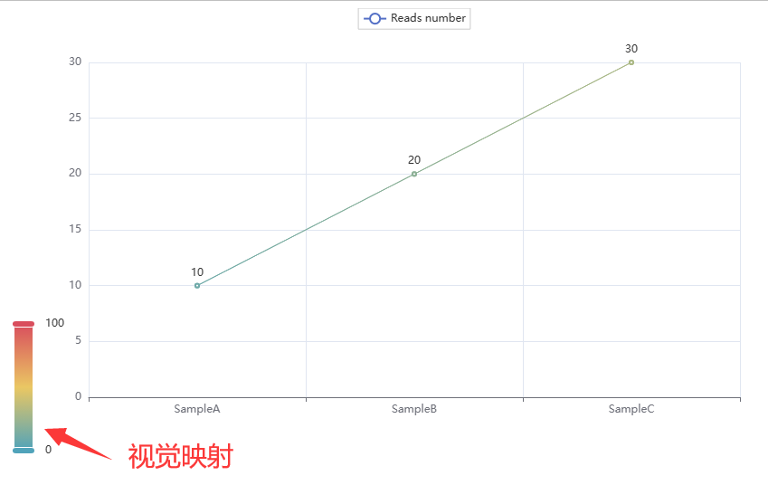
# ToolboxOpts can interactively switch chart types
from pyecharts.options import ToolboxOpts
my_line.set_global_opts(
 toolbox_opts = ToolboxOpts(is_show = True)
)

# Render and generate chart
## <pyecharts.charts.basic_charts.line.Line object at 0x000001AFF3AABD68>my_line.render()## 'F:\公众号\Python学习\render.html'Some interactive icons appear in the upper right corner: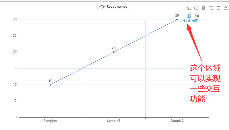 For example, clicking to switch to a bar chart: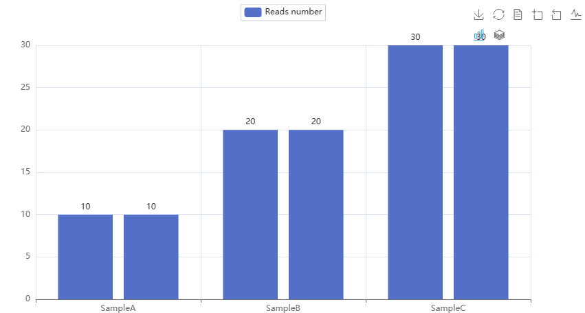
15.2.3 Building Maps
Implemented through the <span>Map</span> function
# Draw the simplest map:
from pyecharts.charts import Map
# Create map object:
map = Map()
# Simulate some data
my_data = [
    ("Beijing", 99),
    ("Shanghai", 199),
    ("Hunan", 299),
    ("Taiwan", 399),
    ("Guangdong", 299)
]
#
map.add("China Map", my_data, "china")
## <pyecharts.charts.basic_charts.map.Map object at 0x000001AFF51EE048>map.render()## 'F:\公众号\Python学习\render.html'We get a bare map: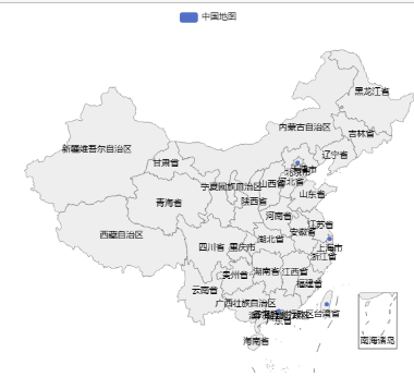
# Add corresponding colors to the regions:
from pyecharts.charts import Map
from pyecharts.options import VisualMapOpts
map = Map()
my_data = [
    ("Beijing", 99),
    ("Shanghai", 199),
    ("Hunan", 299),
    ("Taiwan", 399),
    ("Guangdong", 299)
]
map.add("Map", my_data, "china")
## <pyecharts.charts.basic_charts.map.Map object at 0x000001AFF51EED68>map.set_global_opts(
visualmap_opts = VisualMapOpts(
is_show=True)
)## <pyecharts.charts.basic_charts.map.Map object at 0x000001AFF51EED68>map.render()## 'F:\公众号\Python学习\render.html'We can see that the marked regions show corresponding colors: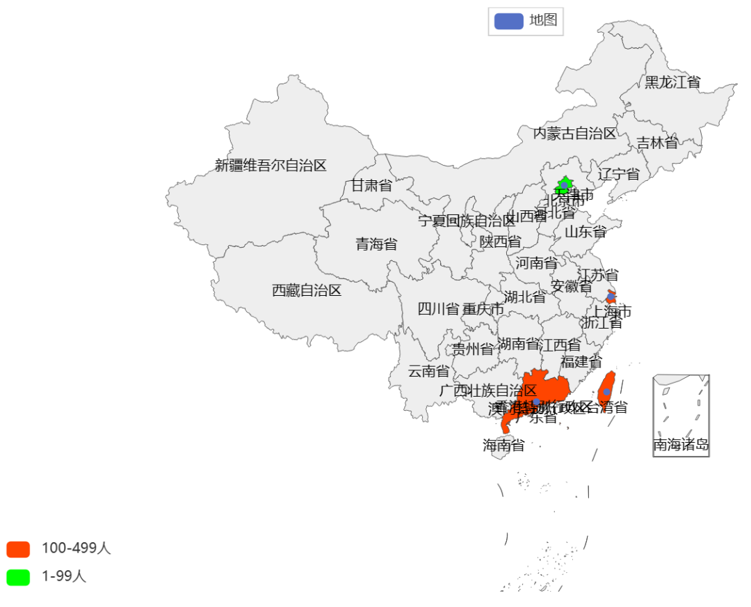 However, the legend still needs modification
# Modify the legend:
from pyecharts.charts import Map
from pyecharts.options import VisualMapOpts
map = Map()
my_data = [
    ("Beijing", 99),
    ("Shanghai", 199),
    ("Hunan", 299),
    ("Taiwan", 399),
    ("Guangdong", 299)
]
map.add("Map", my_data, "china")
## <pyecharts.charts.basic_charts.map.Map object at 0x000001AFF51D9358>map.set_global_opts(
visualmap_opts = VisualMapOpts(
is_show=True,
is_piecewise=True,
pieces = [
{"min":1,"max":99,"label":"1-99 people","color":"#00FF00"},
{"min":100,"max":499,"label":"100-499 people","color":"#FF4500"}
])
)## <pyecharts.charts.basic_charts.map.Map object at 0x000001AFF51D9358>map.render()## 'F:\公众号\Python学习\render.html'We obtain a map result with color distribution and legend:When the data has more elements, just add them to <span>my_data</span>, and we won’t demonstrate further here~
15.2.4 Dynamic Bar Chart
# Basic bar chart
from pyecharts.charts import Bar

# Create bar chart object
bar = Bar()

# Add X-axis data:
bar.add_xaxis(["Sample_1","Sample_2","Sample_3"])

# Add Y-axis data:
## <pyecharts.charts.basic_charts.bar.Bar object at 0x000001AFF51EEE48>bar.add_yaxis("Reads Number", [100000, 200000, 150000])
# Draw chart## <pyecharts.charts.basic_charts.bar.Bar object at 0x000001AFF51EEE48>bar.render("Basic Bar Chart.html") # render allows specifying the filename when outputting the chart## 'F:\公众号\Python学习\Basic Bar Chart.html'We obtain a very basic bar chart: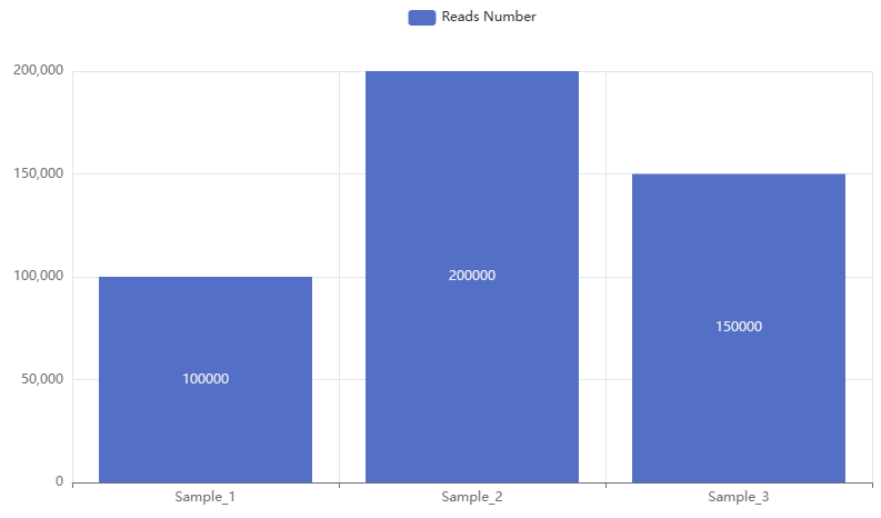
# Reverse the x-axis and y-axis of the above bar chart
bar.reversal_axis()
# Draw chart
## <pyecharts.charts.basic_charts.bar.Bar object at 0x000001AFF51EEE48>bar.render("Basic Bar Chart.html")## 'F:\公众号\Python学习\Basic Bar Chart.html'At this point, the bar chart is oriented from right to left: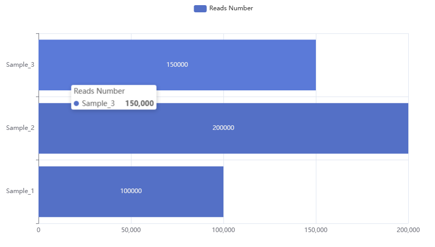 We can see that the numbers are positioned in the center of the bar chart, and we can adjust their position through
 <span>position</span>:
# Basic bar chart
from pyecharts.charts import Bar
from pyecharts.options import LabelOpts

# Create bar chart object
bar = Bar()

# Add X-axis data:
bar.add_xaxis(["Sample_1","Sample_2","Sample_3"])

# Add Y-axis data:
## <pyecharts.charts.basic_charts.bar.Bar object at 0x000001AFF51C7630>bar.add_yaxis("Reads Number", [100000, 200000, 150000],
label_opts=LabelOpts(position="right")
)## <pyecharts.charts.basic_charts.bar.Bar object at 0x000001AFF51C7630>bar.reversal_axis()
# Draw chart## <pyecharts.charts.basic_charts.bar.Bar object at 0x000001AFF51C7630>bar.render("Basic Bar Chart.html")## 'F:\公众号\Python学习\Basic Bar Chart.html'We can see that the number’s position has changed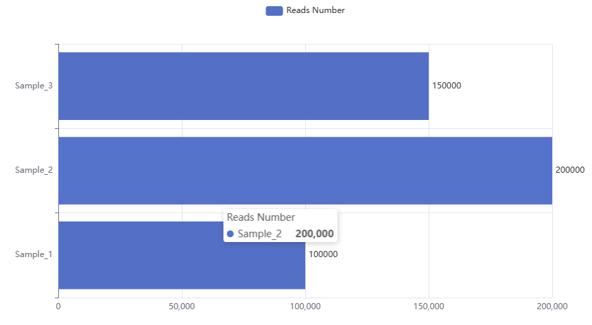
For <span>Pyecharts</span>, we can create a timeline to generate a series of bar charts:
# Basic bar chart
from pyecharts.charts import Bar, Timeline
from pyecharts.options import *

# Create the first bar chart object
bar_1 = Bar()
bar_1.add_xaxis(["Sample_1","Sample_2","Sample_3"])
## <pyecharts.charts.basic_charts.bar.Bar object at 0x000001AFF51D2AC8>bar_1.add_yaxis("Reads Number", [100000, 200000, 150000])## <pyecharts.charts.basic_charts.bar.Bar object at 0x000001AFF51D2AC8>bar_2 = Bar()
bar_2.add_xaxis(["Sample_1","Sample_2","Sample_3"])## <pyecharts.charts.basic_charts.bar.Bar object at 0x000001AFF51D2DA0>bar_2.add_yaxis("Reads Number", [160000, 250000, 170000])## <pyecharts.charts.basic_charts.bar.Bar object at 0x000001AFF51D2DA0>bar_3 = Bar()
bar_3.add_xaxis(["Sample_1","Sample_2","Sample_3"])## <pyecharts.charts.basic_charts.bar.Bar object at 0x000001AFF51DA0F0>bar_3.add_yaxis("Reads Number", [50000, 190000, 150000])
# Create timeline object## <pyecharts.charts.basic_charts.bar.Bar object at 0x000001AFF51DA0F0>timeline = Timeline()
timeline.add(bar_1, "Timeline 1")## <pyecharts.charts.composite_charts.timeline.Timeline object at 0x000001AFF51DA400>timeline.add(bar_2, "Timeline 2")## <pyecharts.charts.composite_charts.timeline.Timeline object at 0x000001AFF51DA400>timeline.add(bar_3, "Timeline 3")
# Draw chart## <pyecharts.charts.composite_charts.timeline.Timeline object at 0x000001AFF51DA400>timeline.render("Timeline Bar Chart.html") # render allows specifying the filename when outputting the chart## 'F:\公众号\Python学习\Timeline Bar Chart.html'At this point, we have obtained a bar chart with a timeline at the bottom, allowing free selection of the timeline for display, and it plays automatically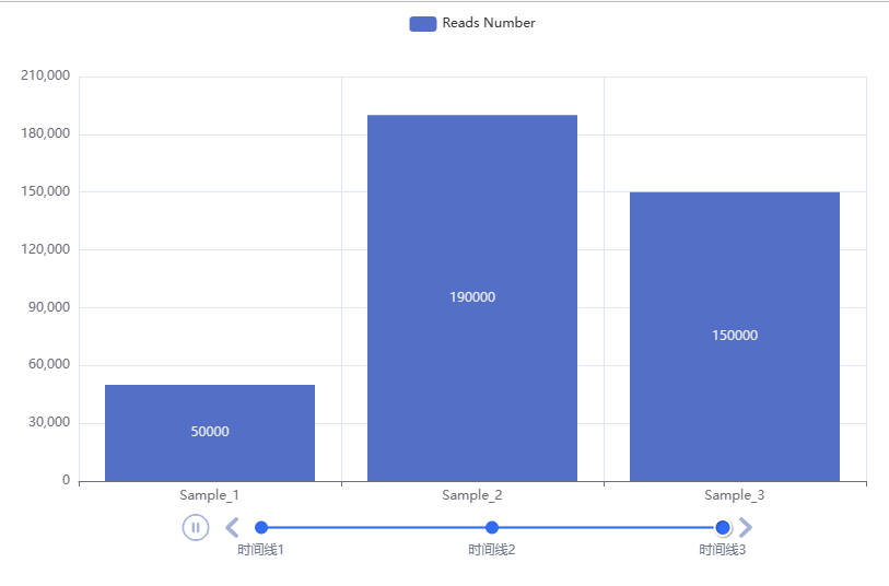
# Set auto-play:
timeline.add_schema(
play_interval = 1000,  # Play interval in milliseconds
is_timeline_show = True,  # Whether to display the timeline
is_auto_play = True,  # Whether to auto-play
is_loop_play = True  # Whether to loop play
)
## <pyecharts.charts.composite_charts.timeline.Timeline object at 0x000001AFF51DA400>timeline.render("Timeline Bar Chart.html")## 'F:\公众号\Python学习\Timeline Bar Chart.html'Previous Reviews
Bioinformatics Python Quick Reference Manual
Python Installation (Windows + Linux)
Python’s “Rstudio” – Pycharm
Python Tool: Jupyter Notebook
Understanding Python Basics in One Article: Literals, Comments, Variables, Types, Operators
Python Conditional Statements
Python Loop Statements
Python Functions and Methods
Mastering Python Data Containers in One Article
Advanced Python Functions
Python File Operations
Python Exceptions
Python Modules
Creating, Importing, and Installing Python Packages

Contact Us

 Leave a message to receive materials、an out-of-the-box single-cell analysis image’sWeChat ID[Biomamba_zhushou], making it convenient for everyone to communicate at any time. We have also built a group chat matrix, and everyone is welcome to join the discussion.After reading these articles, you can addtips for beginners in bioinformaticsWithout retrieval, there is no right to speak
Students who already have contact information for the bioinformatics basedo not need to add again

 Your every like and view is taken seriously as appreciation