
In regular research, the three steps to achieve visualization using Python are:- Identify the problem and choose the graph
- Transform the data and apply functions
- Set parameters to make it clear
1. First, which libraries do we use for plotting?matplotlibis the most basic plotting library in Python, and it is generally the starting point for Python data visualization before moving on to vertical and horizontal expansions.Seabornis a high-level visualization library based on matplotlib, mainly targeting variable feature selection in data mining and machine learning. Seaborn can create visualizations of multi-dimensional data with concise code.Other libraries includeBokeh (a library for interactive visualizations on the browser, enabling interaction between analysts and data);Mapbox (a more powerful visualization tool library for handling geographic data) etc.This article mainly uses matplotlib for case analysisStep 1: Identify the problem and choose the graphThe business may be complex, but through decomposition, we need to find what specific problem we want to express through the graph. Training in analytical thinking can learn from the methods in The McKinsey Method and The Pyramid Principle.This is a summary of chart type selection found online.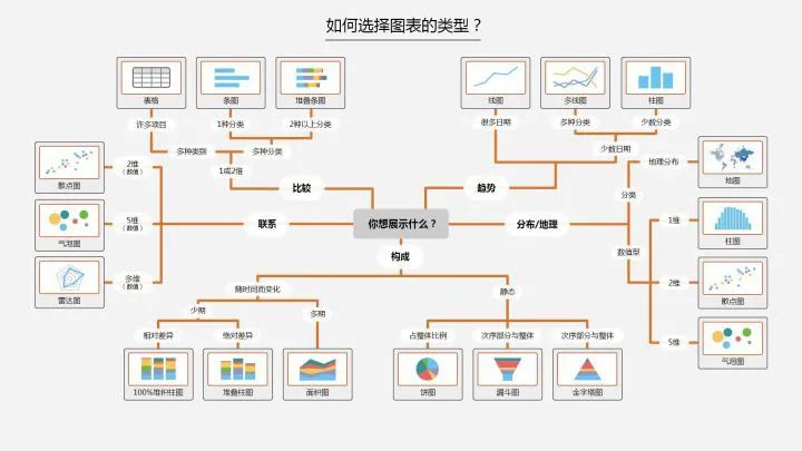 In Python, we can summarize the following four basic visual elements to present graphs:
- Points: scatter plot for two-dimensional data, suitable for simple two-dimensional relationships;
- Lines: line plot for two-dimensional data, suitable for time series;
- Bars: bar plot for two-dimensional data, suitable for categorical statistics;
- Colors: heatmap suitable for displaying a third dimension;
There are relationships between data such as distribution, composition, comparison, connection, and trend changes. Choose the corresponding graph to display according to different relationships.Step 2: Transform the data and apply functionsMuch of the programming work in data analysis and modeling is based on data preparation: loading, cleaning, transforming, and reshaping. Our visualization steps also need to organize the data, transforming it into the format we need before applying visualization methods to complete the plotting.Here are some common data transformation methods:
- Merge: merge, concat, combine_first (similar to a full outer join in databases)
- Reshape: reshape; pivot (similar to Excel pivot tables)
- Remove duplicates: drop_duplicates
- Map: map
- Fill and replace: fillna, replace
- Rename axis indexes: rename
Convert categorical variables to ‘dummy variable matrix’ using the get_dummies function and limit values on a column in df, etc.Functions are then chosen based on the graph selected in the first step, to find the corresponding functions in Python.Step 3: Set parameters to make it clearAfter the original graph is plotted, we can modify colors (color), line styles (linestyle), markers (marker), or other chart decoration items such as titles (Title), axis labels (xlabel, ylabel), axis ticks (set_xticks), and legends (legend) to make the graph more intuitive.The third step is based on the second step, to make the graph clearer and more understandable, and is a work of embellishment. Specific parameters can be found in the plotting function.2. Basics of Visualization PlottingMatplotlib Plotting Basics
# Import packages
import numpy as np
import pandas as pd
import matplotlib.pyplot as plt
Figure and SubplotAll matplotlib graphics are located in Figure (canvas), Subplot creates image space. You cannot plot through figure; you must create one or more subplots using add_subplot.figsize can specify image size.
# Create canvas
fig = plt.figure()
<figure>
# Create subplot, 221 indicates this is the first image in a 2x2 grid.
ax1 = fig.add_subplot(221)
# But now it is more common to create canvas and images as follows, 2,2 indicates this is a 2*2 canvas that can hold 4 images
fig , axes = plt.subplots(2,2,sharex=True,sharey=True)
# The sharex and sharey parameters of plt.subplot can specify that all subplots use the same x and y axis ticks.</figure>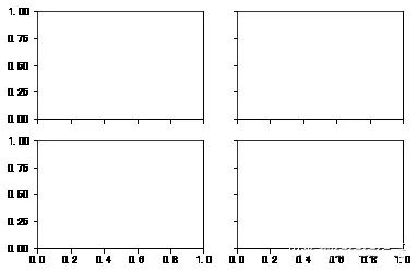 You can adjust spacing using the subplots_adjust method of Figure.
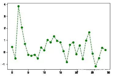
subplots_adjust(left=None,bottom=None,right=None,top=None,wspace=None,hspace=None)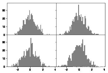 Color, Marker, and Line StyleThe plot function of matplotlib accepts a set of X and Y coordinates and can also accept a string abbreviation representing color and line style: ‘g–‘ indicates the color is green and the line style is ‘–‘ dashed. You can also specify parameters explicitly.Line plots can also add some markers (marker) to highlight the position of data points. Markers can also be included in the format string, but the marker type and line style must be placed after the color.
plt.plot(np.random.randn(30),color='g',linestyle='--',marker='o')
[] Ticks, Labels, and LegendsThe plt’s xlim, xticks, and xtickslabels methods control the range and tick positions and tick labels of the chart.When called without parameters, it returns the current parameter values; when called with parameters, it sets the parameter values.
plt.plot(np.random.randn(30),color='g',linestyle='--',marker='o')
plt.xlim() # Call without parameters to display current parameters;
# You can replace xlim with the other two methods and try
(-1.4500000000000002, 30.45)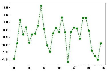
plt.plot(np.random.randn(30),color='g',linestyle='--',marker='o')
plt.xlim([0,15]) # Change x-axis ticks to 0-15
(0, 15)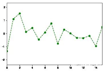 Set Title, Axis Labels, Ticks, and Tick Labels
fig = plt.figure();ax = fig.add_subplot(1,1,1)
ax.plot(np.random.randn(1000).cumsum())
ticks = ax.set_xticks([0,250,500,750,1000]) # Set tick values
labels = ax.set_xticklabels(['one','two','three','four','five']) # Set tick labels
ax.set_title('My first Plot') # Set title
ax.set_xlabel('Stage') # Set axis label
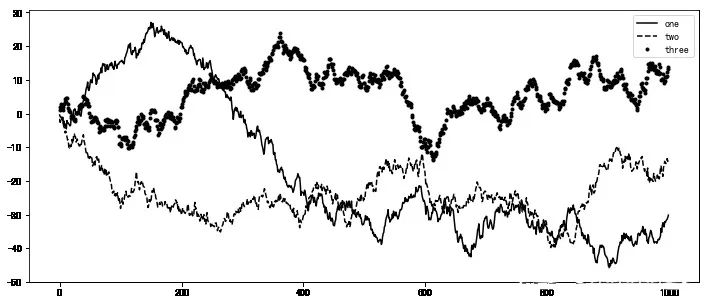
Text(0.5,0,'Stage')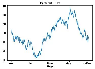 Add LegendThe legend is another important tool for identifying chart elements.You can pass the label parameter when adding a subplot.
fig = plt.figure(figsize=(12,5));ax = fig.add_subplot(111)
ax.plot(np.random.randn(1000).cumsum(),'k',label='one') # Pass in label parameter to define label name
ax.plot(np.random.randn(1000).cumsum(),'k--',label='two')
ax.plot(np.random.randn(1000).cumsum(),'k.',label='three')
# After the graph is created, just call the legend parameter to bring out the label.
ax.legend(loc='best') # If the requirement is not strict, it is recommended to use loc='best' parameter to let it choose the best position itself
 AnnotationsIn addition to standard chart objects, we can also customize adding text annotations or arrows.Annotations can be added using functions like text, arrow, and annotate. The text function can draw text at specified x, y coordinates, and can also be customized.
plt.plot(np.random.randn(1000).cumsum())
plt.text(600,10,'test ',family='monospace',fontsize=10)
# Chinese annotations cannot display normally in the default environment, you need to modify the configuration file to support Chinese fonts. Please search for specific steps yourself.
Save the Chart to a FileYou can use plt.savefig to save the current chart to a file. For example, to save the chart as a png file, you can execute:The file type is determined by the extension. Other parameters include:
- fname: A string containing the file path, the extension specifies the file type
- dpi: Resolution, default 100 facecolor, edgecolor the background color of the image, default ‘w’ white
- format: Display settings for file format (‘png’, ‘pdf’, ‘svg’, ‘ps’, ‘jpg’, etc.)
- bbox_inches: The part of the chart that needs to be retained. If set to ‘tight’, it will try to cut out the blank parts around the image
plt.savefig('./plot.jpg') # Save the image as a jpg format image named plot
<figure></figure>
3. Plotting Functions in Pandas
Matplotlib Plottingmatplotlib is the most basic plotting function and is also relatively low-level.To assemble a chart, you need to call each basic component separately. Pandas has many advanced plotting methods based on matplotlib, and charts that originally required multiple lines of code can be done in just a few lines using pandas.What we use calls the plotting package in pandas.
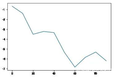
import matplotlib.pyplot as pltLine PlotBoth Series and DataFrame have a plot method for generating various charts.By default, they generate line plots.
s = pd.Series(np.random.randn(10).cumsum(),index=np.arange(0,100,10))
s.plot() # The index of the Series object will be passed to matplotlib as the x-axis for plotting.
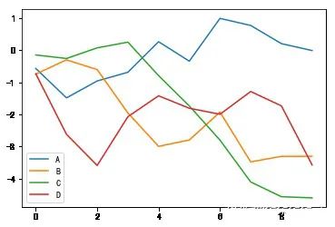
df = pd.DataFrame(np.random.randn(10,4).cumsum(0),columns=['A','B','C','D'])
df.plot() # plot will automatically change colors for different variables and add legends
 Parameters of Series.plot Method
- label: For chart labels
- style: Style string, ‘g–‘
- alpha: Image fill opacity (0-1)
- kind: Chart type (bar, line, hist, kde, etc.)
- xticks: Set x-axis tick values
- yticks: Set y-axis tick values
- xlim, ylim: Set axis limits, [0,10]
- grid: Show axis grid lines, default off
- rot: Rotate tick labels
- use_index: Use the object’s index as tick labels
- logy: Use logarithmic scale on Y-axis
Parameters of DataFrame.plot MethodIn addition to the parameters in Series, DataFrame has some unique options.
- subplots: Plot each DataFrame column in separate subplots
- sharex, sharey: Share x and y axes
- figsize: Control image size
- title: Image title
- legend: Add legend, default display
- sort_columns: Draw columns in alphabetical order, default uses current order
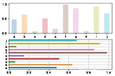
Bar ChartBy adding kind=’bar’ or kind=’barh’ to the code for generating line charts,you can generate bar charts or horizontal bar charts.
fig,axes = plt.subplots(2,1)
data = pd.Series(np.random.rand(10),index=list('abcdefghij'))
data.plot(kind='bar',ax=axes[0],rot=0,alpha=0.3)
data.plot(kind='barh',ax=axes[1],grid=True)
 Bar charts have a very practical method:Use value_counts to visually display the frequency of occurrences of each value in a Series or DF.For example, df.value_counts().plot(kind=’bar’)The basic syntax for Python visualization ends here, and other graph plotting methods are largely similar.The key is to follow the thinking of the three steps to think, choose, and apply. More practice can make you more proficient.
This article is sourced from: https://blog.csdn.net/m0_72557783/article/details/125623698. It is only for passing and sharing more information and does not represent the platform's endorsement of its views or its accuracy. Copyright belongs to the original author. If there is any infringement, please contact us for deletion.Editor / Zhang Zhihong
Review / Fan Ruiqiang
Verification / Zhang Zhihong
Reprinted from: Mathematics China

Follow the public account for more information
Membership application Please reply “individual member” or “unit member” in the public account.
Welcome to follow the media matrix of the China Command and Control Society

CICC official Douyin
CICC Toutiao account

CICC Weibo account

CICC official website

CICC official WeChat account
Official website of the Journal of Command and Control

Official website of the International Unmanned Systems Conference
Official website of the China Command and Control Conference
National Wargame Competition
National Air Intelligent Game Competition
Sohu Account
Yidian Account