In regular research, the three steps to implement visualization in Python are:- Identify the problem and choose the graph
- Transform the data and apply functions
- Set parameters for clarity
1. First, what libraries do we use to plot?matplotlib is the most basic plotting library in Python, which is the foundational Python visualization library. Typically, one starts with matplotlib for Python data visualization and then expands both vertically and horizontally.Seaborn is an advanced visualization library based on matplotlib, primarily aimed at variable feature selection in data mining and machine learning. Seaborn allows you to create visualizations of multidimensional data with concise code.Other libraries includeBokeh (a library for browser-based interactive visualizations, facilitating interaction between analysts and data);Mapbox (a more powerful visualization tool for handling geographic data) and others.This article mainly uses matplotlib for case analysis.Step 1: Identify the problem and choose the graphBusiness may be complex, but by breaking it down, we need to find the specific problem we want to express through a graph. Training in analytical thinking can be learned from The McKinsey Method and The Pyramid Principle.This is a summary of graph type selection found online.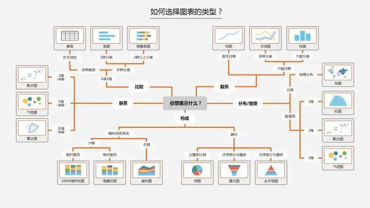 In Python, we can summarize the following four basic visual elements to present graphs:
- Points: scatter plot for two-dimensional data, suitable for simple two-dimensional relationships;
- Lines: line plot for two-dimensional data, suitable for time series;
- Bars: bar plot for two-dimensional data, suitable for categorical statistics;
- Colors: heatmap suitable for displaying a third dimension;
There are relationships among data including distribution, composition, comparison, connections, and trends. Choose the corresponding graph for different relationships.Step 2: Transform data and apply functionsMuch of the programming work in data analysis and modeling is based on data preparation: loading, cleaning, transforming, and reshaping. Our visualization steps also need to organize the data, convert it into the format we need, and then apply the visualization methods to complete the plotting.Here are some common data transformation methods:
- Merging: merge, concat, combine_first (similar to a full outer join in databases)
- Reshaping: reshape; pivot (similar to Excel pivot tables)
- Deduplication: drop_duplicates
- Mapping: map
- Filling and replacing: fillna, replace
- Renaming axis indexes: rename
Convert categorical variables to a ‘dummy variable matrix’ using the get_dummies function and limit values on certain columns in the DataFrame, etc.The functions then correspond to the graph chosen in the first step, finding the corresponding functions in Python.Step 3: Set parameters for clarityAfter creating the raw graph, we can modify the color (color), line style (linestyle), marker (marker), or other chart decoration items such as title (Title), axis labels (xlabel, ylabel), axis ticks (set_xticks), and legends (legend) to make the graph more intuitive.The third step builds on the second step to refine the graph for clarity. Specific parameters can be found in the plotting functions.2. Basics of Visualization PlottingMatplotlib Plotting Basics
# Importing packages
import numpy as np
import pandas as pd
import matplotlib.pyplot as plt
Figure and SubplotAll matplotlib graphics reside in a Figure (canvas), and Subplot creates image space. You cannot plot directly through figure; you must create one or more subplots using add_subplot.figsize can specify the image size.
# Create canvas
fig = plt.figure()
<figure>
# Create subplot, 221 indicates this is the first image in a 2x2 grid.
ax1 = fig.add_subplot(221)
# However, it is now more common to use the following method to create canvas and images, 2,2 indicates this is a 2x2 canvas, which can hold 4 images
fig , axes = plt.subplots(2,2,sharex=True,sharey=True)
# The sharex and sharey parameters of plt.subplot can specify that all subplots use the same x and y axis scales.</figure>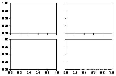 Using the subplots_adjust method of Figure can adjust the spacing.
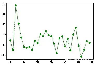
subplots_adjust(left=None,bottom=None,right=None,top=None,wspace=None,hspace=None)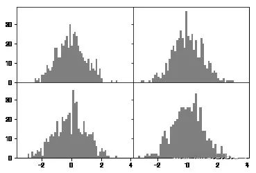 Color, Marker, and Line StyleThe plot function of matplotlib accepts a set of X and Y coordinates and can also accept a string abbreviation representing color and line style: ‘g–‘, meaning the color is green and the line style is ‘–‘ (dashed). You can also specify parameters explicitly.Line plots can also add markers to highlight the positions of data points. Markers can also be included in the format string, but the marker type and line style must be placed after the color.
plt.plot(np.random.randn(30),color='g',linestyle='--',marker='o')
[] Ticks, Labels, and LegendsThe plt’s xlim, xticks, and xtickslabels methods control the range and tick positions and tick labels of the chart.When calling methods without parameters, it returns the current parameter values; when called with parameters, it sets the parameter values.
plt.plot(np.random.randn(30),color='g',linestyle='--',marker='o')
plt.xlim() # Calling without parameters shows the current parameters;
# You can replace xlim with the other two methods to try
(-1.4500000000000002, 30.45)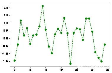
plt.plot(np.random.randn(30),color='g',linestyle='--',marker='o')
plt.xlim([0,15]) # Change the x-axis ticks to 0-15
(0, 15)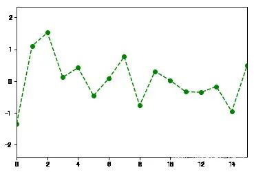 Set Titles, Axis Labels, Ticks, and Tick Labels
fig = plt.figure();ax = fig.add_subplot(1,1,1)
ax.plot(np.random.randn(1000).cumsum())
ticks = ax.set_xticks([0,250,500,750,1000]) # Set tick values
labels = ax.set_xticklabels(['one','two','three','four','five']) # Set tick labels
ax.set_title('My first Plot') # Set title
ax.set_xlabel('Stage') # Set axis label
Text(0.5,0,'Stage')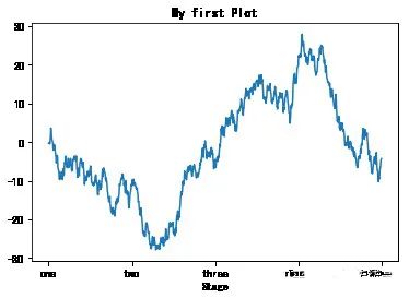 Add LegendsThe legend is another important tool for identifying elements of the graph.You can pass the label parameter when adding a subplot.
fig = plt.figure(figsize=(12,5));ax = fig.add_subplot(111)
ax.plot(np.random.randn(1000).cumsum(),'k',label='one') # Pass in label parameter to define label name
ax.plot(np.random.randn(1000).cumsum(),'k--',label='two')
ax.plot(np.random.randn(1000).cumsum(),'k.',label='three')
# After the graph is created, simply call the legend parameter to bring out the label.
ax.legend(loc='best') # If the requirements are not strict, it is recommended to use loc='best' to let it choose the best position automatically
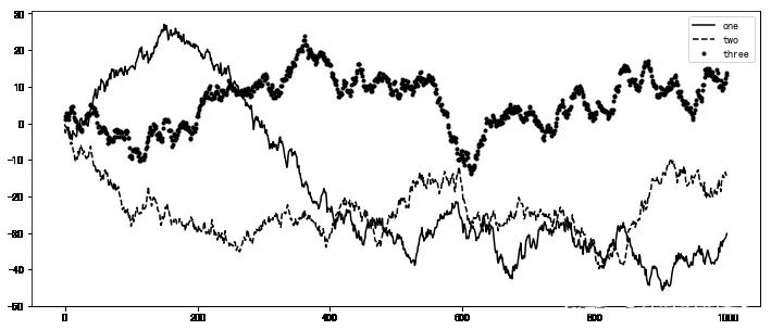 AnnotationsIn addition to standard chart objects, we can also customize and add some text annotations or arrows.Annotations can be added using functions like text, arrow, and annotate. The text function can draw text at specified x and y coordinate positions and can be formatted as needed.
plt.plot(np.random.randn(1000).cumsum())
plt.text(600,10,'test ',family='monospace',fontsize=10)
# Chinese annotations may not display correctly in the default environment, so configuration files need to be modified to support Chinese fonts. Please search for specific steps yourself.
Save Chart to FileUsing plt.savefig, you can save the current chart to a file. For example, to save the chart as a png file, you can execute:The file type is determined by the extension. Other parameters include:
- fname: a string containing the file path, and the extension specifies the file type
- dpi: resolution, default 100 facecolor, edgecolor background color of the image, default ‘w’ (white)
- format: display settings for file format (‘png’, ‘pdf’, ‘svg’, ‘ps’, ‘jpg’, etc.)
- bbox_inches: the portion of the chart to retain. If set to ‘tight’, it will attempt to cut out the blank parts around the image.
plt.savefig('./plot.jpg') # Save the image as a jpg format image named plot
<figure></figure>
3. Plotting Functions in Pandas
Matplotlib PlottingMatplotlib is the most basic plotting function and is relatively low-level.Assembling a chart requires calling each basic component separately. Pandas has many advanced plotting methods based on matplotlib, allowing charts that originally required multiple lines of code to be completed in just a few lines.We use the plotting package in pandas.
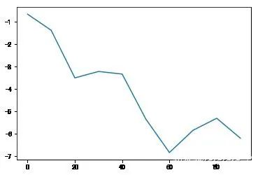
import matplotlib.pyplot as pltLine PlotsBoth Series and DataFrame have a plot method for generating various types of charts.By default, they generate line plots.
s = pd.Series(np.random.randn(10).cumsum(),index=np.arange(0,100,10))
s.plot() # The index of the Series object will be passed to matplotlib as the x-axis for plotting.
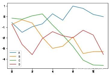
df = pd.DataFrame(np.random.randn(10,4).cumsum(0),columns=['A','B','C','D'])
df.plot() # plot will automatically change colors for different variables and add a legend
 Parameters of the Series.plot Method
- label: used for the chart label
- style: style string, ‘g–‘
- alpha: the fill opacity of the image (0-1)
- kind: chart type (bar, line, hist, kde, etc.)
- xticks: set x-axis tick values
- yticks: set y-axis tick values
- xlim, ylim: set axis limits, [0,10]
- grid: display axis grid lines, default off
- rot: rotate tick labels
- use_index: use the object’s index as tick labels
- logy: use a logarithmic scale on the Y-axis
Parameters of the DataFrame.plot MethodIn addition to the parameters in Series, DataFrame has some unique options.
- subplots: plot each DataFrame column in separate subplots
- sharex, sharey: share x and y axes
- figsize: control image size
- title: image title
- legend: add a legend, displayed by default
- sort_columns: draw columns in alphabetical order, default uses current order
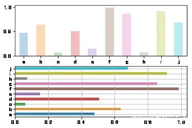
Bar ChartsBy adding kind=’bar’ or kind=’barh’ to the code for generating line plots, you can generate bar charts or horizontal bar charts.
fig,axes = plt.subplots(2,1)
data = pd.Series(np.random.rand(10),index=list('abcdefghij'))
data.plot(kind='bar',ax=axes[0],rot=0,alpha=0.3)
data.plot(kind='barh',ax=axes[1],grid=True)
 Bar charts have a very practical method:Use value_counts to graphically display the frequency of values in a Series or DF.For example, df.value_counts().plot(kind=’bar’)The basic syntax for Python visualization ends here; the methods for drawing other graphs are largely similar.The key is to follow the thought process of thinking, selecting, and applying. More practice will lead to greater proficiency.
This article is sourced from: https://blog.csdn.net/m0_72557783/article/details/125623698. It is only for passing and sharing more information and does not represent this platform's endorsement of its views or responsibility for its authenticity. Copyright belongs to the original author. If there is any infringement, please contact us for deletion.Editor / Zhang Zhihong
Review / Fan Ruiqiang
Verification / Zhang Zhihong
Click below
Follow us
Read the original text