In the world of Python development, data visualization is an indispensable skill. Whether you are doing data analysis, machine learning, or developing a Windows desktop application for a host system, you need to present data visually to users in the form of charts.
Matplotlib, as the most classic plotting library in the Python ecosystem, is known as the “Father of Python Visualization.” However, beginners often feel lost when faced with Matplotlib’s complex API and concepts. This article will quickly guide you through the core concepts of Matplotlib from a practical perspective and help you create your first professional-level chart.
Let’s tackle the key question of “how to quickly get started with Python data visualization in a Windows environment!”
🔍 Problem Analysis: Why Choose Matplotlib?
Market Position and Ecological Advantages
Matplotlib holds an unshakable position in the field of Python visualization:
- • Complete Ecosystem: Seamless integration with core libraries like NumPy and Pandas
- • Powerful Features: Supports 2D/3D charts, animations, and interactive visualizations
- • Active Community: With a 20-year development history, it has rich documentation and tutorial resources
- • Cross-Platform Compatibility: Consistent performance on Windows, Linux, and macOS
Practical Application Scenarios
In Python development on Windows, Matplotlib is commonly used for:
- • Real-time data monitoring interfaces for host software
- • Visualization of scientific computing results
- • Report generation and data analysis reports
- • Chart generation for web applications
💡 Solution: Complete Installation and Configuration Process
🚀 Environment Preparation and Installation
Option 1: Install using pip (Recommended)
# Basic installation
pip install matplotlib

# Full installation (including all optional dependencies)
pip install matplotlib[complete]

# Specify a domestic mirror source to speed up downloads
pip install -i https://pypi.tuna.tsinghua.edu.cn/simple matplotlib
Option 2: Installation in Anaconda Environment
# conda installation (recommended for data scientists)
conda install matplotlib

# Or use conda-forge source
conda install -c conda-forge matplotlib
🔧 Special Configuration for Windows Environment
Resolving Chinese Display Issues
import matplotlib.pyplot as plt
import matplotlib as mpl

# Windows Chinese font configuration
plt.rcParams['font.sans-serif'] = ['SimHei', 'Microsoft YaHei']
plt.rcParams['axes.unicode_minus'] = False  # Resolve negative sign display issue
Backend Configuration Optimization
# Check available backends
import matplotlib
print(matplotlib.get_backend())

# Recommended to use TkAgg backend on Windows
matplotlib.use('TkAgg')
📊 Core Architecture Concept Analysis
Matplotlib adopts a layered architecture design, understanding this concept is crucial for mastering its use:
Three-Layer Architecture Model
import matplotlib.pyplot as plt
import numpy as np

# Backend Layer - responsible for actual drawing
# Artist Layer - responsible for graphic object management
# Scripting Layer - the pyplot interface we mainly use

# Demonstration of the relationship between Figure and Axes
fig = plt.figure(figsize=(10, 6))  # Figure: the entire graphic window
ax1 = fig.add_subplot(2, 1, 1)     # Axes: specific drawing area
ax2 = fig.add_subplot(2, 1, 2)

print(f"Number of Axes in Figure: {len(fig.axes)}")
Object-Oriented vs Functional Interface
# Method 1: Functional interface (simple and quick)
plt.plot([1, 2, 3, 4], [1, 4, 2, 3])
plt.title('Functional Interface Example')
plt.show()

# Method 2: Object-oriented interface (more flexible, recommended)
fig, ax = plt.subplots()
ax.plot([1, 2, 3, 4], [1, 4, 2, 3])
ax.set_title('Object-Oriented Interface Example')
plt.show()
💻 Code Practice: Create Your First Professional Chart
🎨 Creating a Basic Line Chart
import matplotlib.pyplot as plt
import numpy as np
from datetime import datetime, timedelta
import matplotlib.dates as mdates

# Configure Chinese font support
plt.rcParams['font.sans-serif'] = ['SimHei', 'Microsoft YaHei', 'DejaVu Sans']  # Specify default font
plt.rcParams['axes.unicode_minus'] = False  # Resolve the issue of negative sign '-' being displayed as a square when saving images

# Generate simulated data
dates = [datetime.now() - timedelta(days=x) for x in range(30, 0, -1)]
temperatures = 20 + 10 * np.sin(np.linspace(0, 4*np.pi, 30)) + np.random.normal(0, 2, 30)

# Create a professional-level chart
fig, ax = plt.subplots(figsize=(12, 6))

# Draw the main line chart
line = ax.plot(dates, temperatures,
               linewidth=2,
               color='#2E86AB',
               marker='o',
               markersize=4,
               alpha=0.8,
               label='Daily Temperature')

# Add trend line
z = np.polyfit(range(len(temperatures)), temperatures, 1)
trend_line = np.poly1d(z)
ax.plot(dates, trend_line(range(len(temperatures))),
        '--', color='#F24236', alpha=0.7, label='Trend Line')

# Beautify the chart
ax.set_title('30-Day Temperature Change Trend Analysis', fontsize=16, fontweight='bold', pad=20)
ax.set_xlabel('Date', fontsize=12)
ax.set_ylabel('Temperature (°C)', fontsize=12)
ax.grid(True, alpha=0.3)
ax.legend(loc='upper right')

# Format date display
ax.xaxis.set_major_formatter(mdates.DateFormatter('%m-%d'))
ax.xaxis.set_major_locator(mdates.DayLocator(interval=5))
plt.xticks(rotation=45)

# Adjust layout
plt.tight_layout()

# Save image instead of displaying (to avoid PyCharm backend issues)
plt.savefig('temperature_trend.png', dpi=300, bbox_inches='tight')
print("Chart saved as temperature_trend.png")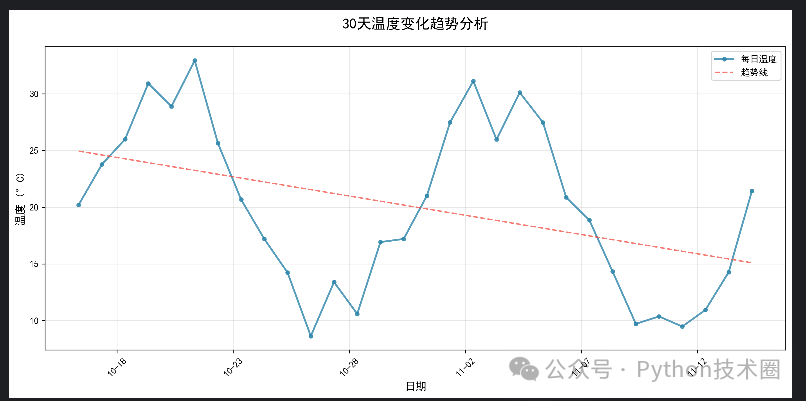
📈 Multi-Subplot Layout Practice
import matplotlib.pyplot as plt
import numpy as np
from datetime import datetime, timedelta
import matplotlib.dates as mdates

# Configure Chinese font support
plt.rcParams['font.sans-serif'] = ['SimHei', 'Microsoft YaHei', 'DejaVu Sans']
plt.rcParams['axes.unicode_minus'] = False

# Create a composite dashboard
fig, ((ax1, ax2), (ax3, ax4)) = plt.subplots(2, 2, figsize=(15, 10))

# Subplot 1: Bar Chart
categories = ['Sales', 'Technical', 'Marketing', 'Operations']
values = [25, 32, 18, 28]
bars = ax1.bar(categories, values, color=['#FF6B6B', '#4ECDC4', '#45B7D1', '#96CEB4'])
ax1.set_title('Department Personnel Distribution', fontweight='bold')
ax1.set_ylabel('Number of People')

# Add value labels to the bar chart
for bar, value in zip(bars, values):
    ax1.text(bar.get_x() + bar.get_width()/2, bar.get_height() + 0.5,
             str(value), ha='center', va='bottom')

# Subplot 2: Pie Chart
sizes = [30, 25, 20, 25]
colors = ['#FF9999', '#66B2FF', '#99FF99', '#FFCC99']
wedges, texts, autotexts = ax2.pie(sizes, labels=categories, colors=colors,
                                   autopct='%1.1f%%', startangle=90)
ax2.set_title('Budget Allocation Ratio', fontweight='bold')

# Subplot 3: Scatter Plot
x = np.random.randn(100)
y = 2*x + np.random.randn(100)
scatter = ax3.scatter(x, y, c=y, cmap='viridis', alpha=0.6)
ax3.set_title('Correlation Analysis', fontweight='bold')
ax3.set_xlabel('Variable X')
ax3.set_ylabel('Variable Y')
plt.colorbar(scatter, ax=ax3)

# Subplot 4: Histogram
data = np.random.normal(100, 15, 1000)
n, bins, patches = ax4.hist(data, bins=30, color='skyblue', alpha=0.7, edgecolor='black')
ax4.set_title('Data Distribution Histogram', fontweight='bold')
ax4.set_xlabel('Value')
ax4.set_ylabel('Frequency')
ax4.axvline(data.mean(), color='red', linestyle='--', label=f'Mean: {data.mean():.1f}')
ax4.legend()

plt.tight_layout()

# Save image instead of displaying
plt.savefig('dashboard.png', dpi=300, bbox_inches='tight', facecolor='white')
print("Dashboard saved as dashboard.png")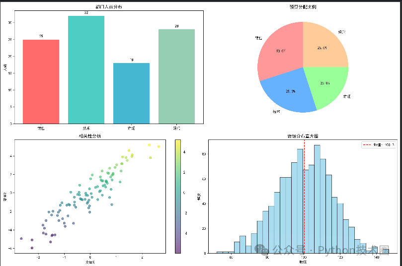
🎯 Summary of Key Points
Through this article, we have completed the full journey from getting started to practical application with Matplotlib. Let’s review three key points:
🔧 Installation and Configuration are Fundamental: Correct environment configuration can avoid 90% of common issues, especially the Chinese display and backend selection on Windows, which directly affects development efficiency.
📊 Understanding the Architecture is Key: Mastering the hierarchical relationship between Figure and Axes and the object-oriented interface is a watershed moment from beginner to expert, determining whether you can create complex visualization applications.
💻 Practical Application is the Goal: Whether it’s simple data presentation or complex dashboard development, Matplotlib can handle it. Combined with the actual needs of Windows development, we need to not only know how to plot but also how to create useful plots.
Data visualization is an essential skill for modern Python developers. Starting today, let Matplotlib be your powerful assistant in solving practical problems and take a step further in host development and data analysis!