
Code output demonstration

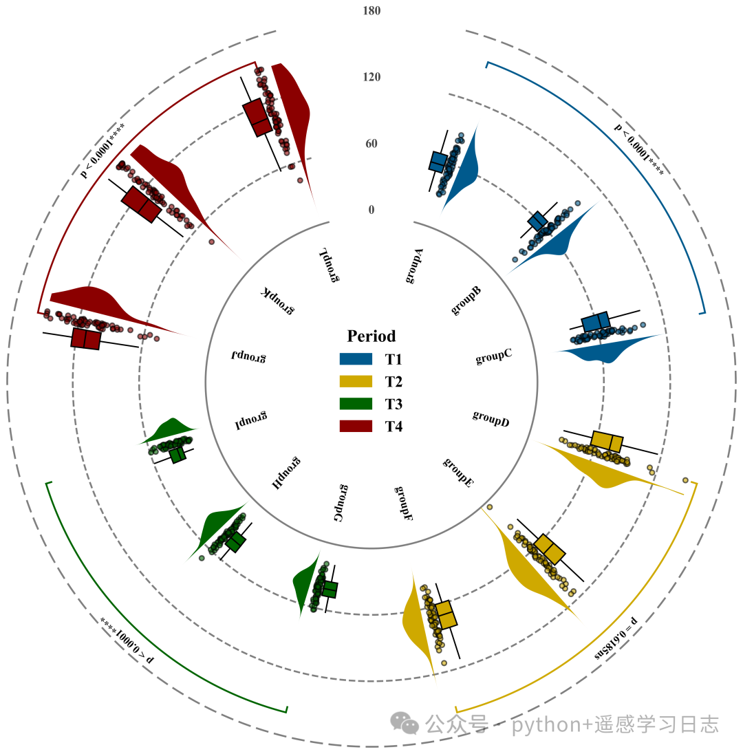
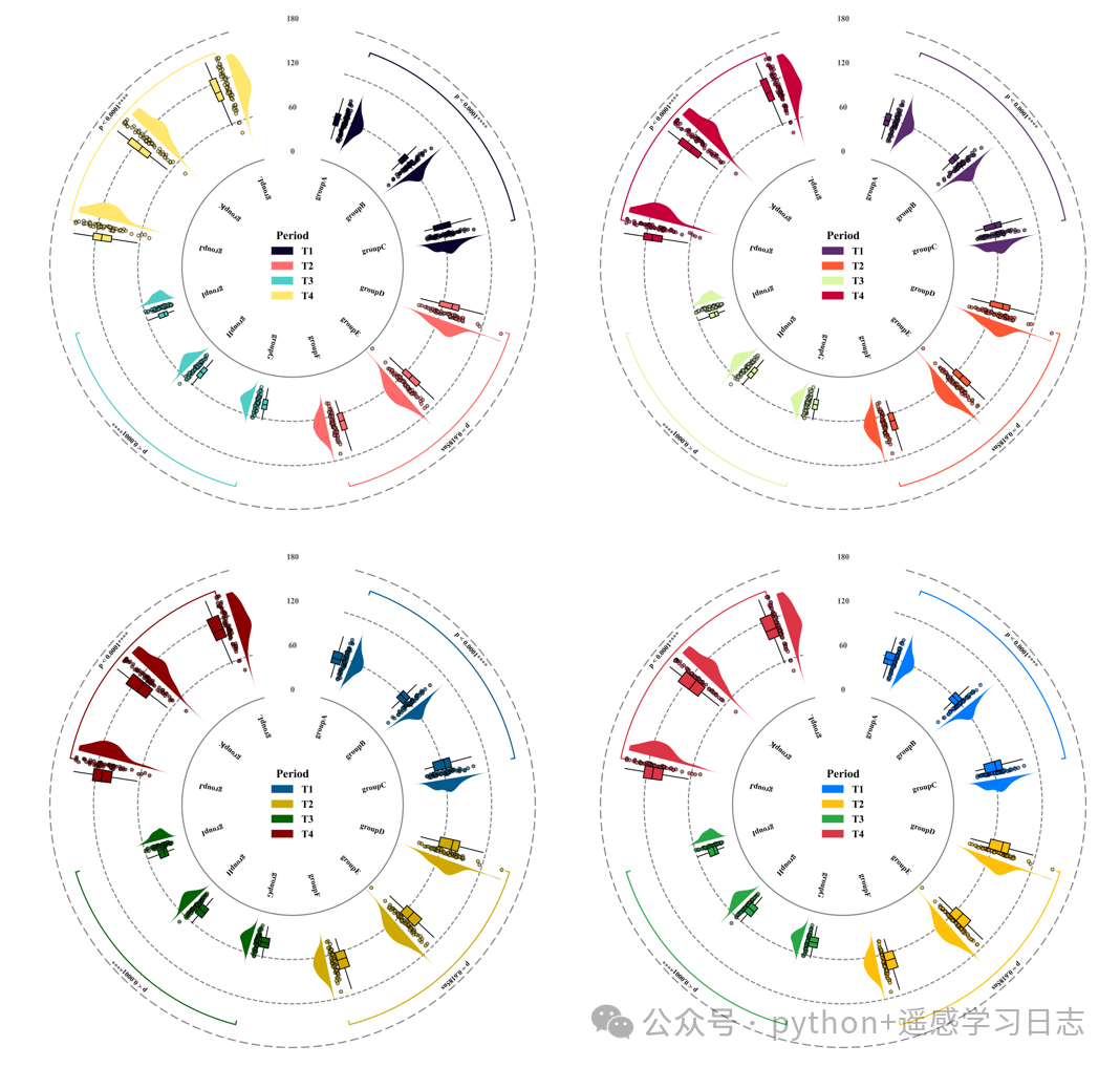 Multiple color schemes
Code explanation


Part One
 Library imports and font settings
# =========================================================================================# ====================================== 1. Environment Setup =======================================# =========================================================================================import numpy as np
import pandas as pd
import matplotlib.pyplot as plt
from matplotlib.patches import Polygon
from scipy.stats import gaussian_kde, ttest_1samp
import matplotlib.patches as mpatches
import os
plt.rcParams['font.family'] = 'serif'
plt.rcParams['font.serif'] = ['Times New Roman']
plt.rcParams['axes.unicode_minus'] = False
Part Two
Color library setup and color scheme selection
# =========================================================================================# ====================================== 2. Color Library Setup ======================================# =========================================================================================COLOR_LIBRARY = {    1: {'T1': '#005A8D', 'T2': '#CFA900', 'T3': '#006400', 'T4': '#8B0000'},}
SELECTED_SCHEME=2
colors_map = COLOR_LIBRARY[SELECTED_SCHEME]
Part Three
Analysis function to calculate statistical significance and set significance markers based on analysis results
# =========================================================================================# ====================================== 3. Analysis Function ======================================# =========================================================================================
def get_significance_label(period_values, baseline_value):
    period_values = np.array(period_values)  # Convert input list to numpy array
    period_values = period_values[~np.isnan(period_values)]  # Remove NaN values
    if len(period_values) < 2:  # If valid data points are less than 2
        return "ns"  # Return no significance marker
    t_stat, p_val = ttest_1samp(period_values, baseline_value)  # Perform one-sample T-test
    # Set significance marker based on analysis results
    if p_val < 0.0001:
        sig = "****"
    elif p_val < 0.001:
        sig = "***"
    elif p_val < 0.01:
        sig = "**"
    elif p_val < 0.05:
        sig = "*"
    else:
        sig = "ns"
    # Set significance value label based on analysis results
    if p_val < 0.0001:
        return f"p < 0.0001{sig}"
    else:
        return f"p = {p_val:.4f}{sig}"
Part Four
Function to draw the raincloud plot for individual subplots in the main figure
# =========================================================================================# ====================================== 5. Individual Raincloud Plot Drawing Function ======================================# =========================================================================================
def draw_raincloud_radial(ax, angle, values, color, width_angle):
    cloud_offset = width_angle * 0.15  # Calculate angle offset for cloud density plot
    cloud_width_max = width_angle * 0.3  # Maximum angle width for cloud density plot
    scatter_jitter_width = width_angle * 0.04  # Random jitter width for scatter plot
    box_offset = -width_angle * 0.15  # Angle offset for box plot
    box_width = width_angle * 0.22  # Define width of box plot
    kde = gaussian_kde(values)  # Perform Gaussian kernel density estimation on data
    r_grid = np.linspace(0, 150, 200)  # Create grid points in the radial direction
    kde_vals = kde(r_grid)  # Calculate density values at grid points
    max_kde = kde_vals.max()  # Get maximum density value
    scaling_factor = cloud_width_max / max_kde if max_kde > 0 else 0  # Calculate scaling factor to fit maximum width
    theta_base = angle + cloud_offset  # Determine base angle for cloud density plot
    theta_curve = theta_base + kde_vals * scaling_factor  # Calculate angle curve for cloud density plot edges based on density values
    verts = list(zip(theta_curve, r_grid)) + list(zip([theta_base] * len(r_grid), r_grid[::-1]))  # Construct polygon vertex coordinates
    # Create cloud density plot
    poly = Polygon(verts,
                   facecolor=color,
                   edgecolor='none',
                   alpha=1,
                   zorder=1)
    ax.add_patch(poly)  # Add cloud density plot to axes

    # Box plot
    q1 = np.percentile(values, 25)  # Lower quartile
    med = np.median(values)  # Median
    q3 = np.percentile(values, 75)  # Upper quartile
    iqr = q3 - q1  # Interquartile range
    whisk_min = np.min(values[values >= q1 - 1.5 * iqr])  # Lower whisker
    whisk_max = np.max(values[values <= q3 + 1.5 * iqr])  # Upper whisker
    box_center_angle = angle + box_offset  # Center angle for box plot
    # Draw box
    ax.bar(x=box_center_angle,
           height=q3 - q1,
           bottom=q1,
           width=box_width,
           color=color,
           edgecolor='black',
           linewidth=1.5,
           alpha=1,
           zorder=10)
    # Draw median line
    ax.plot([box_center_angle - box_width / 2,
             box_center_angle + box_width / 2],
            [med, med],
            color='black',
            lw=1.5,
            zorder=11)
    # Draw lower whisker line
    ax.plot([box_center_angle,
             box_center_angle],
            [whisk_min, q1],
            color='black',
            lw=1.5,
            zorder=9)
    # Draw upper whisker line
    ax.plot([box_center_angle,
             box_center_angle],
            [q3, whisk_max],
            color='black',
            lw=1.5,
            zorder=9)
Part Five
Function to draw significance arcs
# =========================================================================================# ====================================== 6. Significance Arc Drawing Function ======================================# =========================================================================================
def add_significance_arc_dynamic(ax, start_angle, end_angle, text, color):
    r_arc = 158  # Radius height for significance arc
    theta = np.linspace(start_angle, end_angle, 100)  # Angle sequence for arc
    # Draw arc
    ax.plot(theta,
            [r_arc] * len(theta),
            color=color,
            lw=2)
    ax.plot([start_angle, start_angle], [r_arc - 5, r_arc], color=color, lw=2)  # Starting vertical short line
    ax.plot([end_angle, end_angle], [r_arc - 5, r_arc], color=color, lw=2)  # Ending vertical short line
    mid_angle = (start_angle + end_angle) / 2  # Midpoint angle for arc
    deg = np.degrees(mid_angle)  # Convert radians to degrees
    text_rot = 270 - deg + 90  # Text rotation angle
    # Add significance text label
    ax.text(mid_angle,
            r_arc + 12,
            text,
            rotation=text_rot,
            ha='center',
            va='center',
            fontsize=12,
            fontweight='bold',
            color='black')
Part Six
Function to draw the radial raincloud plot/main figure
# =========================================================================================# ====================================== 7. Main Plotting Function ======================================# =========================================================================================
def plot_radial_chart(data_dict, groups_list, periods_list, global_mean, save_dir):
    fig, ax = plt.subplots(figsize=(12, 12), subplot_kw={'projection': 'polar'})  # Create canvas
    ax.set_theta_zero_location("N")  # Set zero degree position for polar coordinates to North
    ax.set_theta_direction(-1)  # Set angle increase direction to clockwise
    ax.set_ylim(-150, 180)  # Set radial range
    num_groups = len(groups_list)  # Get total number of groups
    gap_degrees = 40  # Set gap angle size
    gap_radians = np.radians(gap_degrees)  # Convert gap angle to radians
    start_angle = gap_radians / 2  # Starting angle
    end_angle = 2 * np.pi - (gap_radians / 2)  # Ending angle
    angles = np.linspace(start_angle, end_angle, num_groups)  # Center angles for each group
    width_per_group = (end_angle - start_angle) / (num_groups - 1) * 0.55  # Angle width allocated for each group
    # Loop to draw each group
    for i, (g_name, angle) in enumerate(zip(groups_list, angles)):  # Iterate through each group and corresponding angle
        g_data = data_dict[g_name]  # Get data for that group
        vals = g_data['vals']  # Get value array
        period = g_data['period']  # Get period label
        # Get color based on color scheme
        color = colors_map.get(period, '#555555')
        # Call function to draw raincloud plot
        draw_raincloud_radial(ax, angle, vals, color, width_angle=width_per_group)
        label_r = -20  # Radius position for group name label
        rot_angle = 90 - np.degrees(angle)  # Rotation angle for label
        # Add group name
        ax.text(angle,
                label_r,
                g_name,
                rotation=rot_angle,
                ha='right',
                va='center',
                fontsize=13,
                fontweight='bold',
                color='black',
                rotation_mode='anchor')
    ax.grid(False)  # Remove default grid
    ax.spines['polar'].set_visible(False)  # Remove polar spine
    ax.set_xticks([])  # Remove angle ticks
    ax.set_yticks([])  # Remove radial ticks
    # To prevent raincloud plot from exceeding the circle
    gap_degrees = 30  # Set gap angle size
    gap_radians = np.radians(gap_degrees)  # Convert gap angle to radians
    start_angle = gap_radians / 2  # Starting angle
    end_angle = 2 * np.pi - (gap_radians / 2)  # Ending angle
    grid_angles = np.linspace(start_angle, end_angle, 200)  # Generate angle sequence for circle
    for y in [0, 60, 120, 180]:  # Iterate through radial positions to draw circles
        line_style = '-' if y == 0 else '--'  # Solid line for 0 position, dashed for others
        if y == 180:
            linewidth = 4.0  # Line for outermost circle
        elif y == 0:
            linewidth = 2.0  # Line for 0
        else:
            linewidth = 2.0  # Middle line

    # Get unique period list and sort by numeric suffix
    unique_periods = sorted(list(set(periods_list)), key=lambda x: int(x[1:]) if (isinstance(x, str) and x[1:].isdigit()) else x)
    period_indices = {p: [] for p in unique_periods}  # Initialize dictionary to store indices for each period
    for idx, p in enumerate(periods_list):  # Iterate through all period lists
        period_indices[p].append(idx)  # Record index for each period
    for p in unique_periods:  # Iterate through each unique period
        idxs = period_indices[p]  # Get all indices for that period
        start_idx = idxs[0]  # Get starting index
        end_idx = idxs[-1]  # Get ending index
        current_period_vals = []  # Initialize list for all values for current period
        for i in idxs:  # Iterate through each index within that period
            g_name = groups_list[i]  # Get group name
            current_period_vals.extend(data_dict[g_name]['vals'])  # Add that group's values to the list
        sig_label = get_significance_label(current_period_vals, global_mean)  # Calculate and get significance label
        c = colors_map.get(p, 'black')  # Get color for that period
        add_significance_arc_dynamic(ax, angles[start_idx], angles[end_idx], sig_label, c)  # Draw significance arc and label

    legend_handles = [mpatches.Patch(color=colors_map.get(p, 'gray'), label=p) for p in unique_periods]  # Create legend handle list
    # Add legend
    leg = ax.legend(handles=legend_handles,
                    loc='center',
                    title="Period",
                    frameon=False,
                    fontsize=18,
                    bbox_to_anchor=(0.5, 0.5),
                    bbox_transform=ax.transAxes)
    leg.get_title().set_fontsize(20)  # Set legend title
    leg.get_title().set_fontweight('bold')  # Set legend title
    plt.setp(leg.get_texts(), fontweight='bold')  # Set legend text
    plt.tight_layout()  # Auto-adjust
Part Seven
Execution section, including data reading, analysis, plotting, and saving
# =========================================================================================# ====================================== 8. Execution Section ======================================# =========================================================================================
if __name__ == "__main__":
    excel_file = r'Data.xlsx'  # Original data
    output_folder = r'1125-Radial Raincloud Plot'  # Output path
    df_raw = pd.read_excel(excel_file)  # Read data
    required_cols = ['Group', 'Period', 'Value']  # Required column names
    groups_list = df_raw['Group'].unique().tolist()  # Get unique group name list
    all_values_raw = df_raw['Value'].values  # Get all value data
    global_mean = np.mean(all_values_raw)  # Calculate global mean as baseline
    print(f"Global Mean (Baseline): {global_mean:.2f}")  # Print global mean
    # Build data dictionary
    data_dict = {}  # Initialize data dictionary
    periods_list = []  # Initialize period order list
    for g in groups_list:  # Iterate through each group name
        sub_df = df_raw[df_raw['Group'] == g]  # Filter current group's data
        p_val = sub_df['Period'].iloc[0]  # Get current group's corresponding period identifier
        vals = sub_df['Value'].values  # Get current group's value array
        data_dict[g] = {            'vals': vals,  # Store values            'period': p_val  # Store period        }
        periods_list.append(p_val)  # Add period to list
    plot_radial_chart(            data_dict=data_dict,  # Data            groups_list=groups_list,  # Group names            periods_list=periods_list,  # Periods            global_mean=global_mean,  # Global mean            save_dir=output_folder  # Save path    )
How to apply?

1. Choose the color scheme you want to use:
SELECTED_SCHEME=22. Set the input path for the original data:
excel_file = r'Data.xlsx' # Original data3. Set the save address for the plotting results:
output_folder = r'1125-Radial Raincloud Plot'4. Define the column names for the data you want to use:
required_cols = ['Group', 'Period', 'Value']
Recommendations
Journal image reproduction | Python drawing of 2D partial dependence PDP plotsJournal reproduction | Python drawing of single feature dependence plots based on SHAP analysis and GAM model fittingJournal image reproduction | Python drawing of gradient color SHAP feature importance combination plots (bar chart + hexagon plot)Journal reproduction | Python drawing of SHAP feature importance overview plots, dependence plots, and dual feature interaction effect SHAP plots, unlocking the ultimate secrets of XGBoost modelsJournal image reproduction | Python drawing of SHAP importance hexagon plots + single feature dependence plots + interaction effect intensity bubble plots + interaction effect dependence plots (regression + binary classification + classification)
Acquisition method
The purchase channel for the paid collection of codes and data has been opened, and updates will continue. If needed, pleasemessage me privately for detailed information. Note that only practice data and code files will be shared, and no Q&A service will be provided. The code files already contain complete comments for each line of code. The codes in the paid collection can still be obtained by recommending + liking ten articles, but the number of times is limited (up to 10 articles). Previous free articles will still be free, and there will also be free articles in the future, so please ensure you really need it before purchasing!!!