In the information age, massive amounts of data are generated every moment. Some data visualizations that simplify complexity, are intuitive and elegant, and even breathtaking, not only complement high-level research results but also help authors enhance their understanding of the data, obtaining more valuable insights that add value to their research outcomes, and of course, making it easier to win over reviewers and readers.
On the journey of data visualization, everyone has likely experienced creating some ordinary or even somewhat ugly charts using Excel’s built-in chart features. With the improvement of research capabilities and aesthetics, especially after seeing the works of experts, we began to pay more attention to data visualization, and the tools gradually shifted from office-level to professional-level. In research scenarios, the vast amounts of data and complex calculations, as well as the need for professional and exquisite visualizations, place higher demands on the tools we choose.
 Looking at the ascent of data visualization, Python visualization is a new yet powerful tool. Conquering this peak makes ordinary data visualization scenarios not too difficult for you, as shown in the image below ⬇
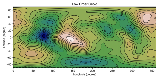
This image, created from global low-order geoid data at high latitudes, has a reasonable color scheme that allows readers to quickly and intuitively and accurately understand the information being conveyed. Such images can impress in defense PPTs or academic papers. As we all know, Python is a hot programming language in recent years, one that can help you get multiple job offers if you learn it. In fact, Python also possesses powerful automation and data processing capabilities, boasts a large number of free graphic libraries and software package resources, supports personalized needs for graphic creation, and even provides more opportunities and advantages for researchers in the future in the age of artificial intelligence.
Such a powerful tool is likely to attract more people who are interested in it than those who want to learn it. Fears of not being able to learn programming, concerns that it will take a long time to get started, and the feeling that data processing is troublesome, etc., all contribute to our continued “watching” rather than decisively “investing”.
 To overcome these difficulties and spend time effectively, we strongly recommend everyone to learn this “Python Data Visualization” course, led by a geophysics PhD who excels in data visualization and is passionate about researching high-level journal paper illustration methods—Jiu Tian Scholar, who will guide you step by step from zero to using Python for data visualization in academic papers. This Python course, taught by researchers, is based on research scenarios and does not overly emphasize complex programming, making it easier for researchers to get started and master.Recently, the instructor added 4 new Python data visualization examples. This update also explains some new auxiliary drawing software, combining various types of graphical elements and integrating some third-party libraries. The difficulty has increased, but the entire tutorial is easy to understand and get started with, allowing you to easily acquire new skills!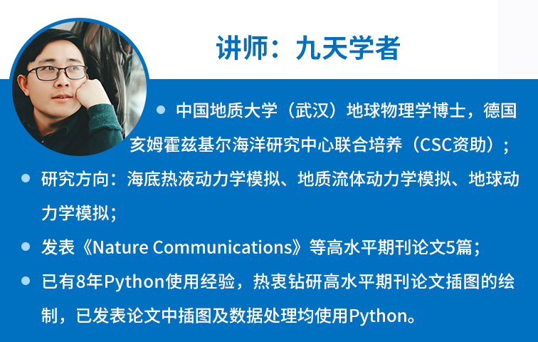
Why Use Python for Data Visualization?
1. High Efficiency, High Level Python can achieve an effective workflow that integrates data processing and visualization; it also supports the output of high-level vector graphics and various journal-compliant formats images. 2. Personalized Editing Freedom Python can achieve data visualization according to users’ personalized needs freely and quickly; given Python’s open-source and free nature and ease of use, it has a large number of free function packages and resource libraries, making it easy for users to find similar codes and modify them as needed to meet various personalized requirements. 3. Easy to Get Started Python’s syntax is simple and intuitive, with strong readability and a low entry barrier; mastering some basic syntax is sufficient to open the door to Python data visualization. 4. Lightweight Files The files during the data visualization process only need to be recorded as text files, making it easy to manage and save various program codes, configuration files, and documentation (also known as “version control”). The following images are all illustrations created using Python by Jiu Tian Scholar, who has 8 years of Python visualization experience: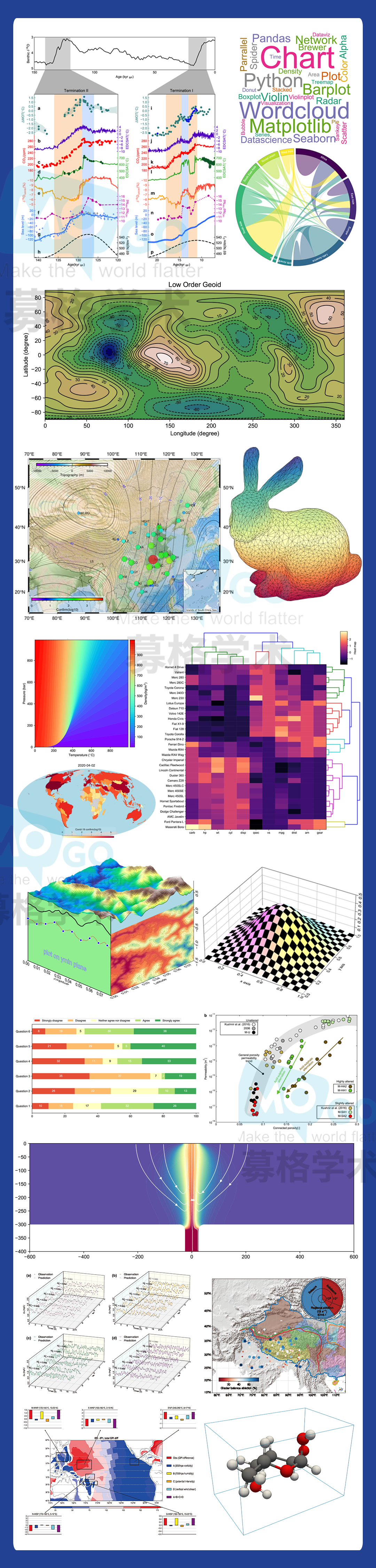
The above stunning illustrations are just a small part of what Python visualization tools can do. I believe we will increasingly see experts showcasing their skills with Python data visualization tools in high-level journals.
Now, let’s learn from Dr. Jiu Tian Scholar, who has 8 years of Python experience, in the course titled “Python Data Visualization”. Jiu Tian Scholar will guide you step by step in coding, helping beginners to progress from “zero” to becoming visualization experts; the course will detail the drawing methods for 40+ case images (some of which are selected from illustrations published in high-quality journals), combining theory with practice, to help everyone master this “skill” of Python visualization in an easy-to-understand manner.Python drawing, achieve high scores in SCI!
Five Learning Modules | 40+ Cases | Step-by-step Coding
Limited-Time Offer: 269 Yuan
Course Price: 359 Yuan
Activity Deadline: July 22, 2024, 24:00
Click the card below for details
▼▼▼
Course Preview
(Preview video) It is recommended to watch on WIFI*Tip: Due to WeChat’s video size limitations, this video is a compressed version. For a clearer version of the preview class, you can click on the mini-program card to watch more “preview classes” in the course directory!
Target Audience
● Researchers who want to improve the quality of their research illustrations● Beginners in Python visualization and those who wish to advance● Enthusiasts of Python data visualization
Course Features
Easy to Understand | Starting from basic knowledge, gradually increasing the difficulty of the course, making it easy for beginners to learn;Easy to Get Started | The instructor personally types the code, step by step helping you understand the meaning of each line of code, assisting you in getting started quickly;High Quality and Practical | The course uses illustrations from top journals as examples, explaining in conjunction with practice, making it highly practical;Practice While Learning | Each part has reserved exercises and code after class to help students consolidate what they have learned;
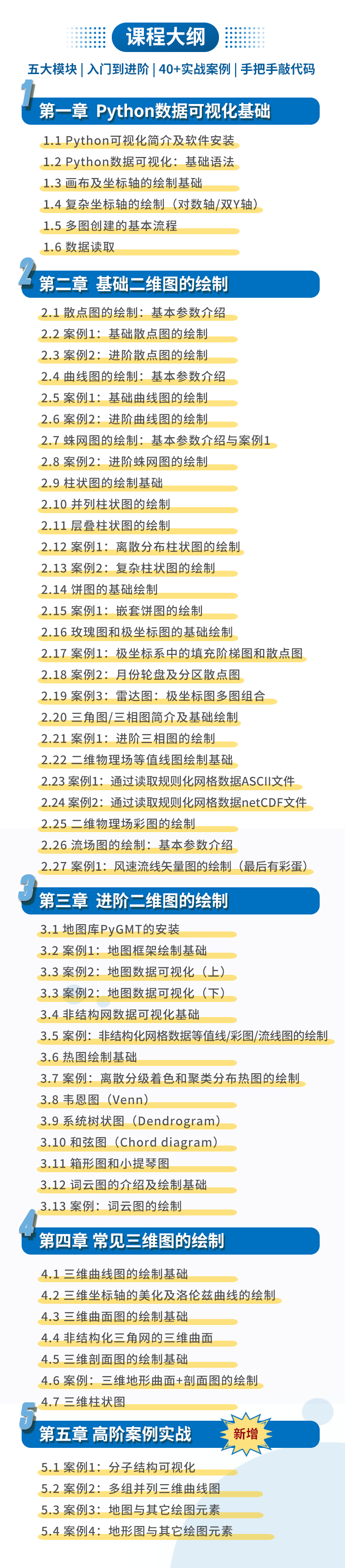
Python drawing, achieve high scores in SCI!
Five Learning Modules | 40+ Cases | Step-by-step Coding
Limited-Time Offer: 269 Yuan
Course Price: 359 Yuan
Activity Deadline: July 22, 2024, 24:00
Click the card below to view the course
▼▼▼
Class Location: Muge Classroom WeChat Official AccountCourse Format: Recorded course, learn anytimeConsult Teaching AssistantWeChat of the assistant: mugexuemei
(Teaching assistant working hours: Monday to Friday 9:00-18:00)