Introduction
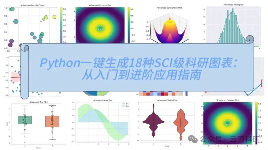
After completing data analysis, how to quickly generate high-quality graphs suitable for SCI papers is a challenge many researchers face. Relying solely on manual parameter adjustments can lead to significant time wastage. This article shares a Python script that can generate 18 common research graphs with one click, primarily using the Matplotlib and Seaborn libraries, with concise and efficient code. The script is based on random data (which can be replaced with your actual data) and outputs high-definition PNGs, suitable for fields such as biostatistics, medical imaging, and environmental data analysis.


18 Types of SCI Research Graphs

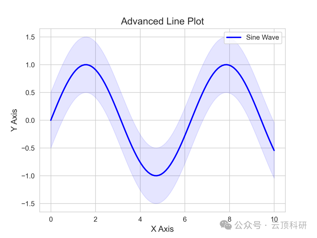
Line Graph
1. Application Scenario: Line graphs are commonly used to display time series data or trends of continuous variables. In research, they are used to track cell growth curves in biological experiments, temperature changes in environmental monitoring, and drug concentration decay over time in medical research.
2. Advantages: Line graphs are simple and intuitive, highlighting trends and fluctuations, and are more professional than pure line graphs. They support multiple line comparisons, suitable for comparing multiple data sets; high-definition output is easy to insert into papers, avoiding the low quality of Excel.


Scatter Plot
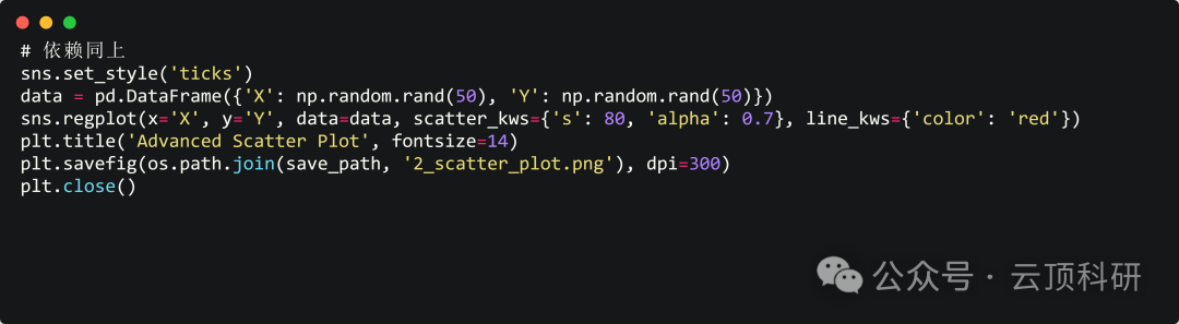
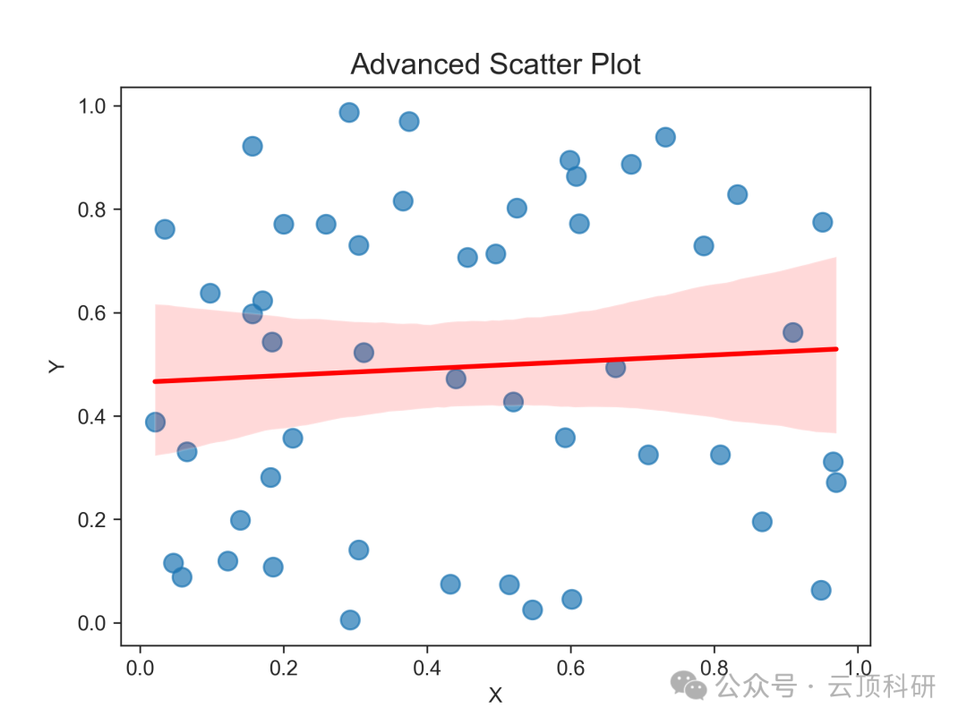
1. Application Scenario: Scatter plots are suitable for exploring the correlation between two variables. In research, they are used to analyze the correlation between two proteins in gene expression data, the relationship between patient age and efficacy in clinical trials, and the relationship between strength and density in materials science.
2. Advantages: They intuitively display point distribution and linear trends, making them more suitable for continuous data than bar charts, avoiding information loss, and allowing customization of color/size to enhance multidimensional expression.

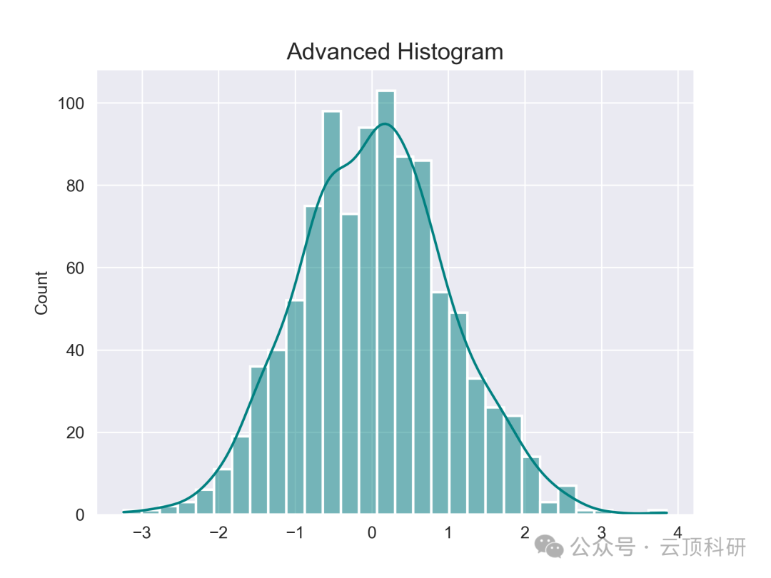
Histogram
1. Application Scenario: Histograms are used for distribution analysis, such as checking data normality. In research, they are commonly found in epidemiology for age distribution, in biometry for cell size distribution, and in environmental science for pollutant concentration distribution.
2. Advantages: They can reveal the shape of the data (skewness, peaks) and can add KDE curves to smooth density estimates, providing more detail than box plots.


Bar Chart
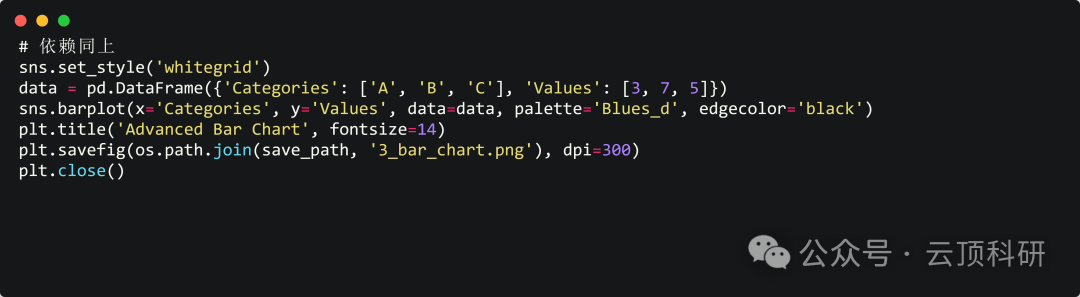
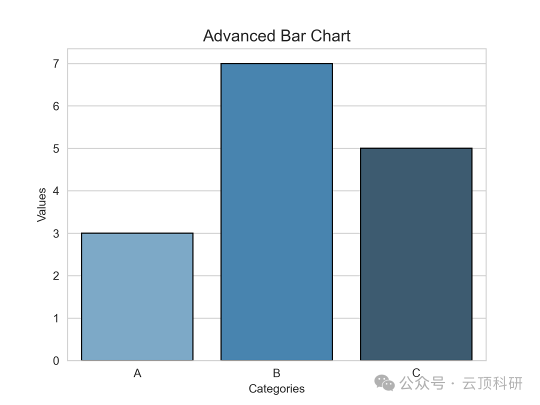
1. Application Scenario: Bar charts are suitable for category comparison, such as comparing average values across different groups. In research, they are used to compare metrics between experimental and control groups (e.g., efficacy scores in drug trials), species abundance distribution in ecology, and behavioral scores across different intervention groups in psychology.
2. Advantages: They clearly compare discrete data and express differences more accurately than pie charts (especially when values are close); they can be stacked or grouped to expand multidimensionality.

Box Plot
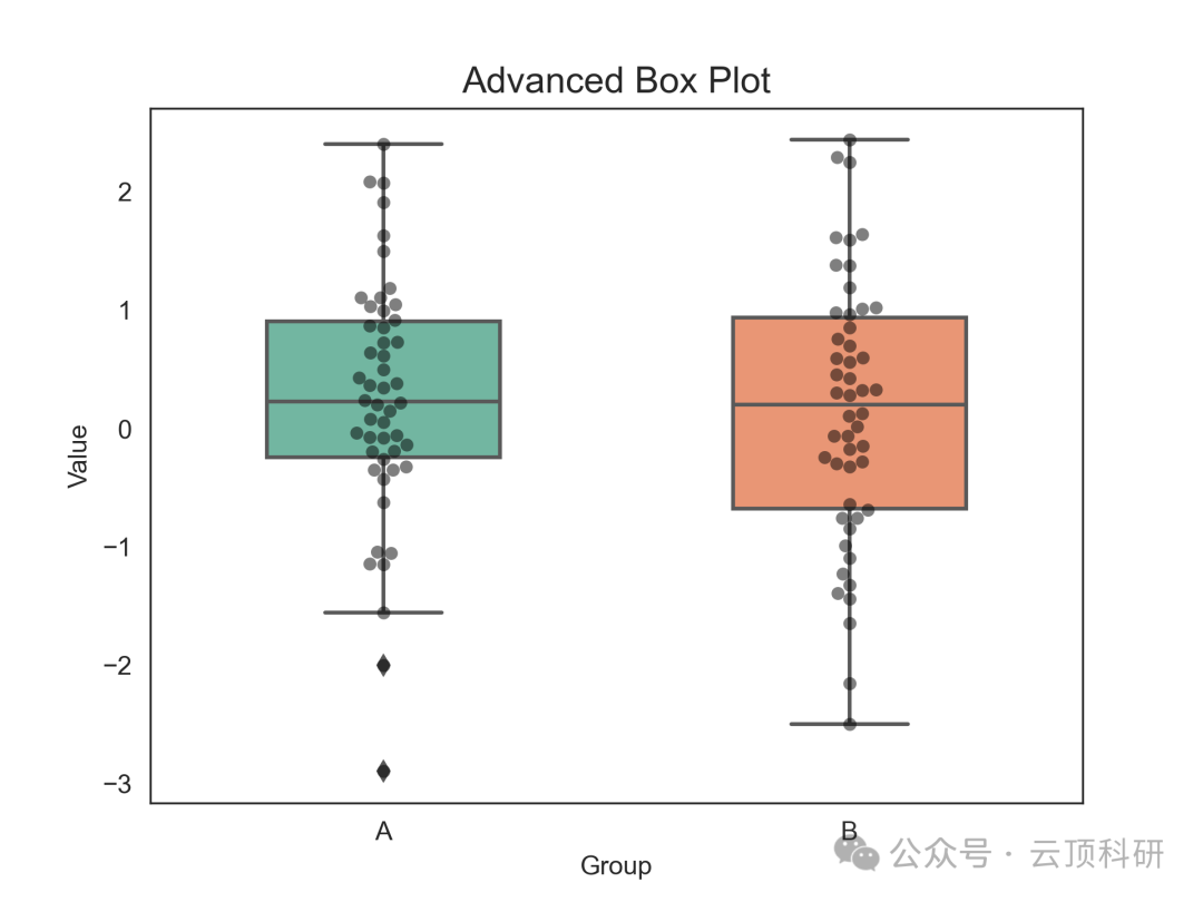
1. Application Scenario: Box plots excel at showing data distribution and outliers. In research, they are used for multiple group comparisons, such as blood pressure changes across different dosage groups in clinical trials and the impact of environmental factors on plant growth in plant physiology.
2. Advantages: They simultaneously display median, quartiles, and outliers, are more compact than histograms, and are suitable for multiple data sets. They are also friendly to non-normal data, making it easy to identify outliers, and can highlight key groups by adjusting width.


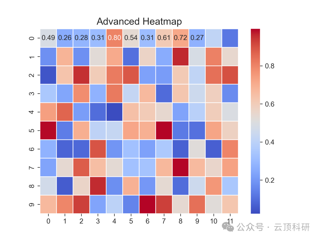
Heatmap
1. Application Scenario: Heatmaps are used for matrix data, such as correlation matrices or gene expression profiles. In research, they are commonly found in bioinformatics for protein interaction networks and in medical imaging for brain activation heatmaps.
2. Advantages: The color gradient is intuitive and more visually friendly than tables. They are easy to handle high-dimensional data, discover underlying patterns, and enhance clarity.


Violin Plot
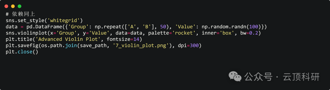
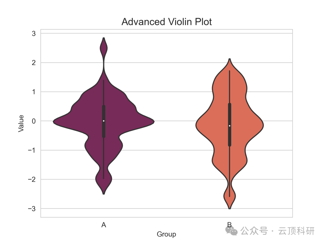
1. Application Scenario: Violin plots combine distribution and density, commonly used for inter-group comparisons. In research, they can be used to analyze the distribution of animal behavior durations in behavioral ecology and the variability of dose responses in pharmacology.
2. Advantages: They can display density shapes and box plots, and are richer than box plots, showing variability. They have high information density and can reveal bimodal distributions, assisting non-parametric tests.

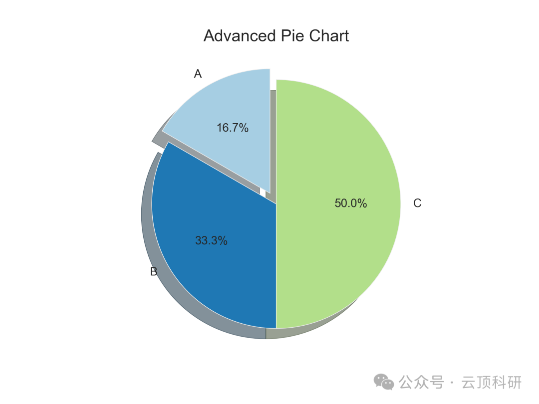
Pie Chart
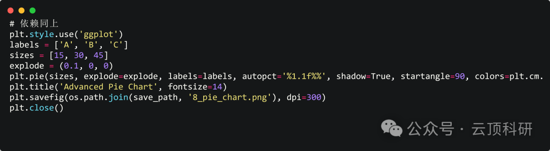
1. Application Scenario: Pie charts are commonly used for proportional distribution, such as composition analysis. In research, they are suitable for categorical data, such as microbial community composition and disease subtype proportions in patient cohorts.
2. Advantages: They can intuitively display percentages, are simple and easy to understand, and are suitable for situations with few categories.

Area Chart
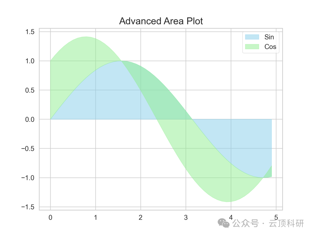
1. Application Scenario: Area charts are commonly used for cumulative trends, such as time series stacking. In research, they can be used to analyze changes in resource allocation in economics and population dynamics in biology.
2. Advantages: They emphasize accumulation with filling, highlighting volume more than line charts, and can dynamically express changes in proportions, enhancing narrative.


Radar Chart
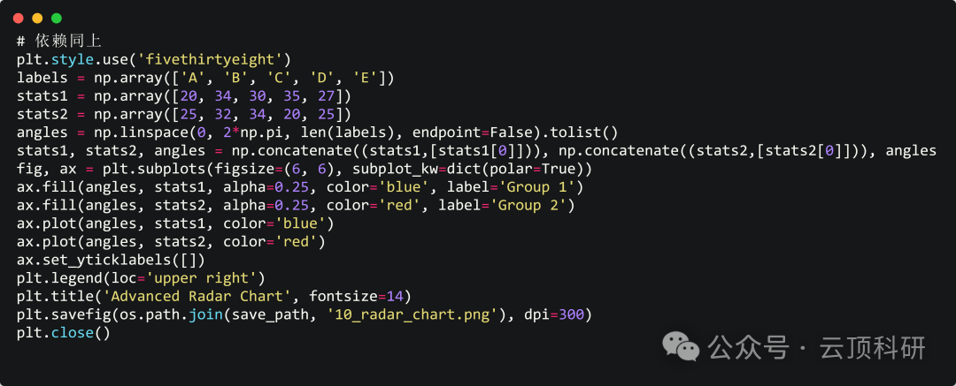
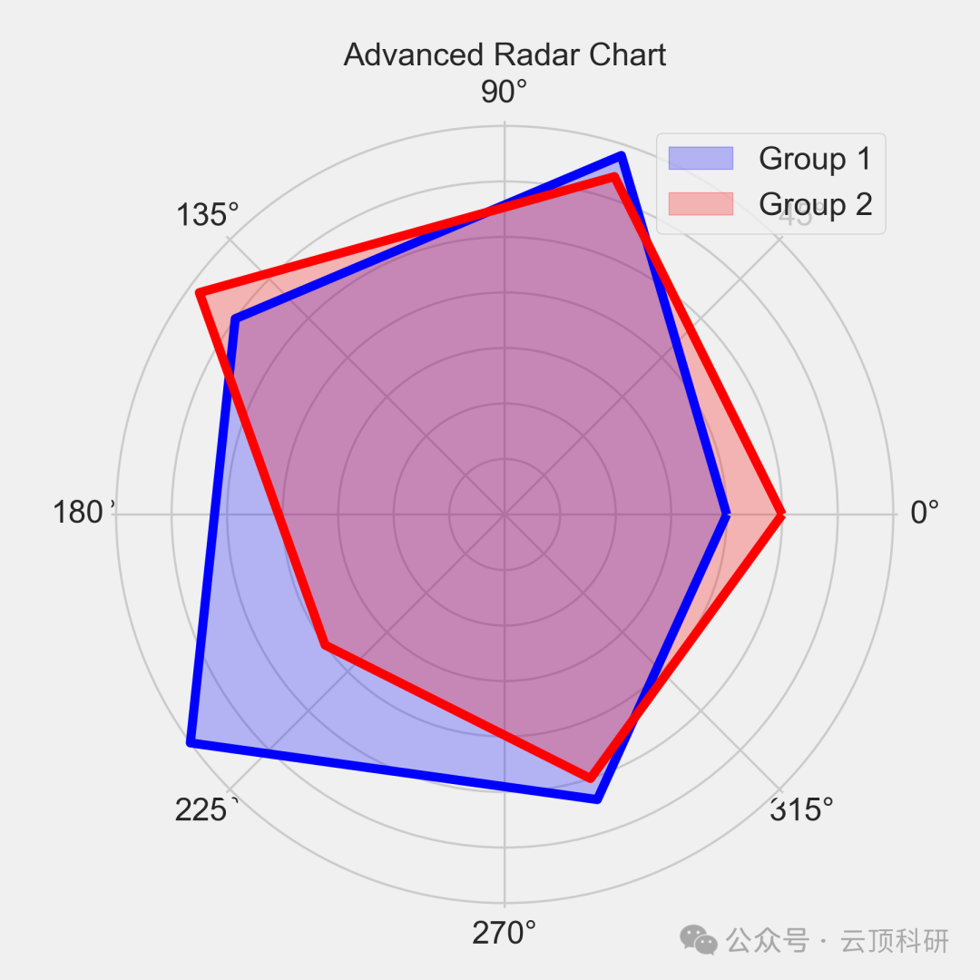
1. Application Scenario: Radar charts are often used for multidimensional comparisons, such as performance evaluation. In research, they can be used to compare nutritional components of foods in nutrition and personality dimension scores in psychology.
2. Advantages: The polygon intuitively displays multiple attributes, allowing for comprehensive assessment and easy identification of strengths/weaknesses, suitable for decision analysis.

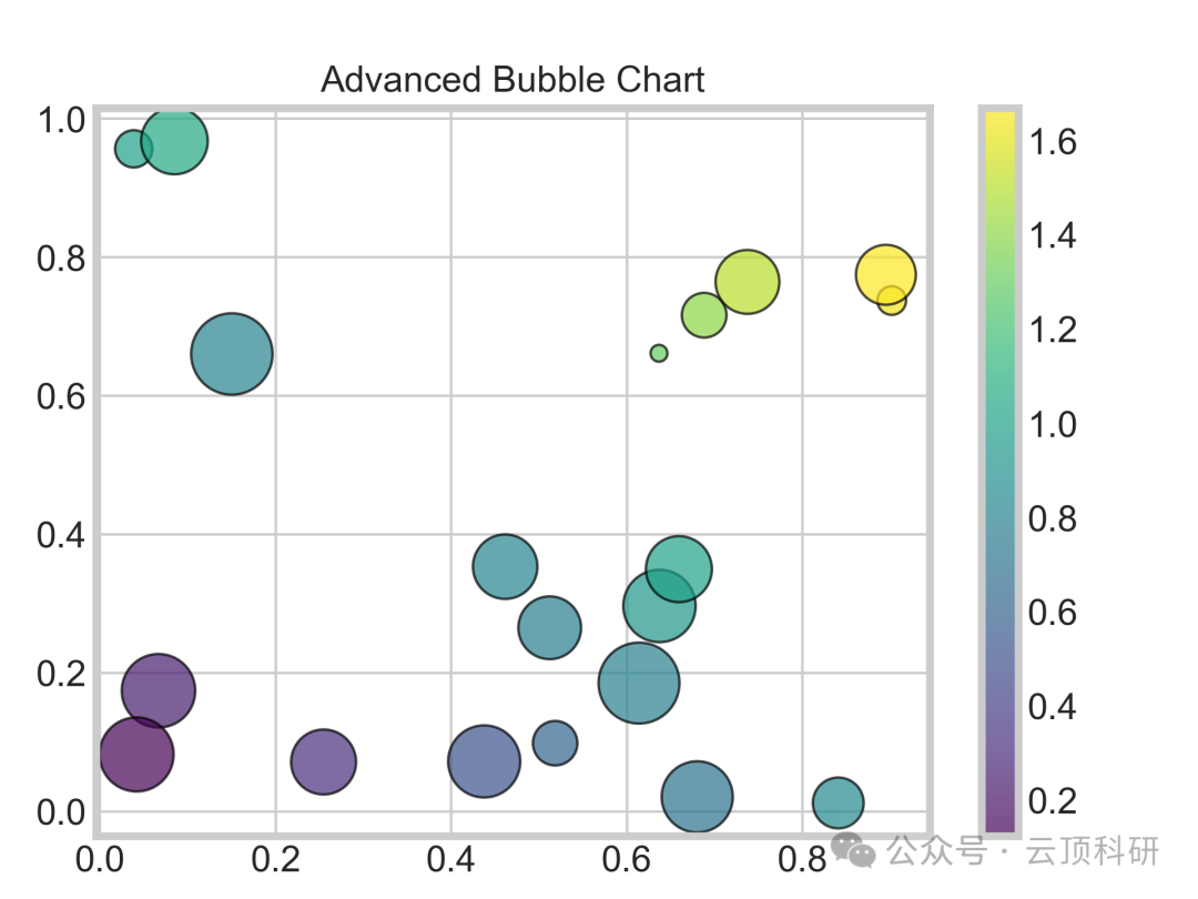
Bubble Chart
1. Application Scenario: Bubble charts extend scatter plots into three dimensions, where size represents a third variable. In research, they can be used to analyze the relationship between GDP, population, and emissions in economics.
2. Advantages: Bubble size/color are multidimensional, making them flatter and easier to read than 3D charts. They are information-rich and can handle three variables without crowding.


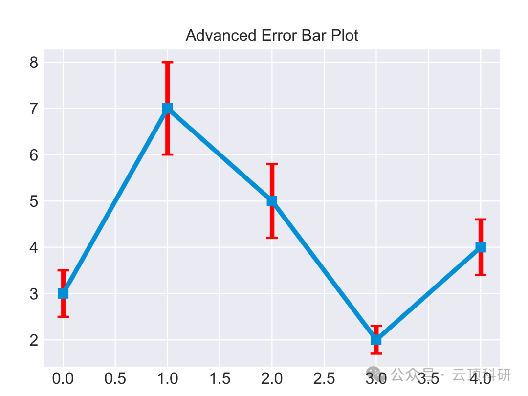
Error Bar Chart
1. Application Scenario: Error bar charts are used for expressing uncertainty, such as mean ± SD. In research, they can be used for measurement errors in physical experiments and variability in repeated trials in biology.
2. Advantages: Error bar charts are more rigorous than pure bar charts, statistically friendly, and can visualize variability, assisting t-tests.


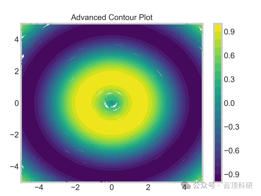
Contour Plot
1. Application Scenario: Contour plots are often used for surface data, such as topography or functions. In research, they can be used to illustrate seismic wave propagation in geology and potential energy surfaces in chemistry.
2. Advantages: They can display spatial expressions and reveal peak/trough patterns.


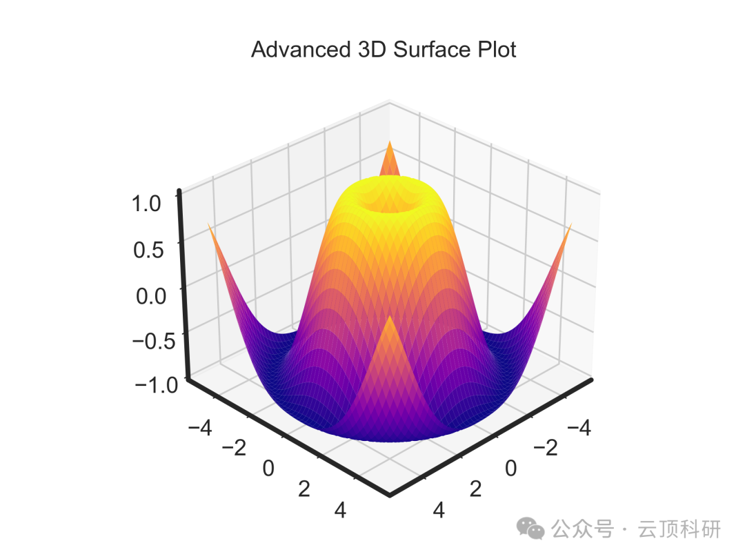
3D Surface Plot
1. Application Scenario: 3D surface plots are used for visualizing three-dimensional functions. In research, they can be used for energy landscapes in molecular dynamics and stress distributions in engineering.
2. Advantages: They can capture complex surfaces and provide better display effects than 2D projections.


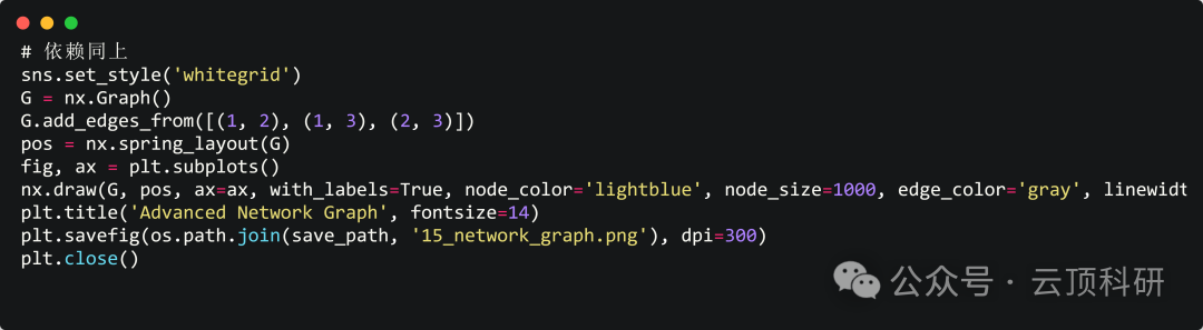
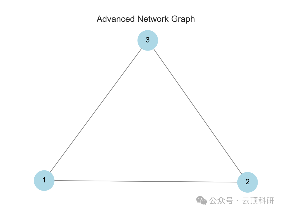
Network Diagram
1. Application Scenario: Network diagrams are often used for relationship modeling, such as social networks or biological pathways. In research, they can be used for protein interaction networks and ecological food chains.
2. Advantages: They can display topology and reveal connection patterns, assisting graph theory analysis.

Dendrogram
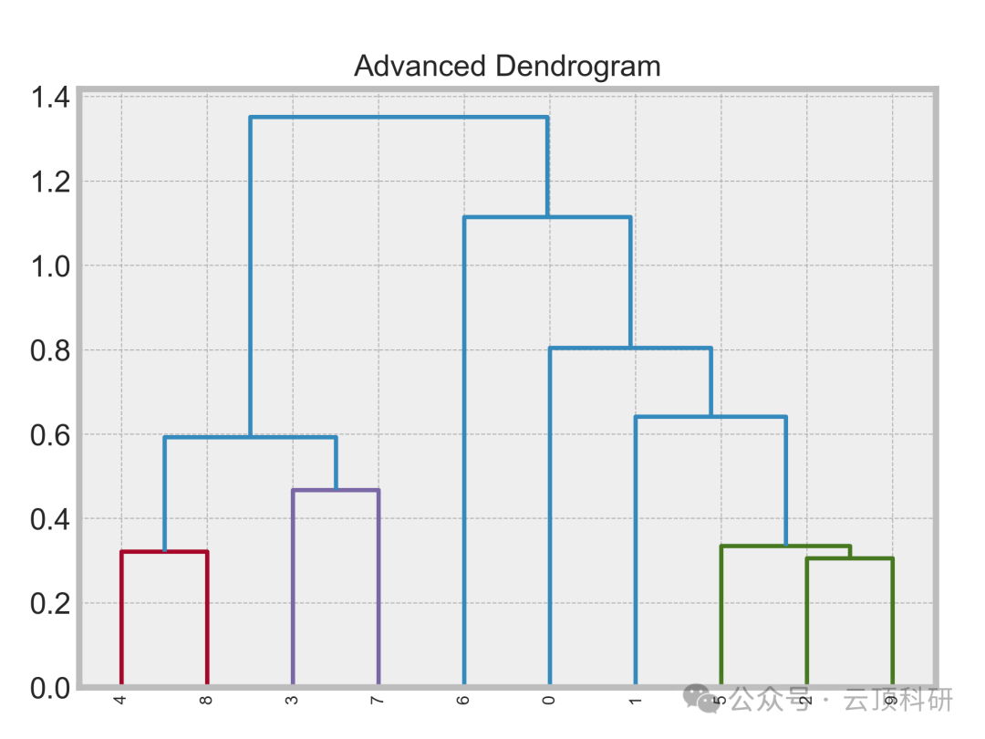
1. Application Scenario: Dendrograms are often used for hierarchical clustering, such as phylogenetic trees. In research, they can be used for phylogenetic trees in evolutionary biology and sample clustering in data mining.
2. Advantages: They can display hierarchical structures, making it easy to cut clusters and assist in classification.


Principal Component Analysis Plot
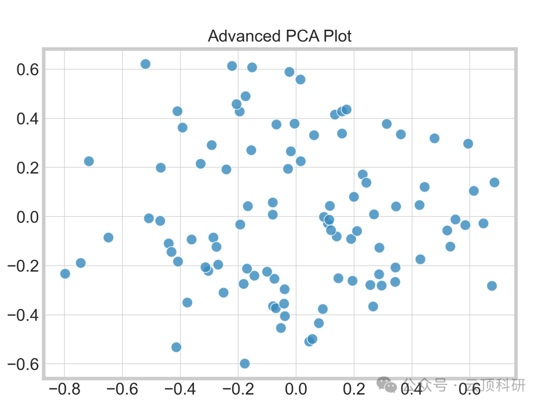
1. Application Scenario: PCA plots are often used for dimensionality reduction visualization, such as projecting high-dimensional data. In research, they can be used for sample clustering in genomics and feature extraction in image processing.
2. Advantages: They can reduce dimensionality of multidimensional data, providing insights into internal patterns.


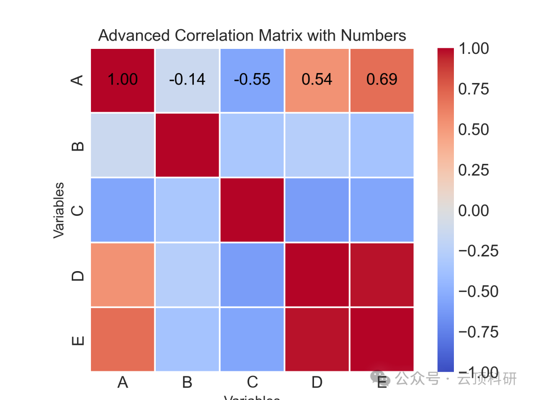
Correlation Matrix Plot
1. Application Scenario: Correlation matrices are often used for analyzing associations between variables. In research, they can be used for multi-omics integration and correlation of indicators in economics.
2. Advantages: They provide more precise effects, using dual coding of numbers and colors, making it easy to discover collinearity.



Scan the code to add the assistant and reply with 【A004】
to get all the code for free.