
Click the blue text to follow us
// MATLAB Plotting Tips
Images are a visual representation of results, which can intuitively reflect your results and demonstrate the accuracy of your findings. In today’s big data era, visualizing data during analysis can provide a multidimensional display, allowing people to better discover and remember the characteristics of the data.
Therefore, mastering some plotting methods is very important, and using MATLAB makes plotting quite simple (of course, there are many other tools available).
Next, here are some basic plotting tips in MATLAB that I hope will help you~
1
// Two-dimensional Graphs
>plot
Two sequences t=t1, t2,…, tn and y=y1, y2,…, yn
Construct vectors: t=[t1, t2,…, tn]
y=[y1, y2,…, yn]
Use this data to plot
plot(t,y)
x = [0:0.01:10]
y = sin(x)
plot(x,y)
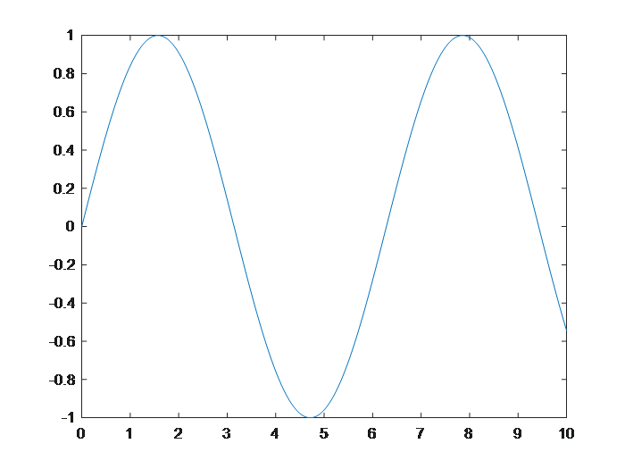
x=[-5:0.1:10];
y=5*sin(x).*(x<0)+x.*x.*(x>=0&&x<=5)+((8-x).*(8-x)+16).*(x>5);
plot(x,y)
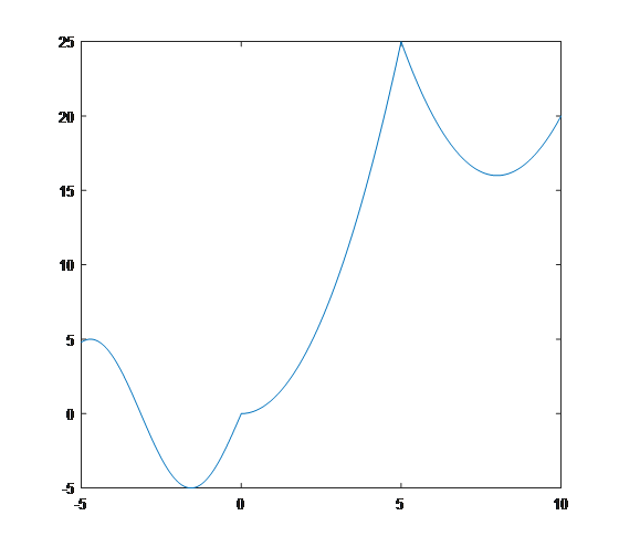
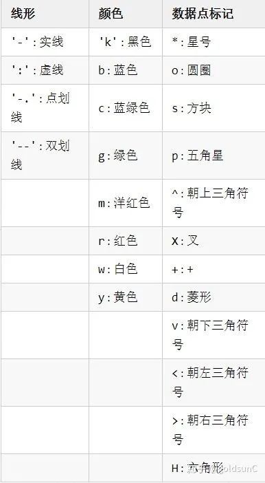
The plotted image can also adjust the curve linearity, color, and data point markers, some specific attributes of the parameters are shown in the table below
>fplot
①fplot(f, lims, parameters)
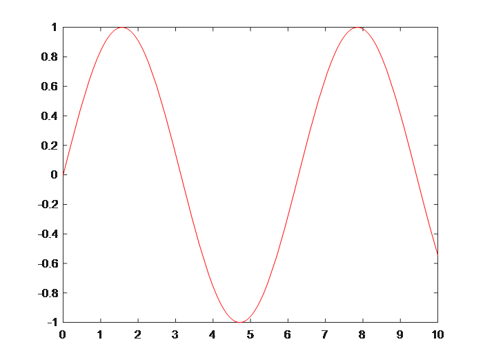
f represents a function, usually in the form of a function handle. lims is the range of values for the x-axis, described by a binary vector [xmin, xmax], with a default value of [-5, 5]. Parameters are defined similarly to the plot function. For example, to use the fplot function to plot the sin(x) image:
fplot(@(x)sin(x), [0, 10], ‘-r’)
②fplot(funx, funy, tlims, parameters)
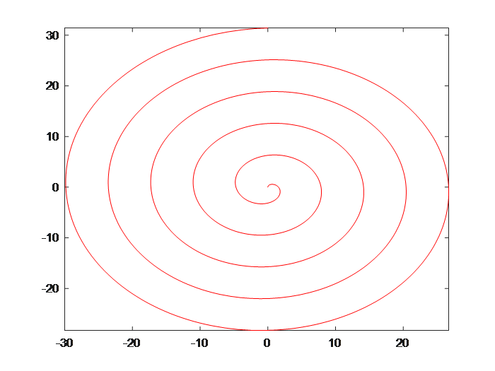
funx and funy represent functions, usually in the form of function handles. tlims describes the range of values for the independent variables of the parameter functions funx and funy, using a binary vector [tmin, tmax]. For example, to plot the parametric equation (x=tsint, y=tcost), the curve is as follows:
fplot(@(t)t.*sin(t), @(t)t.*cos(t), [0, 10*pi], ‘-r’)
// Special Two-dimensional Graphs
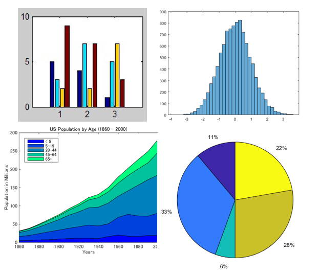
bar: Bar Chart
bar3: 3D Bar Chart
barh: Horizontal Bar Chart
bar3h: Horizontal 3D Bar Chart
histogram: Histogram
histogram2: Bivariate Histogram
polarhistogram: Histogram in Polar Coordinates
pareto: Pareto Chart
area: Filled Area Two-dimensional Plot
pie: Pie Chart
pie3: 3D Pie Chart
// Three-dimensional Graphs
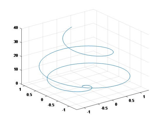
plot3
For example:
t=0:0.01:2*pi;
x=t.^3.*sin(3*t).*exp(-t);
y=t.^3.*cos(3*t).*exp(-t);
z=t.^2;
plot3(x,y,z)
Today’s sharing ends here, I hope it helps everyone~ If you’re interested, you can find more detailed content on your own


WeChat ID: Chengdian Student Affairs