Data Visualization
Data Visualization refers to the use of computer graphics and image processing technology to convert data into graphics or images displayed on the screen, allowing for interactive processing of theories, methods, and techniques. It involves multiple fields such as computer graphics, image processing, computer-aided design, computer vision, and human-computer interaction technologies. The main characteristics of this technology are as follows:
(1) Interactivity: Users can easily manage and develop data interactively.
(2) Multidimensionality: Users can observe multiple attributes or variables of the data representing objects or events, allowing data to be classified, sorted, combined, and displayed according to the values of each dimension.
(3) Visualization: Data can be displayed using images, curves, 2D graphics, 3D graphics, and animations, enabling visual analysis of patterns and relationships.
Data visualization can significantly accelerate data processing speed, effectively utilizing the vast amounts of data generated at all times; it facilitates visual communication between people and data, as well as between individuals, allowing people to observe hidden clues within the data and providing powerful tools for discovering and understanding scientific laws; it enables guidance and control over computation and programming processes, allowing users to change the conditions on which the process is based and observe the effects.
Data visualization aids in the integration and streamlining of engineering processes, enabling engineering leaders and technicians to see and understand how changes in parameters affect the overall dynamics, thereby achieving the goal of shortening development cycles and saving costs throughout the engineering lifecycle.
This chapter introduces the plotting methods in MATLAB, as well as how to edit and annotate graphics.
7.1 Basic Knowledge of Plotting
7.1.1 Visualization of Discrete Data and Functions
It is well known that any pair of binary real scalar values can be represented as a point on a plane, and any pair of binary real vector values can be represented as a set of points on that plane. For discrete real functions, when values are taken in increasing (or decreasing) order, the same number can be obtained based on the function relationship. When the corresponding vectors are illustrated using a sequence of points in Cartesian coordinates, the visualization of the discrete function is achieved; however, the discrete sequence shown in the graph only reflects the function relationship within certain defined effective intervals. It is important to note that the graph cannot represent function relationships over infinite intervals; this is determined by the principles of graphing, not a limitation of the MATLAB software itself.
[Example 7-1] Visualization of Discrete Functions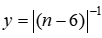 .
.
Ex_7_1.m
n=0:12;
y=1./abs(n-6); % Prepare discrete point data
plot(n,y,’r*’,’MarkerSize’,20) % Plot
grid on
The result of running the above code is shown in Figure 7-1.
7.1.2 Visualization of Continuous Functions
Similar to the visualization of discrete functions, the visualization of continuous functions must first calculate the corresponding function values over a set of discrete independent variables, and these “data pairs” are illustrated using points. However, these discrete points cannot represent the continuity of the function. To further represent the function behavior between discrete points, two common methods can be used: (1) subdivide the interval further to calculate more points to approximate the continuous change of the function; (2) connect the two points with a line to approximate the shape of the function between them.
In MATLAB, both methods can be employed. However, it should be noted that if the number of sampling points for the independent variable is not sufficient, neither method will accurately reflect the original function.
[Example 7-2] Visualization of Continuous Modulated Waveforms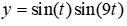 .
.
Ex_7_2.m
t1=(0:11)/11*pi; % Independent variable
y1=sin(t1).*sin(9*t1); % Corresponding function values
t2=(0:100)/100*pi;
y2=sin(t2).*sin(9*t2);
% The following is the plotting, placing several graphs together as subplots for comparison
subplot(2,2,1),plot(t1,y1,’r.’),axis([0,pi,-1,1]),title(‘Subplot (1)’)
subplot(2,2,2),plot(t2,y2,’r.’),axis([0,pi,-1,1]),title(‘Subplot (2)’)
subplot(2,2,3),plot(t1,y1,t1,y1,’r.’)
axis([0,pi,-1,1]),title(‘Subplot (3)’)
subplot(2,2,4),plot(t2,y2)
axis([0,pi,-1,1]),title(‘Subplot (4)’)
The result of running the above code is shown in Figure 7-2.
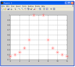
Figure 7-1 Visualization of Discrete Functions
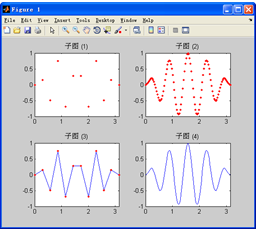
Figure 7-2 Visualization of Continuous Functions
7.1.3 General Steps for Visualization
This section introduces the general steps for visualization, aiming to provide readers with a macro understanding of the plotting process, as shown in Table 7-1. Specific details will be introduced later.
Table 7-1 General Steps for Plotting
|
Step |
Typical Commands |
|
1. Data Preparation Select the range to be plotted Generate the independent variable sampling vector Calculate the corresponding function value vector |
t=pi*(0:100)/100 y=sin(t).*sin(9*t); |
|
2. Select Plotting Window and Subplot Position Default to open Figure 1, or current window, or current subplot. Commands can specify the plotting window and subplot position |
figure(1) subplot(2,2,3) |
|
3. Call Plotting Commands (including line type, color, data point type) |
plot(t,y,’b-‘) % Plot with blue solid line |
|
4. Set Axis Range and Scale, Coordinate Grid |
axis([0,pi,-1,1]) % Set axis range grid on % Draw coordinate grid |
|
5. Graph Annotation: Graph title, axis names, legend, text explanations, etc. |
title(‘figure’) % Graph title xlabel(‘t’); ylabel(‘y’) % Axis names legend(‘sin(t)’, ‘sin(t).*sin(9*t)’) % Legend text(2,0.5,’y=sin(t).*sin(9*t)’)% Text explanation |
|
6. Fine-tuning the Graph Using object property values settings, using the graph window toolbar settings |
set(h,’MarkerSize’,10) % Set data point size |
|
7. Exporting and Printing the Graph |
% Using graph window menu operations |
Steps 1 and 3 are the most basic plotting steps. Generally speaking, the graphs created using these two steps already possess sufficient expressiveness; other steps are not mandatory, and the input order of other steps can be freely specified according to user needs or preferences, generally not affecting the output results. The basic steps for 2D and 3D plotting are similar, with the only difference being that 3D plotting includes additional property control options.