

MATLAB Bar Graph Profile
Combination Graph
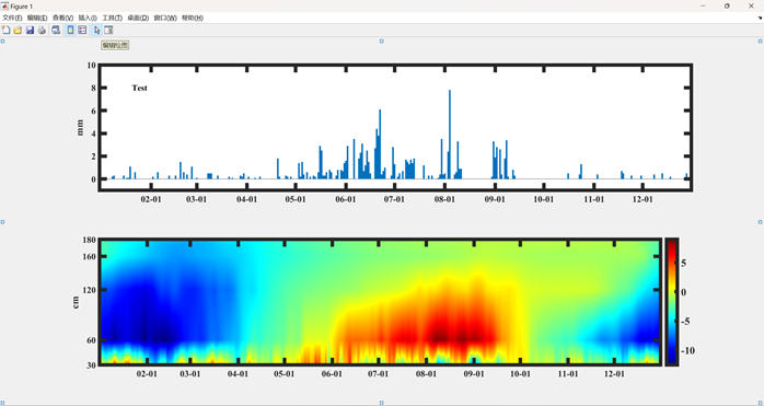
Precipitation Bar Graphclear;clc% Precipitation Bar Graphsubplot(2,1,1)% Group graph 2 rows 1 column first graphx1=xlsread(<span>'Temperature Precipitation.xlsx'</span>,<span>'Date'</span>,<span>'A2:A366'</span>);% Read x-axis coordinatesy1=xlsread(<span>'Temperature Precipitation.xlsx'</span>,<span>'Precipitation'</span>,<span>'A2:A366'</span>);% Read y-axis coordinatesbar(x1,y1,1)% Draw bar graphylabel(<span>'mm'</span>)% y-axis labelaxis([0,365,-1,10]) % Set axis limitstext(20,8,<span>'Test'</span>,<span>'fontname'</span>,<span>'Times New Roman'</span>,<span>'fontsize'</span>,12,<span>'fontweight'</span>,<span>'bold'</span>)% Set title parameters<span>set</span>(gca,<span>'XTick'</span>,[ 32 60 91 121 152 182 213 244 274 305 335]) <span>set</span>(gca,<span>'xticklabel'</span>,{<span>'02-01'</span>,<span>'03-01'</span>,<span>'04-01'</span>,<span>'05-01'</span>,<span>'06-01'</span>,<span>'07-01'</span>,<span>'08-01'</span>,<span>'09-01'</span>,<span>'10-01'</span>,<span>'11-01'</span>,<span>'12-01'</span>})% x-axis ticks% The above two lines, the second line adds descriptions to the positions specified in the first line<span>set</span>(subplot(2,1,1),<span>'fontname'</span>,<span>'Times New Roman'</span>,<span>'fontsize'</span>,13,<span>'fontweight'</span>,<span>'bold'</span>,<span>'LineWidth'</span>,5)% Set graph frame parametersProfile Graph% Profile Graphsubplot(2,1,2)x = xlsread(<span>'Temperature Precipitation.xlsx'</span>,<span>'Date'</span>,<span>'A2:A366'</span>);% Read x-axis coordinatesxmax = max(x);xmin = min(x);y = [30 60 120 160 180];% Soil depth, i.e., y-axis coordinatesymax = max(y);ymin = min(y);z = xlsread(<span>'Temperature Precipitation.xlsx'</span>,<span>'Temperature'</span>,<span>'A2:E366'</span>);% Values at each (x,y) pointC=z<span>';N = 365; % Number of data points in each dimension[X,Y]=meshgrid(linspace(xmin,xmax,N),linspace(ymin,ymax,N));% Grid x,y two-dimensional spaceZ =griddata(x,y,C,X,Y,'</span>linear<span>');% Use interpolation to extend data, using '</span>linear<span>' methodcontourf(X,Y,Z,N, '</span>LineColor<span>','</span>none<span>');% Set contour plotcolormap('</span>jet<span>')% Set color mapcolorbar('</span>fontname<span>','</span>Times New Roman<span>','</span>FontSize<span>',15,'</span>LineWidth<span>',5)% Set color bar parametershold on ylabel('</span>cm<span>') % y-axis label descriptionset(gca,'</span>XTick<span>',[32 60 91 121 152 182 213 244 274 305 335]) set(gca,'</span>xticklabel<span>',{'</span>02-01<span>','</span>03-01<span>','</span>04-01<span>','</span>05-01<span>','</span>06-01<span>','</span>07-01<span>','</span>08-01<span>','</span>09-01<span>','</span>10-01<span>','</span>11-01<span>','</span>12-01<span>','</span>fontname<span>','</span>Times New Roman<span>','</span>fontsize<span>',20,'</span>fontweight<span>','</span>bold<span>'})% x-axis ticks and parametersset(gca,'</span>YTick<span>',[30 60 120 160 180]) set(gca,'</span>yticklabel<span>',{'</span>30<span>', '</span>60<span>', '</span>120<span>', '</span>160<span>', '</span>180<span>'})% y-axis ticks and parametersset(subplot(2,1,2),'</span>fontname<span>','</span>Times New Roman<span>','</span>fontsize<span>',13,'</span>fontweight<span>','</span>bold<span>','</span>LineWidth<span>',5)% Set graph frame parameters</span>Set Scatter Marker Color Range
Step 1, open figure1 window, click the edit drawing arrow marked in blue
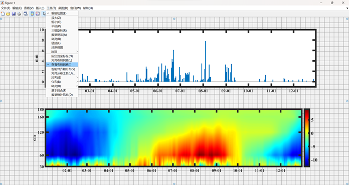
Step 2, click tools, check view layout grid
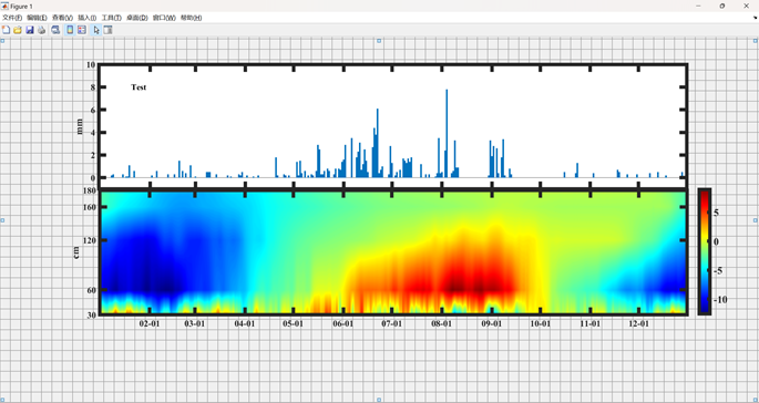
Step 3, click the profile graph border, when the mouse shows a cross arrow, hold the left mouse button to move the image, when it shows a straight arrow, hold the left mouse button to resize the image
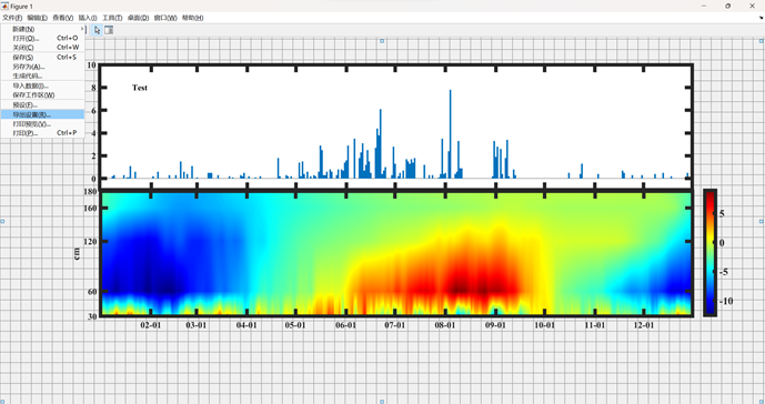
Step 4, click file, select export file
Step 5, click render, change the resolution to 600, and finally click export

Reference Image
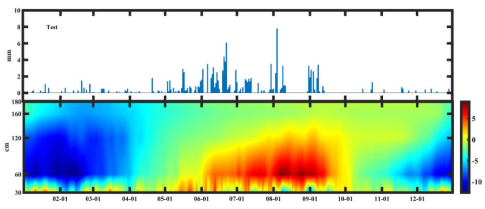
Complete Codeclear;clc% Precipitation Bar Graphsubplot(2,1,1)% Group graph 2 rows 1 column first graphx1=xlsread(<span>'Temperature Precipitation.xlsx'</span>,<span>'Date'</span>,<span>'A2:A366'</span>);% Read x-axis coordinatesy1=xlsread(<span>'Temperature Precipitation.xlsx'</span>,<span>'Precipitation'</span>,<span>'A2:A366'</span>);% Read y-axis coordinatesbar(x1,y1,1)% Draw bar graphylabel(<span>'mm'</span>)% y-axis labelaxis([0,365,-1,10]) % Set axis limitstext(20,8,<span>'Test'</span>,<span>'fontname'</span>,<span>'Times New Roman'</span>,<span>'fontsize'</span>,12,<span>'fontweight'</span>,<span>'bold'</span>)% Set title parameters<span>set</span>(gca,<span>'XTick'</span>,[ 32 60 91 121 152 182 213 244 274 305 335]) <span>set</span>(gca,<span>'xticklabel'</span>,{<span>'02-01'</span>,<span>'03-01'</span>,<span>'04-01'</span>,<span>'05-01'</span>,<span>'06-01'</span>,<span>'07-01'</span>,<span>'08-01'</span>,<span>'09-01'</span>,<span>'10-01'</span>,<span>'11-01'</span>,<span>'12-01'</span>})% x-axis ticks% The above two lines, the second line adds descriptions to the positions specified in the first line<span>set</span>(subplot(2,1,1),<span>'fontname'</span>,<span>'Times New Roman'</span>,<span>'fontsize'</span>,13,<span>'fontweight'</span>,<span>'bold'</span>,<span>'LineWidth'</span>,5)% Set graph frame parameters% Profile Graphsubplot(2,1,2)x = xlsread(<span>'Temperature Precipitation.xlsx'</span>,<span>'Date'</span>,<span>'A2:A366'</span>);% Read x-axis coordinatesxmax = max(x);xmin = min(x);y = [30 60 120 160 180];% Soil depth, i.e., y-axis coordinatesymax = max(y);ymin = min(y);z = xlsread(<span>'Temperature Precipitation.xlsx'</span>,<span>'Temperature'</span>,<span>'A2:E366'</span>);% Values at each (x,y) pointC=z<span>';N = 365; % Number of data points in each dimension[X,Y]=meshgrid(linspace(xmin,xmax,N),linspace(ymin,ymax,N));% Grid x,y two-dimensional spaceZ =griddata(x,y,C,X,Y,'</span>linear<span>');% Use interpolation to extend data, using '</span>linear<span>' methodcontourf(X,Y,Z,N, '</span>LineColor<span>','</span>none<span>');% Set contour plotcolormap('</span>jet<span>')% Set color mapcolorbar('</span>fontname<span>','</span>Times New Roman<span>','</span>FontSize<span>',15,'</span>LineWidth<span>',5)% Set color bar parametershold on ylabel('</span>cm<span>') % y-axis label descriptionset(gca,'</span>XTick<span>',[32 60 91 121 152 182 213 244 274 305 335]) set(gca,'</span>xticklabel<span>',{'</span>02-01<span>','</span>03-01<span>','</span>04-01<span>','</span>05-01<span>','</span>06-01<span>','</span>07-01<span>','</span>08-01<span>','</span>09-01<span>','</span>10-01<span>','</span>11-01<span>','</span>12-01<span>','</span>fontname<span>','</span>Times New Roman<span>','</span>fontsize<span>',20,'</span>fontweight<span>','</span>bold<span>'})% x-axis ticks and parametersset(gca,'</span>YTick<span>',[30 60 120 160 180]) set(gca,'</span>yticklabel<span>',{'</span>30<span>', '</span>60<span>', '</span>120<span>', '</span>160<span>', '</span>180<span>'})% y-axis ticks and parametersset(subplot(2,1,2),'</span>fontname<span>','</span>Times New Roman<span>','</span>fontsize<span>',13,'</span>fontweight<span>','</span>bold<span>','</span>LineWidth<span>',5)% Set graph frame parameters</span>
(Source: Mathematics China)