In recent years, a trend has emerged in automotive design where designers have been “streamlining” the interiors of vehicles. They have eliminated physical controls in favor of touchscreen designs. The main reason for this is to create a cleaner aesthetic and reduce costs.
However, when automotive companies do this, they do not fully leverage the potential of touchscreens. Instead, their approach mainly replicates the interface of tablets, directly converting physical buttons into touch buttons. As a result, the touch interfaces in cars can be difficult to use.
Automakers are fully committed to developing touchscreens
When looking around traffic, the number of people distracted by their phones and infotainment systems is staggering. The latter is a problem entirely created by the automotive companies themselves. I believe they have not done enough to take ownership and address this issue. A well-designed user experience can not only reduce accidents but also make users happier, which is a win-win situation!
In short, either touchscreens lag behind physical controls in usability and different solutions must be found, or there must be significant improvements in design. As part of my blog on automotive user experience design, I decided to explore whether it is possible to create a car experience that is usable without physical controls.
Some Design Principles
Based on the core issues of touchscreens, I proposed four abstract principles to help me address them.
1. “Simplify, then add brightness”
To describe the most important principle, I only need to look at the automotive world itself. The legendary race car designer Colin Chapman created the famous phrase: “Simplify, then add lightness.” His race cars were successful in the 1960s because they were highly specialized and completely adapted to their usage environment. The same principle is a decisive factor in good interfaces.
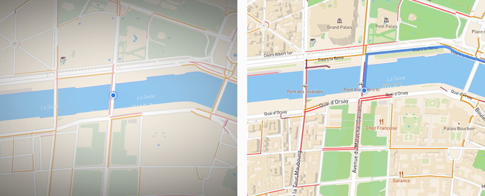
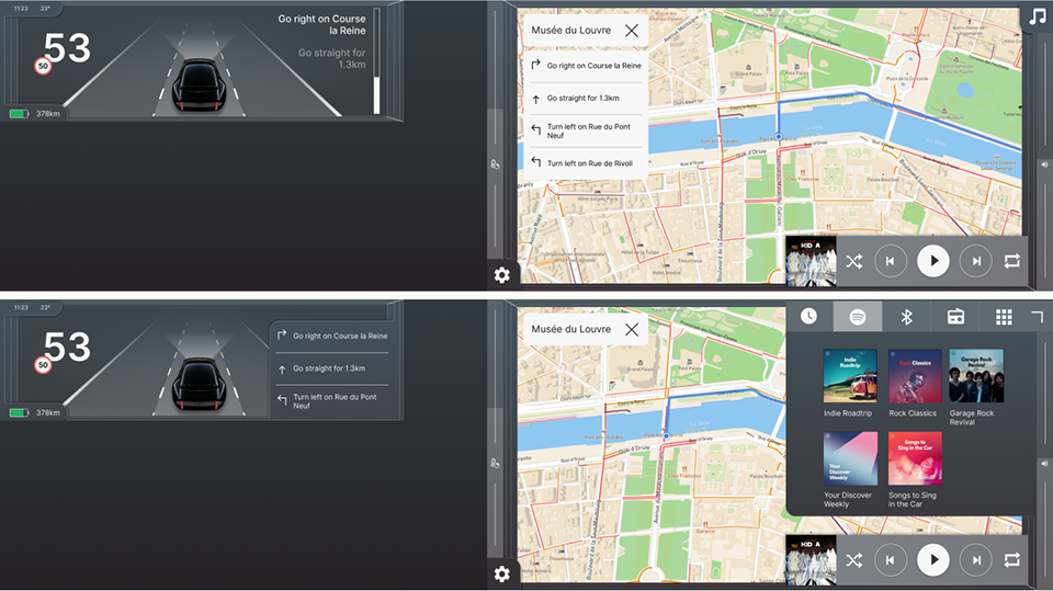
Comparing the interior features of the Volkswagen Golf I and Golf VIII, they are actually very similar. Both provide some information related to driving, climate control, and media control. The main difference is that the Golf VIII has a navigation system. So why is the Golf VIII so complex?
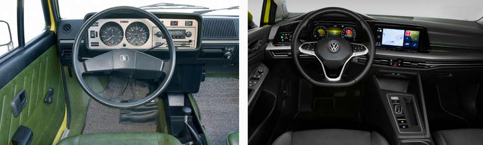
Golf I vs Golf VIII interior
One reason is that it offers hundreds of additional options, features, and settings that are not necessary. As digital interfaces grow larger, automotive companies see it as an opportunity to add more features. But just because you can add something doesn’t mean you should. What I intend to do is reassess all these features and remove those that do not significantly impact the driver experience, while simplifying those that do work, leading to the next principle.
2. Configuration vs Automation
Configuration vs Automation
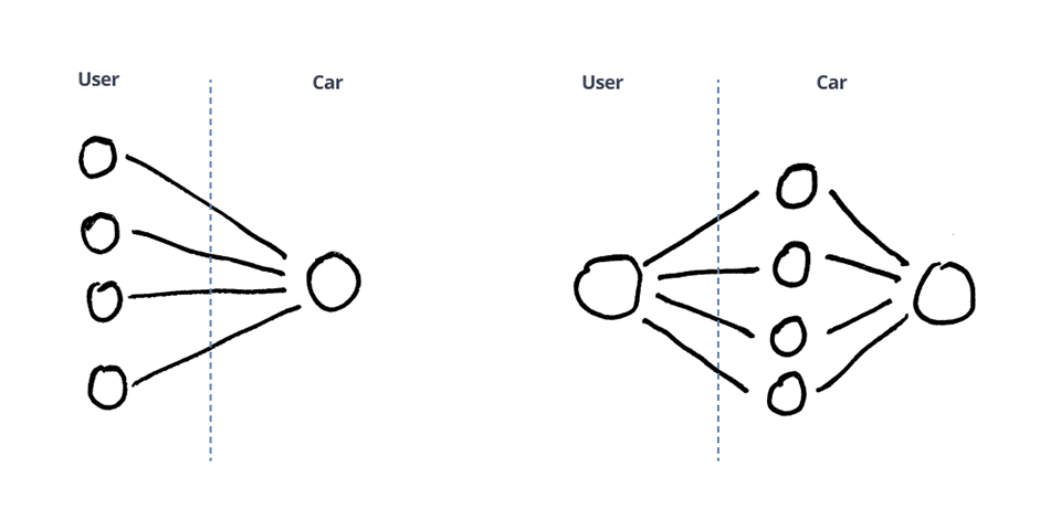
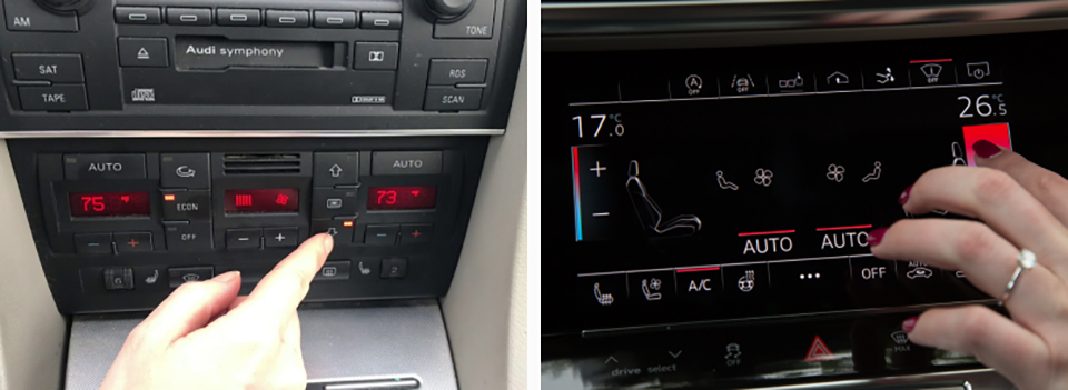
This rich choice is typical in the automotive industry. The more luxurious the car, the more personalized options there are, and modern automotive interfaces reflect this. Users can configure a large number of settings, widgets, backgrounds, colors, etc., in the interface, which also applies to other interactions like climate control.
Is it really luxurious to touch five different controls to get the desired temperature, or do users prefer this luxury? Consider the example below. Is luxury something that is not needed at all or does not interact with the system?
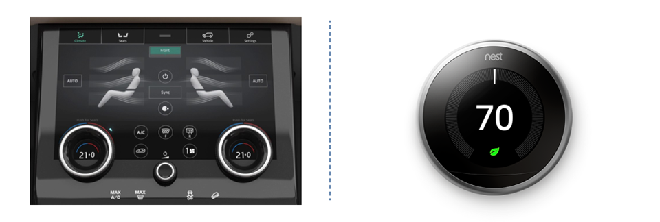
Climate control in the Range Rover Velar compared to the Nest Thermostat
3. Adapt to the Environment
Nowadays, most interfaces in cars are very similar to tablet interfaces. Tablets are devices used across a wide range of contexts. When you are watching Netflix on your couch at home or multitasking in a busy office environment, that interface must work well.
In a car, this is not the case; UX designers can ensure that the interface is used only in contexts related to driving. Therefore, they should design interfaces that fit that context, which is the difference between a Swiss Army knife and a chef’s knife. You can design the best Swiss Army knife in the world, but in the kitchen, a chef’s knife will always be better.
4. Hardware Follows Software
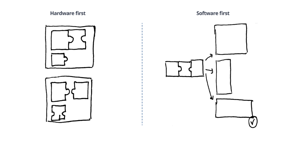
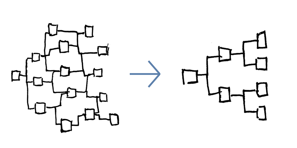
Designing car interiors is a complex process where different disciplines must collaborate and compromise. When considering screen layouts, it is important to balance aesthetics with usability. But what if you don’t have to worry about aesthetics and can focus entirely on usability?
For this project, that is exactly what I did. I first figured out the core functionalities of the interface. Then, I tested the usability of different screen layouts by creating 3D models and testing them in VR. I found that the horizontal screen layout closest to the driver’s line of sight was the best in terms of usability. With this in mind, I had no actual screen size limitations when designing the interface. I let the interface dictate the size of the hardware.
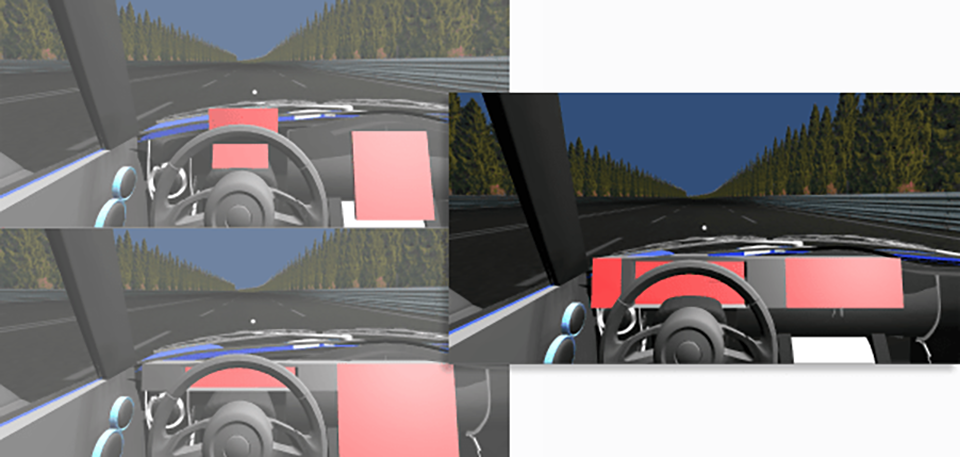
Three different screen layouts
Final Concept
I designed three different versions of this concept in total, seeking feedback from my network after each version to improve it. Below is the model of the final concept. If you are interested in the process behind this project, please check out the article I wrote!
Final concept model
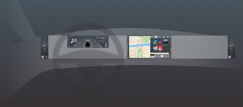
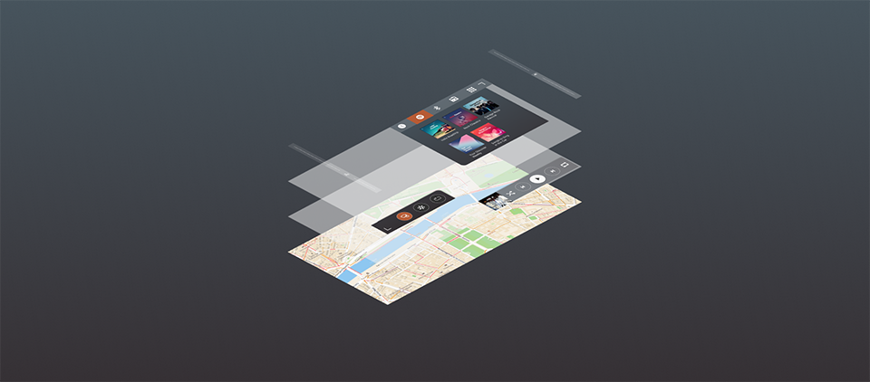
The interface is divided into different screens: the central screen, the dashboard screen, and the climate control screen. Let’s take a look at them!
Layers
The central screen is the most important, and I spent most of my time designing it.
Central screen
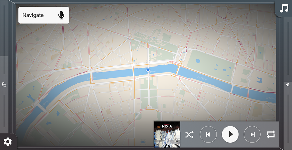
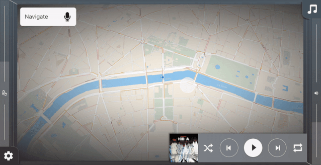
While driving, almost all interactions are related to navigation or media. Nowadays, interfaces often give equal importance to other functions like phone and settings. For simplicity, I chose to make the interface as simple as possible, removing everything except media, navigation, and some basic climate control.
They are organized in a layered manner based on navigation, with the most important being the media player, which is always visible. Above that are controls for climate and media, which can be opened by clicking the icons in the lower left and upper right corners of the screen, respectively.
Layered system
In situations where users are focused on driving, the time spent interacting with the screen should be minimized. This is why the positions of these elements are largely influenced by Fitts’ Law. It states that the time required to move quickly to a target area is a function of the distance to the target and the width of the target. In other words, to make navigation simpler, you can place clickable elements close to each other or make the clickable areas larger.

Main functions switch easily in the corners of the screen for quick access
Fitts’ Law also states that the fastest targets to access on any computer display are the four corners of the screen. Blindly reaching for a corner of the screen is much easier than reaching for an element placed in the middle of the screen. This is why climate and media can be accessed from each corner. Additionally, on each side of the screen, there are more specific sliders for volume and climate, which I will elaborate on later.
I made the informed choice to place climate control controls on the left half of the screen and media control controls on the right half. Most cars have some form of physical controls on the steering wheel for media and volume control. Therefore, it is more important to place climate controls near the driver rather than media.
Driving Modes
The interface changes in two different ways depending on the context: parked vs driving, short trips vs long trips.
Parked vs Driving
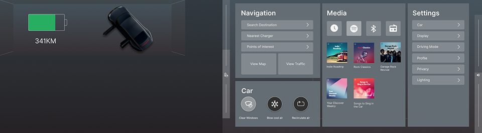
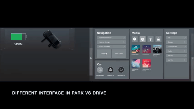
First, the interface when parked is different from the interface when driving. These two scenarios have two sets of different user needs. When parked, all settings and functions are accessible. More importantly, since distraction is not an issue, the system is very similar to a typical recognizable tablet interface with small labels and buttons.
Interface when the car is parked
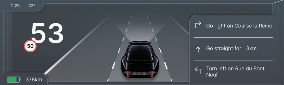
However, when the car is in motion, the interface changes. The driver is limited to functions related to driving, such as navigation and basic media controls. Labels and buttons are also clearer and larger, making them easier to reach. Since the system does not allow the driver (or passengers) to change any settings while driving, making choices becomes difficult. But in my view, this is a balance between user safety and freedom, and in this case, I chose safety.
Short vs Long Driving
The second contextual change is the distinction between short and long drives, with the main difference being the map design. Most users are not interested in many details on the map (like street names, buildings, etc.) when driving to and from work every day. The most important layer of information is traffic. This is why the map appears calmer and only shows streets with traffic information at the top. However, during navigation, the map displays building shapes, major street names, highlighted spaces, and other features.
Different map designs
Another distinction is the information displayed in the cluster, which I want to explore how the cluster screen can work more closely with the central screen to create a more comprehensive design. This is why the cluster screen displays information based on the configuration of the central screen. As a result, the driver can choose between a larger map with a smoother cluster and a media screen that displays directions.
Cluster and central screens working as a whole
Gesture Control
The most common complaint about touchscreens is that in “old-fashioned” cars, you could reach for important physical controls and interact with them while keeping your eyes on the road. With current touch controls, this is not possible, with volume control being the most commonly cited example.
This is a valid complaint, but it is not as bad as some people say. Most cars provide physical volume control buttons on the steering wheel, which means that in most cases, you can make small adjustments without taking your hands off the wheel.
However, in some cases, this button interaction does not apply to the action you want to perform. The same type of interaction as the buttons on the steering wheel does not help on a touchscreen. Fortunately, touchscreens allow for new interaction methods. After all, these screens run on the software we write, and we can use them almost however we want. But unfortunately, automotive companies have started to mimic physical buttons on touchscreens.
Automakers directly copy physical controls as digital controls
For most physical volume controls, the use of rotary controls is because they allow users to change values in small and large increments based on the distance of the rotation.
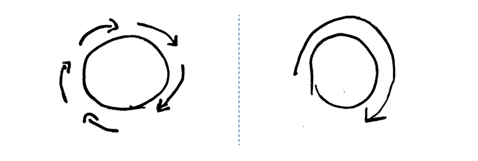
Two ways to interact with rotary controls
Therefore, when designing similar controls for touchscreens, two requirements are: the controls should be reachable blindly, and they should allow adjustments in both large and small increments.
When you reach for a control blindly, you first move your hand in the general direction of the control and then use your sense of touch to reach it. Over time, you build muscle memory that makes the second step faster. This is not possible on touchscreens because they are flat.
However, they do have edges that you can find with your sense of touch. This is why I placed this type of control on the sides of the screen. I used the previous concept of gesture interaction as inspiration. By sliding your finger up and down, you can control basic functions like volume. Slow sliding for small steps, fast sliding for large steps.
Gesture interaction with volume control
To simplify operations, once you touch the slider area, a large lateral error range is allowed. Additionally, you can start interacting at any vertical point on the slider, meaning you do not need to aim very precisely.
Climate Control
As mentioned earlier, the principle of automation vs configuration applies best to climate control. Climate control is interesting because it is fundamentally the same in every car but is indeed quite complex. Most people have only a basic understanding of how to operate them. If you ask five people what the best way to defog the windows is, you might get five different answers (I have tried).
Of course, there is a simpler way to design them. If you step back and list the basic goals users have when interacting with climate control systems, it mainly boils down to one: changing the temperature of the car. There are many different ways to achieve this, but cars are now smart enough to solve this problem for users.
This is why, in this concept, users only set the temperature. Both the driver and passenger have their own displays where they can set the temperature, switch seat and steering wheel heating.
Nowadays, it is common to touch the air conditioning to make the car reach the desired cool temperature faster. For example, when your car is parked in the sun on a hot day. One argument is that with such an automated system, even when the car is parked, it can control the temperature, ensuring it is always correct.
However, automated systems like this are never perfect, so there should be a way to override or push this system in a different direction. This is why there is a second control, which is the time to reach the target temperature. For this, gesture control is used; when you enter a hot parked car, you want the car to cool down as quickly as possible when you get in. That is, when you use gesture input to set the preferred time to reach the target temperature.
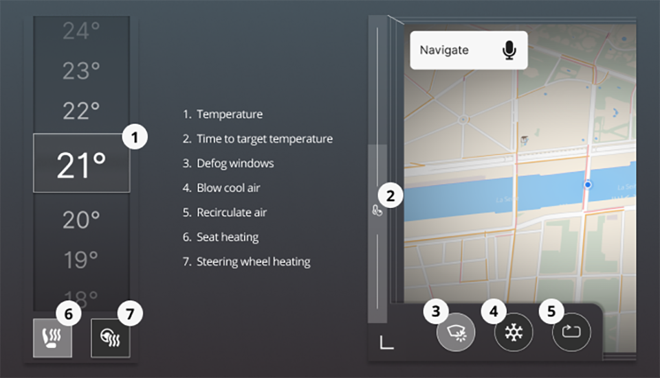
Overview of climate control
The temperature interface and gesture interaction should cover basic interactions that should always be within reach. Additionally, there are three buttons in the lower left corner for less common use cases. The first is the “transparent window” function, which will use various climate control methods to defog the windows in the car. The second function is the cool air function, which can blow cool air into the cabin in a short time. This is added for the use case of blowing cool air on your face for comfort. The last one is the standard recirculation air button used in most cars.
One reason climate control in cars is so similar is that it is easier for users to use some form of standardized control. There is a viewpoint that if controls are easy to operate, then standardization is not that important. However, teaching users a different system is difficult, and in my concept, when the car is parked, the controllers have descriptive labels. But users must test to understand how they interpret this.
Overview of the entire interface
Cluster screen example
Example of the central screen during navigation
Central screen when not navigating


 Scan the QR codeJoin the discussion group