Eye Movement Data Preprocessing and Visualization Using the Python PupEyes Library

Eye Movement Data Preprocessing and Visualization Using the Python PupEyes Library

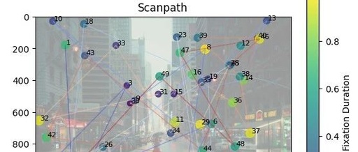
Hello everyone, this is Brain Technology. The content today is sourced from the internet and is for learning reference only. Since establishing the WeChat subscription account (BrainTechnology and Brain Technology), I have written a lot of practical tutorials. I suddenly realized that if my tutorials help friends with experimental analysis in the future, I hope … Read more

The Three Musketeers of Scientific Computing in Python: Collaboration of NumPy, Pandas, and Matplotlib

The Three Musketeers of Scientific Computing in Python: Collaboration of NumPy, Pandas, and Matplotlib

——A one-stop process for data cleaning, feature engineering, and visualization In the era of data explosion, whether in academic research, financial analysis, or business decision-making, efficient data processing capabilities have become a core competitive advantage. The three libraries in the Python ecosystem—NumPy, Pandas, and Matplotlib—have become the “golden combination” for data scientists and engineers due … Read more

Data Visualization with Python: A Case Study Using Pyecharts

Data Visualization with Python: A Case Study Using Pyecharts

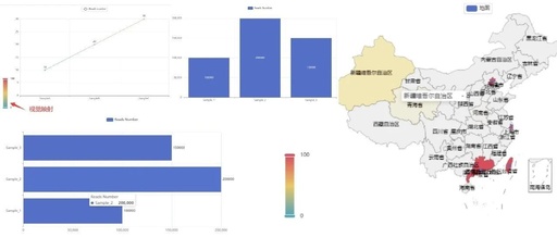
Introduction ECharts is an open-source pure JavaScript charting library developed by Baidu, currently comparable to Highcharts. It supports 12 types of charts including line charts (area charts), bar charts (column charts), scatter plots (bubble charts), candlestick charts, pie charts (doughnut charts), radar charts (filled radar charts), chord diagrams, force-directed layout charts, maps, dashboards, funnel charts, … Read more

Mathematical Modeling | MATLAB Bar Graph Profile Combination

Mathematical Modeling | MATLAB Bar Graph Profile Combination

MATLAB Bar Graph Profile Combination Graph Precipitation Bar Graphclear;clc% Precipitation Bar Graphsubplot(2,1,1)% Group graph 2 rows 1 column first graphx1=xlsread(<span>'Temperature Precipitation.xlsx'</span>,<span>'Date'</span>,<span>'A2:A366'</span>);% Read x-axis coordinatesy1=xlsread(<span>'Temperature Precipitation.xlsx'</span>,<span>'Precipitation'</span>,<span>'A2:A366'</span>);% Read y-axis coordinatesbar(x1,y1,1)% Draw bar graphylabel(<span>'mm'</span>)% y-axis labelaxis([0,365,-1,10]) % Set axis limitstext(20,8,<span>'Test'</span>,<span>'fontname'</span>,<span>'Times New Roman'</span>,<span>'fontsize'</span>,12,<span>'fontweight'</span>,<span>'bold'</span>)% Set title parameters<span>set</span>(gca,<span>'XTick'</span>,[ 32 60 91 121 152 182 213 244 274 305 335]) <span>set</span>(gca,<span>'xticklabel'</span>,{<span>'02-01'</span>,<span>'03-01'</span>,<span>'04-01'</span>,<span>'05-01'</span>,<span>'06-01'</span>,<span>'07-01'</span>,<span>'08-01'</span>,<span>'09-01'</span>,<span>'10-01'</span>,<span>'11-01'</span>,<span>'12-01'</span>})% x-axis … Read more

Advanced Matlab Plotting Issue 89 – Single Group Bar Chart with Significance Markers

Advanced Matlab Plotting Issue 89 - Single Group Bar Chart with Significance Markers

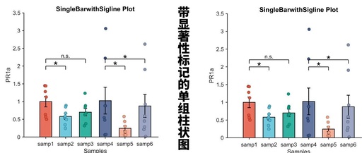
In previous articles, we shared methods for creating single group bar charts (Matlab Paper Illustration Drawing Template – Bar Chart (Single Group Multi-color)): Single group bar chart with error bars (Matlab Paper Illustration Drawing Template Issue 70 – Bar Chart with Error Bars): Bar chart with jitter points (Advanced Matlab Plotting Issue 88 – Bar … Read more

MATLAB Plotting Tips and Tricks

MATLAB Plotting Tips and Tricks

Click the blue text to follow us // MATLAB Plotting Tips Images are a visual representation of results, which can intuitively reflect your results and demonstrate the accuracy of your findings. In today’s big data era, visualizing data during analysis can provide a multidimensional display, allowing people to better discover and remember the characteristics of … Read more

Core Steps for Python Visualization

Core Steps for Python Visualization

In regular research, the three steps to achieve visualization using Python are: Identify the problem and choose the graph Transform the data and apply functions Set parameters to make it clear 1. First, which libraries do we use for plotting?matplotlibis the most basic plotting library in Python, and it is generally the starting point for … Read more

Detailed Explanation of Matlab Fitting

Detailed Explanation of Matlab Fitting

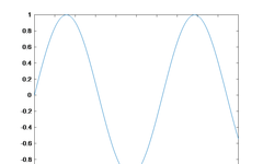
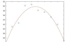
Polynomial Fitting clear x=1:1:10;y=-0.9*x.^2+10*x+20+rand(1,10).*5; % Generate test data plot(x,y,‘o’) % Plot and mark the original data points p=polyfit(x,y,2) p = 1×3 -0.7630 8.5343 25.9050 xi=1:0.5:10; yi=polyval(p,xi); % Calculate the fitting result hold onplot(xi,yi); % Draw the fitting result graph hold off clear x = linspace(0,4*pi,10)'; y = sin(x); p = polyfit(x,y,7); x1 = linspace(0,4*pi); y1 … Read more

HoloViews: A Python Window for Dynamic Data Visualization!

HoloViews: A Python Window for Dynamic Data Visualization!

HoloViews: A Python Window for Dynamic Data Visualization! Hello everyone! Today we are going to learn about a very powerful tool – HoloViews. Imagine if you want to create dynamic and interactive visualizations, but without being bogged down by complex plotting libraries, HoloViews is the perfect choice! HoloViews is a Python library for building complex … Read more

Essential MATLAB Knowledge and Its Application in Mathematical Modeling

Essential MATLAB Knowledge and Its Application in Mathematical Modeling

Hello! This is your 166th encounter with the “University Student Research Competition”. Recommended reading: Essential tools for mathematical modeling? Just how powerful is MATLAB? It’s time for the Mathematical Contest in Modeling (MCM) column again. Today, I am excited to present examples of real test applications of MATLAB in mathematical modeling competitions, which will give … Read more