Summary: Legend and colorbar
1. Legend Common parameters for the Legend command
The importance of legends in mature scientific charts is self-evident. A picture is worth a thousand words; in the field of meteorological research, charts are powerful tools for data visualization, and legends are key to helping readers understand chart information. The plotting library matplotlib has a dedicated command—Legend—for setting this up. Below are the commonly used keyword parameters.
| loc | Sets the position of the legend, generally inside the chart |
| fontsize | Font size |
| markerscale | Relative size of the legend marker compared to the original marker |
| markerfirst | Legend marker on the left side of the label, controlled by a boolean value |
| numpoints | Number of markers in the legend |
| frameon | Legend border, controlled by a boolean value |
| fancybox | Whether the border has rounded corners |
| shadow | Border shadow |
| framealpha | Border transparency |
| edgecolor | Border edge color |
| facecolor | Fill color inside the border |
| ncol | Number of columns in the legend, int value |
| borderpad | Padding inside the border |
| labelspacing | Vertical spacing between legend entries |
| handlelength | Length of the legend handle |
| handleheight | Height of the legend handle |
| handletextpad | Spacing between the legend and the handle |
| columnspacing | Spacing between columns |
| title | Legend title |
| bbox_to_anchor | Specifies the position of the legend on the axes |
Previously, we created a soil moisture map, and this time we will use this map to demonstrate the legend command.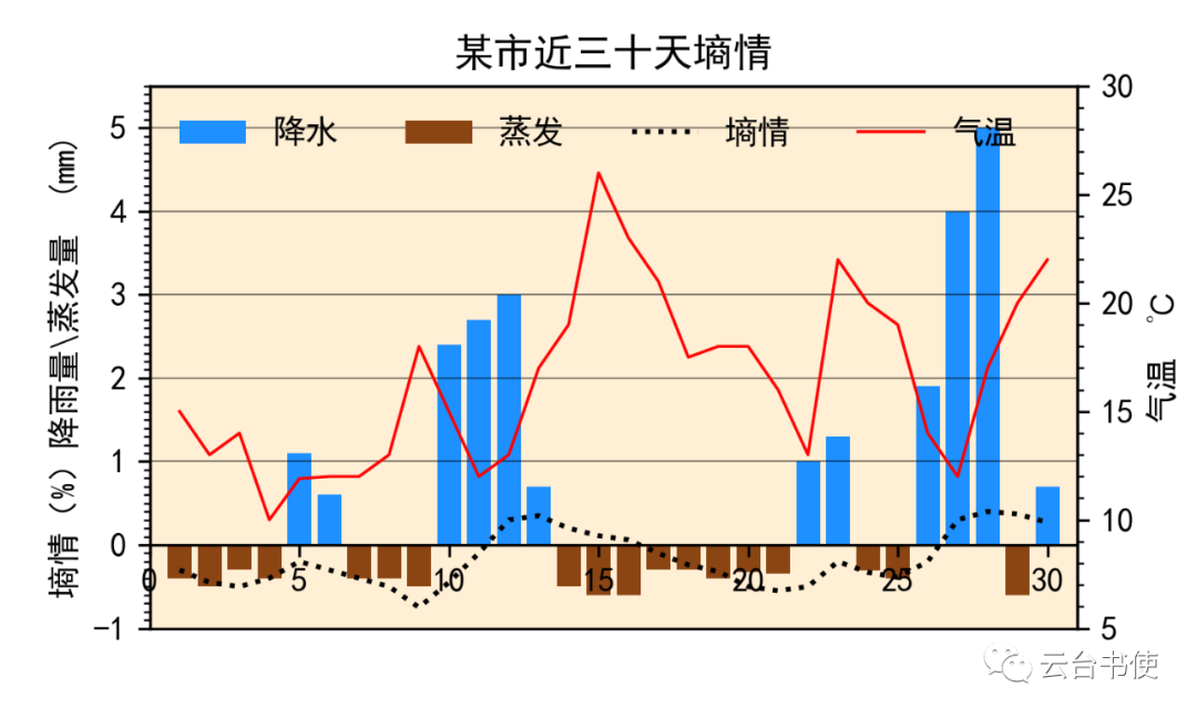
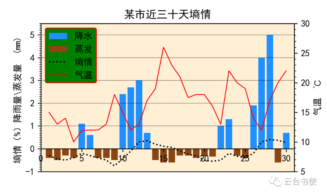 Comparing the two images, we modified ncol to one column, changed edgecolor to red, changed facecolor to green, and set framealpha to 1, and fancybox to rounded corners.Other parameter commands can be experimented with by the reader; it is very convenient to experiment in Jupyter Notebook.2. Adjusting the position of the Legend—loc and bbox_to_anchorThe Legend has two commands to adjust its position, each used differently.loc is the most commonly used position command, with two usage methods: one is using numbers 0-10, and the other is using character commands like ‘best’, ‘right’, ‘center’, ‘upper right’, etc. This legend position is inside the subplot, which may obscure the graphics.Thus, there is the bbox_to_anchor command, which is similar to the previously recommended add_axes command, specifying the absolute position of the legend. Let’s demonstrate this with the previous image:
ax2.legend((bar1,bar2,line1,line2),('Precipitation','Evaporation','Soil Moisture','Temperature'),frameon=True,framealpha=1,ncol=1,shadow=True,bbox_to_anchor=(0,0))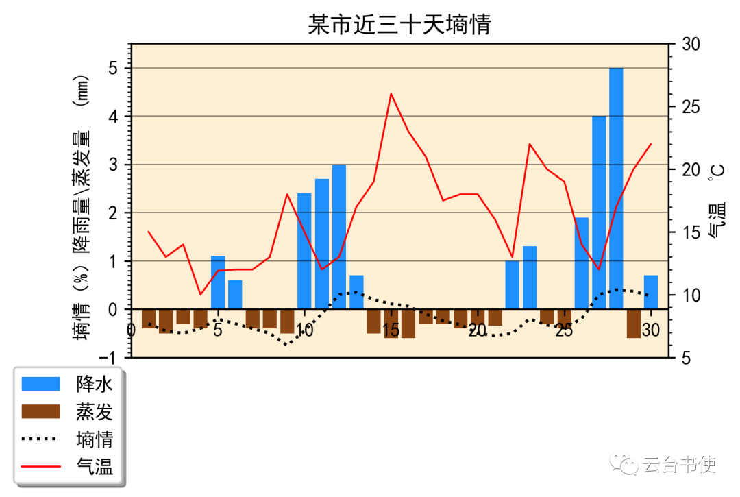 As can be seen, after setting the absolute position to bbox_to_anchor=(0,0), the legend can be placed outside the subplot. Similarly, it can be placed in common legend positions:
ax2.legend((bar1,bar2,line1,line2),('Precipitation','Evaporation','Soil Moisture','Temperature'),frameon=True,framealpha=1,ncol=1,shadow=True,bbox_to_anchor=(1.1,0.9))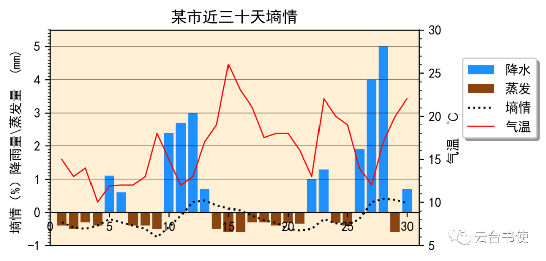 Note that the two commands are not in conflict and can be used in the same statement without error.It is also possible to perform the following operation, bbox_to_anchor=(x1,y1,x2,y2), giving the starting absolute position and ending absolute position of the legend box:
ax2.legend((bar1,bar2,line1,line2),('Precipitation','Evaporation','Soil Moisture','Temperature'),bbox_to_anchor=(0,-0.1,1.,-0.10),frameon=True,framealpha=1,ncol=2,shadow=True,mode="expand", borderaxespad=0.) Under the mode=’expand’ command, after specifying the starting and ending positions, the legend box will be stretched to the maximum. I have not used this yet, but it may be useful for some readers.3. Classification operations for legends, etc.Previously, we annotated each legend with labels, and when needed, we can also perform classification operations.Most of the time, we create an experimental chart using the simplest method (setting label= during plotting, and legend will be generated automatically):
line1=plt.plot(x,y1,lw=2,ls="-",color='cyan',label='line1')line2=plt.plot(x,y2,lw=2,ls='--',color='k',label='line2')line3=plt.plot(x,y3,lw=2,ls=':',color='lightgreen',label='line3')scatter1=plt.scatter(x2,y4,c='orange',s=15,marker='*',label='scatter1')scatter2=plt.scatter(x2,y5,c='darkgray',s=19,marker='1',label='scatter2')scatter3=plt.scatter(x2,y6,c='darkturquoise',s=19,marker='h',label='scatter3')plt.title('This is the main title')plt.legend(title='This is the legend title',bbox_to_anchor=(1,0.9),frameon=False,framealpha=0.75) This method of creating legends does not allow for classification operations, so we establish legends using plt.legend(list1, list2), where list1 represents the plotting commands and list2 contains strings as names:
plt.legend([line1,line2,line3,scatter1,scatter2,scatter3],['line1','line2','line3','scatter1','scatter2','scatter3'])Then classify through parentheses:
plt.legend([(line1,line2,line3),scatter1,scatter2,scatter3],['This is the combined line','scatter1','scatter2','scatter3']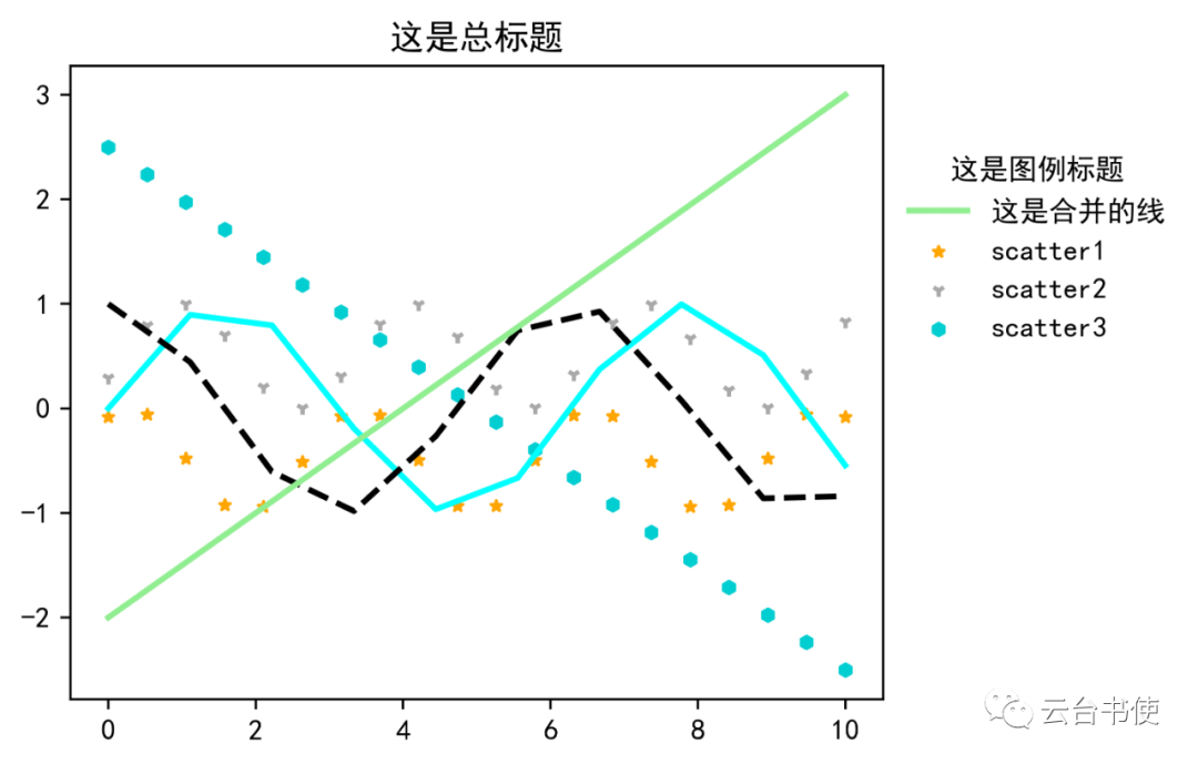 It can be seen that although combined, the combined legend only shows one green line. At this point, we need to introduce a new module:
from matplotlib.legend_handler import HandlerLine2D, HandlerTupleplt.legend([(line1,line2,line3),scatter1,scatter2,scatter3],['This is the combined line','scatter1','scatter2','scatter3'], handler_map={tuple: HandlerTuple(ndivide=None)},numpoints=1, title='This is the legend title',bbox_to_anchor=(1,0.9),frameon=False,framealpha=0.75)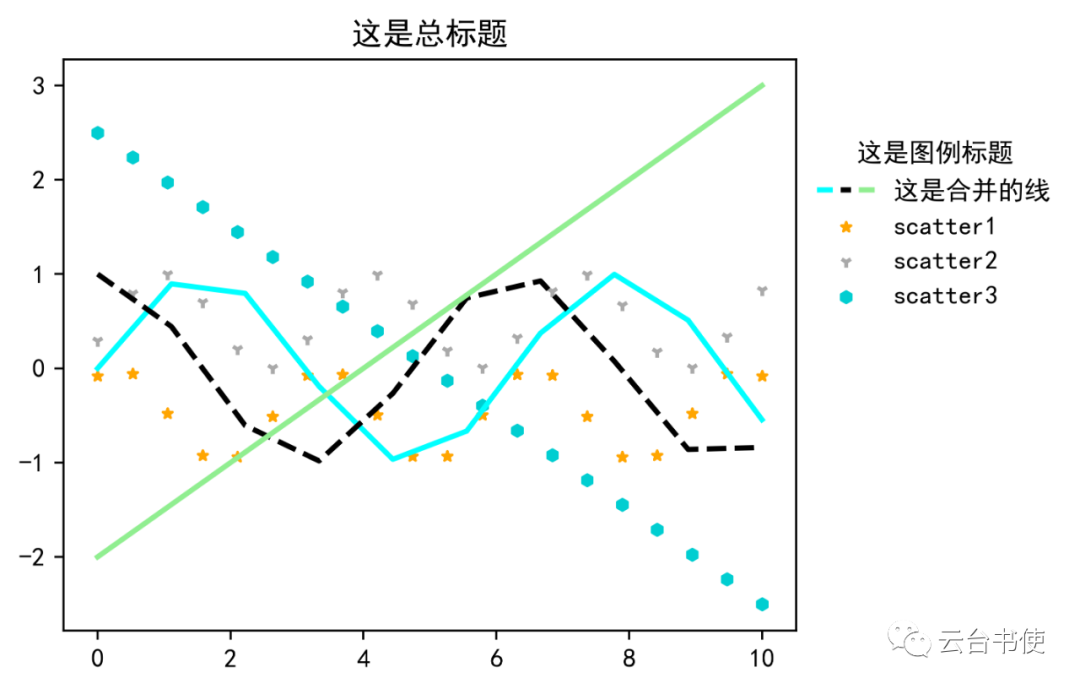 After this, the combined legend can be displayed normally. Of course, scatter plots can also be classified:
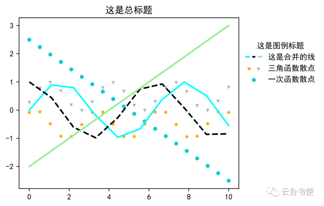 Other plotting styles can also be grouped in the legend:
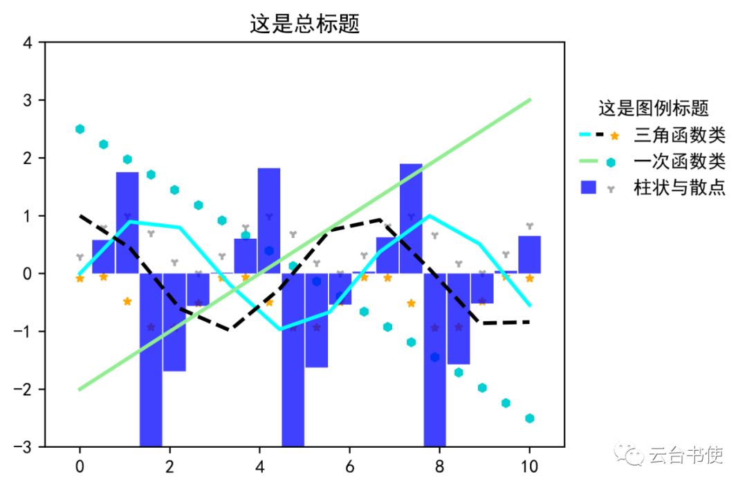 4. How to draw multiple legendsIn matplotlib, due to the nature of the legend command, whether plt.legend or ax.legend, only one legend can be added to the chart. Generally, only the last legend command will be drawn, and the previous ones will be overwritten. For example:ax.legend(xxx)ax.legend(ooo)ax.legend(***)Among these three commands, only the last one (***) will appear as the legend. However, there are cases in scientific charts where multiple legends are needed. If it is indeed necessary to draw, it can be added using the ax.add_artist() command. Still using the previous small section’s chart as an example. First, we will draw all lines using the ax.legend() command:
ax.legend([line1,line2,line3],['Line 1','Line 2','Line 3'],numpoints=1,title='Legend One',bbox_to_anchor=(1,0.9),frameon=False,framealpha=0.75)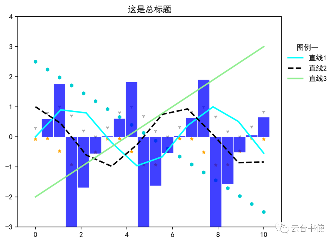 Then, import the from matplotlib.legend import Legend module, and add other scatter points and histograms under the Legend command. The internal keyword parameters of Legend() are consistent with those of ax.legend(). Finally, add it to the subplot using ax.add_artist():
from matplotlib.legend import Legendlegend2=Legend(ax,[scatter1,scatter2,scatter3,bar1],['Scatter 1','Scatter 2','Scatter 3','Histogram 1'],title='Legend Two',frameon=False,bbox_to_anchor=(1,0.3))ax.add_artist(legend2)This way, a legend can be added: Of course, you can add three or even more legends; readers can try it out themselves.5. Adding legends for multiple variables in scatter plotsIn previous posts, two methods of using scatter plots were introduced: one is to use s as a variable, fixing the color, and displaying data through the size of the scatter point; the other is to use color mapping as a variable, fixing s, and displaying data through color changes. These two are the simplest usage methods. Further, scatter plots can also set both as variables to show data changes.This section is based on a question from a friend in the group.First, read in the data:
filename=r'C:\Users\lenovo\Desktop\Annual Precipitation Data.xlsx'df=pd.read_excel(filename)lon=df['lon']# Read in station longitudelat=df['lat']# Read in station latituderain_days=df['rain_days']# Read in the number of rainy days for each station in a certain yearrains=df['precipitation']# Read in the total precipitation for each station in a certain yearrain_size=(rain_days-10)**2# Process the total number of rainy days to make scatter point sizes uniformThen draw the scatter plot (adding the map and station names through def create_map(): is omitted here):
sca=ax.scatter(lon,lat,s=rain_size,c=rains,cmap='GnBu',alpha=0.75,edgecolor='k',label='none')Pass the processed total number of rainy days to s, and the total precipitation to color, setting cmap to ‘GnBu’.Note that it is best to change alpha to less than 1, because scatter points may overlap; if the scatter points are not transparent, small scatter points may be completely covered by large scatter points. Setting edgecolor to black is visually the best.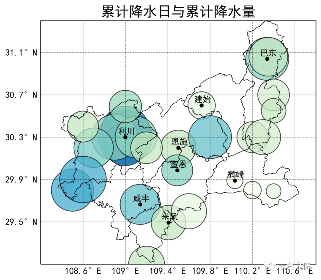 Of course, currently, there is a lack of important auxiliary legends; besides the cartographer, no one knows what this chart expresses. Therefore, next, we will introduce two methods to add auxiliary reading tools.A. Adding a legend to indicate the meaning of circle sizes and adding a colorbar to indicate the meaning of the fill colorFirst, pass sca to the colorbar command to generate the color bar:
position=fig.add_axes([0.1,0.2,0.8,0.01])b=plt.colorbar(ax=sca,cax=position,extend='both',orientation='horizontal',shrink=0.3,label='Total Precipitation $mm$',pad=0.1)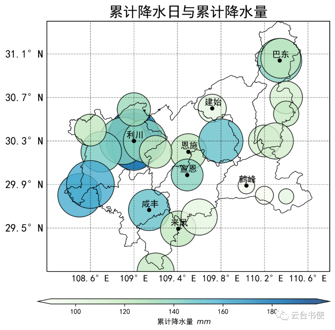 This way, the meaning of the fill color can be displayed, allowing readers to understand that the fill color represents total precipitation. Then, generate the legend with the following command:
marker1=ax.scatter([],[],s=rain_size.min(),c='k',alpha=0.3)marker2=ax.scatter([],[],s=rain_size.max()/2,c='k',alpha=0.3)marker3=ax.scatter([],[],s=rain_size.max(),c='k',alpha=0.3)legend_markers=[marker1,marker2,marker3]labels=['30 days','60 days','90 days']ax.legend(title='Total Rainy Days',handles=legend_markers, labels=labels,scatterpoints=1,frameon=False, labelspacing=0.39,handletextpad=3, bbox_to_anchor=(0.3,0.93))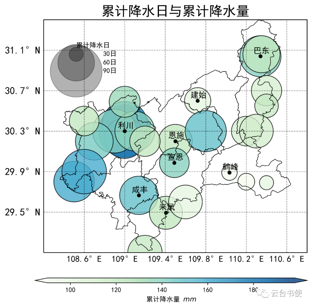 The first three lines generate three circles; since they are generated through two empty lists, they will not display on the main chart, but can be passed to ax.legend() through the handles command. You can understand this as equivalent to (for ease of understanding):ax.legend([line1,line2,line3],[‘Line 1′,’Line 2′,’Line 3’])where the first part is the legend, and the second part is the label.B. Using two legends to separately display scatter point diameter and scatter point colorThe previous program is completely the same as in A; in the fourth section, it has been explained how to create multiple subplots, so we will use it immediately. This time, we will not use a colorbar to display color changes, but use colored scatter points:
from matplotlib.lines import Line2Dcmap=plt.get_cmap('GnBu')levels=[40,60,80,100,120,140,160,180]ls = [Line2D(range(1), range(1), linewidth=0, color=cmap(v), marker='o', ms=(10)) for v in levels]ax.legend(ls,levels,frameon=False,bbox_to_anchor=(1.02,0.5),title='Total Precipitation ($mm$)')The first step is to get cmap, which is consistent with the main chart’s cmap. The second step is to divide the precipitation levels. The third step generates our colored dots, which are actually plot lines with markers, but we set their linewidth to 0, and the lines are cut off. The fourth step is to pass it to the legend command.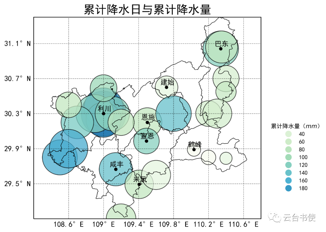 Next, using the method mentioned earlier to add a second legend, we will add the scatter point diameter legend:
marker1=ax.scatter([],[],s=rain_size.min(),c='k',alpha=0.3)marker2=ax.scatter([],[],s=rain_size.max()/2,c='k',alpha=0.3)marker3=ax.scatter([],[],s=rain_size.max(),c='k',alpha=0.3)legend_markers=[marker1,marker2,marker3]labels=['30 days','60 days','90 days']legend2=Legend(ax,title='Total Rainy Days',handles=legend_markers, labels=labels,scatterpoints=1,frameon=False, labelspacing=0.39,handletextpad=3, bbox_to_anchor=(1.1,0.98))ax.add_artist(legend2)The first part is consistent with the one in method A, but since we have already drawn a legend using ax.legend(), we can only add a new legend using ax.add_artist(legend2).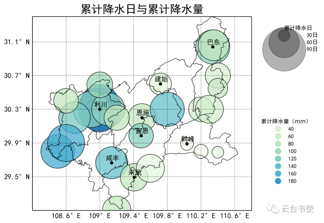 What can be seen from this chart? It can be seen that the high-value areas for the number of rainy days and precipitation in Enshi Prefecture are concentrated in Lichuan City, while Hefeng has fewer days and less precipitation. Looking at Xuan’en County and Enshi City, Xuan’en has fewer rainy days, but the precipitation is higher than that of Enshi City.