One of the reasons for Python’s popularity is its rich computational ecosystem. According to incomplete statistics, there are currently over 130,000 third-party libraries available for Python.
This series will gradually organize and share some interesting and useful third-party libraries.
The code accompanying this article can be obtained in the following two ways:
- Access via Baidu Cloud:
Link: https://pan.baidu.com/s/1FSGLd7aI_UQlCQuovVHc_Q?pwd=mnsj Extraction Code: mnsj- Visit GitHub to obtain:
https://github.com/returu/Python_Ecosystem01Introduction:Pygal is a third-party library for generating SVG (Scalable Vector Graphics) charts in Python. SVG images can be opened in any browser that supports SVG, and they can be scaled infinitely without losing image quality, making Pygal very suitable for creating interactive and responsive visual charts.Pygal supports various types of charts, including but not limited to:
- Bar charts;
- Line charts;
- Pie charts;
- Radar charts;
- Scatter plots;
- Box plots;
- Gauge charts;
- Maps.
Install directly using pip:
pip install pygalGitHub page:
https://github.com/Kozea/pygal02Usage:
- 1. Basic usage:
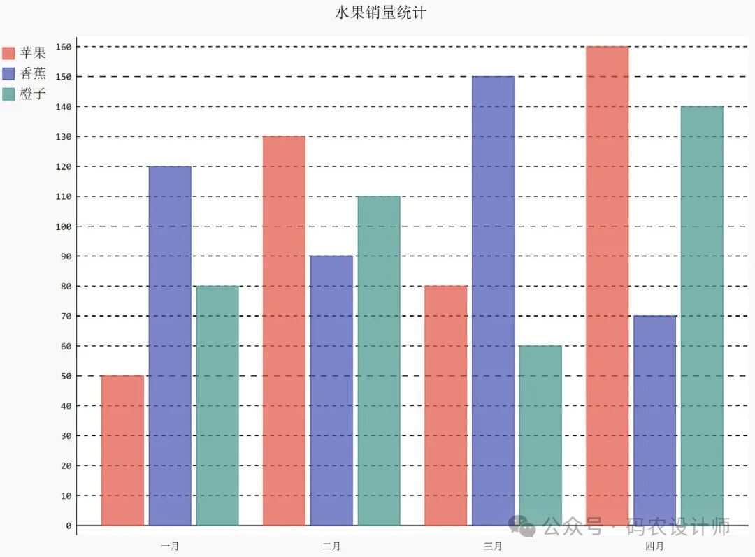
Below is a simple example demonstrating how to create a basic bar chart using Pygal:
import pygal

# Create a bar chart object
bar_chart = pygal.Bar()

# Set the title of the chart
bar_chart.title = 'Fruit Sales Statistics'

# Add data
bar_chart.add('Apples', [50, 130, 80, 160])
bar_chart.add('Bananas', [120, 90, 150, 70])
bar_chart.add('Oranges', [80, 110, 60, 140])

# Set x-axis labels
bar_chart.x_labels = ['January', 'February', 'March', 'April']

# Render the chart to an SVG file
bar_chart.render_to_file('fruit_sales.svg')
The generated chart looks like:
- 2. Output formats:
Pygal can generate various output formats.
- SVG:
The most direct output is in vector format as SVG. If you specify is_unicode=True or use disable_xml_declaration, it can be rendered as a Unicode string.
chart = pygal.Line()
...
# chart.render()  # Returns SVG content as a byte stream
chart.render(is_unicode=True) # Returns SVG content as a Unicode string- File:
You can use render_to_file to write the chart to a file:
chart = pygal.Line()
...
chart.render_to_file('/tmp/chart.svg') # Write the chart to the specified file-
PNG:
If you have cairosvg installed, you can directly use render_to_png to obtain a PNG file. If the rendered PNG image appears black, installing lxml, tinycss, and cssselect should resolve the issue.
chart = pygal.Line()
...
chart.render_to_png('/tmp/chart.png') # Write the chart to the specified file-
Base64 Data URI:
You can directly output a Base64 encoded data URI for embedding in <embed> or <image> tags.
chart = pygal.Line()
...
chart.render_data_uri() # Returns `data:image/svg+xml;charset=utf-8;base64,...`- Browser:
If you have lxml installed, you can use render_in_browser to automatically open the chart in the default browser.
chart = pygal.Line()
...
chart.render_in_browser()
PyQuery:
If you have pyquery installed, you can obtain a wrapped chart pyquery object by calling render_pyquery (mainly for testing).
chart = pygal.Line()
...
chart.render_pyquery() # Returns pyquery object- Integration with Web Frameworks:
Pygal can seamlessly integrate with web frameworks like Flask and Django, making it easy to embed charts into web pages.
For example, you can use the render_response method in a Flask application with Pygal.
@app.route('/charts/line.svg')
def line_route():
    chart = pygal.Line()
    ...
return chart.render_response()-
3. Chart Styles:
When using the pygal library to draw charts, you can design chart styles in three different ways: built-in styles, parametric styles, and custom styles.
- Built-in Styles:
The pygal library provides several predefined built-in styles (14 types) that can be used to quickly set the appearance of charts. These built-in styles have been carefully designed to meet some common visual needs.
import pygal
from pygal.style import DarkStyle

# Create a bar chart and use the DarkStyle built-in style
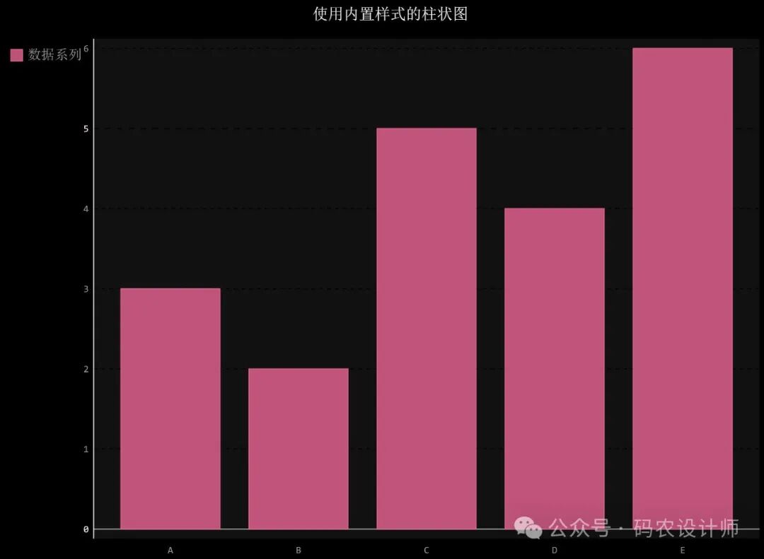
bar_chart = pygal.Bar(style=DarkStyle)
bar_chart.title = 'Bar Chart with Built-in Style'
bar_chart.add('Data Series', [3, 2, 5, 4, 6])
bar_chart.x_labels = ['A', 'B', 'C', 'D', 'E']

# Render the chart to an SVG file
bar_chart.render_to_file('DarkStyle.svg')
The generated chart looks like:
-
Parametric Styles:
Pygal provides 5 types of parametric styles: Rotate, Lighten, Darken, Saturate, and Desaturate.
Usage:
-
Parametric styles are initialized with a default color, and other colors will be generated based on this color;
-
Set the step parameter to specify how many colors the color modifier applies to;
-
By setting the max_ parameter, you can limit the extent of color changes. For all color operations, the unit of max_ is percentage, except for rotate (which is in degrees);
-
You can specify that the style inherits all styles from another theme.
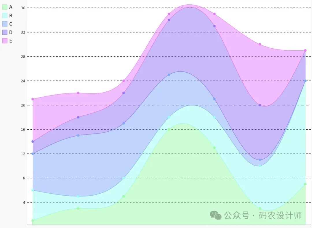
For example, create a stacked line chart with a custom rotating hue style.
# RotateStyle is used to create a style with rotating hues, generating a series of related colors based on the specified base color
# LightColorizedStyle is a light-colored base style that can serve as the basis for other styles
from pygal.style import RotateStyle, LightColorizedStyle

# Create a rotating hue style object dark_rotate_style
# '#75ff98' is the specified base color, RotateStyle will generate a series of related colors based on this color
# base_style=LightColorizedStyle indicates that LightColorizedStyle is used as the base style for color rotation
dark_rotate_style = RotateStyle('#75ff98', base_style=LightColorizedStyle)

# Create a stacked line chart object and add data series to the chart
chart = pygal.StackedLine(fill=True, interpolate='cubic', style=dark_rotate_style)
chart.add('A', [1, 3, 5, 16, 13, 3, 7])
chart.add('B', [5, 2, 3, 2, 5, 7, 17])
chart.add('C', [6, 10, 9, 7, 3, 1, 0])
chart.add('D', [2, 3, 5, 9, 12, 9, 5])
chart.add('E', [7, 4, 2, 1, 2, 10, 0])
# Render the chart to an SVG file
chart.render_to_file('RotateStyle.svg')
The generated chart looks like:
- Custom Styles:
Pygal provides two methods for custom styles:
- Using the Style class: You can customize settings through the Style class for quick styling;
- Using custom CSS: You can also achieve deeper customization by specifying a file containing custom CSS.
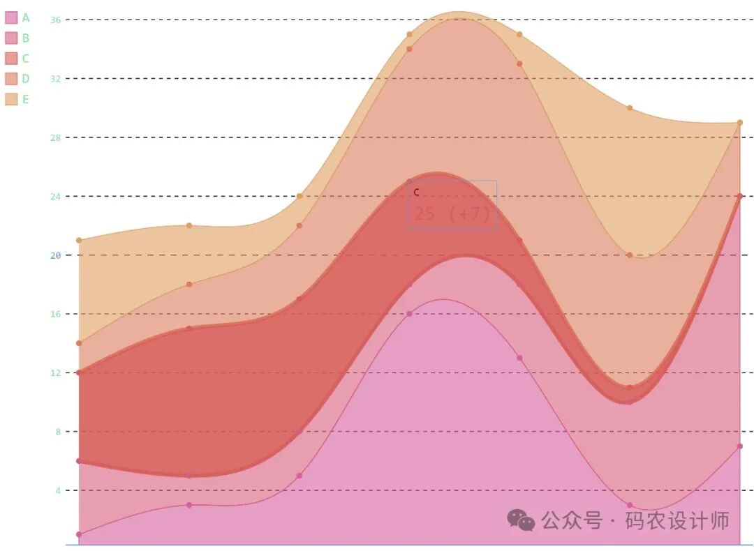
For example, create a custom style object using the Style class by passing different parameters to customize the appearance of the chart.
# Import the Style class for customizing chart styles
from pygal.style import Style

# Create a custom style object custom_style by passing different parameters to customize the appearance of the chart
custom_style = Style(
    # Set the overall background color of the chart to transparent, so the chart background does not obscure elements below it
    background='transparent',
    # Set the background color of the plotting area (the area where the chart is actually drawn) to transparent
    plot_background='transparent',
    # Set the foreground color of the chart, which is usually used for text, axes, and other elements
    foreground='#53E89B',
    # Set the strong foreground color, generally used to emphasize some important foreground elements
    foreground_strong='#53A0E8',
    # Set the weak foreground color for less important foreground elements
    foreground_subtle='#630C0D',
    # Set the default opacity of elements to 0.6, giving elements a semi-transparent effect
    opacity='.6',
    # Set the opacity to 0.9 when hovering over elements, making elements more opaque when hovered over
    opacity_hover='.9',
    # Set the transition effect for element state changes (like hovering), 400ms indicates a transition time of 400 milliseconds, ease-in indicates a gradual transition
    transition='400ms ease-in',
    # Set the colors for different data series in the chart, specifying different hexadecimal color codes for five data series
    colors=('#E853A0', '#E8537A', '#E95355', '#E87653', '#E89B53')
)

# Create a stacked line chart object chart and add data series to the chart
chart = pygal.StackedLine(fill=True, interpolate='cubic', style=custom_style)
chart.add('A', [1, 3, 5, 16, 13, 3, 7])
chart.add('B', [5, 2, 3, 2, 5, 7, 17])
chart.add('C', [6, 10, 9, 7, 3, 1, 0])
chart.add('D', [2, 3, 5, 9, 12, 9, 5])
chart.add('E', [7, 4, 2, 1, 2, 10, 0])

# Render the created chart as an SVG file
chart.render_to_file('custom_style.svg')
The generated chart looks like:
For more content, you can check the official documentation:
https://www.pygal.org/en/stable/