Working with new colleagues unfamiliar with Python for data analysis has truly made me feel “powerless”—a basic data cleaning task requires repeated explanations, and when mentioning Pandas or Matplotlib, they look completely lost. In fact, getting started with data analysis isn’t that difficult; it just lacks a clear guide that goes “from basics to practical use.”

Instead of wasting time with hand-holding explanations, it’s better to compile the core operations and techniques into a guide. Whether you are a newcomer in the workplace or a student just starting out, following this checklist can help you meet 80% of your daily analysis needs.
1. Core Basic Functions: Getting Data “In and Organized”
This part covers the “fundamentals” of data analysis, akin to “prepping ingredients” before cooking, which must be practiced until mastered.
1. Data Reading: “Bringing Data into” Python
The three most commonly used methods for reading data in daily work can be accomplished with a single line of code:
- CSV Files (most common):
<span>df = pd.read_csv('file_path/filename.csv', encoding='utf-8')</span>(Note: If there are Chinese character garbles, change<span>encoding</span>to<span>gbk</span>) - Excel Files:
<span>df = pd.read_excel('file_path/filename.xlsx', sheet_name='sheet_name')</span> - SQL Data: Connect to the database first, then read; beginners can first master the first two methods, which cover 90% of scenarios.
2. Data Cleaning: “Performing a Checkup” on Data
Dirty data (missing, duplicate, poorly formatted) directly affects analysis results; these steps are essential:

- Handling Missing Values:
- Delete: Remove columns/rows with few and unimportant missing values using
<span>df.dropna(subset=['key_column_name'], axis=0)</span> - Fill: Use mean/median to fill numeric columns,
<span>df['column_name'].fillna(df['column_name'].mean(), inplace=True)</span> - Removing Duplicates: Delete completely duplicate rows,
<span>df = df.drop_duplicates(subset=['repeatable_column_name'], keep='first')</span>(<span>keep='first'</span>means keep the first row to avoid accidental deletion) - Renaming Columns: Modify column names that are too long or messy,
<span>df.rename(columns={'old_column_name1':'new_column_name1', 'old_column_name2':'new_column_name2'}, inplace=True)</span>
3. Data Filtering: Extracting the “Useful Parts”
There’s no need to analyze the entire table; efficiently extract the required data:
- Filtering Rows by Conditions: For example, select data where “sales > 1000”,
<span>df_filtered = df[df['sales'] > 1000]</span>Use<span>&</span>(and)/<span>|</span>(or) for multiple conditions, remembering to add parentheses:<span>df[(df['sales']>1000) & (df['region']=='Beijing')]</span> - Selecting Columns by Need: Keep only the “name, sales, date” columns,
<span>df_selected = df[['name', 'sales', 'date']]</span>
4. Descriptive Statistics: Quickly “Understanding Data Details”

No need to calculate manually; Pandas has built-in tools to output results with one click:
- Single Metric Statistics:
<span>df['sales'].mean()</span>(mean),<span>df['sales'].sum()</span>(total),<span>df['sales'].max()</span>(maximum) - Overview of the Entire Table:
<span>df.describe()</span>directly outputs counts, means, standard deviations, and extremes for all numeric columns, quickly assessing data distribution.
5. Basic Visualization: Making Data “Visible”
Newcomers should first master three basic charts to meet daily reporting needs:
- Bar Chart (to compare sizes):
<span>plt.bar(df['region'], df['sales']); plt.title('Sales Comparison by Region')</span> - Line Chart (to observe trends):
<span>plt.plot(df['date'], df['sales']); plt.xticks(rotation=45)</span>(rotate dates to prevent overlap) - Pie Chart (to show proportions):
<span>plt.pie(df['sales'], labels=df['region'], autopct='%1.1f%%')</span>(using<span>seaborn</span>for better aesthetics, just replace<span>plt</span>with<span>sns</span>, for example,<span>sns.barplot(x='region', y='sales', data=df)</span>)
2. Advanced Operations: From “Organizing Data” to “Analyzing Data”
After mastering the basics, use these techniques to dig deeper into data insights.
1. Pivot Tables: Multi-dimensional Summary “One-click Output”
More flexible than<span>groupby</span><span>, suitable for multi-dimensional analysis (e.g., "sales by region and month"):</span>
pythonpivot_table <span><span>=</span></span><span> pd</span><span><span>.</span></span><span>pivot_table</span><span><span>(</span></span><span> data</span><span><span>=</span></span><span>df</span><span><span>,</span></span><span> values</span><span><span>=</span></span><span><span>'sales'</span></span><span><span>,</span></span><span><span># Value column to analyze</span></span><span> index</span><span><span>=</span></span><span><span>'region'</span></span><span><span>,</span></span><span><span># Row dimension</span></span><span> columns</span><span><span>=</span></span><span><span>'month'</span></span><span><span>,</span></span><span><span># Column dimension</span></span><span> aggfunc</span><span><span>=</span></span><span><span>'sum'</span></span><span><span># Summary method (sum/mean, etc.)</span></span>
<span><span><span>2. Grouping and Aggregation: "Calculating Totals" by Category</span></span></span>
For example, “calculating average sales by region” or “total profit by product”:
- Single Metric Aggregation:
<span>df_grouped = df.groupby('region')['sales'].mean().reset_index()</span> - Multi-metric Aggregation: simultaneously calculate mean and total,
<span>df_grouped = df.groupby('region').agg({'sales':['mean','sum']}).reset_index()</span>
3. Time Series Analysis: Handling “Time-related Data”
Essential for analyzing sales trends and monthly fluctuations:
- Step 1: Convert the “date column” to datetime format,
<span>df['date'] = pd.to_datetime(df['date'])</span> - Step 2: Group and summarize by time,
<span>df_monthly = df.groupby(pd.Grouper(key='date', freq='M'))['sales'].sum()</span>(M represents monthly) - Step 3: Plot the trend chart,
<span>plt.plot(df_monthly.index, df_monthly.values)</span>
4. Custom Processing: Using apply+lambda for “Batch Work”
When encountering complex rules (e.g., classifying sales), no need to write loops:
- Example: Sales > 1000 as “High Sales”, otherwise “Normal”:
<span>df['sales_level'] = df['sales'].apply(lambda x: 'High Sales' if x>1000 else 'Normal')</span>
5. Basic Machine Learning: Simple “Predicting the Future”
Beginner-level predictions can be accomplished in minutes using<span>scikit-learn</span>:
- Linear regression to predict sales (requires feature columns like “advertising spend” and “foot traffic”):
3. Practical Tips: Making Analysis “More Efficient and Aesthetic”
These details can significantly enhance analysis efficiency and report quality.
1. Multi-plot Layout: Displaying “Multi-dimensional Information” in One Chart
Use<span>subplot</span><span> to place multiple charts on one canvas, such as simultaneously displaying sales trends and regional distribution:</span>
pythonplt<span><span>.</span></span><span>figure</span><span><span>(</span></span><span>figsize</span><span><span>=</span></span><span><span>(</span></span><span><span>12</span></span><span><span>,</span></span><span><span>5</span></span><span><span>)</span></span><span><span>)</span></span><span><span># Canvas size</span></span><span><span># Subplot 1: Line chart (top left)</span></span><span>plt</span><span><span>.</span></span><span>subplot</span><span><span>(</span></span><span><span>1</span></span><span><span>,</span></span><span><span>2</span></span><span><span>,</span></span><span><span>1</span></span><span><span>)</span></span><span>plt</span><span><span>.</span></span><span>plot</span><span><span>(</span></span><span>df</span><span><span>[</span></span><span><span>'date'</span></span><span><span>]</span></span><span><span>,</span></span><span> df</span><span><span>[</span></span><span><span>'sales'</span></span><span><span>]</span></span><span><span>)</span></span><span>plt</span><span><span>.</span></span><span>title</span><span><span>(</span></span><span><span>'Sales Trend'</span></span><span><span>)</span></span><span><span># Subplot 2: Bar chart (top right)</span></span><span>plt</span><span><span>.</span></span><span>subplot</span><span><span>(</span></span><span><span>1</span></span><span><span>,</span></span><span><span>2</span></span><span><span>,</span></span><span><span>2</span></span><span><span>)</span></span><span>plt</span><span><span>.</span></span><span>bar</span><span><span>(</span></span><span>df</span><span><span>[</span></span><span><span>'region'</span></span><span><span>]</span></span><span><span>,</span></span><span> df</span><span><span>[</span></span><span><span>'sales'</span></span><span><span>]</span></span><span><span>)</span></span><span>plt</span><span><span>.</span></span><span>title</span><span><span>(</span></span><span><span>'Sales by Region'</span></span><span><span>)</span></span><span>plt</span><span><span>.</span></span><span>tight_layout</span><span><span>(</span></span><span><span>)</span></span><span><span># Avoid overlap</span></span>
2. Key Charts: Quickly “Highlighting Key Points”
- Heatmap: To see variable correlations (e.g., whether “advertising spend” and “sales” are related):
<span>sns.heatmap(df[['sales','advertising_spend','foot_traffic']].corr(), annot=True, cmap='Blues')</span>(<span>annot=True</span>displays values) - Box Plot: To find outliers (e.g., abnormally high sales):
<span>sns.boxplot(x='region', y='sales', data=df)</span>(points outside the box are outliers)
3. Interactive and Reporting: Making Results “Easier to Share”
- Interactive Charts: Use
<span>plotly</span><span> instead of</span><code><span>matplotlib</span><span>, hovering over can show specific values, for example:</span><code><span>import plotly.express as px; px.bar(df, x='region', y='sales').show()</span> - Dynamic Reports: Use Jupyter Notebook for analysis—code, charts, and text explanations together, allowing leaders to see the entire process from “data to conclusion” clearly, ten times clearer than just submitting tables.
In fact, the core of Python data analysis is “learning by doing”; first, practice the basic functions until you don’t need to check the manual, then gradually tackle advanced techniques. Newcomers need not fear making mistakes; coding against data is 100 times more effective than rote memorization of syntax!
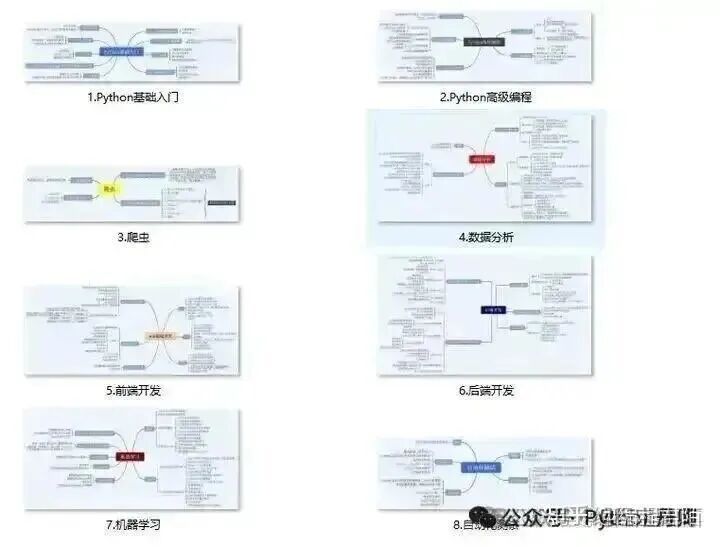
1. Learning Path for All Directions of Python A compilation of technical points across all directions of Python, forming a summary of knowledge points in various fields, which is useful as you can find corresponding learning resources based on the following knowledge points, ensuring a comprehensive learning experience.
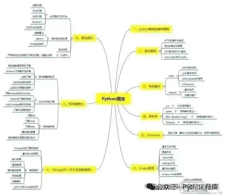
2. Essential Development Tools for Python The tools have been compiled for everyone; just install them to get started!
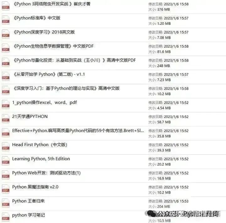
3. Latest Python Learning Notes When I reach a certain foundation and have my own understanding, I read books or handwritten notes compiled by predecessors; these notes detail their understanding of certain technical points, which are unique and provide different perspectives. There are 100 electronic books available for you to read without having to buy them yourself.
4. Python Video Collection Watching comprehensive zero-based learning videos is the quickest and most effective way; following the teacher’s thought process in the videos, from basics to depth, makes it easy to get started.

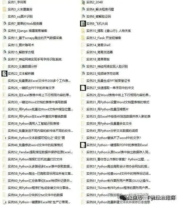
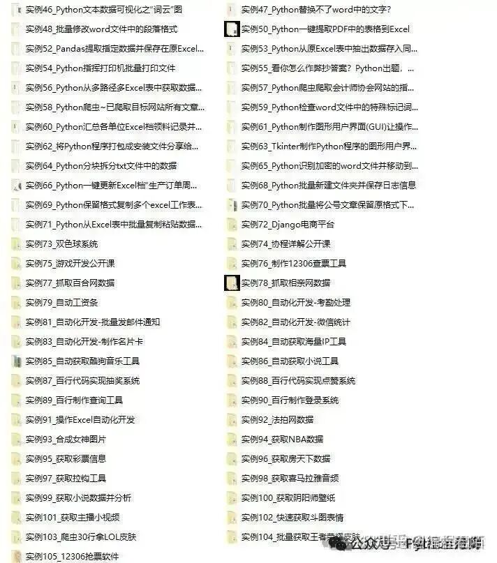
5. Practical Cases Learning from books is always superficial; you must practice hands-on while following along with the videos to apply what you’ve learned in real situations. At this point, you can work on some practical cases to learn.
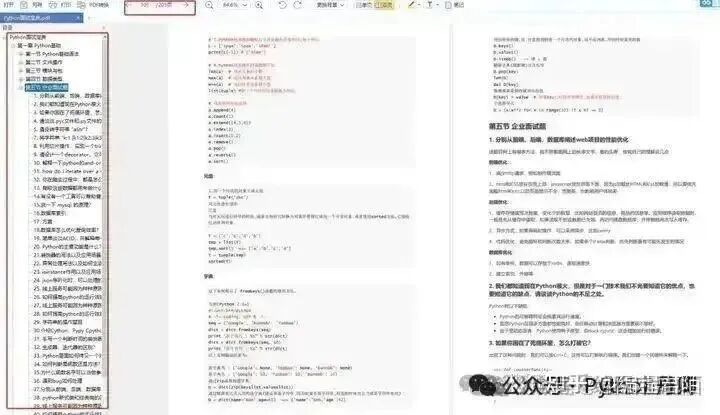
6. Interview Guide

Resume Template
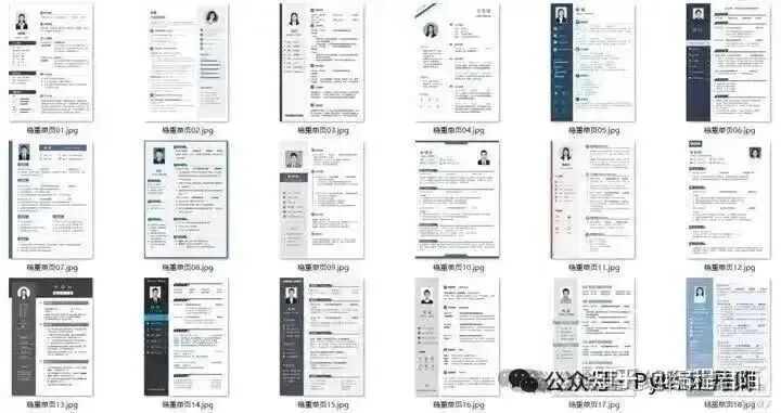
Everything above has been organized for those in need; I hope it helps everyone.
1. Follow the public account below↓↓↓↓
2. Like + reply “learning”