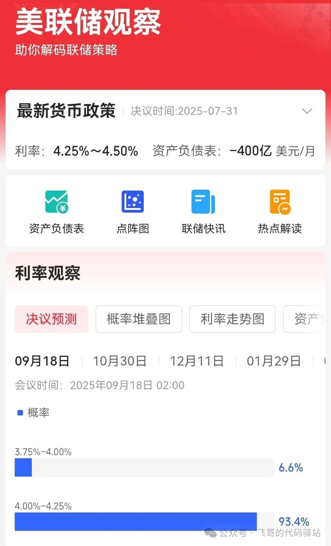
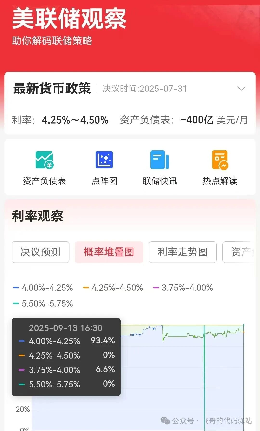
This week, with a series of economic data released in the U.S., the non-farm payroll data has been significantly revised downwards, and discussions about economic recession have become increasingly prominent. The CME FedWatch tool shows that for the Federal Reserve’s meeting on September 18, 2025, the probability of a 25 basis point rate cut has risen to 93.4%, while the probability of a 50 basis point cut is at 6.6%.
 |
 |
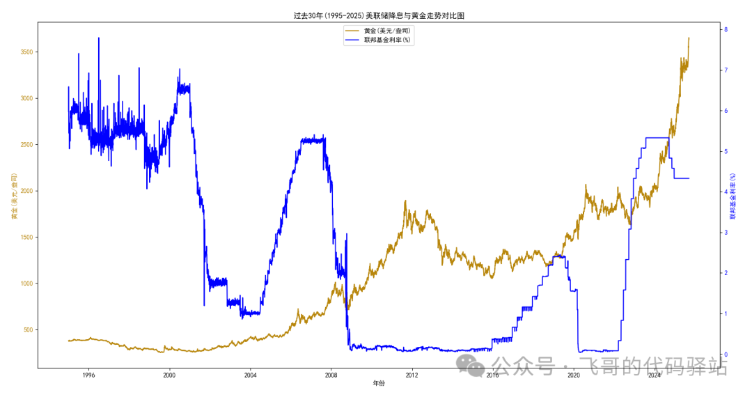
In the past month, gold prices have surged, already surpassing the highs of February. As we enter the Federal Reserve’s rate cut cycle, is there a strong correlation between gold prices and the Fed’s rate cuts? I used Python programming to obtain the last 30 years (1995-2025) of U.S. federal funds rates and spot gold (London gold) prices, and created a comparison chart for reference. The Python source code is attached at the end for those interested in trying it out themselves.
1
Programming Environment
Operating System: Windows 10
CPU: Intel(R) Core(TM) i5-10400 CPU @ 2.90GHz
Python: Python 3.10.11
Modules Used: matplotlib 3.10.3, pandas 2.2.3
2
Obtaining U.S. Federal Funds Rate Data
1) Federal Reserve Rate Official Website:
https://fred.stlouisfed.org/series/DFF
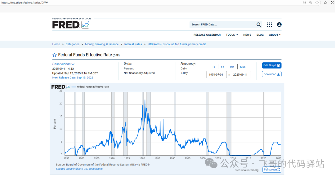
On the page, you can select data for 1 year, 5 years, 10 years, or the maximum available data from July 1, 1954, to the present, or customize the range.
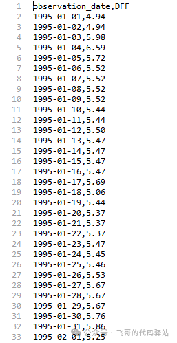
2) Starting from January 1, 1995, we will extract the last 30 years of rate data. Click the Download button to download the CSV file to your local machine.
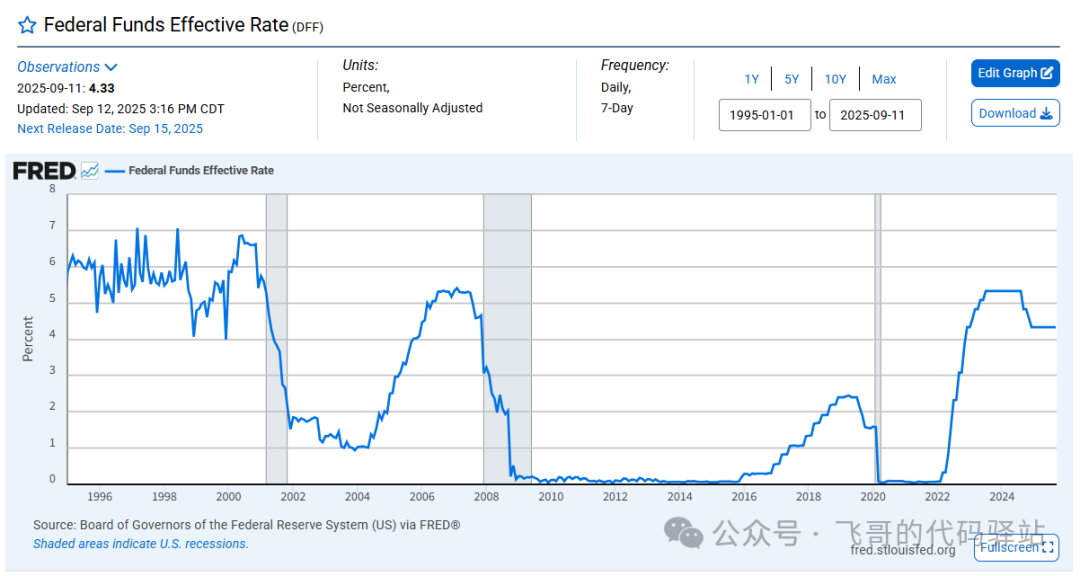
3) You can also use the curl command to download in the cmd window. Be sure to modify the date range in the URL, where cosd= indicates the start date:
curl "https://fred.stlouisfed.org/graph/fredgraph.csv?bgcolor=%23ebf3fb&chart_type=line&drp=0&fo=open%20sans&graph_bgcolor=%23ffffff&height=450&mode=fred&recession_bars=on&txtcolor=%23444444&ts=12&tts=12&width=1320&nt=0&thu=0&trc=0&show_legend=yes&show_axis_titles=yes&show_tooltip=yes&id=DFF&scale=left&cosd=1995-01-01&coed=2025-09-11&line_color=%230073e6&link_values=false&line_style=solid&mark_type=none&mw=3&lw=3&ost=-99999&oet=99999&mma=0&fml=a&fq=Daily%2C%207-Day&fam=avg&fgst=lin&fgsnd=2020-02-01&line_index=1&transformation=lin&vintage_date=2025-09-12&revision_date=2025-09-12&nd=1954-07-01" -o DFF-1995-2025.csv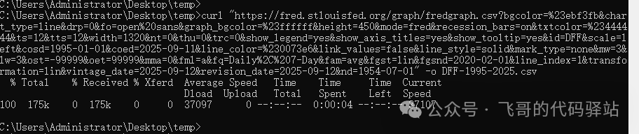
3
Obtaining Historical Gold Prices
1) LBMA (London Bullion Market Association) Official Website:
https://www.lbma.org.uk/cn/prices-and-data#/
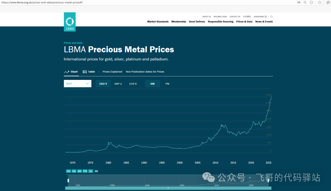
The page provides all gold price information from April 1, 1968, to the present.
2) Since the official page does not provide a download button, data can only be obtained through the URL.
https://prices.lbma.org.uk/json/gold_pm.json?r=516741003
The r parameter after the question mark is speculated to be randomly generated. Interested readers can also press F12 in the browser to enter developer mode and retrieve the URL again.
3) Accessing this URL directly in the browser will yield a set of data in JSON format:
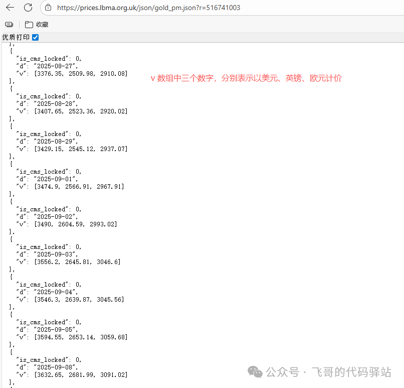
4) You can also use the curl command to download the JSON file locally:
curl "https://prices.lbma.org.uk/json/gold_pm.json?r=516741003" -o gold.json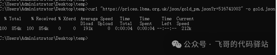
4
Processing Data
1) Next, process the obtained data by merging both datasets based on the same date. This primarily utilizes functions from the pandas module.
2) First, extract the dollar-denominated data from the gold price JSON and convert it into a pandas object:
# Process London gold data gold.json
def process_gold_json():
    fd = open('gold.json', 'r')
    data = json.load(fd)
    fd.close()
    # Create DataFrame
    df_gold = pd.json_normalize(data)
    # Add columns
    split_cols = df_gold['v'].apply(pd.Series)
    split_cols.columns = ['USD', 'GBP', 'EUR']
    # Drop columns axis=1
    df_gold.drop(['is_cms_locked', 'v'], axis=1, inplace=True)
    df_gold = pd.concat([df_gold, split_cols['USD']], axis=1)
    # Rename columns
    df_gold = df_gold.rename(columns={'d':'date', 'USD':'price'})
    df_gold['date'] = pd.to_datetime(df_gold['date'])
    df_gold.set_index('date', inplace=True)
    # Filter data after 1995
    start_date = datetime.strptime("19950101", "%Y%m%d")
    df_gold = df_gold[(df_gold.index >= start_date)]
    df_gold.reset_index(inplace=True)
    return df_gold
3) Process the rate CSV data and modify the column titles:
# Process rate DFF-1995-2025.csv, modify column titles
def process_rate_csv():
    df_rate = pd.read_csv("DFF-1995-2025.csv")
    df_rate = df_rate.rename(columns={"observation_date":"date","DFF":"rate"})
    df_rate['date'] = pd.to_datetime(df_rate['date'])
    return df_rate
4) Merge the data:
def recombine_data():
    # 1. Process gold data:
    df_gold = process_gold_json()
    # 2. Read CSV data
    df_rate = process_rate_csv()
    df = pd.merge(df_gold, df_rate, on='date', how='inner', suffixes=('_df1', '_df2'))
    # Write to CSV file
    df.to_csv("combin.csv")
    return df
5
Plotting the Comparison Chart
1) Use the Python module matplotlib to draw a dual-axis line chart:
def draw_line_graph(df):
    # Set x,y data
    x = df["date"]
    y1 = df["price"]
    y2 = df["rate"]
    fig, ax1 = plt.subplots(figsize=(10, 6))
    # First y-axis (left)
    ax1.plot(x, y1, label='Gold (USD/oz)', color='#B8860B')
    ax1.set_ylabel('Gold (USD/oz)', color='#B8860B')
    ax1.tick_params(axis='y', labelcolor='#B8860B')
    # Create second y-axis (right, sharing x-axis)
    ax2 = ax1.twinx()
    ax2.plot(x, y2, label='Federal Funds Rate (%)', color='#0000ff')
    ax2.set_ylabel('Federal Funds Rate (%)', color='#0000ff')
    ax2.tick_params(axis='y', labelcolor='#0000ff')
    # Add title and x-axis label
    ax1.set_title('Comparison of Federal Reserve Rate Cuts and Gold Prices Over the Last 30 Years (1995-2025)')
    ax1.set_xlabel('Year')
    # Merge legends
    lines1, labels1 = ax1.get_legend_handles_labels()
    lines2, labels2 = ax2.get_legend_handles_labels()
    ax1.legend(lines1 + lines2, labels1 + labels2, loc='upper center')
    plt.show()
2) The result of the trend chart is as follows:
6
Federal Reserve Rate Cut Cycles
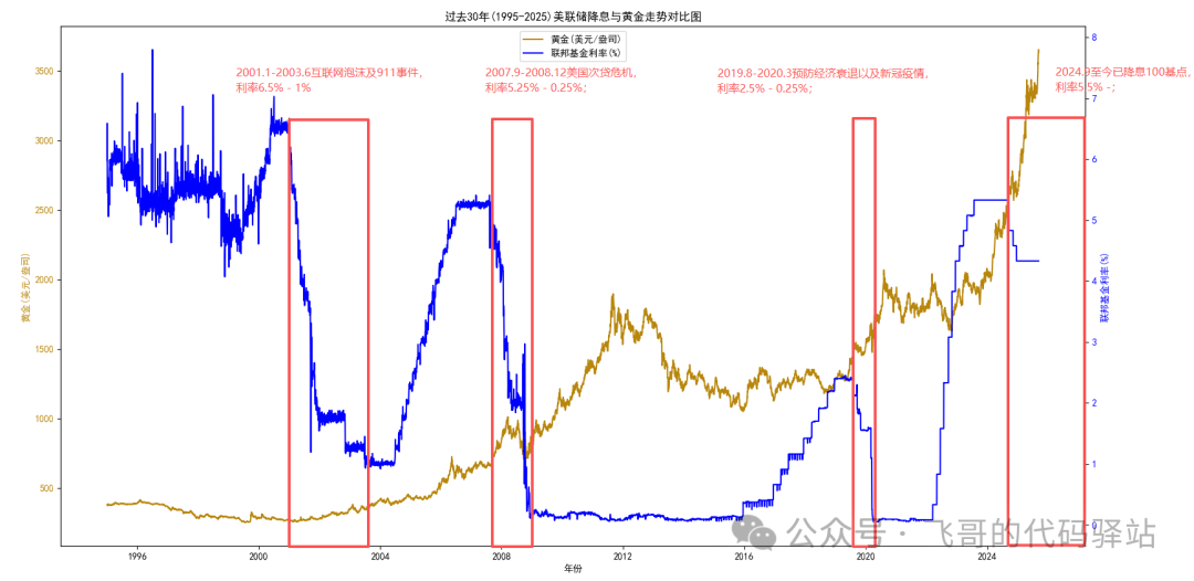
Over the last 30 years, the Federal Reserve’s rate cut cycles are as follows:
1) January 2001 – June 2003: Internet bubble and 9/11, rates from 6.5% to 1%;
2) September 2007 – December 2008: U.S. subprime mortgage crisis, rates from 5.25% to 0.25%;
3) August 2019 – March 2020: Preventing economic recession and the COVID-19 pandemic, rates from 2.5% to 0.25%;
4) From September 2024 to now, rates have been cut by 100 basis points, currently at 5.5%;
The last rate cut was at the end of last year, and the next meeting will be held on September 18, 2025, with expectations of officially entering a rate cut cycle in the next year.
The corresponding periods marked on the overlay chart are as follows:
7
Python Source Code
1) The Python source code is as follows:
import matplotlib.pyplot as plt
import matplotlib.gridspec as gridspec
import numpy as np
import pandas as pd
import json
from datetime import datetime

# Federal Reserve Rate Official Website: https://fred.stlouisfed.org/series/DFF
# curl "https://fred.stlouisfed.org/graph/fredgraph.csv?bgcolor=%23ebf3fb&chart_type=line&drp=0&fo=open%20sans&graph_bgcolor=%23ffffff&height=450&mode=fred&recession_bars=on&txtcolor=%23444444&ts=12&tts=12&width=1320&nt=0&thu=0&trc=0&show_legend=yes&show_axis_titles=yes&show_tooltip=yes&id=DFF&scale=left&cosd=1995-01-01&coed=2025-09-11&line_color=%230073e6&link_values=false&line_style=solid&mark_type=none&mw=3&lw=3&ost=-99999&oet=99999&mma=0&fml=a&fq=Daily%2C%207-Day&fam=avg&fgst=lin&fgsnd=2020-02-01&line_index=1&transformation=lin&vintage_date=2025-09-12&revision_date=2025-09-12&nd=1954-07-01" -o DFF-1995-2025.csv
# # London Gold Official Website: https://www.lbma.org.uk/cn/prices-and-data#/
# # curl "https://prices.lbma.org.uk/json/gold_pm.json?r=516741003" -o gold.json
#
# Set Matplotlib global parameters
plt.rcParams['font.sans-serif'] = ['SimHei']  # Specify Chinese font
plt.rcParams['axes.unicode_minus'] = False    # Solve negative sign display issue

# Use twinx() to create a chart with a shared x-axis but different y-axes
def draw_line_graph(df):
    # Set x,y data
    x = df["date"]
    y1 = df["price"]
    y2 = df["rate"]
    fig, ax1 = plt.subplots(figsize=(10, 6))
    # First y-axis (left)
    ax1.plot(x, y1, label='Gold (USD/oz)', color='#B8860B')
    ax1.set_ylabel('Gold (USD/oz)', color='#B8860B')
    ax1.tick_params(axis='y', labelcolor='#B8860B')
    # Create second y-axis (right, sharing x-axis)
    ax2 = ax1.twinx()
    ax2.plot(x, y2, label='Federal Funds Rate (%)', color='#0000ff')
    ax2.set_ylabel('Federal Funds Rate (%)', color='#0000ff')
    ax2.tick_params(axis='y', labelcolor='#0000ff')
    # Add title and x-axis label
    ax1.set_title('Comparison of Federal Reserve Rate Cuts and Gold Prices Over the Last 30 Years (1995-2025)')
    ax1.set_xlabel('Year')
    # Merge legends
    lines1, labels1 = ax1.get_legend_handles_labels()
    lines2, labels2 = ax2.get_legend_handles_labels()
    ax1.legend(lines1 + lines2, labels1 + labels2, loc='upper center')
    plt.show()

def process_gold_json():
    fd = open('gold.json', 'r')
    data = json.load(fd)
    fd.close()
    # Create DataFrame
    df_gold = pd.json_normalize(data)
    # Add columns
    split_cols = df_gold['v'].apply(pd.Series)
    split_cols.columns = ['USD', 'GBP', 'EUR']
    # Drop columns axis=1
    df_gold.drop(['is_cms_locked', 'v'], axis=1, inplace=True)
    df_gold = pd.concat([df_gold, split_cols['USD']], axis=1)
    # Rename columns
    df_gold = df_gold.rename(columns={'d':'date', 'USD':'price'})
    df_gold['date'] = pd.to_datetime(df_gold['date'])
    df_gold.set_index('date', inplace=True)
    # Filter data after 1995
    start_date = datetime.strptime("19950101", "%Y%m%d")
    #end_date = datetime.strptime("20250912", "%Y%m%d")
    df_gold = df_gold[(df_gold.index >= start_date)]
    df_gold.reset_index(inplace=True)
    #print(df_gold)
    return df_gold

def process_rate_csv():
    # London gold gold.json: v corresponds to 'USD', 'GBP', 'EUR' in three currencies
    # {    #    "is_cms_locked": 0,    #    "d": "1968-04-18",    #    "v": [37.55, 15.63, 0]    # },    # {    #    "is_cms_locked": 0,    #    "d": "1968-04-19",    #    "v": [37.65, 15.68, 0]    # },
    df_rate = pd.read_csv("DFF-1995-2025.csv")
    df_rate = df_rate.rename(columns={"observation_date":"date","DFF":"rate"})
    df_rate['date'] = pd.to_datetime(df_rate['date'])
    return df_rate

def recombine_data():
    # 1. Process gold data:
    df_gold = process_gold_json()
    # 2. Read CSV data
    df_rate = process_rate_csv()
    # Merge two tables
    # on: on: specify the column name to merge (when both tables have the same column name)
    # left_on/right_on: use when the left and right table column names are different, e.g., date1,date2
    # how: merge method
    #    'inner': only keep dates that exist in both tables (default)
    #    'outer': keep all dates, fill missing values with NaN
    #    'left': keep all dates from the left table
    #    'right': keep all dates from the right table
    # suffixes: suffixes for conflicting column names (default ('x', 'y'))
    df = pd.merge(df_gold, df_rate, on='date', how='inner', suffixes=('_df1', '_df2'))
    #df.set_index('date', inplace=True)
    # Write to CSV file
    df.to_csv("combin.csv")
    #print(df)
    return df

if __name__ == "__main__":
    df = recombine_data()
    draw_line_graph(df)
8
Conclusion
By comparing the Federal Reserve’s rate cut cycles and gold price trends, we can intuitively see the correlation between the two. Stimulated by expectations of Federal Reserve rate cuts, gold is already in a “running ahead” state. Drawing from history, I believe everyone can make a more rational judgment about the future trend of gold.
Disclaimer: The examples provided in this article do not constitute any investment advice. The stock market has risks, and investments should be made cautiously!
