
Between symbols and meanings, there exists a subtle balance. An excellent robot logo is the art of this balance—it does not need to show off, nor does it need to speak, yet it possesses its own power.

Looking at those unforgettable robot logos, you will find that they all adhere to the same design philosophy:Less is more.


True design masters understand how to simplify within limited space. They know that a logo cannot carry too much information; the key is to find the visual focal point that best represents the brand’s core. This focal point could be a shape, a posture, or even a perfectly placed negative space.


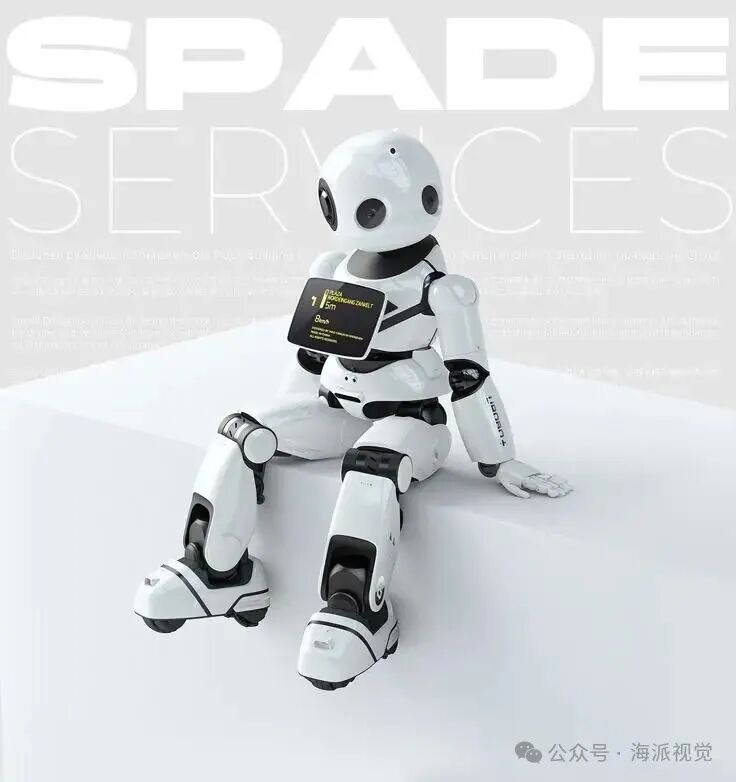
The exploration of forms is endless. From biomimetic lines to geometric structures, from abstract strokes to figurative depictions, every curve tells a different story. Arcs may represent friendliness and inclusiveness, while sharp angles might suggest precision and professionalism—the important thing is not the style chosen, but whether this choice resonates with the brand’s soul.

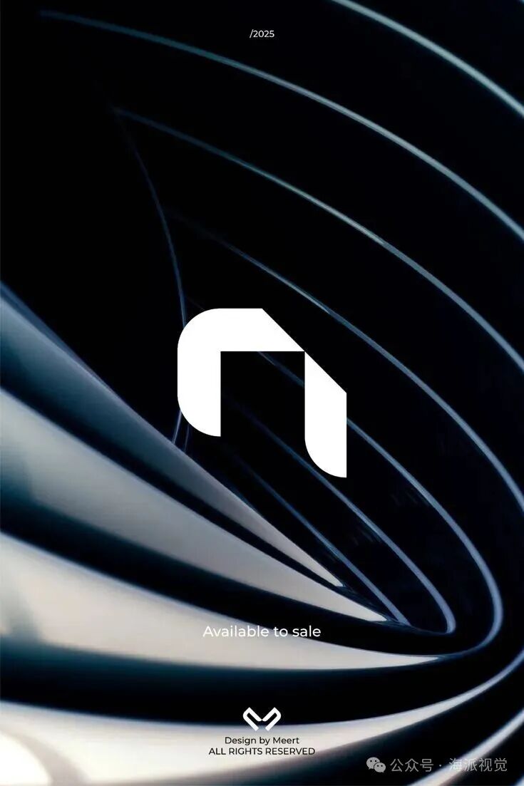

In the refinement of details, designers exhibit an almost obsessive focus. The curvature of a corner, the thickness of a line, the shape of a negative space—these seemingly minor decisions accumulate to define the entire character of the logo. Just like excellent literary works, what truly moves people are often those subtle yet perfectly placed details.


The choice of colors is equally intriguing. Metallic gray conveys professionalism and reliability, warm tones break the coldness of technology, and monochromatic designs showcase confidence and purity. Each color is a silent confession, telling the viewer the emotions and attitudes the brand wishes to convey.
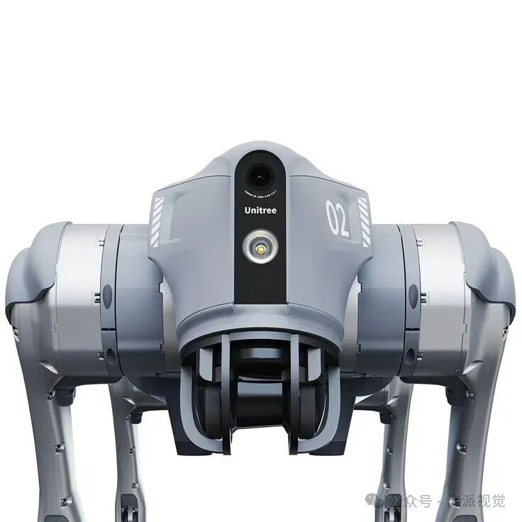

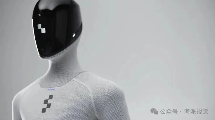
Most touching are those truly outstanding robot logos that often carry a hint of warmth. It may come from a humanized outline, a gentle curve, or an imaginative negative space—these designs remind us that on the other side of technology, there is always humanity.

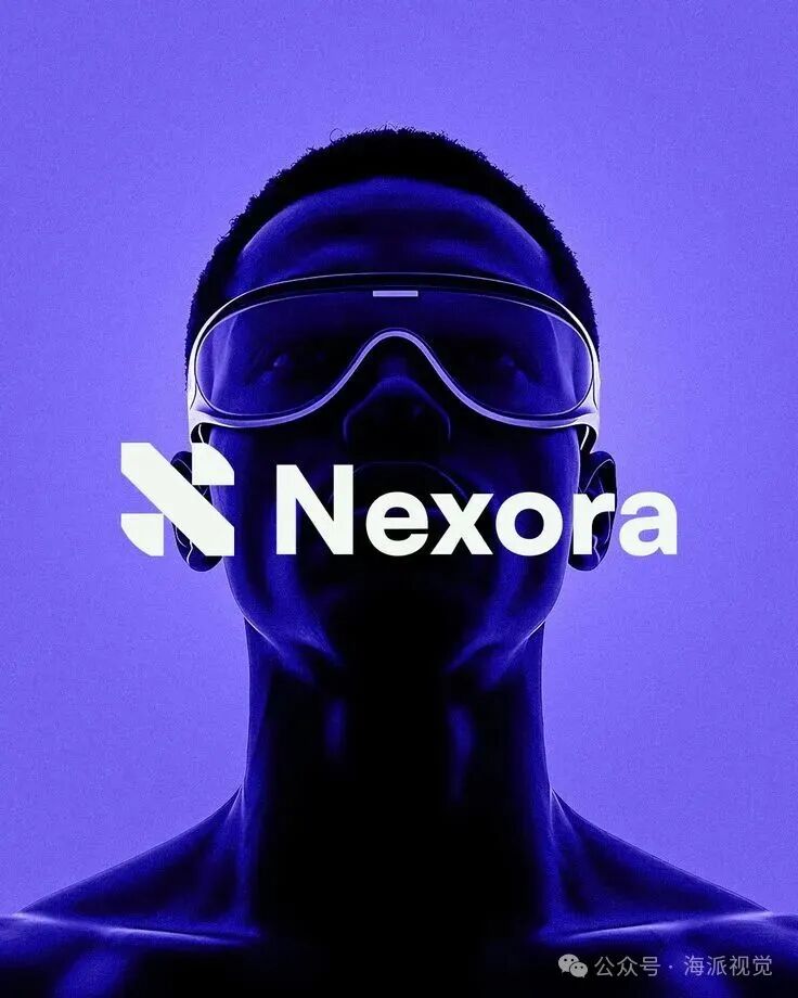
In this age of information overload, a good logo is like a lamp in the city at night—unobtrusive, not glaring, quietly guiding you in the right direction when needed. It tells the most profound stories in the simplest language.
This may be the essence of design: to find a clear expression of truth in a complex world.




Shanghai Hansi for 18 yearsfocusing on brand planning and design,understanding brands and values better.
Hansi uses the wisdom of design to enhance your brand value,success comes from anticipating the future.
· END ·
Welcome to share in your circle of friends Delivered daily at 7:00

© Copyright Statement: We are committed to sharing valuable information. Some images used in this article could not be traced back to their original sources, hence we could not specify the original authors. If you are the copyright holder of any of these images, please contact us, and we will handle it according to your request.