
Life is short, beginners learn Python!
Recently, many readers have asked me which Python plotting library to learn because there are too many options. Even after I choose a plotting library, I<span>don’t know how to learn</span>, I don’t know what the first step is, and I don’t know what to do next, <span>forgetting everything after learning it once</span>.
Actually, this was a problem that troubled me a lot back then. After learning numpy and pandas, I started learning matplotlib. I was really frustrated, feeling like there was so much plotting code and the plotting logic was completely chaotic, not knowing how to start.
Later, through repeated learning, I found a method to learn Python plotting libraries, which is to learn their <span>plotting principles</span>. As the saying goes:<span>"Know yourself and know your enemy, and you will never lose a battle"</span>, once you understand the principles, the rest is just a matter of practice.
Today, we will use this article to help everyone sort out the plotting principles of <span>matplotlib</span>, <span>seaborn</span>, <span>plotly</span>, and <span>pyecharts</span> so that learning becomes easier!
1. Matplotlib Plotting Principles
For more detailed explanations about matplotlib, you can refer to the article below. I believe you will definitely learn it after reading.
Matplotlib Plotting Principles: http://suo.im/678FCo
1) Explanation of Plotting Principles
Based on my own learning and understanding, I have summarized the matplotlib plotting principles into the following steps:
- ① Import libraries;
- ② Create a
<span>figure</span>canvas object; - ③ Get the corresponding
<span>axes</span>coordinate object; - ④ Call the axes object to draw the corresponding shape;
- ⑤ Display the figure;
2) Example Explanation
# 1. Import relevant libraries
import matplotlib as mpl
import matplotlib.pyplot as plt
# 2. Create figure canvas object
figure = plt.figure()
# 3. Get the corresponding axes coordinate object
axes1 = figure.add_subplot(2,1,1)
axes2 = figure.add_subplot(2,1,2)
# 4. Call the axes object to draw the corresponding shape
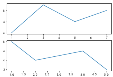
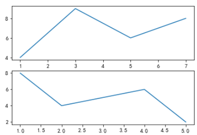
axes1.plot([1,3,5,7],[4,9,6,8])
axes2.plot([1,2,4,5],[8,4,6,2])
# 5. Display the figure
figure.show()
The result is as follows:
2. Seaborn Plotting Principles
Among these four plotting libraries, only <span>matplotlib</span> and <span>seaborn</span> have a certain connection; the other libraries have no relationship, and their plotting principles are also different.
Seaborn is a <span>higher-level wrapper</span> for matplotlib. Therefore, before learning seaborn, you must first understand the plotting principles of matplotlib. Since seaborn is a higher-level wrapper for matplotlib, the <span>tuning parameter settings</span> of matplotlib can also be used after drawing with seaborn.
We know that using matplotlib requires adjusting a lot of plotting parameters, and there is a lot to remember. Seaborn, being a higher-level wrapper based on matplotlib, makes <span>plotting easier</span>, allowing you to create many exquisite graphics without needing to understand a lot of underlying parameters. Moreover, seaborn is compatible with <span>numpy</span> and <span>pandas</span> data structures, playing a significant role in organizing data and thus greatly helping us complete data visualization.
Since the plotting principles of seaborn are consistent with those of matplotlib, I won’t go into detail here. You can refer to the matplotlib plotting principles above to learn how seaborn plots. Here’s a link for you.
Seaborn Plotting Principles: http://suo.im/5D3VPX
1) Example Explanation
# 1. Import relevant libraries
import seaborn as sns
import matplotlib.pyplot as plt

df = pd.read_excel("data.xlsx",sheet_name="数据源")

sns.set_style("dark")
plt.rcParams["font.sans-serif"] = ["SimHei"]
plt.rcParams["axes.unicode_minus"] = False
# Note: estimator indicates summing the sales quantity for the grouped data. The default is to calculate the mean.
sns.barplot(x="品牌",y="销售数量",data=df,color="steelblue",orient="v",estimator=sum)
plt.show()
The result is as follows:
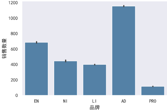
<span>Note:</span> As you can see in the plotting code above, you should have a feeling that the code contains both matplotlib and seaborn plotting code. In fact, this is how it works; we follow the plotting principles of matplotlib to create graphics, but some parts are replaced with seaborn-specific code, while the rest of the formatting adjustments can be made using methods from matplotlib.
3. Plotly Plotting Principles
Before introducing the plotting principles of this library, let’s briefly introduce plotly.
- Plotly is a JavaScript-based plotting library with a rich variety of plots and beautiful effects;
- It is easy to save and share plotly results, and it can be seamlessly integrated with the web;
- The default output of plotly is an HTML web file that can be viewed directly through a browser;
Its plotting principles have no relation to matplotlib or seaborn, and you need to learn it separately. Similarly, I will provide a link for you to learn plotly in more detail.
Plotly Plotting Principles: http://suo.im/5vxNTu
1) Explanation of Plotting Principles
Based on my own learning and understanding, I have summarized the plotting principles of plotly into the following steps:
- ① Draw the plot trajectory, which is called a
<span>trace</span>in plotly; each trajectory is one trace. - ② Wrap the traces into a list to form a “trajectory list”. One trace is placed in a list, and multiple traces are also placed in a list.
- ③ Create a canvas while passing the above
<span>trajectory list</span>into<span>Figure()</span>. - ④ Use
<span>Layout()</span>to add other plotting parameters and enhance the plot. - ⑤ Display the plot.
2) Example Explanation
import numpy as np
import pandas as pd
import plotly as py
import plotly.graph_objs as go
import plotly.expression as px
from plotly import tools

df = pd.read_excel("plot.xlsx")
# 1. Draw the plot trajectory, which is called `trace` in plotly; each trajectory is one trace.
trace0 = go.Scatter(x=df["年份"],y=df["城镇居民"],name="城镇居民")
trace1 = go.Scatter(x=df["年份"],y=df["农村居民"],name="农村居民")
# 2. Wrap the traces into a list to form a "trajectory list". One trace is placed in a list, and multiple traces are also placed in a list.
data = [trace0,trace1]
# 3. Create a canvas while passing the above `trajectory list` into `Figure()`.
fig = go.Figure(data)
# 4. Use `Layout()` to add other plotting parameters and enhance the plot.
fig.update_layout(
    title="城乡居民家庭人均收入",
    xaxis_title="年份",
    yaxis_title="人均收入(元)"
)
# 5. Display the plot.
fig.show()
The result is as follows:
4. Pyecharts Plotting Principles
<span>Echarts</span> is an open-source data visualization tool by Baidu, recognized by many developers for its good interactivity and exquisite chart design. Python, being an expressive language, is well-suited for data processing. When data analysis meets data visualization, <span>pyecharts</span> was born.
Pyecharts is divided into <span>v0.5</span> and <span>v1</span>, which are incompatible. v1 is a completely new version, so we should try to operate based on the <span>v1 version</span>.
Like plotly, the plotting principles of pyecharts are also completely different from those of matplotlib and seaborn, so we need to learn their plotting principles separately. Therefore, I will also provide a link for you to learn pyecharts in more detail.
Pyecharts Plotting Principles: http://suo.im/5S1PF1
1) Explanation of Plotting Principles
Based on my own learning and understanding, I have summarized the plotting principles of pyecharts into the following steps:
- ① Choose the chart type;
- ② Declare the chart class and add data;
- ③ Choose global variables;
- ④ Display and save the chart;
2) Example Explanation
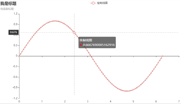
# 1. Choose the chart type: we are using a line chart, so we directly import the Line module from the charts module;
from pyecharts.charts import Line
import pyecharts.options as opts
import numpy as np

x = np.linspace(0,2 * np.pi,100)
y = np.sin(x)

(
 # 2. We are drawing a Line chart, so we need to instantiate this chart class, just use Line() directly;
 Line()
 # 3. Add data, adding data to the x and y axes;
 .add_xaxis(xaxis_data=x)
 .add_yaxis(series_name="绘制线图",y_axis=y,label_opts=opts.LabelOpts(is_show=False))
 .set_global_opts(title_opts=opts.TitleOpts(title="我是标题",subtitle="我是副标题",title_link="https://www.baidu.com/"),
                  tooltip_opts=opts.TooltipOpts())
).render_notebook() # 4. render_notebook() is used to display and save the chart;
The result is as follows:
Conclusion
Through the learning above, I believe everyone will have a new understanding of the plotting principles of these libraries.
In fact, regardless of the plotting library of any programming software, there is a plotting principle. Instead of blindly creating various shapes, it is better to understand their rules first, and then practice plotting with the libraries. I believe this will lead to significant improvement.
推荐阅读:
入门: 最全的零基础学Python的问题  | 零基础学了8个月的Python  | 实战项目 |学Python就是这条捷径

干货:爬取豆瓣短评,电影《后来的我们》 | 38年NBA最佳球员分析 |   从万众期待到口碑扑街!唐探3令人失望  | 笑看新倚天屠龙记 | 灯谜答题王 |用Python做个海量小姐姐素描图 |碟中谍这么火,我用机器学习做个迷你推荐系统电影

趣味:弹球游戏  | 九宫格  | 漂亮的花 | 两百行Python《天天酷跑》游戏!

AI: 会做诗的机器人 | 给图片上色 | 预测收入 | 碟中谍这么火,我用机器学习做个迷你推荐系统电影

小工具: Pdf转Word,轻松搞定表格和水印! | 一键把html网页保存为pdf!|  再见PDF提取收费! | 用90行代码打造最强PDF转换器,word、PPT、excel、markdown、html一键转换 | 制作一款钉钉低价机票提示器! |60行代码做了一个语音壁纸切换器天天看小姐姐!|

年度爆款文案
1).卧槽!Pdf转Word用Python轻松搞定!
2).学Python真香!我用100行代码做了个网站,帮人PS旅行图片,赚个鸡腿吃
3).首播过亿,火爆全网,我分析了《乘风破浪的姐姐》,发现了这些秘密
4).80行代码!用Python做一个哆来A梦分身
5).你必须掌握的20个python代码,短小精悍,用处无穷
6).30个Python奇淫技巧集
7).我总结的80页《菜鸟学Python精选干货.pdf》,都是干货
8).再见Python!我要学Go了!2500字深度分析!
9).发现一个舔狗福利!这个Python爬虫神器太爽了,自动下载妹子图片

点阅读原文,看B站我的视频!