
Compiled by: Huang Nian, Xi Xiongfen
Proofread by: Wang Jing
Image source: bokeh.pydata.org
◆ ◆ ◆
Introduction
Recently, I have been watching a video from the SciPy 2015 conference held in Austin, Texas, titled “Creating Python Data Applications with Blaze and Bokeh,” and I can’t help but repeatedly think about the powerful capabilities these two libraries provide to data scientists using Python around the world. In this article, I will take you through various ways to implement data visualization using Bokeh and explain why Bokeh is an essential tool for every data scientist.
◆ ◆ ◆
What is Bokeh?
Bokeh is an interactive visualization library for Python that is specifically designed for rendering in web browsers. This is the core difference between Bokeh and other visualization libraries. As shown in the figure below, it illustrates how Bokeh displays data in a web browser.
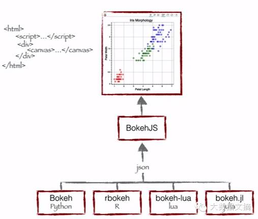
As you can see, Bokeh bundles multiple languages (Python, R, Lua, and Julia). These bundled languages produce a JSON file, which serves as an input to BokehJS (a JavaScript library), and subsequently displays the data in modern web browsers.
Bokeh can create clean and beautiful interactive visualizations like D3.js, even for very large or streaming datasets, allowing for efficient interaction. Bokeh helps everyone quickly and easily create interactive charts, dashboards, and data applications.
◆ ◆ ◆
What can Bokeh offer data scientists like me?
I initially started my data science journey as a business intelligence professional, gradually learning predictive modeling, data science, and machine learning. I primarily used QlikView and Tableau for data visualization, and SAS and Python for predictive and data analysis. I had very little experience with JavaScript.
Therefore, for all my previous data products or ideas, I could only either outsource them or present them through website wireframes, neither of which was suitable for rapid prototyping. Now, with Bokeh, I can continue using Python and quickly create these prototypes.
Advantages of Bokeh:
-
Bokeh allows you to quickly create complex statistical charts with simple commands.
-
Bokeh provides output to various media, such as HTML, Notebook documents, and servers.
-
We can also embed Bokeh visualizations in Flask and Django applications.
-
Bokeh can convert visualizations written in other libraries (such as Matplotlib, Seaborn, and ggplot).
-
Bokeh can flexibly use interactive applications, layouts, and different style choices for visualizations.
Considering the advantages of Bokeh and the challenges it faces, Bokeh is currently an ideal tool for rapid prototype development. However, if you want to innovate in a product environment, D3.js may still be your best choice.
Challenges faced by Bokeh:
-
Like any emerging open-source library, Bokeh is undergoing constant changes and developments. Therefore, the code you write today may not be fully reusable in the future.
-
Compared to D3.js, Bokeh has relatively fewer visualization options. Thus, in the short term, Bokeh cannot challenge D3.js’s dominance.
Considering the advantages of Bokeh and the challenges it faces, Bokeh is currently an ideal tool for rapid prototype development. However, if you want to innovate in a product environment, D3.js may still be your best choice.
Visualizing with Bokeh
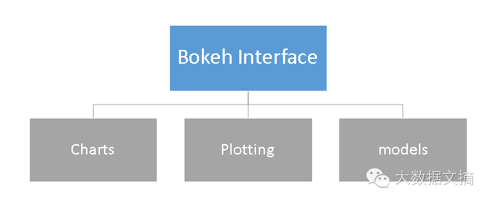
Bokeh provides powerful and flexible features that make it easy to operate and highly customizable. It offers users multiple visualization interfaces, as shown in the figure below:
-
Charts: A high-level interface for quickly building complex statistical charts.
-
Plotting: An intermediate-level interface focused on constructing various visual symbols.
-
Models: A low-level interface that provides maximum flexibility for application developers.
In this article, we will only cover the first two interfaces, Charts and Plotting.
Charts
As mentioned, it is a high-level interface used to present information through standard visualization methods. These methods include box plots, bar charts, area charts, heat maps, donut charts, and many other graphics. You can generate these charts simply by inputting data frames, numpy arrays, or dictionaries.
Let’s look at a general method for creating a chart:
1. Import libraries and functions/methods
2. Prepare data
3. Set output mode (Notebook document, web browser, or server)
4. Create the chart and select the style of the chart (if needed)
5. Visualize the chart
To better understand these steps, let me demonstrate with the following example:
Chart Example 1: Create a bar chart using Bokeh and display it in a web browser
We will follow the steps listed above to create a chart:
# Import library functions
from bokeh.charts import Bar, output_file, show
# Use output_notebook to visualize data on the computer screen
# Prepare data (simulated data)
data = {“y”: [1, 2, 3, 4, 5]}
# Output to Line.HTML
output_file(“lines.html”, title=”line plot example”)
# Create a new window with title and axis labels online
p = Bar(data, title=”Line Chart Example”, xlabel=’x’, ylabel=’values’, width=400, height=400)
# Show results
show(p)
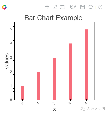
In the chart above, you can see the tool options at the top (zoom, resize, reset, rotate zoom), which help you interact with the chart. You can also see multiple chart options (legend, X-axis name label, Y-axis name label, coordinate grid lines, width, height, etc.) and various chart examples.
Chart Example 2: Compare the distribution of sepal length and petal length in the IRIS dataset using a box plot in a Notebook document
To create this visualization chart, I first need to import the IRIS dataset using the Sklearn library. Then, I will visualize the chart in an IPython Notebook document following the steps mentioned above.
# IRIS dataset
from sklearn.datasets import load_iris
import pandas as pd
iris = load_iris()
df=pd.DataFrame(iris.data)
df.columns=[‘petal_width’,’petal_length’,’sepal_width’,’sepal_length’]
# Import library functions
from bokeh.charts import BoxPlot, output_notebook, show
data=df[[‘petal_length’,’sepal_length’]]
# Output to the computer screen
output_notebook()
# Create a new window with title and axis labels online
p = BoxPlot(data, width=400, height=400)
# Show results
show(p)
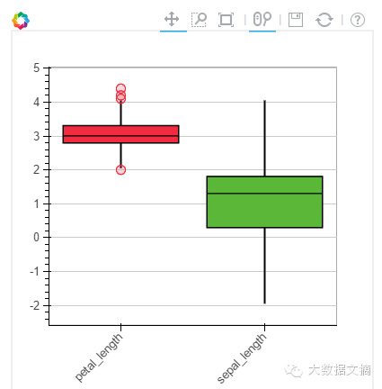
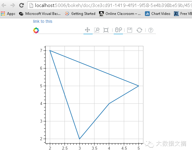
Chart Example 3: Create a line chart on the Bokeh server
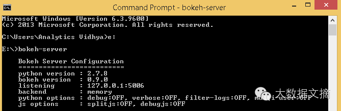
Before plotting the visualization chart on the Bokeh server, you first need to run the server.
If you are using the conda package, you can run the command “bokeh-server” in any directory. If not, “python ./bokeh-server” usually works as well.
There are several advantages to visualizing plots on the Bokeh server:
-
Charts have a larger audience
-
Interactive visualization can be performed on large datasets
-
Charts can be automatically updated based on data streams
-
Create dashboards and applications
Before starting to plot on the Bokeh server, I first ran the “bokeh-server” command to initialize it, and then executed the relevant commands for visualization.
from bokeh.plotting import figure, output_server, show
output_server(“line”)
p = figure(plot_width=400, plot_height=400)
# Add line rendering
p.line([5, 2, 3, 4, 5], [5, 7, 2, 4, 5], line_width=2)
show(p)
Plotting
Plotting is an intermediate-level interface focused on constructing visual symbols. Here, you can combine various visual elements (points, circles, lines, patches, and many other elements) and tools (hover, zoom, save, reset, and other tools) to create visualizations.
Charts created using Bokeh’s Plotting interface come with a set of default tools and visual effects. Plotting can be done in the following steps:
1. Import libraries, methods, or functions
2. Choose output method (Notebook document, web browser, server)
3. Activate the plot (similar to Matplotlib)
4. Execute subsequent plotting operations that will affect the already generated graphics.
5. Visualize the chart
To better understand these steps, let me demonstrate with an example:
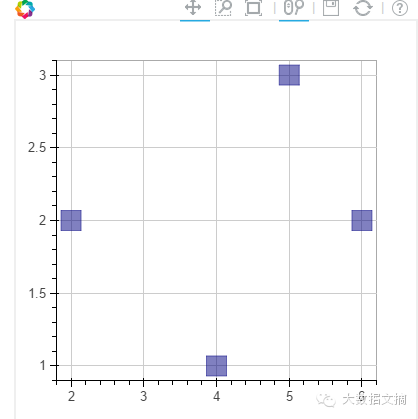
Plotting Example 1: Create a 2D scatter plot (square markers) in a Notebook document
from bokeh.plotting import figure, output_notebook, show
# Output to the computer screen
output_notebook()
p = figure(plot_width=400, plot_height=400)
# Add a square box with size, color, and alpha value
p.square([2, 5, 6, 4], [2, 3, 2, 1, 2], size=20, color=”navy”)
# Show results
show(p)
Similarly, you can create various other types of charts: such as lines, angles, arcs, ellipses, images, patches, and many other charts.
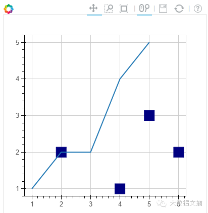
Plotting Example 2: Combine two visual elements in one chart
from bokeh.plotting import figure, output_notebook, show
# Output to the computer screen
output_notebook()
p = figure(plot_width=400, plot_height=400)
# Add a square box with size, color, and alpha value
p.square([2, 5, 6, 4], [2, 3, 2, 1, 2], size=20, color=”navy”)
p.line([1, 2, 3, 4, 5], [1, 2, 2, 4, 5], line_width=2) # added a line plot to existing figure
# Show results
show(p)
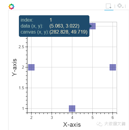
Plotting Example 3: Add a hover tool and axis labels to the above chart
from bokeh.plotting import figure, output_notebook, show
from bokeh.models import HoverTool, BoxSelectTool # For enabling tools
# Output to the computer screen
output_notebook()
# Add hover tool
TOOLS = [BoxSelectTool(), HoverTool()]
p = figure(plot_width=400, plot_height=400, tools=TOOLS)
# Add a square box with size, color, and alpha value
p.square([2, 5, 6, 4], [2, 3, 2, 1, 2], size=20, color=”navy”, alpha=0.5)
# Show axis labels
p.xaxis.axis_label = “X-axis”
p.yaxis.axis_label = “Y-axis”
# Show results
show(p)
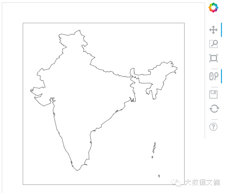
Plotting Example 4: Use latitude and longitude data to plot a map of India
Note: I already have a CSV file containing the latitude and longitude polygon data for the borders of India. I will use this data to plot.
Here, we will use patch plotting; let’s look at the commands below:
# Import library functions
import pandas as pd
from bokeh.plotting import figure, show, output_notebook
# Import latitude and longitude coordinates
India=pd.read_csv(‘E:/India.csv’)
del India[‘ID’]
India.index=[‘IN0′,’IN1′,’IN2′,’IN3′,’IN4′,’IN5’]
# If the coordinates in the dataframe are character types, convert character values to float values
for j in range(0,len(India)):
a = India[‘lats’][j]
India[‘lats’][j] = [float(i) for i in a[1:len(a)-1].split(“,”)]
for j in range(0,len(India)):
a = India[‘lons’][j]
India[‘lons’][j] = [float(i) for i in a[1:len(a)-1].split(“,”)]
# Output to the computer screen
output_notebook()
# Create a canvas
p = figure(plot_height=400, plot_width=400, toolbar_location=”right”,x_axis_type=None, y_axis_type=None)
p.patches(xs=India[‘lons’], ys=India[‘lats’], fill_color=”white”,line_color=”black”, line_width=0.5)
# Visualize the icon
show(p)
◆ ◆ ◆
Conclusion
In this article, we discussed how to create visualizations with Bokeh and how to present the visualization results in Notebook documents, HTML documents, and on the Bokeh server. We also talked about how to create personalized visual charts using the plotting interface, allowing you to combine various visual elements to display data information.
Recommended previous articles, click the image to read
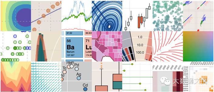
10 Ways to Visualize Data with Python

Animated GIF, tracking NBA players’ movements with Python

Step-by-step guide on how to draw JS maps with Python?
◆ ◆ ◆
Author Biography