Follow and star to learn new Python skills every day
Due to changes in the public account’s push rules, please click “View” and add “Star” to get exciting technical shares at the first time
Source from the internet, please delete if infringing

In multivariable data analysis, visualizing data involving three variables often requires three-dimensional plotting techniques to comprehensively understand and analyze complex relationships and data patterns that are difficult to present clearly in two-dimensional representations.
The Matplotlib library in Python provides powerful support for generating complex three-dimensional visualizations through its mpl_toolkits.mplot3d toolkit. The foundation for constructing three-dimensional graphics lies in correctly configuring the plotting environment to support three-dimensional projections, which requires explicit settings on the plotting axes.
This initialization process is crucial for rendering accurate spatial representations and enabling advanced visualization techniques.
Implementation Example:
 import matplotlib.pyplot as plt
 fig = plt.figure()
 ax = plt.axes(projection='3d')
 plt.show()
Output Result

The plt.figure() function creates a new figure object, serving as a container for all plotting elements. The plt.axes(projection=’3d’) adds a set of axes to the figure that enables three-dimensional projection. The projection=’3d’ parameter explicitly specifies the three-dimensional plotting mode. The plt.show() function is responsible for rendering the plotting window, ultimately displaying the configured three-dimensional coordinate system.
3D Line Plotting Techniques
Three-dimensional line plotting, also known as three-dimensional curve plotting, represents continuous spatial trajectories by connecting data points within a three-dimensional coordinate system. This visualization technique excels in describing the temporal evolution or spatial changes of variables across three dimensions, allowing analysts to identify data trends and change patterns that are difficult to perceive in lower-dimensional representations.
In the implementation of this example, trigonometric functions (sine and cosine functions) are used to generate a parameterized curve that spirals upward along the z-axis, effectively demonstrating how periodic functions can be utilized to mathematically model cyclical phenomena in three-dimensional space. Such techniques are widely applied in fields such as physics, engineering, and computer graphics, primarily for visualizing object trajectories, signal processing analysis results, and the spatial relationships of complex geometric structures.
from mpl_toolkits import mplot3d
import numpy as np
import matplotlib.pyplot as plt
fig = plt.figure()
ax = plt.axes(projection='3d')
z = np.linspace(0, 1, 100)
x = z * np.sin(25 * z)
y = z * np.cos(25 * z)
ax.plot3D(x, y, z, 'green')
ax.set_title('3D Line Plot')
plt.show()
Output Result
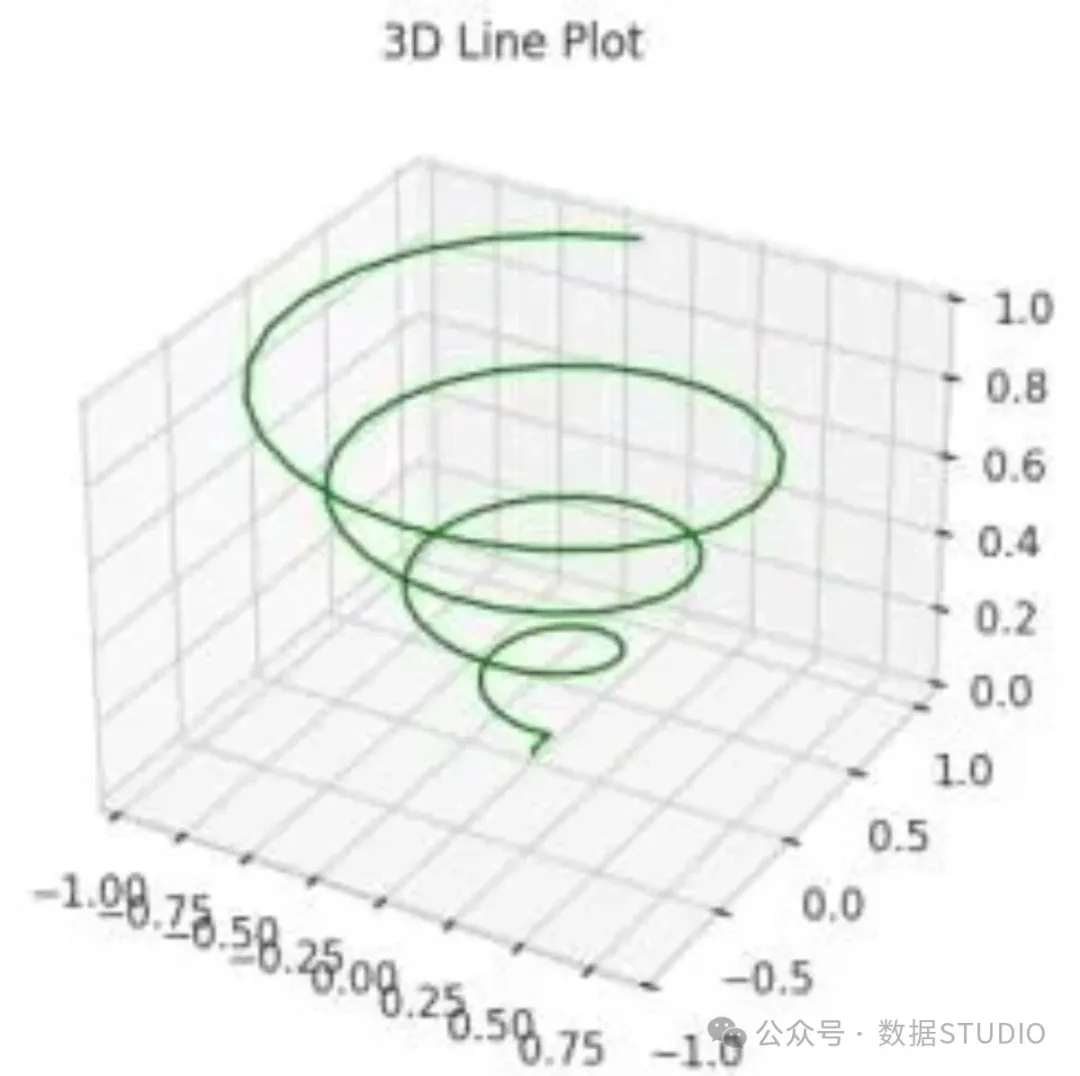
Using the np.linspace() function, 100 evenly spaced z-coordinate points are generated within the range of 0 to 1, followed by calculating x = z × sin(25z) and y = z × cos(25z) to construct the parameterized equations for the spiral trajectory. Finally, the ax.plot3D(x, y, z, ‘green’) method renders the green three-dimensional spiral curve.
3D Scatter Plot Visualization
A three-dimensional scatter plot is a visualization technique specifically used to depict discrete data points within a three-dimensional coordinate system. This method has significant advantages in identifying distribution patterns, development trends, or data clustering within multivariable datasets, as it allows analysts to intuitively observe the spatial distribution characteristics of data across three different dimensions.
In a three-dimensional scatter plot, each data point is represented by a marker symbol (usually a sphere or dot), with its position in space precisely corresponding to the (x, y, z) coordinate values of that point, thereby enabling simultaneous visualization analysis of three variables.
Additionally, by introducing color mapping techniques (i.e., color coding), the visualization effect can be further enhanced, incorporating a fourth variable (such as data magnitude, classification labels, or time series information) into the graphical representation, significantly improving the analytical depth and information capacity of the chart. This comprehensive visualization method is widely applied in scientific research, machine learning algorithm analysis, and exploratory data analysis, particularly suitable for revealing potential correlations and outlier data points within complex datasets.
fig = plt.figure()
ax = plt.axes(projection='3d')
z = np.linspace(0, 1, 100)
x = z * np.sin(25 * z)
y = z * np.cos(25 * z)
c = x + y  # Color mapping array based on x and y coordinate values
ax.scatter(x, y, z, c=c)
ax.set_title('3D Scatter Plot')
plt.show()
Output Result
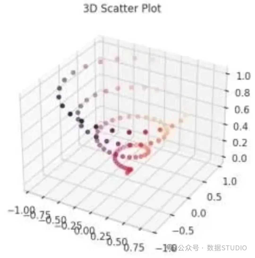
Using the same x, y, and z coordinate data as before, independent three-dimensional scatter points are plotted using the ax.scatter() method. The color parameter c = x + y is set to achieve color coding based on coordinate values, thereby introducing a fourth dimension to visualize the numerical differences between data points.
Surface Plot Visualization Techniques
Surface plots (three-dimensional surface visualizations) are used to depict continuous parameterized surfaces defined on a regular (x, y) coordinate grid, where the z values determine the elevation distribution of the surface in the vertical direction. This visualization technique is particularly suitable for representing scalar field distributions, graphical representations of bivariate mathematical functions (such as f(x,y)), or visualizing the results of interpolating empirical datasets onto regular grids.
By employing color gradients and advanced shading algorithms (such as Phong shading or Gouraud shading techniques), surface plots can effectively convey the topological structure characteristics of data, including local extrema (peaks and valleys), terrain ridges, and saddle points. This makes surface plots indispensable in applications such as function studies in mathematical analysis, terrain modeling in geographic information systems, and visualizing solutions to partial differential equations in computational physics.
 x = np.outer(np.linspace(-2, 2, 10), np.ones(10))
 y = x.copy().T
 z = np.cos(x**2 + y**3)
 fig = plt.figure()
 ax = plt.axes(projection='3d')
 ax.plot_surface(x, y, z, cmap='viridis', edgecolor='green')
 ax.set_title('Surface Plot')
 plt.show()
Output Result
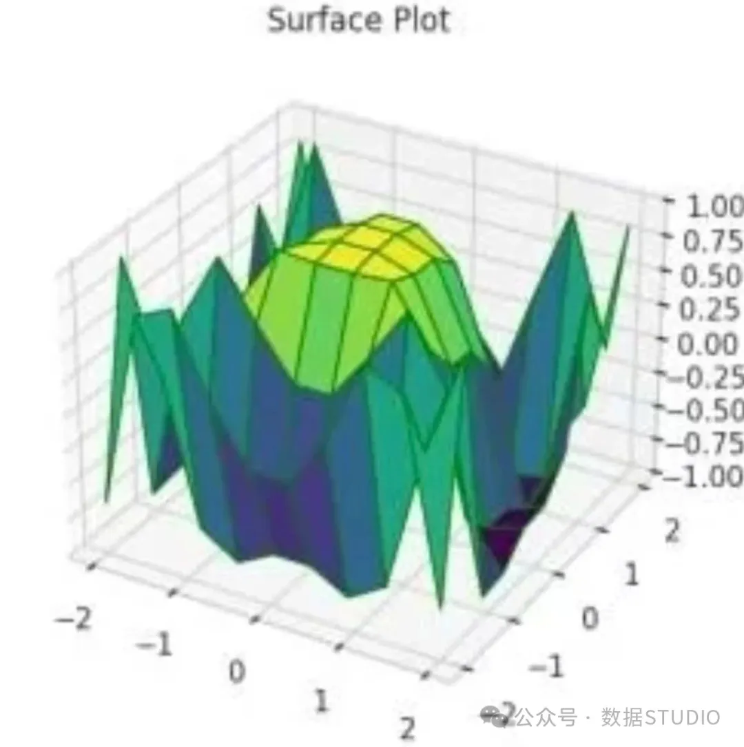
By using the np.outer() function combined with the transpose operation .T, a two-dimensional grid matrix for x and y is created, followed by calculating z = cos(x² + y³) to obtain surface elevation data. The ax.plot_surface() method is used for surface visualization, where the cmap=’viridis’ parameter specifies the color mapping scheme, and the edgecolor=’green’ parameter sets the color of the grid lines.
Wireframe Plot Visualization Method
A wireframe plot, also known as a skeleton plot or mesh plot, is a three-dimensional visualization technique that displays the geometric framework of a surface by rendering only the edges and vertex structures, omitting face fills. This simplified three-dimensional surface representation emphasizes the underlying topological structure characteristics, allowing analysts to focus on geometric relationship analysis, contour tracing, and surface mesh connectivity studies.
Wireframe plots exhibit unique technical advantages in several aspects. In topological analysis, they help identify key points (including local maxima, minima, and saddle points) and track the distribution of contour lines. In visualization transparency, wireframe plots allow observers to unobstructedly view the internal structures of overlapping surface areas. In computational efficiency, wireframe plots have lower rendering computational overhead compared to fully shaded surface plots. In the data exploration phase, wireframe plots support rapid iterative analysis, particularly suitable for preliminary visualization analysis that prioritizes structural insights over color-coded data values.
This technique is widely applied in computational geometry, computer-aided design, and numerical analysis, particularly for visualizing solutions to partial differential equations, displaying parameterized surfaces, and analyzing the structure of complex geometric models.
def f(x, y):
    return np.sin(np.sqrt(x**2 + y**2))
x = np.linspace(-1, 5, 10)
y = np.linspace(-1, 5, 10)
X, Y = np.meshgrid(x, y)
Z = f(X, Y)
fig = plt.figure()
ax = plt.axes(projection='3d')
ax.plot_wireframe(X, Y, Z, color='green')
ax.set_title('Wireframe Plot')
 plt.show()
Output Result
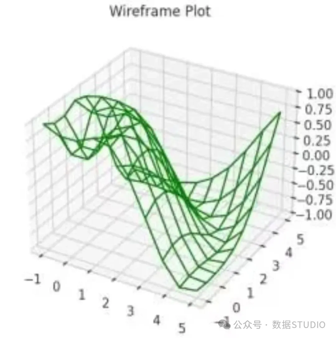
First, define the function f(x, y) = sin(√(x² + y²)), then generate grid data for x and y coordinates and calculate the corresponding z values. The three-dimensional surface is rendered as a green wireframe structure using the ax.plot_wireframe() method.
3D Contour Plot Techniques
A three-dimensional contour plot is a comprehensive visualization technique that combines three-dimensional surface visualization with projected contour lines (isoline), aimed at enhancing spatial perception of elevation gradients and terrain features. By overlaying contour lines projected onto the xy plane or other reference planes, this method provides complementary depth visual cues, thereby strengthening the spatial expression of surface geometric structures.
This hybrid visualization technique can simultaneously convey multi-layered spatial information. In terms of surface morphology, it showcases overall terrain features through three-dimensional rendering with optional color mapping. In terms of isoline sets, it achieves effects similar to topographic maps by tracking contour lines formed by equal z-value points. In terms of gradient information, it implicitly represents slope changes through the spatial density distribution of contour lines (the closer the contour lines, the steeper the terrain slope).
This visualization method is particularly suitable for analyzing scalar field distributions, mathematical function characteristics, or the features of empirical datasets, excelling in application scenarios where understanding both surface morphology and cross-sectional profile characteristics is required. Typical application fields include terrain modeling analysis, fluid dynamics research, and landscape visualization of optimization problems in machine learning.
def fun(x, y):
    return np.sin(np.sqrt(x**2 + y**2))
x = np.linspace(-10, 10, 40)
y = np.linspace(-10, 10, 40)
X, Y = np.meshgrid(x, y)
Z = fun(X, Y)
fig = plt.figure(figsize=(10, 8))
ax = plt.axes(projection='3d')
ax.plot_surface(X, Y, Z, cmap='cool', alpha=0.8)
ax.set_title('3D Contour Plot')
ax.set_xlabel('x')
ax.set_ylabel('y')
ax.set_zlabel('z')
plt.show()
Output Result
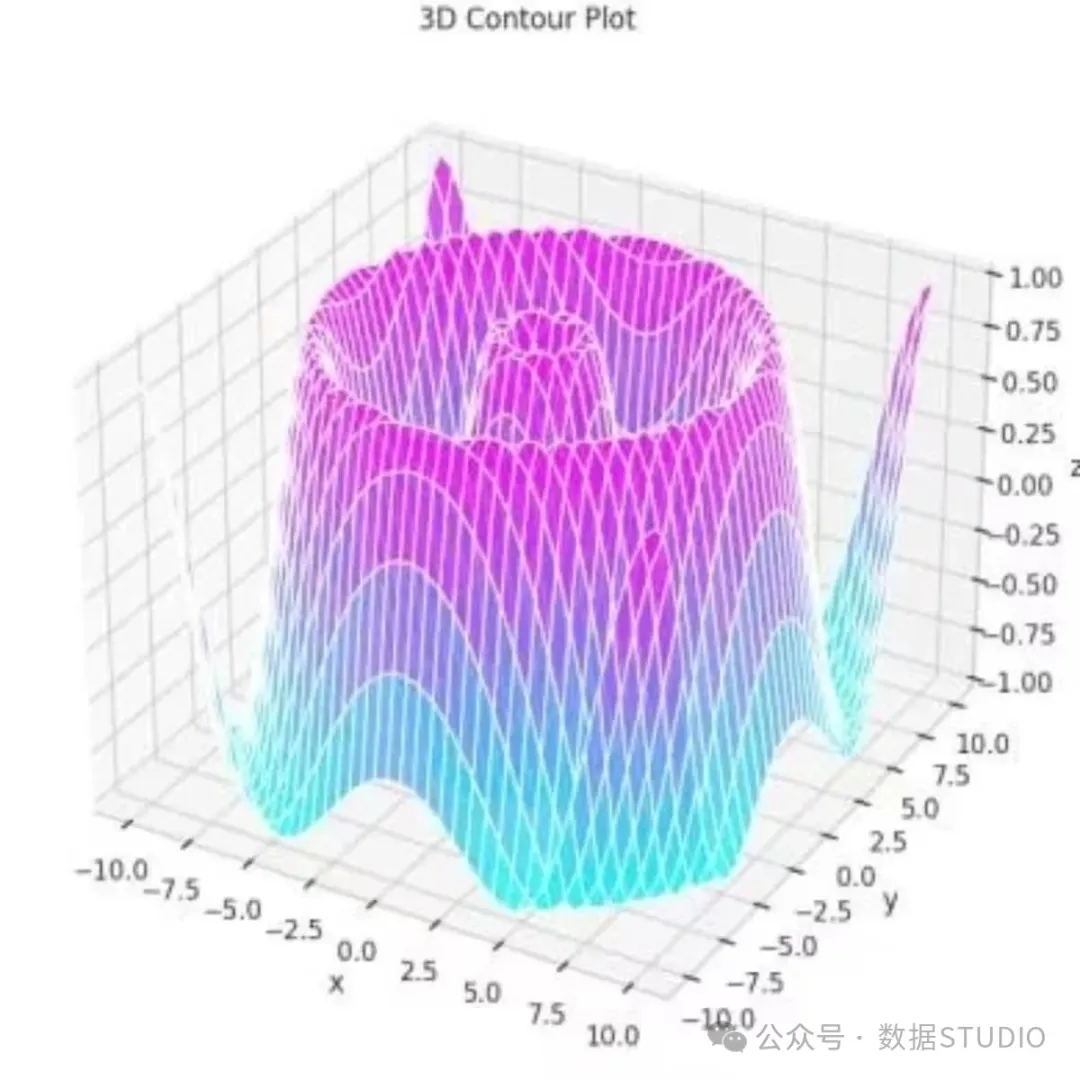
Define the function fun(x, y) = sin(√(x² + y²)) and generate high-density grid data for x and y coordinates. The ax.plot_surface() method is used to draw the surface, where the alpha=0.8 parameter sets the transparency effect, while coordinate axis labels are added to enhance the readability and professionalism of the graph.
Surface Triangulation Visualization
Surface triangulation visualization techniques use triangulated mesh interpolation methods (triangulation algorithms) to construct piecewise linear three-dimensional surfaces from discrete data points, regardless of whether these data points are arranged in a regular grid or irregular spatial distribution. Triangulated meshes (TIN, i.e., irregular triangulated networks) have significant technical advantages in handling complex terrain data.
In handling irregular terrain, triangulation can effectively model surfaces with sudden discontinuities, such as complex terrains containing cliffs or fault structures. In adaptive resolution control, this method allows for denser triangulation in areas of high curvature or significant data variability, achieving precise expression of local details. In handling non-rectangular domains, triangulation can process datasets with irregular boundaries or missing values. In terms of computational efficiency, triangulation significantly reduces computational overhead compared to higher-order interpolation methods.
The Delaunay triangulation algorithm is commonly used to generate optimal mesh structures, maximizing the minimum angle of each triangle to minimize artifacts in numerical computations. This method forms the foundational technical support in fields such as digital elevation model construction in geographic information systems, mesh rendering in computer graphics, and finite element analysis.
from matplotlib.tri import Triangulation
def f(x,y):
    return np.sin(np.sqrt(x**2+y**2))
x=np.linspace(-6,6,30)
y=np.linspace(-6,6,30)
X,Y=np.meshgrid(x,y)
Z=f(X,Y)
tri=Triangulation(X.ravel(),Y.ravel())
fig=plt.figure(figsize=(10,8))
ax=fig.add_subplot(111,projection='3d')
ax.plot_trisurf(tri,Z.ravel(),cmap='cool',edgecolor='none',alpha=0.8)
ax.set_title('Surface Triangulation Plot')
ax.set_xlabel('x')
ax.set_ylabel('y')
ax.set_zlabel('z')
plt.show()
Output Result
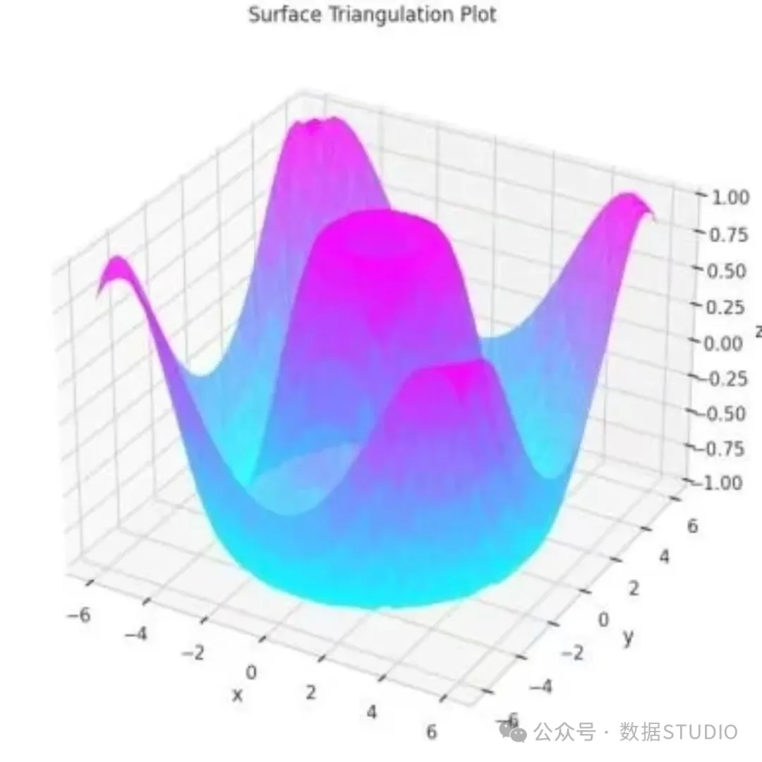
After defining the function and using np.meshgrid() to generate x and y coordinate grids, the two-dimensional arrays are flattened into one-dimensional arrays using the .ravel() method, and a Triangulation object is created. The ax.plot_trisurf() method is used to draw the triangulated surface, combining color mapping and transparency settings to achieve the final visualization effect.
3D Visualization of the Möbius Strip
The Möbius strip is a classic concept in topology, characterized as a geometric object with a single surface and a single boundary, possessing a half-twisted structure. Demonstrating the geometric form of the Möbius strip through three-dimensional visualization techniques can intuitively illustrate the perfect combination of mathematical theory and visual art, while reflecting the application value of parameterized surface modeling in expressing complex geometric structures.
R = 2
u = np.linspace(0, 2*np.pi, 100)
v = np.linspace(-1, 1, 100)
u, v = np.meshgrid(u, v)
x = (R + v * np.cos(u / 2)) * np.cos(u)
y = (R + v * np.cos(u / 2)) * np.sin(u)
z = v * np.sin(u / 2)
fig = plt.figure()
ax = fig.add_subplot(111, projection='3d')
ax.plot_surface(x, y, z, alpha=0.5)
ax.set_xlabel('X')
ax.set_ylabel('Y')
ax.set_zlabel('Z')
ax.set_title('Möbius Strip')
ax.set_xlim([-3, 3])
ax.set_ylim([-3, 3])
ax.set_zlim([-3, 3])
plt.show()
Output Result
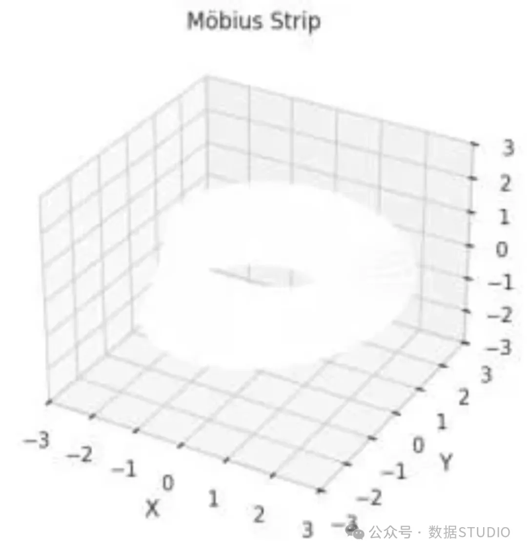
By generating parameters u and v to control the variation range in the circumferential direction and the width of the strip, they are then converted into grid form. Using the parameter equations of the Möbius strip, the x, y, and z coordinate values are calculated, and finally rendered using the ax.plot_surface() method combined with transparency settings and custom coordinate ranges to visualize this twisted band structure with special topological properties.
Conclusion
This article provides a detailed introduction to seven core three-dimensional data visualization techniques based on the Matplotlib library in Python, ranging from basic linear plots and scatter plots to advanced surface modeling and triangulation methods. These techniques offer comprehensive technical solutions for complex three-dimensional data visualization in scientific computing, data analysis, and engineering applications. Mastering these visualization methods is of significant practical value for deeply understanding the spatial relationships and inherent laws of multidimensional data.
Click to follow the public account below to get free access to Python open courses and hundreds of gigabytes of learning materials organized by experts, including but not limited to Python e-books, tutorials, project orders, source code, etc.


▲ Click to follow - Free to receive

Recommended Reading
Source code + database + course report of the weather data visualization system developed based on Python in Xinyang
Data collection and analysis visualization of job postings on Boss Zhipin implemented in Python
Write more elegant code: Understand the core differences between Python protocols and abstract base classes
Understand whether iterable objects in Python are equal, just a few tips needed


Click to read the original text