 Introduction
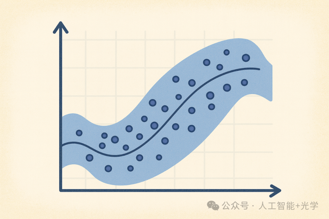
Visualization is not just about making things look good; it is about presenting data accurately. A semi-transparent scatter plot with a Confidence Region is a golden combination that balances aesthetics and scientific rigor. Whether you are creating scientific plots, data analysis reports, or engineering visualizations, this type of plot is extremely common:
-
Algorithm performance comparison
-
Sensor noise analysis
-
Regression effect visualization
-
Experimental data trend display
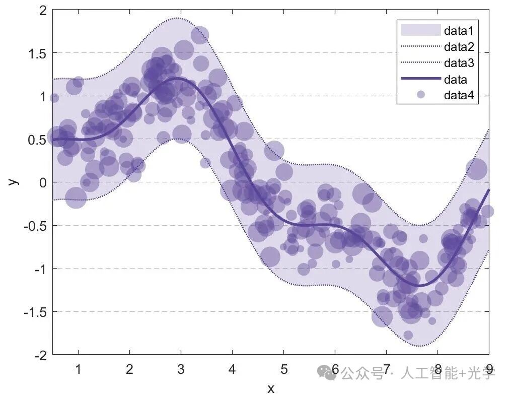
Creating Semi-Transparent Scatter Plots with Confidence Regions in MATLAB
clear all;close all;clc
rng(0);                           % Fix random seed
N  = 250;                         % Number of data points
x  = 0.5 + (9-0.5).*rand(N,1);
x  = sort(x);
f  = @(x) sin(x/1.5) + 0.3*cos(x/0.5);   % "True" function
y  = f(x) + 0.3*randn(size(x));         % Noisy observations
xg = linspace(0.5,9,400)';       % Independent variable for smooth curve
yg = f(xg);
sigma = 0.35;                    % Assume a fixed standard deviation
upper = yg + 2*sigma;           % Upper bound (≈95% confidence interval)
lower = yg - 2*sigma;           % Lower bound
%% Plotting
figure; hold on;
col = [0.35 0.27 0.60];
% Shadow confidence interval
fill([xg;flipud(xg)], [lower;flipud(upper)], col, ...    'FaceAlpha',0.2, 'EdgeColor','none');
% Confidence interval boundary dashed line
plot(xg, upper, ':', 'Color',col, 'LineWidth',1);
plot(xg, lower, ':', 'Color',col, 'LineWidth',1);
% Center smooth curve
plot(xg, yg, '-', 'Color',col, 'LineWidth',2, ...    'DisplayName','data');
% Semi-transparent bubble scatter
sz = 20 + 250*rand(N,1);    % Scatter point size (bubble size)
scatter(x, y, sz, 'MarkerFaceColor',col, ...    'MarkerFaceAlpha',0.4, 'MarkerEdgeColor','none');
% Axes and grid
xlabel('x');
ylabel('y');
xlim([0.5 9]);
set(gca, 'YGrid','on', 'XGrid','off', ...    'GridLineStyle','--', 'GridAlpha',0.3, ...    'Box','on');
legend('Location','northeast');
set(gcf,'Color','w');       % White background
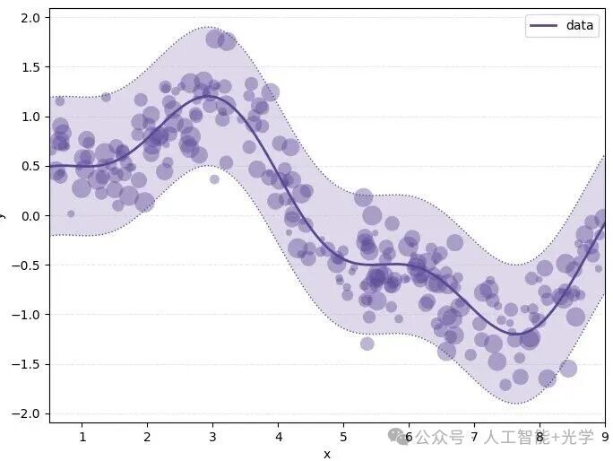
Creating Semi-Transparent Scatter Plots with Confidence Regions in Python
import numpy as np
import matplotlib.pyplot as plt
np.random.seed(0)  # Fix random seed
N = 250            # Number of data points
# Generate x (uniformly distributed between 0.5 and 9)
x = 0.5 + (9 - 0.5) * np.random.rand(N)
x = np.sort(x)
# Define function f
def f_func(t):
    return np.sin(t / 1.5) + 0.3 * np.cos(t / 0.5)
# Generate y (with noise)
y = f_func(x) + 0.3 * np.random.randn(N)
# Generate smooth curve data
xg = np.linspace(0.5, 9, 400)
yg = f_func(xg)
sigma = 0.35
upper = yg + 2 * sigma  # Upper bound
lower = yg - 2 * sigma  # Lower bound
# %% Plotting
# Set color
col = (0.35, 0.27, 0.60)
# Create canvas, set background to white
fig, ax = plt.subplots(figsize=(8, 6), facecolor='w')
# 1. Draw shadow confidence interval
ax.fill_between(xg, lower, upper, color=col, alpha=0.2, edgecolor='none')
# 2. Draw confidence interval boundary dashed line
ax.plot(xg, upper, ':', color=col, linewidth=1)
ax.plot(xg, lower, ':', color=col, linewidth=1)
# 3. Draw center smooth curve
ax.plot(xg, yg, '-', color=col, linewidth=2, label='data')
# 4. Draw semi-transparent bubble scatter
sz = 20 + 250 * np.random.rand(N)  # Scatter point size
ax.scatter(x, y, s=sz, color=col, alpha=0.4, edgecolors='none')
# 5. Axes and grid settings
ax.set_xlabel('x')
ax.set_ylabel('y')
ax.set_xlim(0.5, 9)
# Set grid: Y-axis on, dashed line, transparency
ax.grid(True, which='major', axis='y', linestyle='--', alpha=0.3)
ax.grid(False, axis='x')
ax.legend(loc='upper right')
# Show image
plt.show()
# I ran this on Linux, please modify the save path accordingly
plt.savefig('/root/result.png')
print("Image saved to /root/result.png")
Conclusion
If you want to make your scientific plots more professional and give them a “journal feel,” a semi-transparent scatter plot with confidence regions is definitely the combination worth mastering.