Hello, everyone! I am the evolving ape, a learner navigating the field of data analysis. Today, I will guide you through advanced customization techniques for data visualization!
In the field of data visualization, basic charts can only tell half the story. This article will delve into how to elevate our data visualization to a professional level through advanced customization techniques, allowing charts to not only display data but also narrate a complete data story.
Adding Reference Lines and Annotations: Enhancing Chart Interpretability
Professional Reference Line System
import numpy as np
import pandas as pd
import seaborn as sns
import matplotlib.pyplot as plt
from matplotlib.ticker import FuncFormatter

# Create financial dataset
np.random.seed(42)
dates = pd.date_range('2023-01-01', periods=100)
stock_data = pd.DataFrame({    'Date': dates,    'Price': np.cumsum(np.random.randn(100)*0.5) + 100,    'Volume': np.random.randint(1000, 10000, 100)})

# Create basic chart
plt.figure(figsize=(12, 6))
ax = sns.lineplot(x='Date', y='Price', data=stock_data, linewidth=2.5, color='#3498db')

# Add professional reference line system
def add_reference_lines(ax, data):
    """Add multi-type reference line system"""
    # Horizontal reference line
    mean_price = data['Price'].mean()
    ax.axhline(mean_price, color='#e74c3c', linestyle='--', alpha=0.7, linewidth=1.5)
    ax.text(data['Date'].iloc[-1] + pd.Timedelta(days=2),             mean_price,             f' Mean: {mean_price:.2f}',             va='center',             color='#e74c3c')

    # Vertical reference line (key event)
    event_date = pd.to_datetime('2023-03-15')
    ax.axvline(event_date, color='#2ecc71', linestyle=':', alpha=0.7, linewidth=1.5)
    ax.text(event_date,             data['Price'].min()*0.98,             ' Product Launch',             rotation=90,             va='bottom',             color='#2ecc71')

    # Area fill
    ax.axhspan(95, 105, color='#f39c12', alpha=0.1)
    ax.text(data['Date'].iloc[10], 100,             ' Normal Range',             color='#f39c12',             bbox=dict(facecolor='white', alpha=0.8))

    # Trend line
    x_vals = np.array([data['Date'].iloc[0], data['Date'].iloc[-1]])
    y_vals = np.array([data['Price'].iloc[0], data['Price'].iloc[-1]])
    ax.plot(x_vals, y_vals, color='#9b59b6', linestyle='-.', alpha=0.5)
    ax.text(x_vals[-1], y_vals[-1]+1,             ' Overall Trend',             color='#9b59b6',             ha='right')

add_reference_lines(ax, stock_data)

# Chart decoration
ax.set_title('Stock Price Analysis with Reference System', fontsize=16, pad=20)
ax.set_xlabel('Date', fontsize=12)
ax.set_ylabel('Price ($)', fontsize=12)
plt.xticks(rotation=45)
plt.grid(True, alpha=0.2)
plt.tight_layout()
plt.show()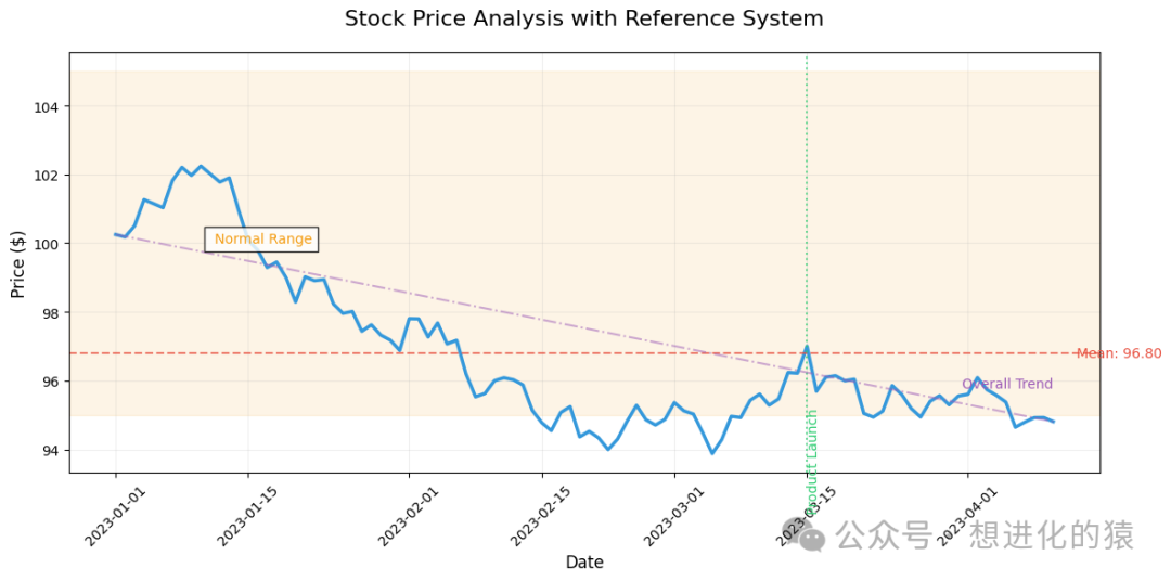
Smart Annotation Engine
# Create sales dataset
sales_data = pd.DataFrame({    'Month': ['Jan', 'Feb', 'Mar', 'Apr', 'May', 'Jun'],    'Revenue': [120, 145, 160, 185, 210, 190],    'Profit': [25, 30, 45, 60, 75, 50]})
plt.figure(figsize=(10, 6))
ax = sns.barplot(x='Month', y='Revenue', data=sales_data, color='#3498db', alpha=0.7)

# Smart annotation system
def smart_annotations(ax, data):
    """Automatically add annotations based on data characteristics"""
    max_val = data['Revenue'].max()
    min_val = data['Revenue'].min()
    avg_val = data['Revenue'].mean()

    for i, val in enumerate(data['Revenue']):
        # Regular annotation
        ax.text(i, val + 5, f'{val}K',                 ha='center',                 fontsize=10,                bbox=dict(facecolor='white', alpha=0.8, edgecolor='none'))

        # Special point annotation
        if val == max_val:
            ax.text(i, val + 15, 'Peak Sales!',                     ha='center',                     color='#e74c3c',                    fontweight='bold',                    bbox=dict(facecolor='white', edgecolor='#e74c3c', boxstyle='round,pad=0.5'))
        elif val == min_val:
            ax.text(i, val - 15, 'Lowest',                     ha='center',                     va='top',                    color='#2ecc71',                    bbox=dict(facecolor='white', edgecolor='#2ecc71', boxstyle='round,pad=0.5'))

    # Add average line
    ax.axhline(avg_val, color='#9b59b6', linestyle='--', alpha=0.7)
    ax.text(len(data)-0.5, avg_val+3, f'Avg: {avg_val:.1f}K',             ha='right',             color='#9b59b6',            bbox=dict(facecolor='white', alpha=0.8))

smart_annotations(ax, sales_data)

# Add second Y-axis
ax2 = ax.twinx()
sns.lineplot(x=np.arange(len(sales_data)), y='Profit', data=sales_data,              color='#e74c3c', marker='o', linewidth=2.5, ax=ax2)
ax2.set_ylabel('Profit (K)', fontsize=12)
plt.title('Monthly Revenue & Profit Analysis', fontsize=16, pad=20)
plt.grid(True, alpha=0.2)
plt.tight_layout()
plt.show()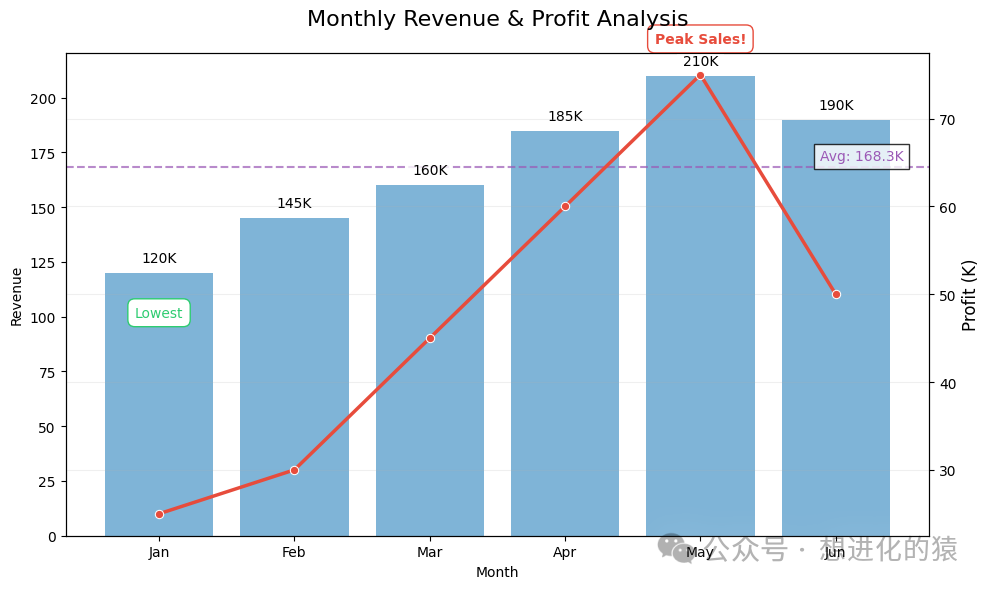
Custom Legends and Labels: Creating Branded Visuals
Advanced Legend Engineering
# Create multi-series dataset
np.random.seed(42)
x = np.linspace(0, 10, 100)
data = pd.DataFrame({    'x': np.tile(x, 3),    'y': np.concatenate([        np.sin(x) * 3 + np.random.normal(0, 0.2, 100),        np.cos(x) * 3 + np.random.normal(0, 0.2, 100),        (np.sin(x) + np.cos(x)) * 2 + np.random.normal(0, 0.2, 100)    ]),    'series': np.repeat(['Production', 'Sales', 'Inventory'], 100),    'region': np.random.choice(['North', 'South', 'East', 'West'], 300)})
plt.figure(figsize=(12, 7))
ax = sns.lineplot(x='x', y='y', hue='series', style='region',                   data=data, palette='Set2', linewidth=2.5)

# Advanced legend customization
def customize_legend(ax, position='upper right'):
    """Professional legend customization function"""
    # Get current legend
    legend = ax.legend_

    # If there is an existing legend, remove it first
    if legend is not None:
        legend.remove()

    # Create custom legend handles
    from matplotlib.lines import Line2D
    custom_lines = [        Line2D([0], [0], color=sns.color_palette('Set2')[0], lw=4),        Line2D([0], [0], color=sns.color_palette('Set2')[1], lw=4),        Line2D([0], [0], color=sns.color_palette('Set2')[2], lw=4),    ]

    # Create first legend (series)
    leg1 = ax.legend(custom_lines, ['Production', 'Sales', 'Inventory'],                     title='Business Metrics',                     title_fontsize=12,                     fontsize=11,                     loc='upper left',                     frameon=True,                     framealpha=0.9,                     edgecolor='#34495e')

    # Add second legend (region)
    region_markers = [        Line2D([0], [0], color='gray', marker='o', linestyle='None'),        Line2D([0], [0], color='gray', marker='s', linestyle='None'),        Line2D([0], [0], color='gray', marker='^', linestyle='None'),        Line2D([0], [0], color='gray', marker='D', linestyle='None')    ]
    leg2 = ax.legend(region_markers, ['North', 'South', 'East', 'West'],                     title='Region',                     title_fontsize=12,                     fontsize=11,                     loc='lower right',                     ncol=2,                     frameon=True,                     framealpha=0.9,                     edgecolor='#34495e')

    # Add both legends to the chart
    ax.add_artist(leg1)
    ax.add_artist(leg2)
    return ax

# Apply legend customization
ax = customize_legend(ax)

# Chart decoration
ax.set_title('Business Metrics with Advanced Legend', fontsize=16, pad=20)
ax.set_xlabel('Time Period', fontsize=12)
ax.set_ylabel('Metric Value', fontsize=12)
plt.grid(True, alpha=0.2)
plt.tight_layout()
plt.show()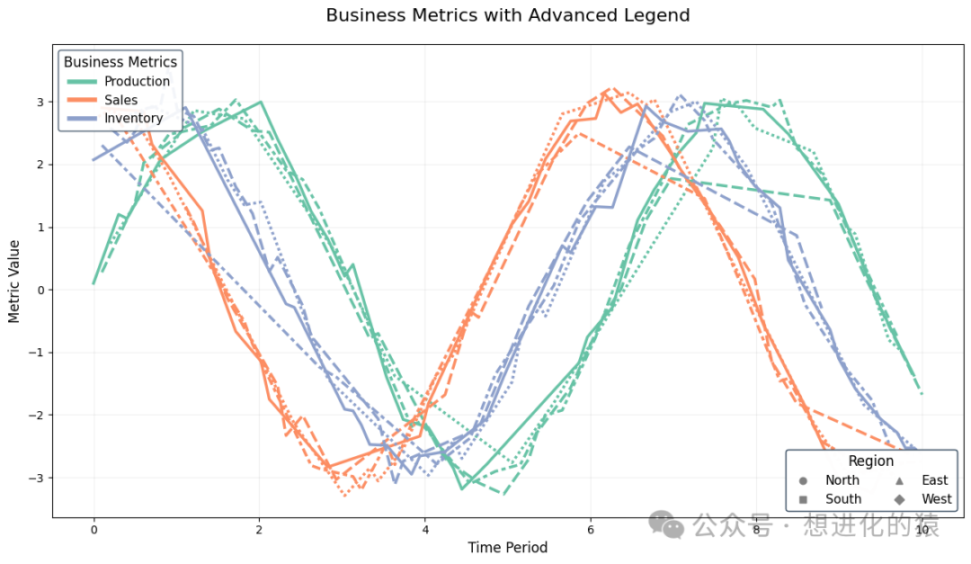
Label Formatting Engine
# Create financial dataset
financials = pd.DataFrame({    'Quarter': ['Q1 2023', 'Q2 2023', 'Q3 2023', 'Q4 2023'],    'Revenue': [4500000, 5200000, 4800000, 6200000],    'Growth': [0.15, 0.23, -0.05, 0.32]})
plt.figure(figsize=(10, 6))
ax = sns.barplot(x='Quarter', y='Revenue', data=financials, color='#3498db')

# Professional label formatting
def format_labels(ax, data):
    """Apply professional-level label formatting"""
    # Y-axis currency formatting
    def currency_formatter(x, pos):
        if x >= 1e6:
            return f'${x/1e6:.1f}M'
        return f'${x/1e3:.0f}K'

    ax.yaxis.set_major_formatter(FuncFormatter(currency_formatter))

    # Add data labels
    for i, val in enumerate(data['Revenue']):
        ax.text(i, val + 100000, currency_formatter(val, None),                 ha='center',                 fontsize=10,                bbox=dict(facecolor='white', alpha=0.8, pad=2))

    # Add growth rate labels
    ax2 = ax.twinx()
sns.lineplot(x=np.arange(len(data)), y='Growth', data=financials,                  color='#e74c3c', marker='o', linewidth=2.5, ax=ax2)

    # Growth rate percentage formatting
    ax2.yaxis.set_major_formatter(FuncFormatter(lambda x, _: f'{x:.0%}'))
    ax2.set_ylabel('Growth Rate', fontsize=12)

    # Highlight growth points
    for i, growth in enumerate(data['Growth']):
        if growth > 0.2:
            ax2.text(i, growth + 0.02, f'+{growth:.0%}',                      ha='center',                      color='#e74c3c',                     fontweight='bold',                     bbox=dict(facecolor='white', edgecolor='#e74c3c', boxstyle='round,pad=0.3'))
        elif growth < 0:
            ax2.text(i, growth - 0.05, f'{growth:.0%}',                      ha='center',                      color='#2ecc71',                     bbox=dict(facecolor='white', edgecolor='#2ecc71', boxstyle='round,pad=0.3'))

format_labels(ax, financials)
plt.title('Quarterly Financial Performance', fontsize=16, pad=20)
plt.grid(True, alpha=0.2)
plt.tight_layout()
plt.show()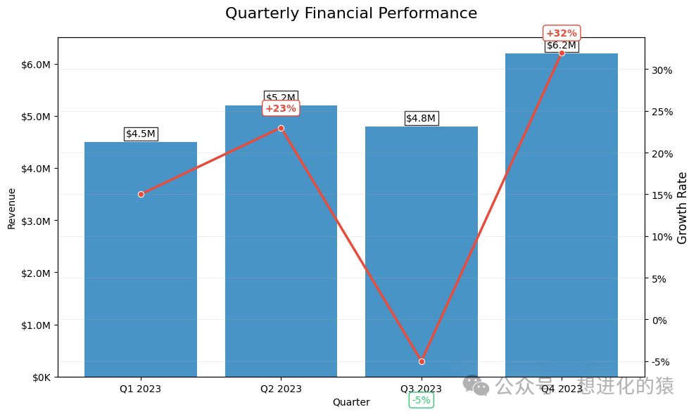
Axis and Scale Control: Precise Data Expression
Professional Axis Engineering
# Create scientific dataset
x = np.linspace(0, 20, 500)
data = pd.DataFrame({    'x': x,    'y1': np.sin(x) * np.exp(-x/10),    'y2': np.cos(x) * np.exp(-x/15)})
plt.figure(figsize=(12, 7))
ax = sns.lineplot(x='x', y='y1', data=data, color='#3498db', linewidth=2.5)
sns.lineplot(x='x', y='y2', data=data, color='#e74c3c', linewidth=2.5, ax=ax)

# Advanced axis control
def advanced_axes(ax):
    """Professional axis control system"""
    # Set dual Y-axis
    ax2 = ax.twinx()
    ax2.plot(data['x'], data['y2'], color='#e74c3c', linewidth=2.5, alpha=0)

    # Set scientific notation
    ax.yaxis.set_major_formatter(FuncFormatter(lambda x, _: f'{x:.1e}'))
    ax2.yaxis.set_major_formatter(FuncFormatter(lambda x, _: f'{x:.1e}'))

    # Set tick density
    ax.xaxis.set_major_locator(plt.MultipleLocator(2))
    ax.xaxis.set_minor_locator(plt.MultipleLocator(0.5))

    # Set grid
    ax.grid(which='major', linestyle='-', linewidth='0.5', color='gray', alpha=0.5)
    ax.grid(which='minor', linestyle=':', linewidth='0.5', color='gray', alpha=0.3)

    # Set axis color
    ax.spines['left'].set_color('#3498db')
    ax.spines['right'].set_color('#e74c3c')
    ax.tick_params(axis='y', colors='#3498db')
    ax2.tick_params(axis='y', colors='#e74c3c')

    # Set axis labels
    ax.set_ylabel('Decaying Sine', color='#3498db', fontsize=12)
    ax2.set_ylabel('Decaying Cosine', color='#e74c3c', fontsize=12)

    # Set axis limits
    ax.set_ylim(-1.1, 1.1)
    ax2.set_ylim(-1.1, 1.1)
    return ax, ax2

ax, ax2 = advanced_axes(ax)
# Chart decoration
plt.title('Scientific Data with Advanced Axes', fontsize=16, pad=20)
plt.xlabel('Time (s)', fontsize=12)
plt.tight_layout()
plt.show()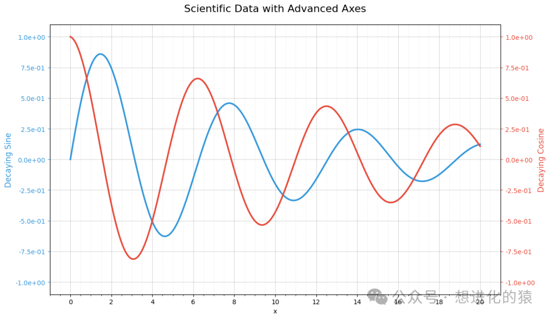
Logarithmic and Polar Transformations
# Create polar coordinate dataset
theta = np.linspace(0, 2*np.pi, 100)
r = np.abs(np.sin(5*theta) + 0.1*np.random.randn(100))
plt.figure(figsize=(12, 6))

# Standard Cartesian coordinates
plt.subplot(1, 2, 1, projection='rectilinear')
plt.plot(theta, r, color='#3498db')
plt.title('Cartesian Coordinates', fontsize=14)
plt.xlabel('Theta (radians)', fontsize=10)
plt.ylabel('Amplitude', fontsize=10)
plt.grid(True, alpha=0.3)

# Polar coordinates
plt.subplot(1, 2, 2, projection='polar')
plt.plot(theta, r, color='#e74c3c')
plt.title('Polar Coordinates', fontsize=14, pad=20)
plt.grid(True, alpha=0.3)
plt.suptitle('Coordinate System Transformation', fontsize=16, y=0.95)
plt.tight_layout()
plt.show()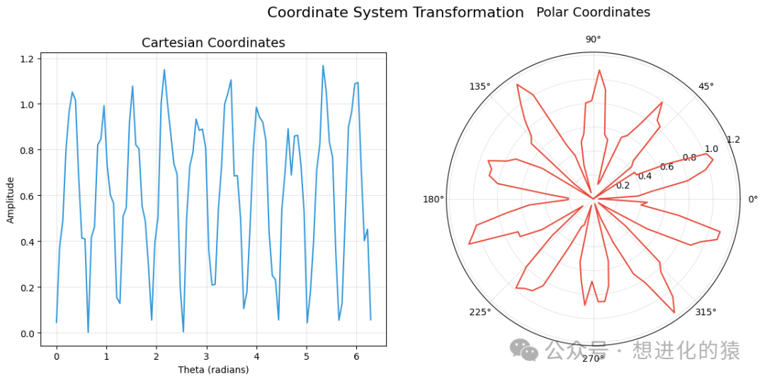
Hybrid Use with Matplotlib: Unlocking Full Potential
Hybrid Plotting System
from matplotlib.patches import Ellipse, Rectangle, Wedge
# Create hybrid chart
plt.figure(figsize=(12, 8))

# Use Seaborn to draw basic chart
ax = sns.barplot(x=['A', 'B', 'C', 'D'],                  y=[25, 40, 30, 45],                  palette='pastel',                  alpha=0.7)

# Use Matplotlib to add advanced elements
# 1. Add custom shapes
ax.add_patch(Rectangle((0.5, 20), 1, 20, color='#e74c3c', alpha=0.3))
ax.add_patch(Ellipse((2.5, 50), 0.8, 15, color='#2ecc71', alpha=0.3))
ax.add_patch(Wedge((3, 10), 10, 0, 180, color='#3498db', alpha=0.3))

# 2. Add custom lines
ax.plot([0, 3], [30, 30], color='#9b59b6', linestyle='--', linewidth=2)

# 3. Add complex annotations
ax.annotate('Critical Threshold',             xy=(1.5, 30),             xytext=(1.5, 15),            arrowprops=dict(arrowstyle='->', color='#9b59b6'),            bbox=dict(boxstyle='round,pad=0.5', fc='white', ec='#9b59b6'),            ha='center')

# 4. Add mathematical formula
ax.text(0.5, 50, r'$\\int_0^1 x^2 dx = \frac{1}{3}$',         fontsize=14,         bbox=dict(facecolor='white', alpha=0.8))

# 5. Add custom legend
from matplotlib.lines import Line2D
custom_lines = [    Line2D([0], [0], color='#e74c3c', lw=4, alpha=0.3),    Line2D([0], [0], color='#2ecc71', lw=4, alpha=0.3),    Line2D([0], [0], color='#9b59b6', lw=2, linestyle='--')]
ax.legend(custom_lines, ['Warning Zone', 'Target Area', 'Threshold'],           loc='upper right',           frameon=True,           framealpha=0.9)
plt.title('Hybrid Visualization with Seaborn & Matplotlib', fontsize=16, pad=20)
plt.ylabel('Performance Score', fontsize=12)
plt.grid(True, alpha=0.2)
plt.tight_layout()
plt.show()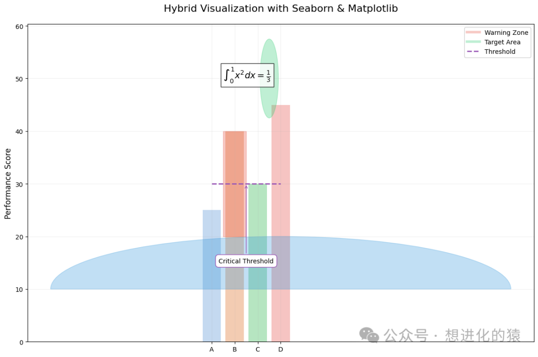
Advanced Hybrid Applications: Overlaying Heatmaps and Scatter Plots
# Create hybrid dataset
np.random.seed(42)
x = np.random.randn(1000)
y = x * 0.5 + np.random.randn(1000) * 0.5
z = np.sin(x*2) + np.cos(y*2)
plt.figure(figsize=(12, 8))

# Use Matplotlib to draw hexbin
hb = plt.hexbin(x, y, C=z, gridsize=30, cmap='viridis', alpha=0.7)
cb = plt.colorbar(hb)
cb.set_label('Function Value', fontsize=12)

# Use Seaborn to add regression line
sns.regplot(x=x, y=y, scatter=False, color='#e74c3c', line_kws={'linewidth': 2.5})

# Use Matplotlib to add contour
from scipy.stats import gaussian_kde
kde = gaussian_kde(np.vstack([x, y]))
xgrid = np.linspace(x.min(), x.max(), 100)
ygrid = np.linspace(y.min(), y.max(), 100)
Xgrid, Ygrid = np.meshgrid(xgrid, ygrid)
Z = kde(np.vstack([Xgrid.ravel(), Ygrid.ravel()]))
plt.contour(Xgrid, Ygrid, Z.reshape(Xgrid.shape),             levels=5, colors='white', linewidths=1, alpha=0.7)

# Add special point annotations
outliers = np.where(np.abs(x) > 2.5)[0]
plt.scatter(x[outliers], y[outliers], color='#e74c3c', s=50, edgecolor='white')
for i in outliers:
    plt.text(x[i], y[i], f'Outlier {i}',              fontsize=10,              color='white',             bbox=dict(facecolor='#e74c3c', alpha=0.7))
plt.title('Advanced Hybrid Visualization', fontsize=16, pad=20)
plt.xlabel('X Variable', fontsize=12)
plt.ylabel('Y Variable', fontsize=12)
plt.grid(True, alpha=0.2)
plt.tight_layout()
plt.show()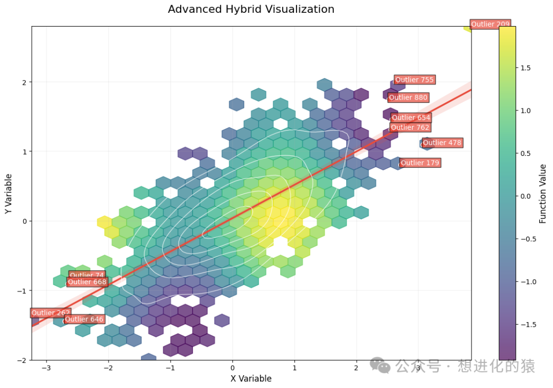
Graph Saving and Exporting: Professional Publishing-Grade Output
Advanced Export System
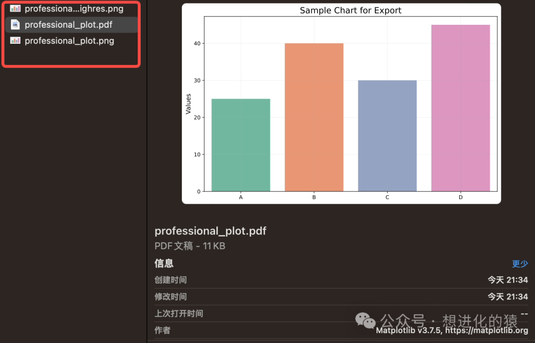
# Create sample chart
plt.figure(figsize=(10, 6))
sns.barplot(x=['A', 'B', 'C', 'D'], y=[25, 40, 30, 45], palette='Set2')
plt.title('Sample Chart for Export', fontsize=16)
plt.ylabel('Values', fontsize=12)
plt.grid(True, alpha=0.2)

# Professional export function
def export_plot(fig, filename, formats=['png', 'pdf', 'svg'], dpi=300, **kwargs):
    """    Professional chart export system    Parameters:        fig: matplotlib figure object        filename: save filename (without extension)        formats: export format list        dpi: resolution (dots per inch)        **kwargs: other save parameters    """
    for fmt in formats:
        output_file = f"{filename}.{fmt}"
        fig.savefig(            output_file,            dpi=dpi,            bbox_inches='tight',            facecolor=fig.get_facecolor(),            edgecolor='none',            **kwargs        )        print(f"Exported to {output_file} at {dpi} DPI")

    # Additional export high-resolution version
    fig.savefig(        f"{filename}_highres.png",        dpi=600,        bbox_inches='tight',        facecolor=fig.get_facecolor(),        edgecolor='none'    )
    print(f"Exported high-res version to {filename}_highres.png at 600 DPI")

# Usage example
export_plot(plt.gcf(), 'professional_plot', formats=['png', 'pdf'], dpi=300)
plt.close()
Exported to professional_plot.png at 300 DPI
Exported to professional_plot.pdf at 300 DPI
Exported high-res version to professional_plot_highres.png at 600 DPI
Batch Exporting in Multiple Formats and DPIs
# Create complex chart
fig, (ax1, ax2) = plt.subplots(1, 2, figsize=(15, 6))

# First subplot
sns.barplot(x=['A', 'B', 'C', 'D'], y=[25, 40, 30, 45], palette='Set2', ax=ax1)
ax1.set_title('Bar Chart', fontsize=14)

# Second subplot
sns.lineplot(x=np.arange(10), y=np.random.randn(10).cumsum(),              marker='o', color='#e74c3c', ax=ax2)
ax2.set_title('Line Chart', fontsize=14)

# Overall title
fig.suptitle('Multi-Panel Figure for Export', fontsize=16, y=1.02)

# Advanced batch export
def batch_export(fig, base_name, dpi_list=[72, 150, 300, 600], formats=['png', 'pdf', 'svg']):
    """Batch export different resolutions and formats"""
    for dpi in dpi_list:
        for fmt in formats:
            filename = f"{base_name}_{dpi}dpi.{fmt}"
            fig.savefig(                filename,                dpi=dpi,                bbox_inches='tight',                facecolor=fig.get_facecolor(),                edgecolor='none',                transparent=True            )            print(f"Exported: {filename}")

    # Additional export TIFF format (suitable for publishing)
    fig.savefig(        f"{base_name}_print.tiff",        dpi=600,        bbox_inches='tight',        facecolor=fig.get_facecolor(),        edgecolor='none',        format='tiff',        pil_kwargs={'compression': 'tiff_lzw'}    )
    print(f"Exported print-ready: {base_name}_print.tiff")

# Usage example
batch_export(fig, 'multi_panel_figure', dpi_list=[150, 300], formats=['png', 'pdf'])
plt.close()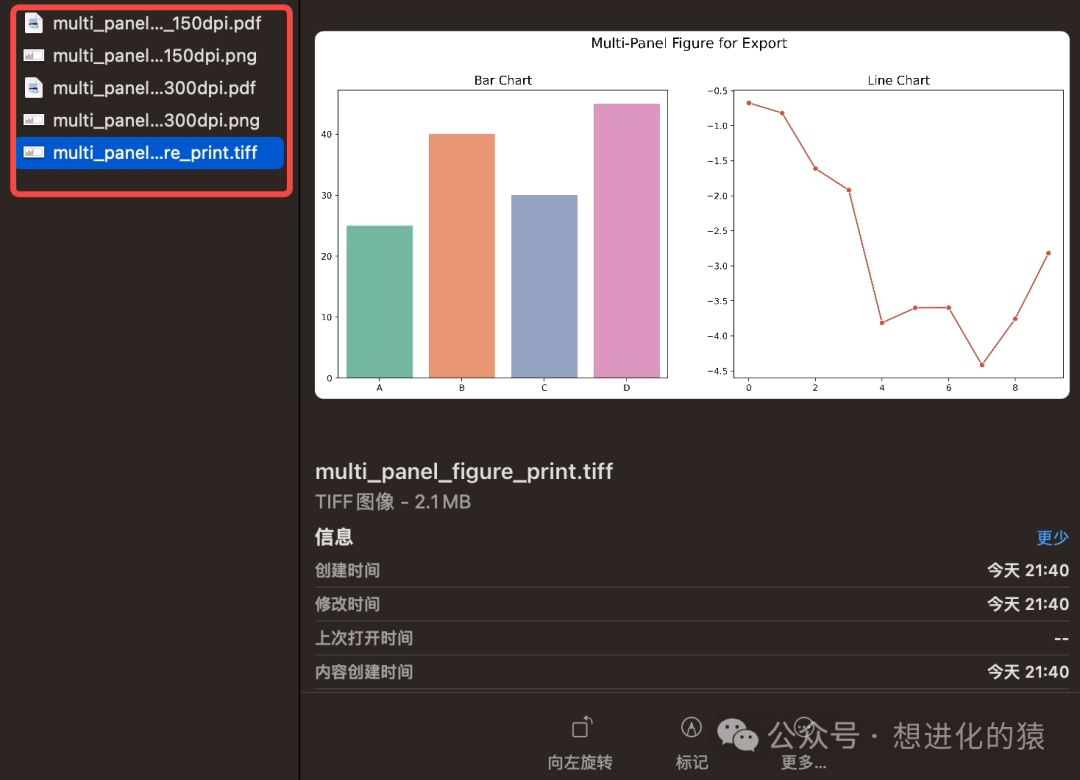
Professional Visualization Checklist
-
Reference Lines and Annotations
- Are key thresholds and baseline lines annotated?
- Are outliers and special trends explained?
- Are annotations clear and unobtrusive?
Legends and Labels
- Are legends complete and easy to understand?
- Are data label formats professional (currency, percentage, etc.)?
- Is the multi-legend system organized?
Axis Control
- Is tick density appropriate for the data range?
- Is the appropriate scale used (linear, logarithmic, etc.)?
- Are axis labels clear and precise?
Hybrid Plotting
- Are the advantages of Seaborn and Matplotlib fully utilized?
- Do custom graphic elements enhance data expression?
- Do complex charts maintain readability?
Export Settings
- Are multiple format and resolution options provided?
- Does the export version retain sufficient editability (e.g., PDF/SVG)?
- Is the print version set to a sufficiently high DPI?
Conclusion
Through the introduction in this article, I believe everyone has mastered these advanced customization techniques. By utilizing these techniques, we will be able to:
- Create charts with professional publishing quality
- Produce business reports with complex annotations
- Develop high-precision visualizations required for academic research
- Build automated chart production pipelines
- Ensure the best presentation of visual works across various media