
Source: Deep Learning Enthusiasts


This article is about 1800 words long and takes about 8 minutes to read. It introduces 10 Python data visualization libraries suitable for multiple disciplines.
Today, we will introduce 10 Python data visualization libraries suitable for multiple disciplines, some of which are well-known while others are less recognized.
1. Matplotlib
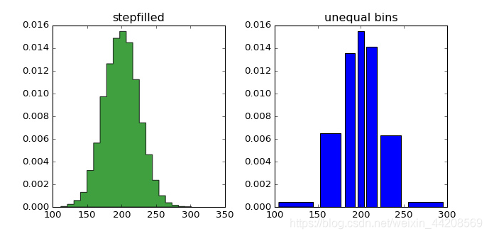
Two histograms
Matplotlib is the master of Python visualization libraries. After more than a decade, it remains the most commonly used plotting library among Python users. Its design is very similar to the commercial programming language MATLAB, which was designed in the 1980s.
Since Matplotlib is the first Python visualization library, many other libraries are built on its foundation or directly call it.
For example, pandas and Seaborn are wrappers around Matplotlib, allowing you to call Matplotlib’s methods with less code.
While Matplotlib makes it easy to get a general idea of the data, creating publishable charts is not as straightforward.
As Chris Moffitt mentioned in “Introduction to Python Visualization Tools”: “It is very powerful, but also very complex.”
Matplotlib’s default plotting style, which has a strong 90s vibe, has been criticized for many years. The upcoming Matplotlib 2.0 claims to include many more stylish options.
Developer: John D. Hunter
More information: http://matplotlib.org/
2. Seaborn
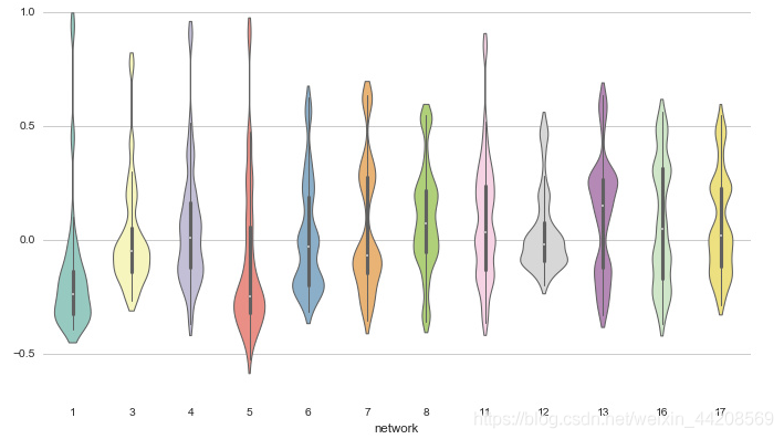
Violin plot (Michael Waskom)
Seaborn leverages Matplotlib to create attractive charts with concise code.
The main difference between Seaborn and Matplotlib is that Seaborn’s default plotting style and color palette have a modern aesthetic.
Since Seaborn is built on Matplotlib, you need to understand Matplotlib in order to adjust Seaborn’s default parameters.
Developer: Michael Waskom
More information: http://seaborn.pydata.org/index.html
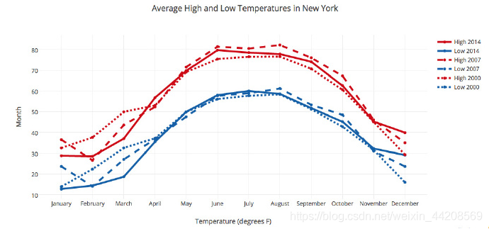
3. ggplot
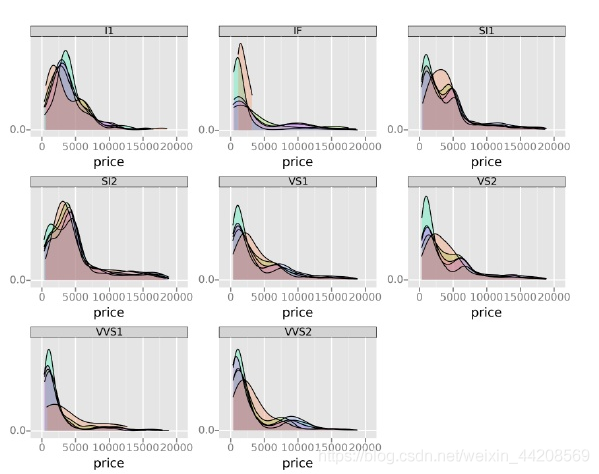
Small multiples (ŷhat)
ggplot is based on R’s ggplot2 plotting package and utilizes concepts from “The Grammar of Graphics”.
ggplot differs from Matplotlib in that it allows you to layer different components to create a plot. For instance, you can start with axes and then add points, lines, trend lines, and so on.
While “The Grammar of Graphics” has been praised for its “thinking process” approach to plotting, users accustomed to Matplotlib may need some time to adapt to this new way of thinking.
The author of ggplot mentions that it is not suitable for creating highly customized images. It sacrifices image complexity for simplicity of operation.
ggplot is tightly integrated with pandas, so it’s best to store your data in a DataFrame when using ggplot.
Developer: ŷhat
More information: http://ggplot.yhathq.com/
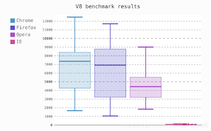
4. Bokeh
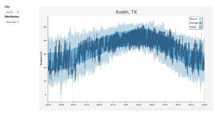
Interactive weather statistics for three cities (Continuum Analytics)
Like ggplot, Bokeh is also based on the concept of “The Grammar of Graphics”.
However, unlike ggplot, it is entirely based in Python rather than being ported from R.
Its strength lies in its ability to create interactive charts that can be used directly on the web. Charts can be exported as JSON objects, HTML documents, or interactive web applications.
Bokeh also supports streaming and real-time data. It offers three levels of control for different users.
The highest level of control is for rapid plotting, mainly for creating common images such as bar charts, box plots, and histograms.
The medium level of control allows you to manage the basic elements of the image (e.g., points in a scatter plot), similar to Matplotlib.
The lowest level of control is primarily aimed at developers and software engineers.
It has no defaults, and you must define every element of the chart.
Developer: Continuum Analytics
More information: https://docs.bokeh.org/en/latest/
5. pygal
Box plot (Florian Mounier)
pygal, like Bokeh and Plotly, provides interactive images that can be embedded directly in web browsers.
The main difference from the other two is that it can output charts in SVG format.
If your data volume is relatively small, SVG is sufficient. However, if you have hundreds or thousands of data points, the SVG rendering process can become slow.
Since all charts are encapsulated as methods and the default style is quite attractive, you can easily create beautiful charts with just a few lines of code.
Developer: Florian Mounier
More information: http://www.pygal.org/en/latest/index.html
6. Plotly
Line plot (Plotly)
You may have heard of the online plotting tool Plotly, but did you know you can use it through Python?
Plotly, like Bokeh, is dedicated to creating interactive charts, but it offers several chart types that are hard to find in other libraries, such as contour plots, treemaps, and 3D charts.
Developer: Plotly
More information: https://plotly.com/python/
7. geoplotlib
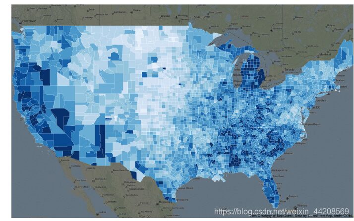
Choropleth (Andrea Cuttone)
geoplotlib is a toolbox for creating maps and geospatial data.
You can use it to create various types of maps, such as choropleth maps, heat maps, and point density maps.
You must install Pyglet (an object-oriented programming interface) to use geoplotlib. However, having a dedicated tool for drawing maps is quite convenient since most Python visualization tools do not provide mapping capabilities.
Developer: Andrea Cuttone
More information: https://github.com/andrea-cuttone/geoplotlib
8. Gleam
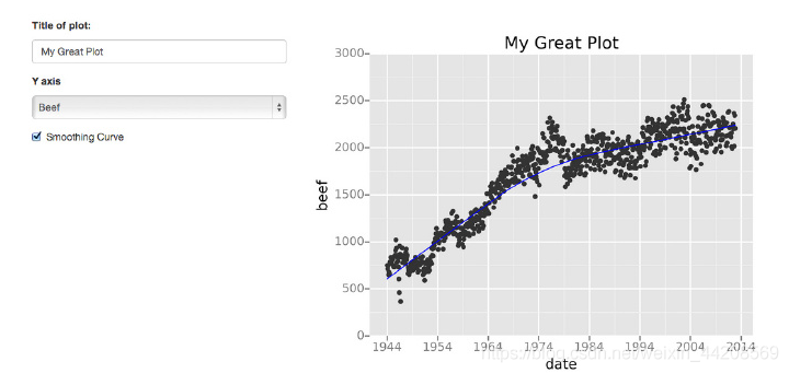
Scatter plot with trend line (David Robinson)
Gleam draws inspiration from R’s Shiny. It allows you to turn your analysis into an interactive web application using only Python, without needing to know HTML, CSS, or JavaScript.
Gleam can utilize any Python visualization library.
When you create a chart, you can add a domain on top of it, allowing users to sort and filter the data.
Developer: David Robinson
More information: https://github.com/dgrtwo/gleam
9. missingno
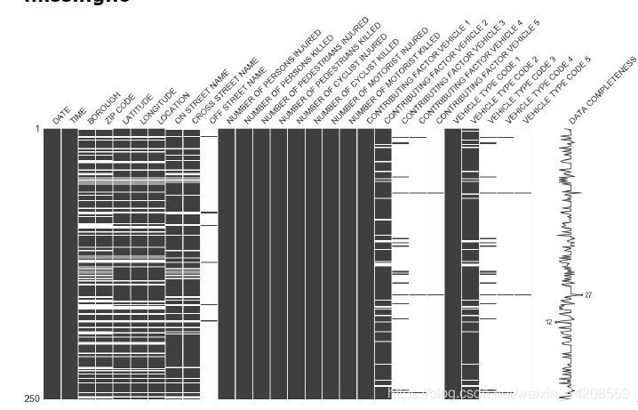
Nullity matrix (Aleksey Bilogur)
Missing data is a perpetual pain.
missingno allows you to quickly assess data missingness visually, rather than trudging through a data table.
You can sort or filter data based on its completeness, or consider correcting the data based on heat maps or dendrograms.
10. Leather
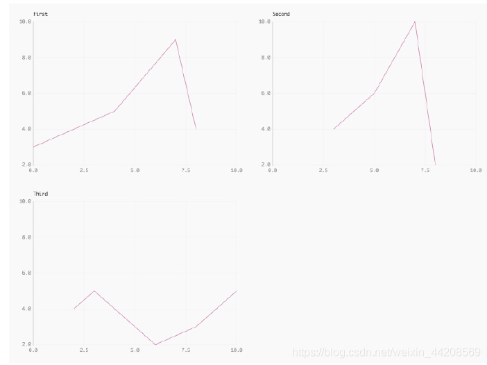
Chart grid with consistent scales (Christopher Groskopf)
The best definition of Leather comes from its author, Christopher Groskopf.
“Leather is for those who need a chart now and don’t care if it’s perfect.”
It can be used for all data types and generates SVG images, ensuring that image quality is not lost when resizing.
Developer: Christopher Groskopf
More information: https://leather.readthedocs.io/en/latest/index.html
Editor: Huang Jiyan