Data visualization is not only a crucial part of data analysis but also a bridge for communication and presentation. As a leader in the field of scientific computing, MATLAB offers an extremely rich and powerful visualization capability. This article will guide you to master various graphing techniques in MATLAB comprehensively! Let’s go!
1. Basic 2D Graphics: The Foundation of Data Analysis
1.1 Multi-style Line Graphs
% Create sample data
x = linspace(0, 4*pi, 100);
y1 = sin(x);
y2 = cos(x);
y3 = sin(x) .* cos(x);
% Create multiple subplots for comparison
figure('Position', [100, 100, 1200, 800]);
% Comparison of different line styles
subplot(2, 3, 1);
plot(x, y1, 'r-', 'LineWidth', 2); hold on;
plot(x, y2, 'b--', 'LineWidth', 2);
plot(x, y3, 'g:', 'LineWidth', 2);
title('Comparison of Different Line Styles');
legend('Solid Line', 'Dashed Line', 'Dotted Line');
grid on;
% Comparison of different marker styles
subplot(2, 3, 2);
plot(x(1:10:end), y1(1:10:end), 'ro', 'MarkerSize', 8, 'LineWidth', 2);hold on;
plot(x(1:10:end), y2(1:10:end), 'b*', 'MarkerSize', 8, 'LineWidth', 2);
title('Comparison of Different Marker Styles');
legend('Circle', 'Star');
% Comparison of line widths
subplot(2, 3, 3);
for lw = 1:4
    plot(x, y1 + lw*0.2, 'LineWidth', lw);
    hold on;
end
title('Comparison of Line Widths');
legend('Line Width=1', 'Line Width=2', 'Line Width=3', 'Line Width=4');
% Comparison of colors
subplot(2, 3, 4);
colors = ['r', 'g', 'b', 'm', 'c', 'y'];
for i = 1:6
    plot(x, y1 + i*0.15, colors(i), 'LineWidth', 2);
    hold on;
end
title('Comparison of Colors');
% Set axis limits
subplot(2, 3, 5);
plot(x, y1, 'b-', 'LineWidth', 2);
axis([0 2*pi -1.5 1.5]); % Set x,y limits
title('Custom Axis Limits');
grid on;
% Dual Y-axis plot
subplot(2, 3, 6);
yyaxis left;
plot(x, y1, 'b-', 'LineWidth', 2);
ylabel('sin(x)');
yyaxis right;
plot(x, y2, 'r-', 'LineWidth', 2);
ylabel('cos(x)');
title('Dual Y-axis Plot');
grid on;
sgtitle('Comprehensive Guide to Basic Line Styles in MATLAB', 'FontSize', 16, 'FontWeight', 'bold');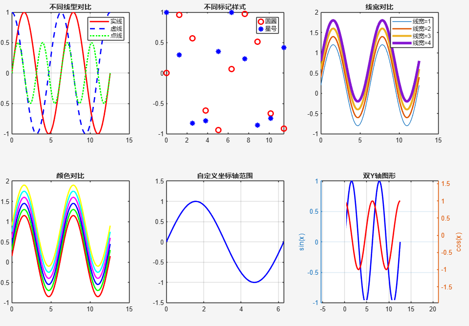
1.2 Bar Graphs and Column Charts
% Create sample data
categories = {'Product A', 'Product B', 'Product C', 'Product D', 'Product E'};
sales_2023 = [120, 150, 80, 200, 95];
sales_2024 = [140, 170, 100, 220, 110];
figure('Position', [100, 100, 1000, 400]);
% Grouped bar chart
subplot(1, 2, 1);
bar([sales_2023; sales_2024]');
set(gca, 'XTickLabel', categories);
title('Annual Sales Comparison');
legend('2023', '2024');
ylabel('Sales (10,000s)');
grid on;
% Stacked bar chart
subplot(1, 2, 2);
bar([sales_2023; sales_2024]', 'stacked');
set(gca, 'XTickLabel', categories);
title('Sales Stacked Chart');
legend('2023', '2024');
ylabel('Sales (10,000s)');
grid on;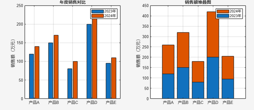
2. Statistical Visualization: Insights into Data Distribution
2.1 Advanced Statistical Graphics
% Generate random data
rng(42);
data = [randn(1000,1)*2 + 3, randn(1000,1)*1.5 + 5, randn(1000,1)*3 + 2];
figure('Position', [100, 100, 1200, 800]);
% Box plot
subplot(2, 3, 1);
boxplot(data, 'Labels', {'Group A', 'Group B', 'Group C'});
title('Box Plot - Data Distribution Statistics');
ylabel('Values');
% Violin plot (using distribution curves)
subplot(2, 3, 2);
hold on;
for i = 1:3
    [f, xi] = ksdensity(data(:,i));
    plot(xi, f + i, 'LineWidth', 2);
end
title('Distribution Density Plot');
set(gca, 'YTick', 1:3, 'YTickLabel', {'Group A', 'Group B', 'Group C'});
% Histogram
subplot(2, 3, 3);
histogram(data(:,1), 30, 'FaceColor', 'blue', 'EdgeColor', 'none', 'FaceAlpha', 0.7);
hold on;
histogram(data(:,2), 30, 'FaceColor', 'red', 'EdgeColor', 'none', 'FaceAlpha', 0.7);
histogram(data(:,3), 30, 'FaceColor', 'green', 'EdgeColor', 'none', 'FaceAlpha', 0.7);
title('Grouped Histogram');
legend('Group A', 'Group B', 'Group C');
% Pie chart
subplot(2, 3, 4);
market_share = [30, 25, 20, 15, 10];
pie(market_share, {'Apple', 'Samsung', 'Huawei', 'Xiaomi', 'Others'});
title('Market Share Distribution');
% Heatmap
subplot(2, 3, 5);
corr_matrix = corr(data);
imagesc(corr_matrix);
colorbar;
set(gca, 'XTick', 1:3, 'XTickLabel', {'A', 'B', 'C'});
set(gca, 'YTick', 1:3, 'YTickLabel', {'A', 'B', 'C'});
title('Correlation Coefficient Heatmap');
% Error bar plot
subplot(2, 3, 6);
means = mean(data);
stds = std(data);
errorbar(1:3, means, stds, 'o', 'LineWidth', 2, 'MarkerSize', 8);
set(gca, 'XTick', 1:3, 'XTickLabel', {'Group A', 'Group B', 'Group C'});
title('Mean and Standard Deviation');
ylabel('Values');
grid on;
sgtitle('Comprehensive Guide to Statistical Visualization', 'FontSize', 16, 'FontWeight', 'bold');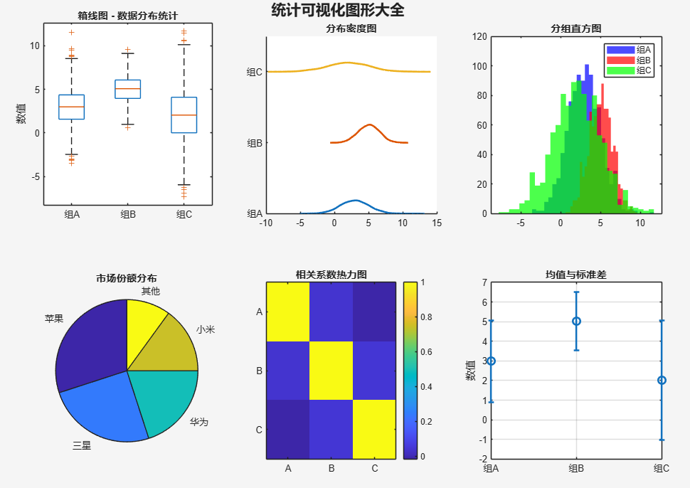
3. 3D Visualization: Exploring Three-Dimensional Data
3.1 3D Surfaces and Meshes
% Create 3D data
[X, Y] = meshgrid(-3:0.1:3, -3:0.1:3);
Z1 = sin(X) + cos(Y);
Z2 = X .* exp(-X.^2 - Y.^2);
figure('Position', [100, 100, 1200, 800]);
% 3D surface plot
subplot(2, 3, 1);
surf(X, Y, Z1);
title('3D Surface Plot');
xlabel('X'); ylabel('Y'); zlabel('Z');
colormap('jet');
colorbar;
% Mesh plot
subplot(2, 3, 2);
mesh(X, Y, Z2);
title('3D Mesh Plot');
xlabel('X'); ylabel('Y'); zlabel('Z');
% Contour plot
subplot(2, 3, 3);
contour(X, Y, Z1, 20);
title('Contour Plot');
xlabel('X'); ylabel('Y');
colorbar;
% Filled contour plot
subplot(2, 3, 4);
contourf(X, Y, Z1, 20);
title('Filled Contour Plot');
xlabel('X'); ylabel('Y');
colorbar;
% 3D contour plot
subplot(2, 3, 5);
contour3(X, Y, Z1, 20);
title('3D Contour Plot');
xlabel('X'); ylabel('Y'); zlabel('Z');
% Surface and contour combination
subplot(2, 3, 6);
surfc(X, Y, Z2);
title('Surface + Contour Combination');
xlabel('X'); ylabel('Y'); zlabel('Z');
colormap('hot');
sgtitle('Showcase of 3D Visualization Graphics', 'FontSize', 16, 'FontWeight', 'bold');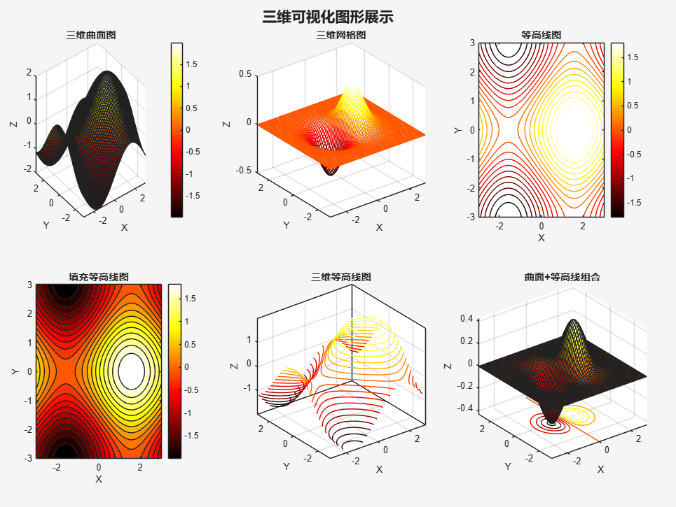
3.2 3D Scatter and Vector Fields
% Create 3D scatter data
rng(42);
x = randn(300, 1);
y = randn(300, 1);
z = randn(300, 1);
sizes = 50 + 100 * rand(300, 1); % Random sizes
colors = rand(300, 1); % Random colors
figure('Position', [100, 100, 1200, 400]);
% 3D scatter plot
subplot(1, 2, 1);
scatter3(x, y, z, sizes, colors, 'filled');
title('3D Scatter Plot (Variable Size and Color)');
xlabel('X'); ylabel('Y'); zlabel('Z');
colorbar;
% Vector field plot
subplot(1, 2, 2);
[X, Y] = meshgrid(-2:0.4:2, -2:0.4:2);
U = -Y; % x-direction component
V = X;  % y-direction component
quiver(X, Y, U, V, 0.5); % 0.5 indicates arrow size
title('2D Vector Field Plot');
xlabel('X'); ylabel('Y');
axis equal;
grid on;
sgtitle('3D Scatter and Vector Field Visualization', 'FontSize', 16, 'FontWeight', 'bold');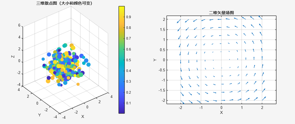
4. Special Graphics: Applications in Professional Fields
4.1 Polar and Complex Graphics
% Polar coordinate data
theta = linspace(0, 2*pi, 100);
rho = sin(2*theta) .* cos(2*theta);
figure('Position', [100, 100, 1000, 400]);
% Polar plot
subplot(1, 2, 1);
polarplot(theta, rho, 'LineWidth', 2);
title('Polar Coordinate Plot');
% Complex plot
subplot(1, 2, 2);
z = exp(1i * theta);
plot(real(z), imag(z), 'LineWidth', 2);
axis equal;
title('Complex Unit Circle');
xlabel('Real Part'); ylabel('Imaginary Part');
grid on;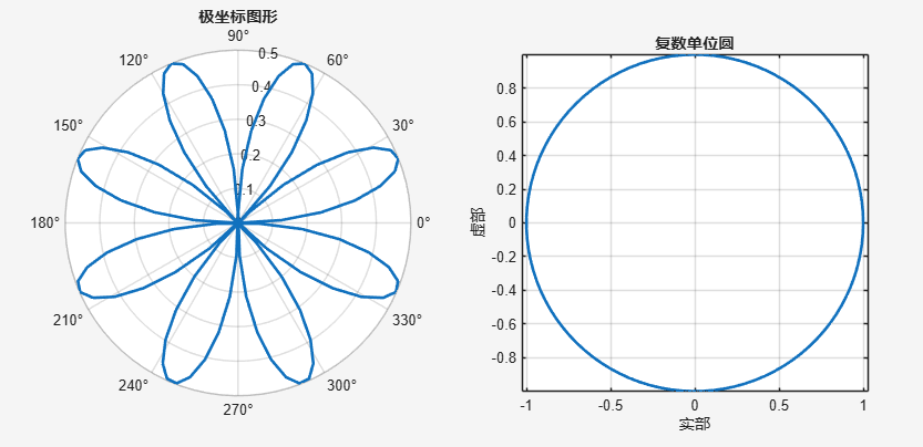
4.2 Geographic Information Visualization
% Create geographic data (requires Mapping Toolbox)
cities = {    'Beijing', 39.9042, 116.4074;    'Shanghai', 31.2304, 121.4737;    'Guangzhou', 23.1291, 113.2644;    'Shenzhen', 22.3193, 114.1694;    'Chengdu', 30.5728, 104.0668};
figure('Position', [100, 100, 800, 600]);
geoscatter(cell2mat(cities(:,2)), cell2mat(cities(:,3)), 100, 'filled');
text(cell2mat(cities(:,2)), cell2mat(cities(:,3)), cities(:,1), ...    'VerticalAlignment', 'bottom', 'HorizontalAlignment', 'right');
title('Distribution of Major Cities in China');
geobasemap('colorterrain');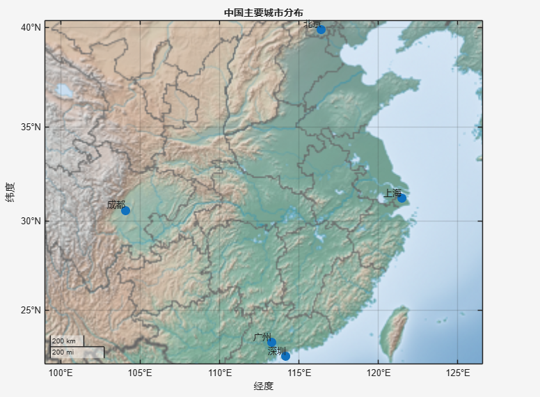
5. Interactive Graphics: Enhancing User Experience
5.1 Adding Interactive Features
% Create interactive graphics
x = linspace(0, 10, 100);
y = sin(x);
figure('Position', [100, 100, 800, 600]);
h = plot(x, y, 'b-', 'LineWidth', 2);
title('Interactive Sine Wave - Click on the Graph to View Data Points');
xlabel('X-axis'); ylabel('Y-axis');
grid on;
% Add data tip functionality
dcm = datacursormode(gcf);
set(dcm, 'Enable', 'on', 'UpdateFcn', @myupdatefcn);
% Custom data tip content
function output_txt = myupdatefcn(~, event_obj)
    pos = get(event_obj, 'Position');
    output_txt = {        ['X: ', num2str(pos(1), '%.2f')], ...        ['Y: ', num2str(pos(2), '%.2f')], ...        ['sin(X): ', num2str(sin(pos(1)), '%.4f')]    };
end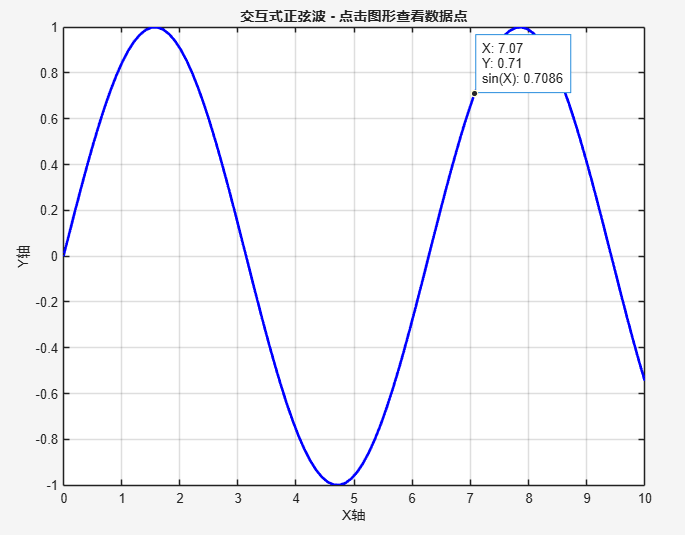
6. Graphic Beautification and Export
6.1 Professional Graphic Beautification
% Create beautified graphics
x = linspace(0, 2*pi, 100);
y1 = sin(x);
y2 = cos(x);
figure('Position', [100, 100, 800, 600]);
% Use default color order
colors = get(gca, 'ColorOrder');
% Plot main data
h1 = plot(x, y1, 'LineWidth', 3, 'Color', colors(1,:));
hold on;
h2 = plot(x, y2, 'LineWidth', 3, 'Color', colors(2,:));
% Set graphic properties
set(gca, 'FontSize', 12, 'LineWidth', 1.5, 'Box', 'on');
title('Example of Professionally Beautified Graphics', 'FontSize', 16, 'FontWeight', 'bold');
xlabel('X-axis', 'FontSize', 14);
ylabel('Y-axis', 'FontSize', 14);
legend([h1, h2], {'Sine Function', 'Cosine Function'}, 'Location', 'northeast');
% Add grid
grid on;
set(gca, 'GridAlpha', 0.3, 'MinorGridAlpha', 0.1);
% Set axis limits
xlim([0, 2*pi]);
ylim([-1.2, 1.2]);
% Add reference lines
line([pi pi], ylim, 'Color', 'k', 'LineStyle', '--', 'LineWidth', 1);
line(xlim, [0 0], 'Color', 'k', 'LineStyle', '--', 'LineWidth', 1);
% Add text annotations
text(pi, 0.2, '\leftarrow π', 'FontSize', 12);
text(0.5, 0.05, 'Zero Point', 'FontSize', 10);
% Export high-quality image
exportgraphics(gcf, 'high_quality_plot.png', 'Resolution', 300);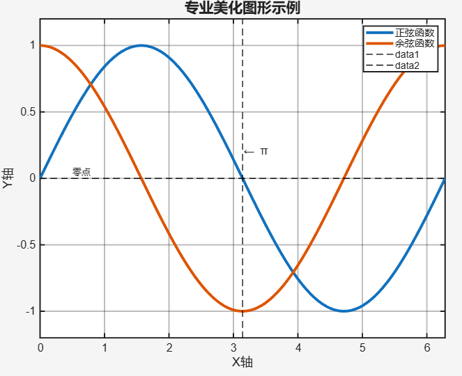
7. Practical Tips and Best Practices
7.1 Graphic Processing Techniques
% Batch process multiple graphics
figure('Position', [100, 100, 1200, 400]);
% Automatic layout of subplots
for i = 1:4
    subplot(2, 2, i);
    x = linspace(0, 2*pi, 100);
    y = sin(x + (i-1)*pi/4);
    plot(x, y, 'LineWidth', 2);
    title(sprintf('Phase Shift: %dπ/4', i-1));
    grid on;
end
% Graphic save settings
set(gcf, 'PaperPositionMode', 'auto'); % Maintain screen display ratio
saveas(gcf, 'multiple_subplots.png');
% Create graphic template function
function create_standard_plot(x, y, title_str)
    figure;
    plot(x, y, 'LineWidth', 2);
    title(title_str, 'FontSize', 14);
    xlabel('X-axis', 'FontSize', 12);
    ylabel('Y-axis', 'FontSize', 12);
    grid on;
    set(gca, 'FontSize', 11);
    set(gcf, 'Color', 'w'); % White background
end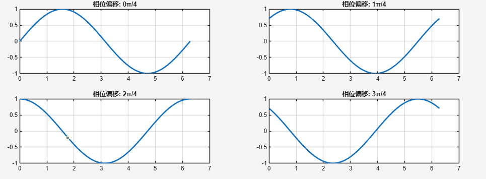
Conclusion
The visualization capabilities of MATLAB are extremely powerful, covering everything from basic 2D graphics to complex 3D visualizations, from static images to interactive graphics, almost meeting all the needs of scientific computing and data presentation. Mastering these visualization techniques will not only make your data more vivid and intuitive but also significantly enhance the professionalism of research papers and technical reports.
It is not easy to organize this, so I kindly ask everyone to leave a like and follow.