
Long time no see, friends. In the last issue, we shared the method for creating scatter plots. In this issue, we will share a special method for creating scatter plots—bubble charts.
A bubble chart is an enhanced version of a scatter plot. A regular scatter plot can only express the relationship between the x-axis and y-axis, while a bubble chart can represent a third dimension of information through the size of the bubbles. Visually, bubbles of varying sizes also have a greater impact than uniformly sized scatter points.
However, due to the size distribution of the bubbles, bubble charts have certain limitations: first, the amount of data cannot be too large; otherwise, a large number of bubbles will fill the entire chart, making it difficult for readers to understand the meaning of the image. Additionally, the sizes of the bubbles cannot differ too greatly; otherwise, some information may become nearly invisible in the chart.
Next, let’s create a bubble chart.
Part.01
Data Preparation
Like scatter plots, bubble charts also require a considerable amount of data, and generating it manually is obviously not suitable. We will use the same method as last time, generating a set of random data using the rand() function.
clc
clear
close all
x=1:10;y=rand(1,10);sk=rand(1,10);
The three sets of data we generated represent the x-coordinates, y-coordinates, and bubble sizes for the bubble chart. These will all need to be input into the function later.
Part.02
Plotting the Chart
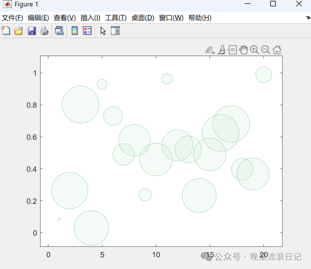
In MATLAB, you can directly use the built-in function bubblechart() to create a bubble chart. By sequentially inputting the corresponding x-axis values, y-axis values, and bubble size values, you can create a simple bubble chart:
clc
clear
close all
x=1:20;y=rand(1,20);sk=rand(1,20);
bubblechart(x,y,sk);
This completes the creation of the bubble chart. Visually, this bubble chart is clearly of a higher quality compared to other built-in plotting functions, but it may not be suitable for reviewers with high standards. Next, let’s enhance the aesthetics of this chart.
Part.03
Enhancing the Chart
After so many issues, I believe everyone has some insights into enhancing chart aesthetics. The first thing to modify is, of course, the overly saturated colors in MATLAB.
To change the color of the bubbles themselves, you can simply add the desired color name or RGB value after the size:
clc
clear
close all
x=1:20;y=rand(1,20);sk=rand(1,20);
bubblechart(x,y,sk,[152,212,171]./255);
Careful readers will notice that the color of the plotted bubble chart is lighter than the color we input. This is because there is a possibility of overlap among the bubbles, so MATLAB automatically adds a transparency value when plotting. If you want to modify the transparency value, simply adjust the parameter: ‘MarkerFaceAlpha’.
clc
clear
close all
x=1:20;y=rand(1,20);sk=rand(1,20);
bubblechart(x,y,sk,[152,212,171]./255,'MarkerFaceAlpha',0.5);
This parameter can only be selected within the range of 0 to 1; exceeding this range will result in an error. The closer the value is to 1, the lower the transparency.
Additionally, if you want to change the color of the bubble borders, you can use the parameter MarkerEdgeColor:
clc
clear
close all
x=1:20;y=rand(1,20);sk=rand(1,20);
bubblechart(x,y,sk,[152,212,171]./255,'MarkerFaceAlpha',0.5,'MarkerEdgeColor','black');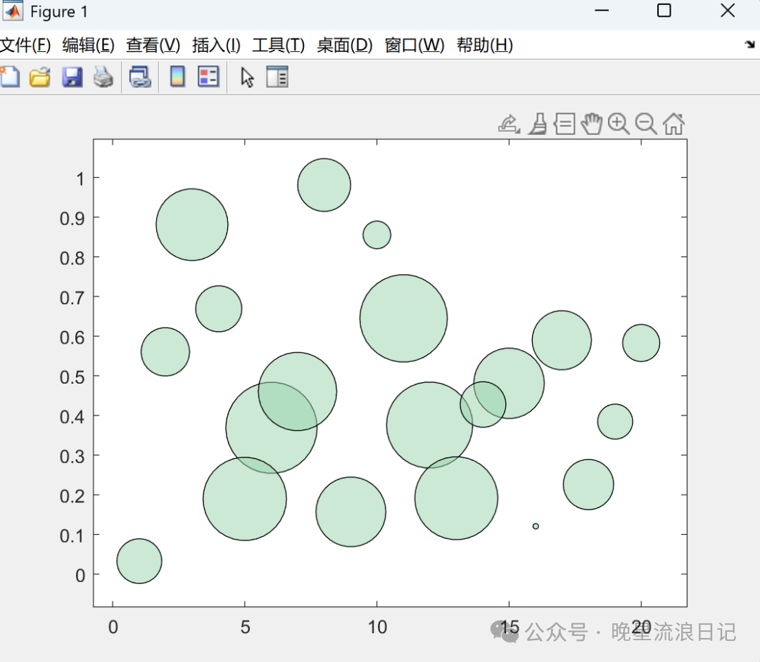
From an aesthetic perspective, not everyone finds this border appealing. However, borders can also convey information. If you have a fourth piece of information that needs to be displayed on the chart, you can consider using different border colors to represent this information.
In the past, when I submitted papers, I used black borders in bubble charts to distinguish one set of information, allowing a single bubble chart to contain four dimensions of information. This idea was well-received by all my classmates and teachers in the research group.
When plotting, you may find that some points are very small and nearly invisible, while others are particularly large. We can limit their sizes using the bubblesize() function. Based on the values you input, MATLAB will proportionally adjust the sizes of the bubbles displayed on the chart. This will make the bubble chart visually more comfortable:
clc
clear
close all
x=1:20;y=rand(1,20);sk=rand(1,20);
bubblechart(x,y,sk,[152,212,171]./255,'MarkerFaceAlpha',0.5,'MarkerEdgeColor','black');
bubblesize([10 40])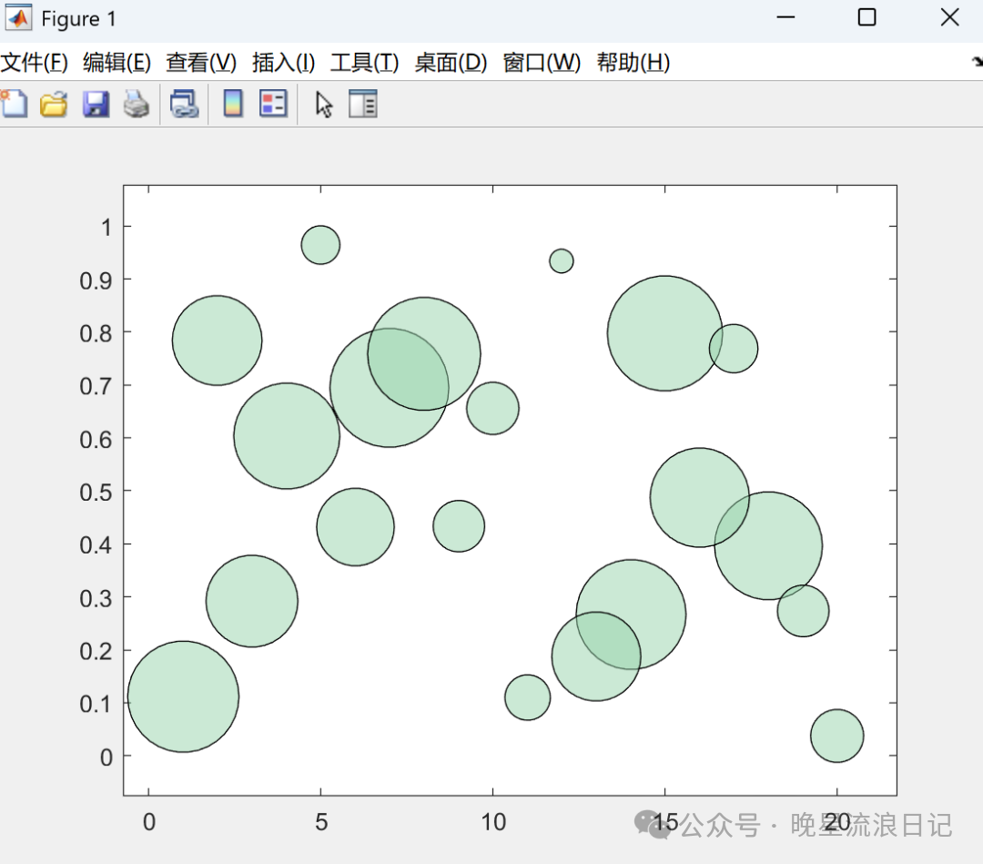
Next, we will add legends. In a bubble chart, two types of legends are needed: one for bubble size, which is essential, and another for different colors, which can be omitted if there is only one color of bubbles in the chart. We will include both here.
The legend for bubble size is implemented using the bubblelegend() function. You only need to input its title and position to output the bubble size legend:
clc
clear
close all
x=1:20;y=rand(1,20);sk=rand(1,20);
bubblechart(x,y,sk,[152,212,171]./255,'MarkerFaceAlpha',0.5,'MarkerEdgeColor','black');
bubblesize([10 40])
bubblelegend('Size','Location','southeastoutside','FontName','Times New Roman')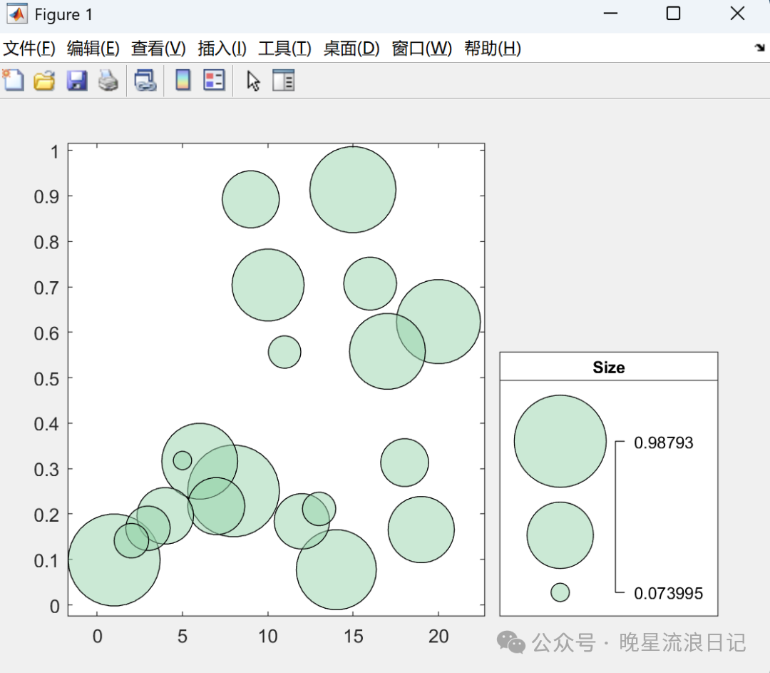
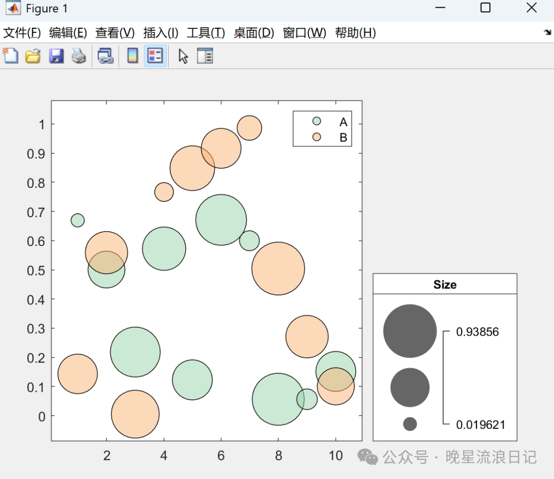
The legend for different colors can be created using the legend() function we discussed earlier:
clc
clear
close all
x=1:10;y=rand(1,10);sk=rand(1,10);
bubblechart(x,y,sk,[152,212,171]./255,'MarkerFaceAlpha',0.5,'MarkerEdgeColor','black');
hold on
y1=rand(1,10);sk1=rand(1,10);bubblechart(1:10,y1,sk1,[249,180,116]./255,'MarkerFaceAlpha',0.5,'MarkerEdgeColor','black');
legend('A','B','Location','northeast')
bubblesize([10 40])
bubblelegend('Size','Location','southeastoutside','FontName','Times New Roman')
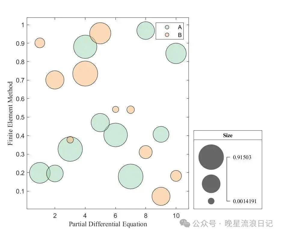
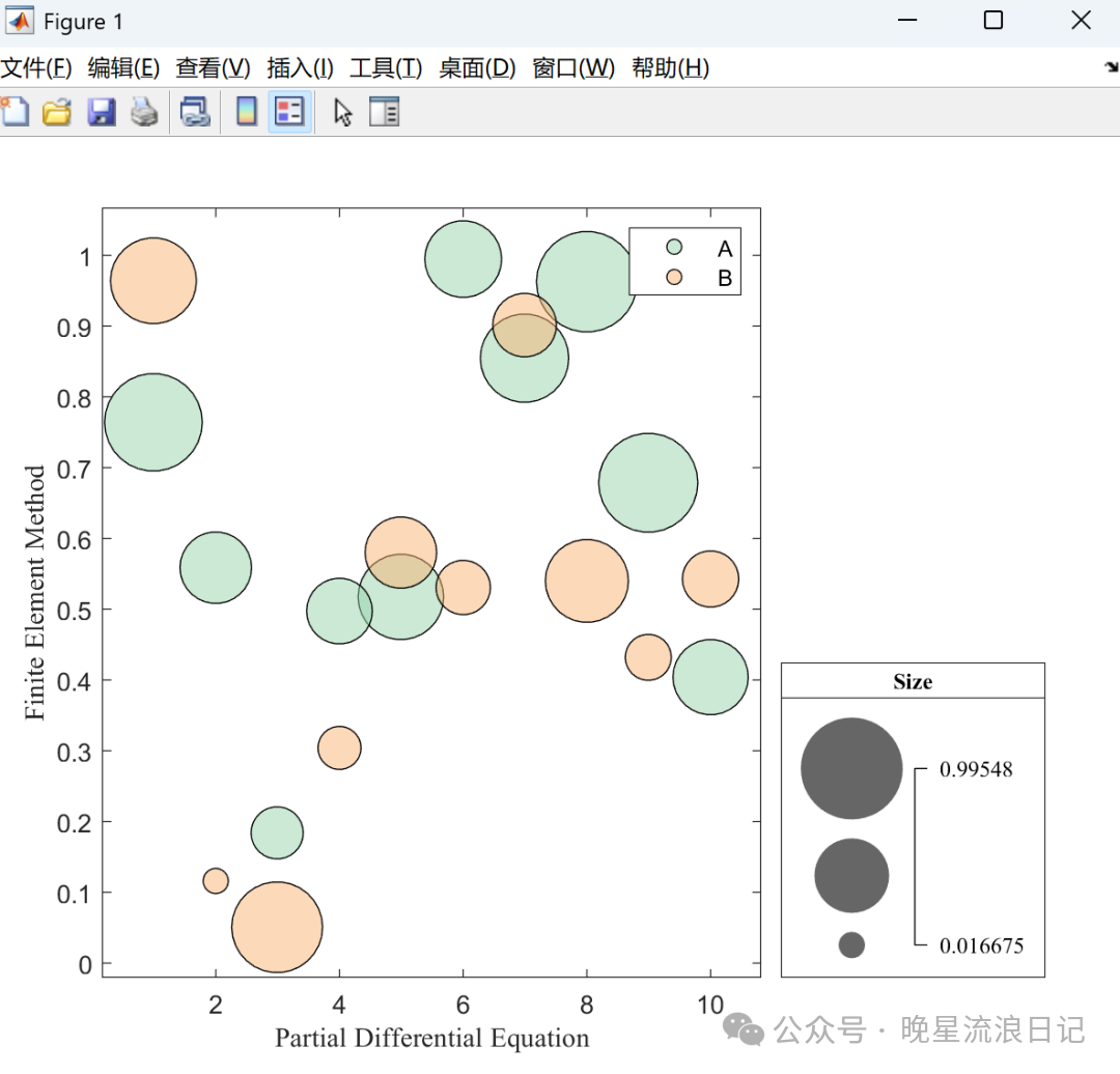
Finally, we will make some simple adjustments to the layout, size, and axes of the chart to complete the bubble chart:
clc
clear
close all
figure('color','w','position',[400,300,600,500])
x=1:10;y=rand(1,10);sk=rand(1,10);
bubblechart(x,y,sk,[152,212,171]./255,'MarkerFaceAlpha',0.5,'MarkerEdgeColor','black');
hold on
y1=rand(1,10);sk1=rand(1,10);bubblechart(1:10,y1,sk1,[249,180,116]./255,'MarkerFaceAlpha',0.5,'MarkerEdgeColor','black');
legend('A','B','Location','northeast')
bubblesize([10 40])
bubblelegend('Size','Location','southeastoutside','FontName','Times New Roman')

xlabel('Partial Differential Equation','FontName','Times New Roman')
ylabel('Finite Element Method','FontName','Times New Roman')
Today’s sharing ends here. The next issue will be the final installment of advanced imaging—creating three-dimensional images. See you next time.

END
Click below
Follow us