
This article introduces 19 commonly used components in MATLAB App Designer, including buttons, labels, axes, edit fields, radio button groups, toggle button groups, dropdowns, list boxes, checkboxes, trees, tables, sliders, spinners, state buttons, date pickers, text areas, images, hyperlinks, and HTML.
There are a total of 21 commonly used components in MATLAB App Designer. Table 5-1 shows the names and functions of these components.
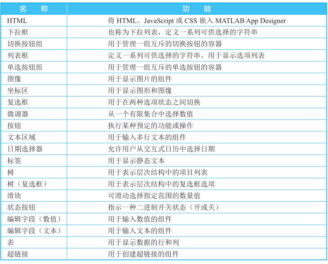
■ Table 5-1 Names and Functions of Common Components
01
Button
A button, also known as a command button, is an interactive component primarily used to respond to click events. The button is a rectangular component, often labeled with text. Clicking the button executes the action defined by the callback string.
By default, the button is in a raised state, and when clicked, it goes into a pressed state. After the user releases the mouse, the button returns to the raised state.
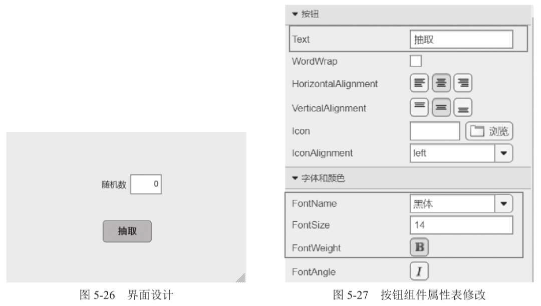
Example 5-2 Create a random number extraction interface. Create an edit field (numeric) and a button, setting the button text label to “Extract”, the font to bold 14-point black, and the button color to blue. The edit field label should be “Random Number”. Clicking the “Extract” button will display a random number between 1 and 10 in the edit field.
Step 1: Set up layout and properties.
Add an edit field (numeric) and a button component, where the static interface design is shown in Figure 5-26. The properties table for the button component is modified as shown in Figure 5-27.
Step 2: Add callbacks.
Right-click the button component, select [Callback] from the pop-up menu, and choose [Add ButtonPushedFcn Callback]. The interface will automatically jump to the code view, where you can enter the following program command at the cursor location:

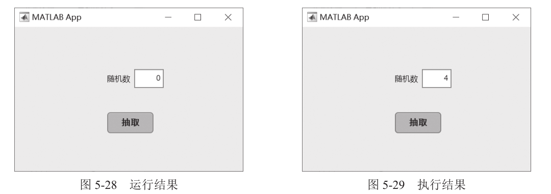
Click the [Run] button, and the result is shown in Figure 5-28. Clicking the [Extract] button will yield the result shown in Figure 5-29.
Example 5-3 Create a button that pops up a message window when clicked.
Step 1: Add a button component and place it in a blank area.
Step 2: Right-click the button component, select [Callback] from the pop-up menu, and choose [Add ButtonPushedFcn Callback]. The interface will automatically jump to the code view, where you can enter the following program command at the cursor location:

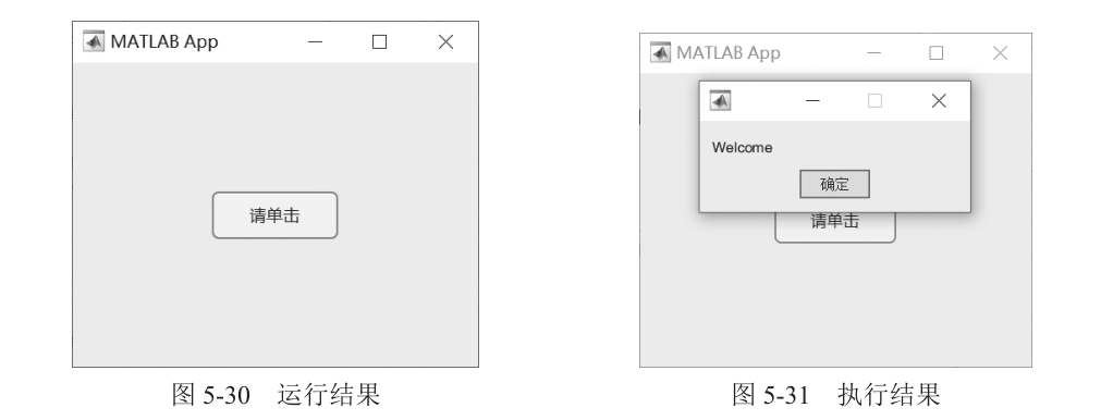
The result is shown in Figure 5-30. Clicking the [Please Click] button yields the result shown in Figure 5-31.
02
Label
Text labels are areas that display fixed strings and can also provide functional explanations and usage instructions for other components. Their main function is to provide prompts.
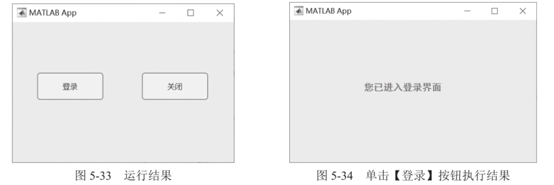
Example 5-4 Create a login interface that includes a main interface and a welcome interface. The main interface contains two buttons, [Login] and [Close]. When the [Login] button is clicked, the current interface closes, and the welcome interface opens; when the [Close] button is clicked, the main interface closes.
Step 1: Design the main interface, adding [Login] and [Close] buttons. Design the welcome interface, adding a label that says “You have entered the login interface” and modifying the label’s font, size, and color properties as shown in Figure 5-32.
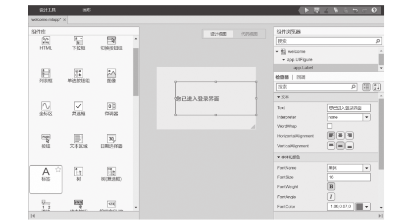
■ Figure 5-32 Add Label Component
Step 2: Right-click the [Close] button, select [Callback] from the pop-up menu, and choose [Add ButtonPushedFcn Callback]. The interface will automatically jump to the code view, where you can enter the following program command at the cursor location:

Right-click the [Login] button, add a callback, and enter the following program command:

The result is shown in Figure 5-33. Clicking the [Login] button yields the result shown in Figure 5-34.
03
Axes
The axes component is commonly used to display images or the axes of graphs. In MATLAB App Designer, you can set one or more axes.
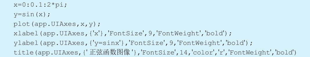
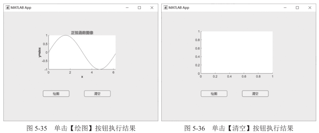
Example 5-5 Add an axes component and two buttons. Clicking the [Plot] button will draw the sine function graph in the axes, and clicking the [Clear] button will clear the graph in the axes.
Step 1: Add an axes component and two button components.
Step 2: Right-click the [Plot] button, select [Callback] from the pop-up menu, and choose [Add ButtonPushedFcn Callback]. The interface will automatically jump to the code view, where you can enter the following program command at the cursor location:
Right-click the [Clear] button, add a callback, and enter the following program command:

Run the program, click the [Plot] button, and the result is shown in Figure 5-35. Clicking the [Clear] button will yield the result shown in Figure 5-36.
The axes component has two properties that determine whether it responds to clicks and how it responds to clicks.
(1) PickableParts: Determines whether the object captures clicks.
(2) HitTest: Determines whether the object responds to clicks or passes them to the nearest parent.
By combining the PickableParts and HitTest properties, the axes component can achieve the following scenarios.
(1) The clicked object captures the click and executes the button pressed callback or calls the context menu response.
(2) The clicked object captures the click and passes it to one of its parents, which executes the button pressed callback or calls the context menu response.
(3) The clicked object captures the click, but the click may be captured by an object behind the clicked object.
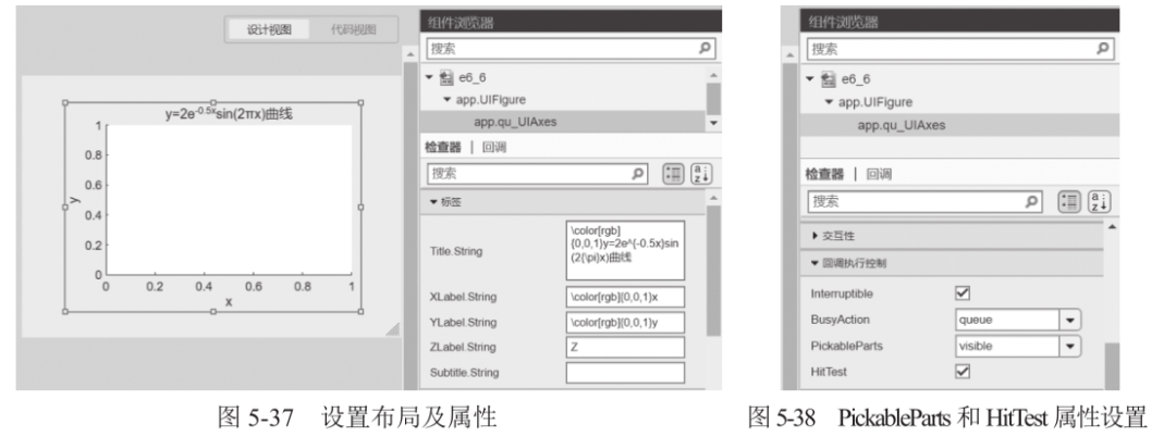
Example 5-6 Create an axes component to plot the curve y=2e-0.5xsin(2πx).
Step 1: Set layout and properties.
Add an axes component and change Title.String to \color[rgb]{0,0,1}y=2e^{-0.5x}sin(2{\pi}x), XLabel.String to \color[rgb]{0,0,1}x, and YLabel.String to \color[rgb]{0,0,1}y, as shown in Figure 5-37. Set the PickableParts property to visible and the HitTest property to on, as shown in Figure 5-38.
Step 2: Right-click the axes component, select [Callback] from the pop-up menu, and choose [Add qu_UIAxesButtonDown Callback]. The interface will automatically jump to the code view, where you can enter the following program command at the cursor location:

Run the program, click the axes component, and the result is shown in Figure 5-39.
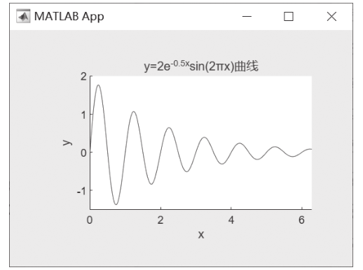
■ Figure 5-39 Axes Component Execution Result Interface
04
Button Edit Field (Numeric, Text)
Edit fields are divided into numeric edit fields and text edit fields, allowing users to dynamically input numbers or text. The numeric edit field only allows numeric input. Edit fields can be used to obtain user input data in callbacks or to display running results.
Example 5-7 Based on user input of the trigonometric function name, amplitude, frequency, and initial phase, plot the corresponding trigonometric function graph.
Step 1: Set layout and properties.
Add an axes, a button, 3 numeric edit fields, and a text edit field. Among them, the 3 numeric edit fields are used for user input of amplitude, frequency, and initial phase, while the text edit field is used for user input of the trigonometric function name. The interface layout is shown in Figure 5-40.
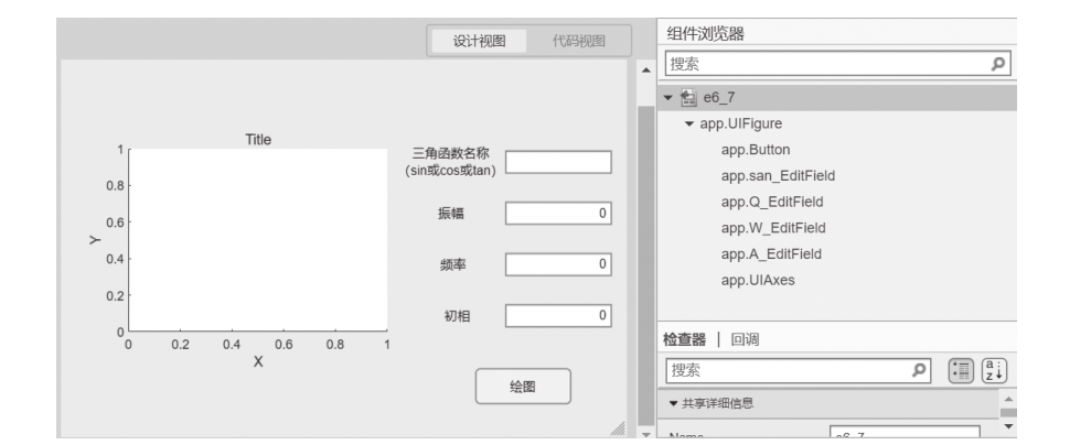
■ Figure 5-40 Interface Layout
Analysis: When the [Plot] button is clicked, the program determines an operation based on the user input of the [Trigonometric Function Name] and retrieves the user input for [Amplitude], [Frequency], and [Phase] data to plot the graph in the axes component.
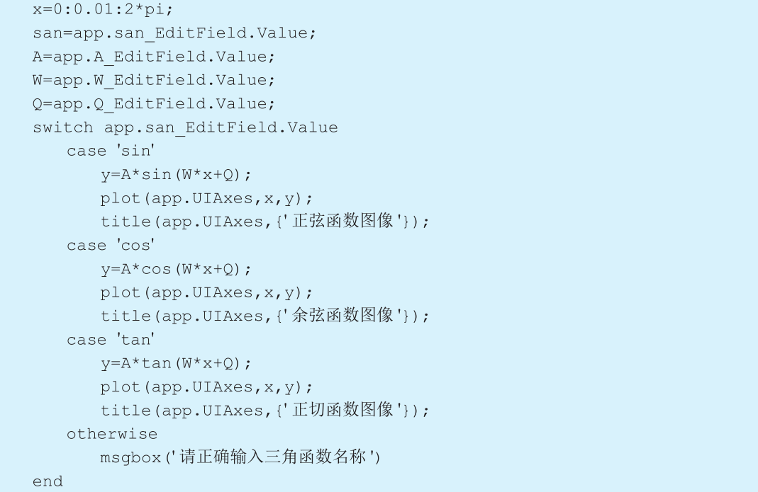
Step 2: Right-click the [Plot] button, select [Callback] from the pop-up menu, and choose [Add ButtonPushedFcn Callback]. The interface will automatically jump to the code view, where you can enter the following program command at the cursor location:
Run the program, input the corresponding content in the edit field component, and click the [Plot] button. The result is shown in Figure 5-41.
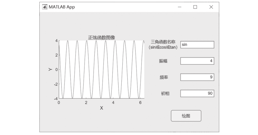
■ Figure 5-41 Execution Result Interface
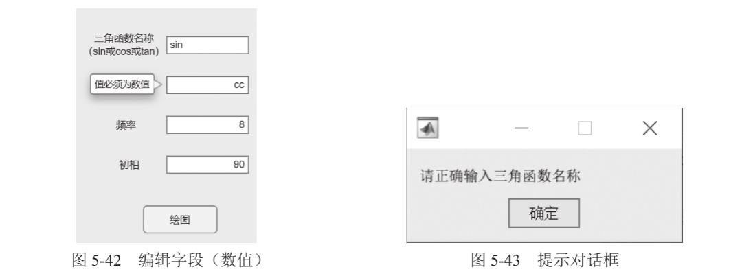
When the user inputs a non-numeric value in the numeric edit field, a prompt saying “Value must be numeric” will appear, as shown in Figure 5-42. If the user inputs an incorrect trigonometric function name, a prompt dialog box will pop up, as shown in Figure 5-43.
Numeric and text edit fields can also be used to display running results, data, or text.
Example 5-8 Design a simple BMI calculator. Obtain user height and weight, calculate the BMI value, and display the degree of obesity based on Chinese standards.
Step 1: Set layout and properties.
Add 3 numeric edit fields, a text edit field, a button, and a label, as shown in Figure 5-44.
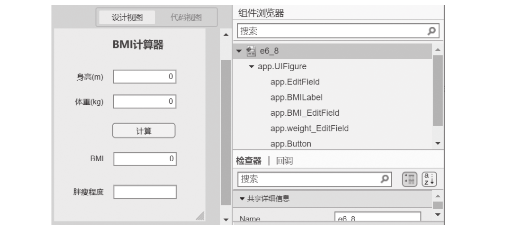
■ Figure 5-44 BMI Interface Design
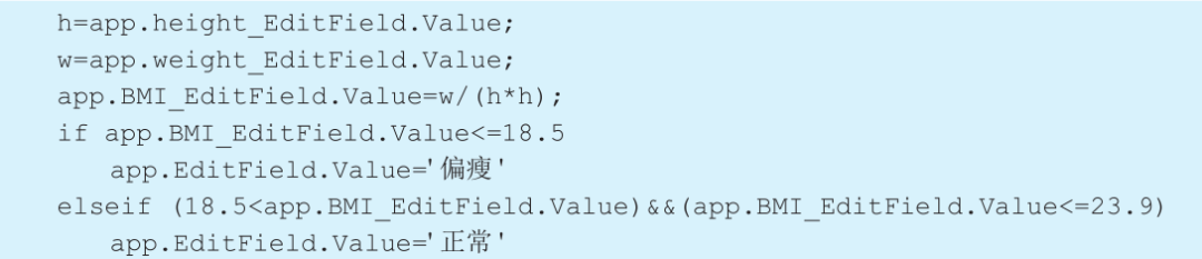
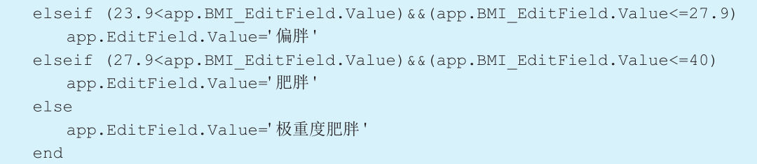
Step 2: Obtain the user’s height and weight information, calculate the BMI value, and determine the degree of obesity based on the BMI value range.
Right-click the [Calculate] button, select [Callback] from the pop-up menu, and choose [Add ButtonPushedFcn Callback]. The interface will automatically jump to the code view, where you can enter the following program command:
Run the program, input the height and weight, and click the [Calculate] button. The running result is shown in Figure 5-45.
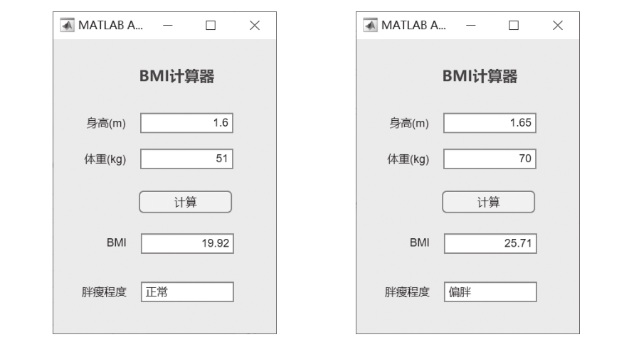
■ Figure 5-45 BMI Running Result
05
Reference Books