
This section introduces 19 commonly used components in MATLAB App Designer, including buttons, labels, axes, edit fields, radio button groups, toggle button groups, dropdowns, list boxes, checkboxes, trees, tables, sliders, spinners, state buttons, date pickers, text areas, images, hyperlinks, and HTML.
01
Radio Button Group
The radio button group is a container for managing a group of mutually exclusive radio buttons, and its appearance and behavior can be controlled through properties.
In older versions of MATLAB, the button group was a container for GUI objects, where callback functions were defined for child objects when the button group contained radio buttons or toggle buttons. In the newer versions of MATLAB, the button group has been optimized, with separate components for radio button groups and toggle button groups, and the radio and toggle button objects it manages can no longer have callback functions created.
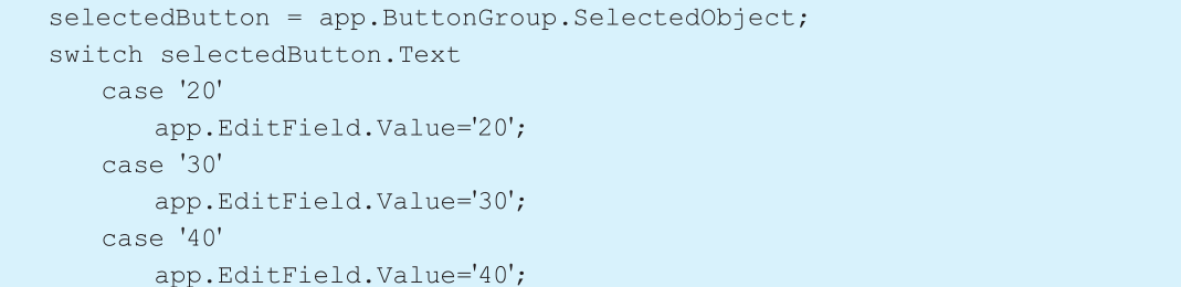
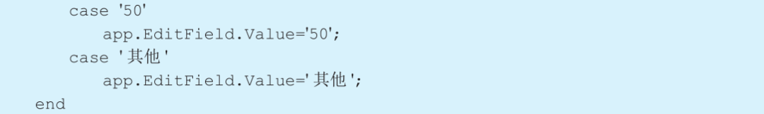
[Example 5-9] Radio button example. The requirement is to display the content selected by the radio button group in the edit field component.
Step 1: Set layout and properties.
Add an edit field (numeric) and a radio button group, and add 5 options to the radio button group.
Step 2: Right-click on the radio button group component, select [Callback] from the pop-up context menu, and choose [Go to ButtonGroupSelectionChanged callback]. The interface automatically jumps to the code view, and enter the following command at the cursor position:
Run the program and select the “50” option. The result is shown in Figure 5-46.
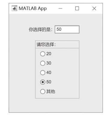
■ Figure 5-46 Result of the radio button group component
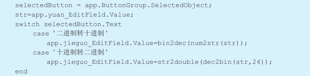
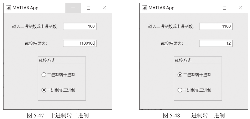
[Example 5-10] Implement binary to decimal conversion using the radio button group.
Step 1: Set layout and properties.
Add two edit fields (numeric) and a radio button group, where the radio button group can choose between binary to decimal or decimal to binary.
Step 2: Right-click on the radio button group component, select [Callback] from the pop-up context menu, and choose [Go to ButtonGroupSelectionChanged callback]. The interface automatically jumps to the code view, and enter the following command at the cursor position:
Input data and select the “Decimal to Binary” option. The result is shown in Figure 5-47. Input data and select the “Binary to Decimal” option. The result is shown in Figure 5-48.
[Example 5-11] Use the radio button group to select the color of the curve in the axes.
Step 1: Set layout and properties.
Add an axes and a radio button group, and set yellow, red, and blue options in the radio button group.
Step 2: Right-click on the radio button group component, select [Callback] from the pop-up context menu, and choose [Go to ButtonGroupSelectionChanged callback]. The interface automatically jumps to the code view, and enter the following command at the cursor position:
After running the program, select the “Red” option. The result is shown in Figure 5-49.
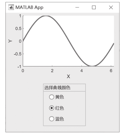
■ Figure 5-49 Curve color selection interface
02
Toggle Button Group
The toggle button group is similar to the radio button group and is used to manage a group of mutually exclusive toggle buttons, and its appearance and behavior can be controlled through properties.
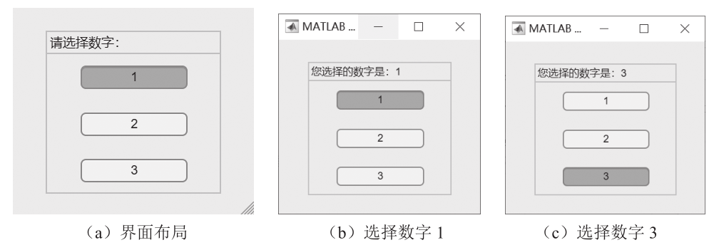
[Example 5-12] Add a toggle button group to change the title of the toggle button group when a user clicks the toggle button.
Step 1: Set layout and properties. Add a toggle button group with button names 1, 2, and 3, as shown in the layout in Figure 5-50 (a).
Step 2: Right-click on the toggle button group component, select [Callback] from the pop-up context menu, and choose [Go to ButtonGroupSelectionChanged callback]. The interface automatically jumps to the code view, and enter the following command at the cursor position:
After running the program, click the “1” toggle button and the “3” toggle button respectively. The results are shown in Figures 5-50 (b) and 5-50 (c).
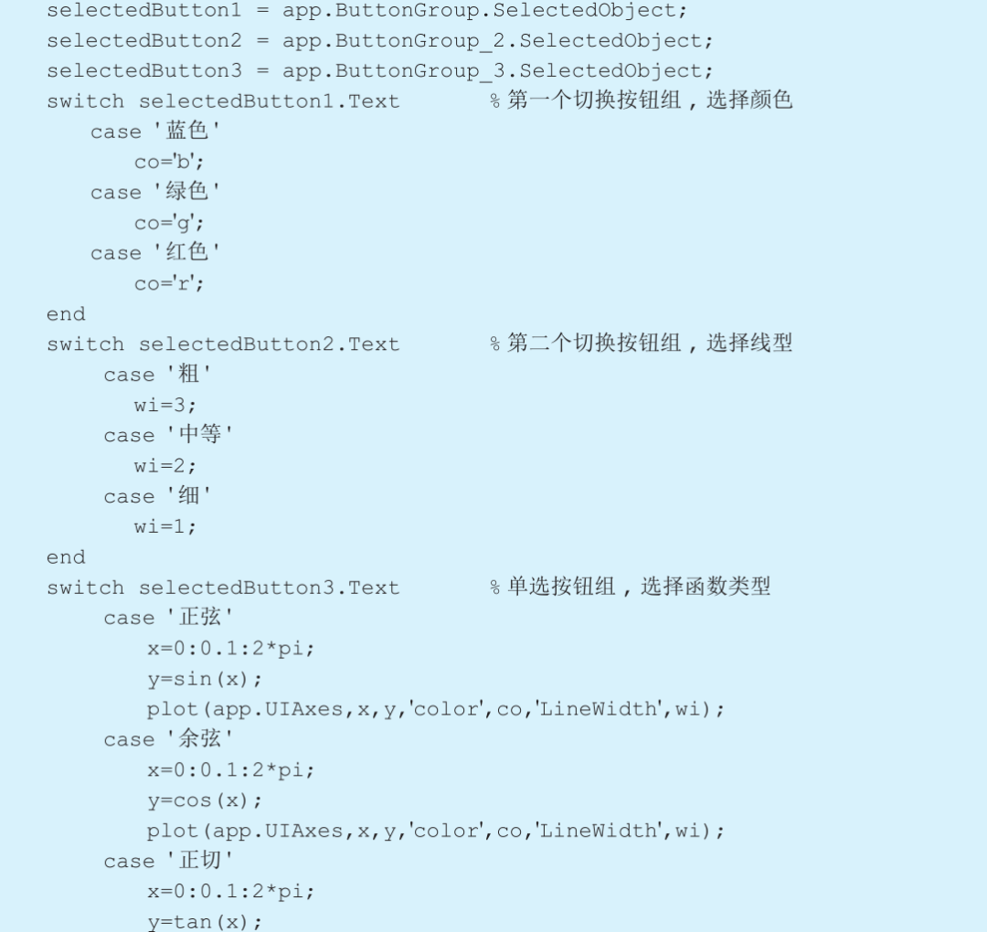
[Example 5-13] Use the radio button group and toggle button group components to switch the color, line type, and shape type of the curve in the axes.
■ Figure 5-50 Layout and results of Example 5-12
Step 2: Right-click on the [Close] button, select [Callback] from the pop-up context menu, and choose [Add ButtonPushedFcn callback]. The interface automatically jumps to the code view, and enter the following command at the cursor position:
Right-click on the [Login] button, add a callback, and enter the following command:
The result is shown in Figure 5-33. Click the [Login] button, and the result is shown in Figure 5-34.
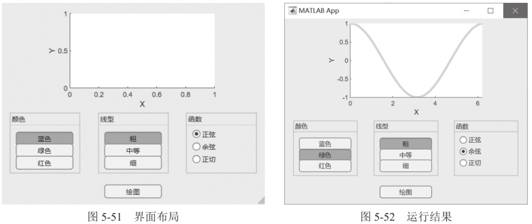
Step 1: Set layout and properties. Add two toggle button groups to switch between colors and line types; add a radio button group to switch between different functions; add a button to perform drawing operations. The layout is as shown in Figure 5-51.
Step 2: Right-click on the [Draw] button component, select [Callback] from the pop-up context menu, and choose [Add ButtonPushedFcn callback]. The interface automatically jumps to the code view, and enter the following command at the cursor position:

After running the program, select the color, line type, and function type, and click the [Draw] button. The result is shown in Figure 5-52.
03
Dropdown
[Example 5-14] Select different dishes through a dropdown and display the corresponding dish introduction.
Step 1: Set layout and properties. Add a dropdown and a label.
Step 2: Right-click on the dropdown component, select [Callback] from the pop-up context menu, and choose [Add DropDownValueChanged callback]. The interface automatically jumps to the code view, and enter the following command at the cursor position:
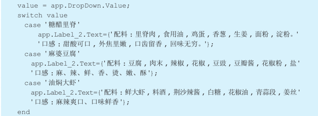
After running the program, select “Sweet and Sour Pork” and “Oil-Braised Prawns” respectively. The results are shown in Figure 5-53.
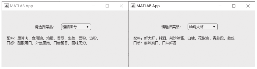
■ Figure 5-53 Dropdown results
[Example 5-15] Select circle, rectangle, or triangle from the dropdown, and the user inputs parameters through a pop-up dialog to calculate the area of the corresponding shape.
Step 1: Set layout and properties. Add a dropdown, as shown in the layout in Figure 5-54.
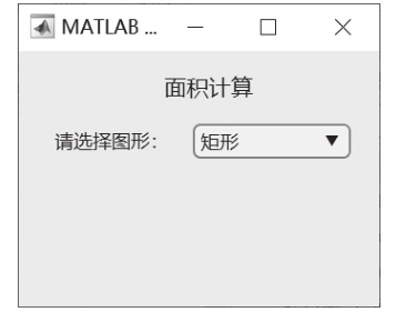
■ Figure 5-54 Layout
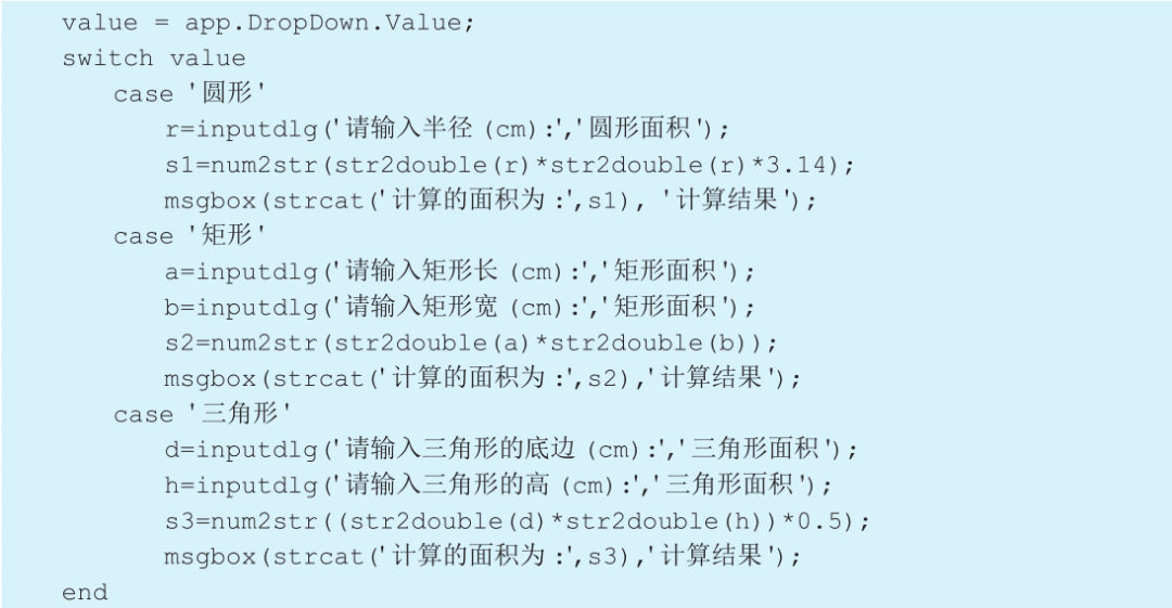
Step 2: Right-click on the dropdown component, select [Callback] from the pop-up context menu, and choose [Add DropDownValueChanged callback]. The interface automatically jumps to the code view, and enter the following command:
After running the program, for example, select “Rectangle”, a dialog pops up as shown in Figure 5-55 (a). Input the length of the rectangle, click the [OK] button, continue to pop up as shown in Figure 5-55 (b), input the width of the rectangle, click the [OK] button, and finally a result dialog pops up as shown in Figure 5-55 (c).
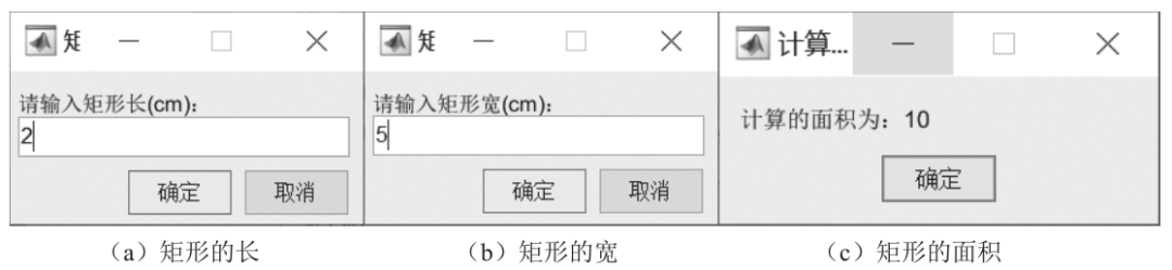
■ Figure 5-55 Area calculation running interface
04
List Box
[Example 5-16] Draw a sine curve in the axes and use a radio button group to select the line type, and the list box to select the line width and color of the figure in the axes.
Step 1: Set layout and properties. Add an axes, a radio button group, and two list boxes.
Step 2: Right-click on the radio button component, select [Callback] from the pop-up context menu, and choose [Go to ButtonGroupSelectionChanged callback]. The interface automatically jumps to the code view, and enter the following command:
Right-click on the first list box component, select [Callback] from the pop-up context menu, and choose [Go to ListBoxValueChanged callback]. The interface automatically jumps to the code view, and enter the following command:

Right-click on the second list box component, select [Callback] from the pop-up context menu, and choose [Go to ListBox_2ValueChanged callback]. The interface automatically jumps to the code view, and enter the following command:
After running the program, respectively select the grid line type, axes line width, and figure color, and the result is shown in Figure 5-56.
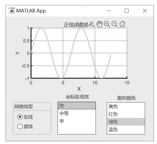
■ Figure 5-56 List box example
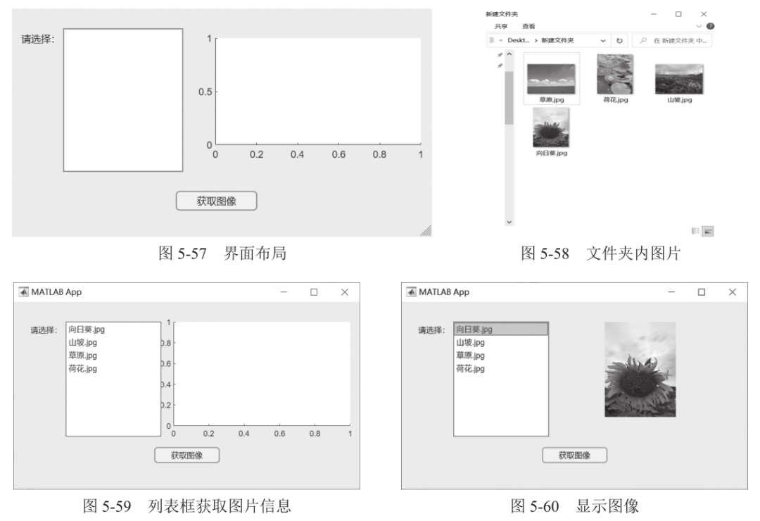
[Example 5-17] Import all JPG format images from the specified path folder into the list box and display the selected image.
Step 1: Set layout and properties. Add an axes, a list box, and a button, as shown in the layout in Figure 5-57.
Step 2: Right-click on the [Get Image] button, select [Callback] from the pop-up context menu, and choose [Add ButtonPushedFcn callback]. The interface automatically jumps to the code view, and enter the following command:
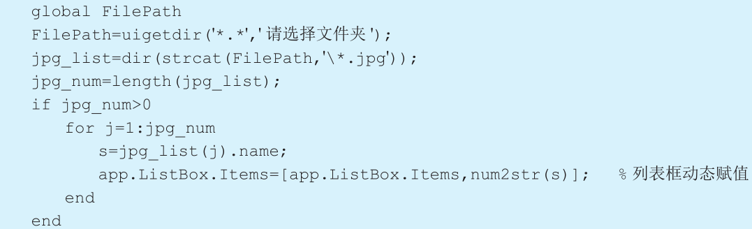
Right-click on the list box component, select [Callback] from the pop-up context menu, and choose [Go to ListBoxValueChanged callback]. The interface automatically jumps to the code view, and enter the following command:
After running the program, click the [Get Image] button, a window pops up as shown in Figure 5-58, select the folder, and all JPG format image names in the folder will be displayed in the list box, as shown in Figure 5-59. Select one option, and the corresponding image will be displayed in the axes, as shown in Figure 5-60.
05
Checkbox
[Example 5-18] Control the display of the X-axis and Y-axis grid lines in the axes through checkboxes.
Step 1: Set layout and properties. Add an axes and two checkboxes.
Step 2: Right-click on the first checkbox component, select [Callback] from the pop-up context menu, and choose [Add XCheckBoxValueChanged callback]. The interface automatically jumps to the code view, and enter the following command:
Right-click on the second checkbox component, select [Callback] from the pop-up context menu, and choose [Add XCheckBoxValueChanged callback]. The interface automatically jumps to the code view, and enter the following command:
After running the program, select the checkbox options, and the grid in the axes will change accordingly, as shown in Figure 5-61.
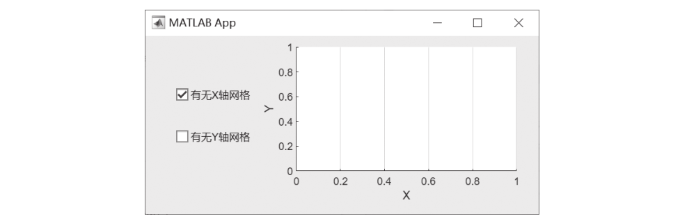
■ Figure 5-61 Checkbox adjustment grid lines
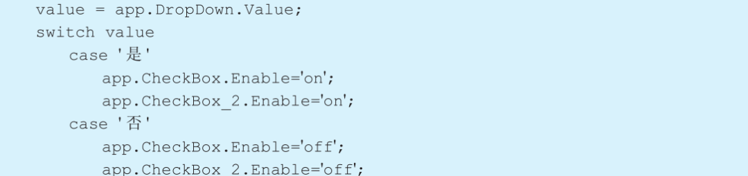
[Example 5-19] Select whether to pass the English proficiency test through the dropdown; if not passed, the checkbox is disabled; if passed, select the corresponding English proficiency test from the checkbox.
Step 1: Set layout and properties. Add a dropdown and a checkbox.
Step 2: Right-click on the dropdown component, select [Callback] from the pop-up context menu, and choose [Add DropDownValueChanged callback]. The interface automatically jumps to the code view, and enter the following command:
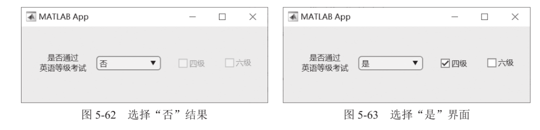
After running the program, select “No” in the dropdown, the checkbox is disabled, as shown in Figure 5-62. Select “Yes” in the dropdown, and select the “Level 4” checkbox, as shown in Figure 5-63.

06
Tree and Tree (Checkbox)
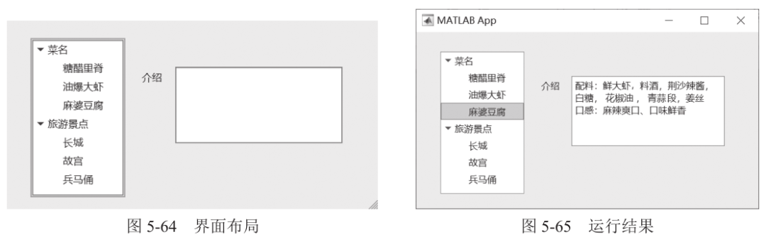
[Example 5-20] Use the tree component to implement a menu and tourist attraction list. When clicking on an option in the list, display the corresponding content in the text area component.
Step 1: Set layout and properties. Add a tree component and a text area, as shown in the layout in Figure 5-64.
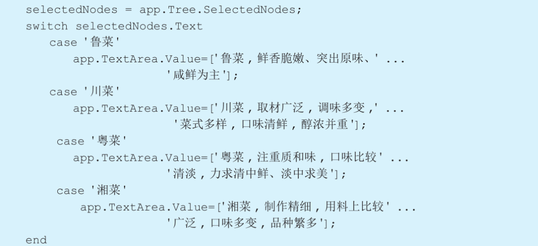
Step 2: Right-click on the tree component, select [Callback] from the pop-up context menu, and choose [Add TreeSelectionChanged callback]. The interface automatically jumps to the code view, and enter the following command:
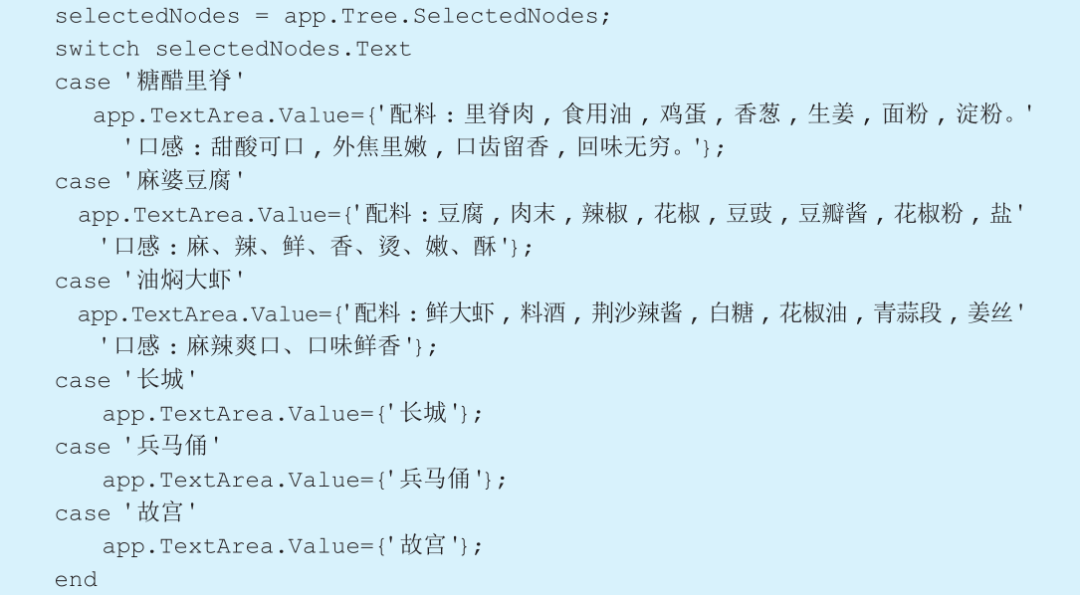
After running the program, select “Mapo Tofu”, and the result is shown in Figure 5-65.
[Example 5-21] Select different cuisines through the tree (checkbox) and display the introduction of the cuisine in the text area component.
Step 1: Set layout and properties. Add a tree (checkbox) and a text area.
Step 2: Right-click on the tree (checkbox) component, select [Callback] from the pop-up context menu, and choose [Add TreeSelectionChanged callback]. The interface automatically jumps to the code view, and enter the following command:
After running the program, first select “Shandong Cuisine”, then select “Sichuan Cuisine”, and the result is shown in Figure 5-66.
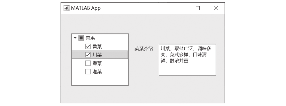
■ Figure 5-66 Tree (checkbox) result
07
Reference Books