
Author: GURCHETAN SINGH
Translator: Zhang Yi
Proofreader: Ding Nanya
This article has 5800 words, and is recommended to read in 8 minutes. It starts with linear regression and polynomial regression, guiding you to implement spline regression using Python.
When I first started learning data science, the first algorithm I encountered was linear regression. Through applying this algorithm to various datasets, I summarized some of its advantages and disadvantages.
First, linear regression assumes a linear relationship between the independent and dependent variables, but this is rarely the case in reality. To improve this model, I tried polynomial regression, which indeed performed better (most of the time it improves). However, a new problem arose: when the dataset has too many variables, polynomial regression can easily lead to overfitting.
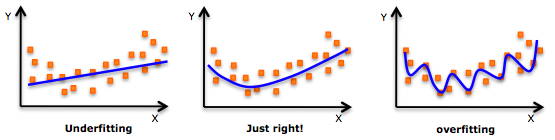
Moreover, the model I built was always too flexible; it might perform well on the test set but poorly on unseen data. Later, I came across another nonlinear method called spline regression, which combines linear/polynomial functions to fit the data.
In this article, I will introduce the basic concepts of linear regression and polynomial regression, then elaborate on more details about spline regression and its implementation in Python.
Note: To better understand the various concepts mentioned in this article, you need to have a foundational knowledge of linear regression and polynomial regression. Here are some related materials you can refer to:
https://www.analyticsvidhya.com/blog/2015/08/comprehensive-guide-regression/
Article Structure
-
Understanding the Data
-
A Brief Review of Linear Regression
-
Polynomial Regression: An Improvement on Linear Regression
-
Understanding Spline Regression and Its Implementation
-
Piecewise Step Functions
-
Basis Functions
-
Piecewise Polynomials
-
Constraints and Splines
-
Cubic Splines and Natural Cubic Splines
-
Determining the Number and Position of Knots
-
Comparing Spline Regression and Polynomial Regression
Understanding the Data
To better understand these concepts, we chose a wage prediction dataset for illustration. You can download it here:
https://drive.google.com/file/d/1QIHCTvHQIBpilzbNxGmbdEBEbmEkMd_K/view
This dataset is extracted from a recently popular book, Introduction to Statistical Learning (http://www-bcf.usc.edu/~gareth/ISL/ISLR%20Seventh%20Printing.pdf).
Our dataset includes information such as ID, year of birth, gender, marital status, race, education level, occupation, health status, health insurance, and wage records. To explain spline regression in detail, we will use age as the independent variable to predict wage (the dependent variable).
Let’s get started:
# Import necessary packages
import pandas as pd
import numpy as np
import statsmodels.api as sm
import matplotlib.pyplot as plt
%matplotlib inline
# Read in data
data = pd.read_csv(“Wage.csv”)
data.head()
We will get the following result:

Continuing:
data_x = data[‘age’]
data_y = data[‘wage’]
# Split the data into training and validation sets
from sklearn.model_selection import train_test_split
train_x, valid_x, train_y, valid_y = train_test_split(data_x, data_y, test_size=0.33, random_state = 1)
# Visualize the relationship between age and wage
import matplotlib.pyplot as plt
plt.scatter(train_x, train_y, facecolor=’None’, edgecolor=’k’, alpha=0.3)plt.show()
We will get such a plot:
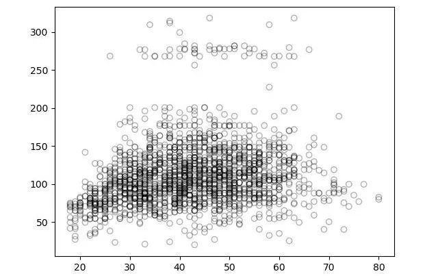
Looking at the scatter plot above, what comes to mind? Does it represent a positive correlation, a negative correlation, or is there no relationship at all? Everyone can share their views in the comments below.
Introduction to Linear Regression
Linear regression is the simplest and most widely used statistical method in predictive modeling. It is a supervised learning method used to solve regression tasks.
This method establishes a linear relationship between the independent and dependent variables, which is why it is called linear regression. It is primarily a linear equation, as shown in the equation below. It can be understood that our features are a set of independent variables with coefficients.

In this equation, we consider Y as the dependent variable, X as the independent variable, and all β as coefficients. These coefficients are the weights corresponding to the features, indicating the importance of each feature. For example, if a predicted result heavily relies on one of the features (X1), it means that compared to all other features, the coefficient (i.e., weight) of X1 will be higher.
Next, let’s try to understand linear regression with only one feature. That is, only one independent variable. It is called simple linear regression. The corresponding equation is as follows:
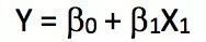
As mentioned earlier, we will only use age as a feature to predict wage, so it is clear that we can apply simple linear regression on the training set and calculate the model’s error (RMSE) on the validation set.
from sklearn.linear_model import LinearRegression
# Fit the linear regression model
x = train_x.reshape(-1,1)
model = LinearRegression()
model.fit(x,train_y)
print(model.coef_)
print(model.intercept_)
-> array([0.72190831])
-> 80.65287740759283
# Make predictions on the validation set
valid_x = valid_x.reshape(-1,1)
pred = model.predict(valid_x)
# Visualization
# We will use 70 points between the minimum and maximum values of valid_x for plotting
xp = np.linspace(valid_x.min(),valid_x.max(),70)
xp = xp.reshape(-1,1)
pred_plot = model.predict(xp)
plt.scatter(valid_x, valid_y, facecolor=’None’, edgecolor=’k’, alpha=0.3)
plt.plot(xp, pred_plot)
plt.show()
The resulting plot is as follows:
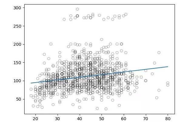
Now let’s calculate the RMSE for the predicted results:
from sklearn.metrics import mean_squared_error
from math import sqrt
rms = sqrt(mean_squared_error(valid_y, pred))
print(rms)
-> 40.436
From the plot above, we can see that the linear regression model did not capture all the characteristics of the data, and for the wage prediction problem, this method did not perform well.
So the conclusion is that although linear models are relatively simple to describe and implement, and very easy to understand and apply, they have limited predictive power. This is because linear models assume that there is always a linear relationship between the independent and dependent variables. This assumption is weak; it is merely an approximation and can be very poor in some cases.
In the other methods mentioned below, we will temporarily set aside this linear assumption, but we cannot completely disregard it. We will expand on this simplest linear model to obtain polynomial regression, step functions, or more complex methods like spline regression, which will also be introduced below.
Improvements on Linear Regression: Polynomial Regression
Let’s take a look at a set of visualizations:
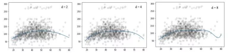
These graphs seem to have uncovered more connections between age and wage. They are nonlinear because the equations used to establish the age and wage model are nonlinear equations. This regression method using nonlinear functions is called polynomial regression.
Polynomial regression extends the simple linear model by adding additional predictor terms. Specifically, it raises each original predictor term to a power. For example, a cubic regression uses these three variables:
 as predictors. It provides a simple way to better fit the data with nonlinearity.
So how does this method replace linear models with nonlinear models to establish relationships between independent and dependent variables? The essence of this improvement is to use a polynomial equation to replace the original linear relationship.

However, as we increase the power, the curve starts to oscillate at high frequencies. This leads to an overly complex shape of the curve, ultimately causing overfitting.
# Generate weights for the regression function, set degree=2
weights = np.polyfit(train_x, train_y, 2)
print(weights)
-> array([ -0.05194765, 5.22868974, -10.03406116])
# Generate the model based on the given weights
model = np.poly1d(weights)
# Make predictions on the validation set
pred = model(valid_x)
# We only plot 70 points
xp = np.linspace(valid_x.min(),valid_x.max(),70)
pred_plot = model(xp)
plt.scatter(valid_x, valid_y, facecolor=’None’, edgecolor=’k’, alpha=0.3)
plt.plot(xp, pred_plot)
plt.show()
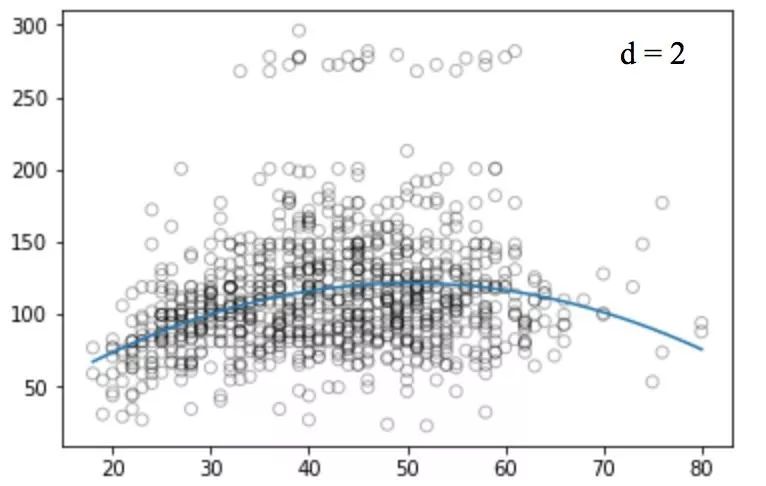
Similarly, we plot the graphs corresponding to different degree values:
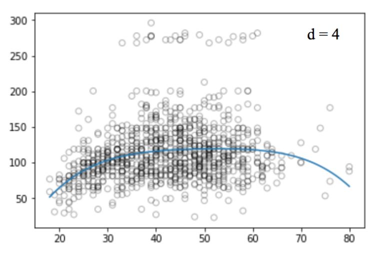
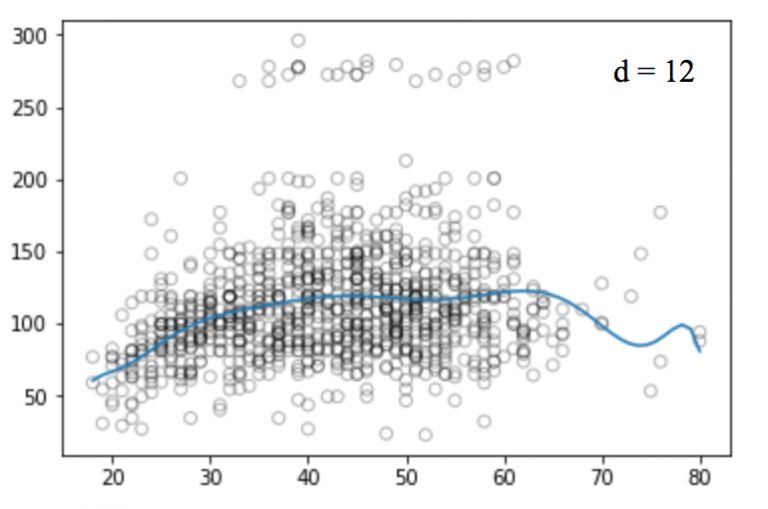
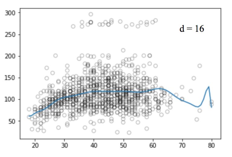
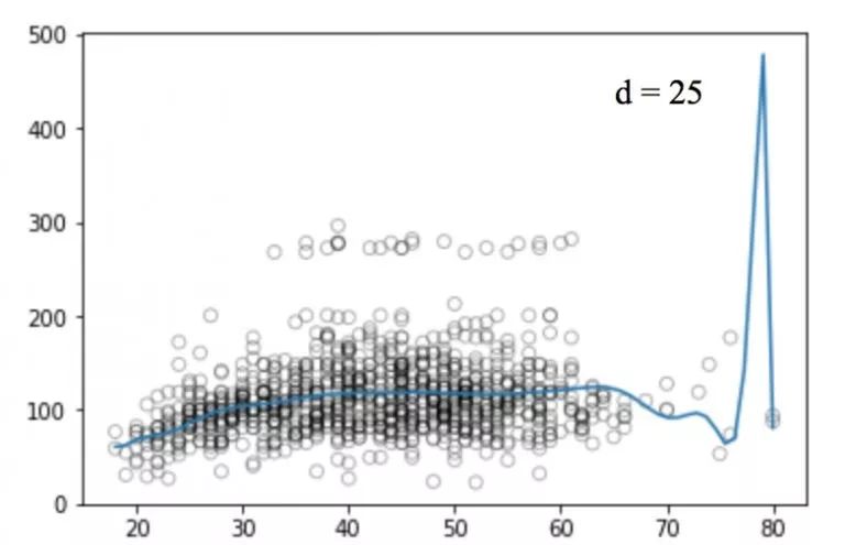
Unfortunately, polynomial regression also has many issues; as the complexity of the equations increases, the number of features can grow to an uncontrollable level. Moreover, even on this simple one-dimensional dataset, polynomial regression can lead to overfitting.
In addition, there are other problems. For example, polynomial regression is essentially non-local. This means that changing the y-value of one point in the training set can affect the fitting of other data points far from this point. Therefore, to avoid using overly high-order polynomials across the entire dataset, we can use many different low-order polynomial functions as alternatives.
Spline Regression and Its Implementation
To overcome the drawbacks of polynomial regression, we can use another improved regression method. This method does not apply the model to the entire dataset but divides the dataset into multiple intervals, fitting a separate model for the data in each interval. This method is called spline regression.
Spline regression is one of the most important nonlinear regression methods. In polynomial regression, we create new features by applying different polynomial functions to existing features, which has a global effect on the dataset. To solve this problem, we can divide the data into different parts based on the distribution characteristics and fit linear or low-order polynomial functions on each part.
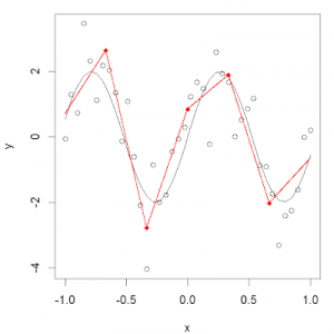
The points used for partitioning are called knots. We can use piecewise functions to model the data in each interval. There are many different piecewise functions that can be used to fit this data.
In the next section, we will introduce these functions in detail.
-
Piecewise Step Functions
Step functions are one of the most common piecewise functions. Their function value remains constant within a segment of intervals. We can apply different step functions to different data intervals to avoid affecting the structure of the entire dataset.
Here we will segment the values of X and fit a different constant for each part.
More specifically, we set the cut points C1, C2, … Ck. We construct K+1 new variables in the range of X.
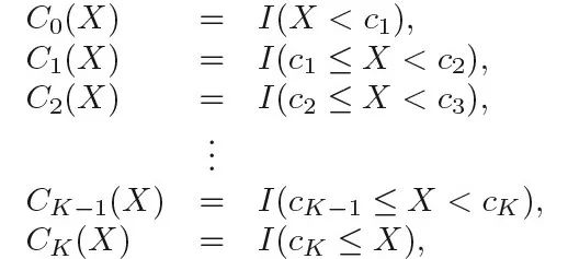
In the above figure, I() is an indicator function that returns 1 if the condition is met, otherwise it returns 0. For example, when Ck ≤ X, the function value I(Ck ≤ X) is 1; otherwise, it equals 0. For any given value of X, only one of C1, C2, … Ck can be non-zero because X can only be assigned to one interval.
# Divide the data into four intervals
df_cut, bins = pd.cut(train_x, 4, retbins=True, right=True)
df_cut.value_counts(sort=False)
->(17.938, 33.5] 504
(33.5, 49.0] 941
(49.0, 64.5] 511
(64.5, 80.0] 54
Name: age, dtype: int64
df_steps = pd.concat([train_x, df_cut, train_y],
keys=[‘age’,’age_cuts’,’wage’], axis=1)
# Encode age as dummy variables
df_steps_dummies = pd.get_dummies(df_cut)
df_steps_dummies.head()
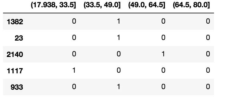
df_steps_dummies.columns = [‘17.938-33.5′,’33.5-49′,’49-64.5′,’64.5-80’]
# Fit a Generalized Linear Model
fit3 = sm.GLM(df_steps.wage, df_steps_dummies).fit()
# Also divide the validation set into four buckets
bin_mapping = np.digitize(valid_x, bins)
X_valid = pd.get_dummies(bin_mapping)
# Remove outliers
X_valid = pd.get_dummies(bin_mapping).drop([5], axis=1)
# Make predictions
pred2 = fit3.predict(X_valid)
# Calculate RMSE
from sklearn.metrics import mean_squared_error
from math import sqrt
rms = sqrt(mean_squared_error(valid_y, pred2))
print(rms)
->39.9
# Here we only plot the graph of 70 observation points
xp = np.linspace(valid_x.min(),valid_x.max()-1,70)
bin_mapping = np.digitize(xp, bins)
X_valid_2 = pd.get_dummies(bin_mapping)
pred2 = fit3.predict(X_valid_2)
# Visualization
fig, (ax1) = plt.subplots(1,1, figsize=(12,5))
fig.suptitle(‘Piecewise Constant’, fontsize=14)
# Plot the spline regression scatter plot
ax1.scatter(train_x, train_y, facecolor=’None’, edgecolor=’k’, alpha=0.3)
ax1.plot(xp, pred2, c=’b’)
ax1.set_xlabel(‘age’)
ax1.set_ylabel(‘wage’)
plt.show()
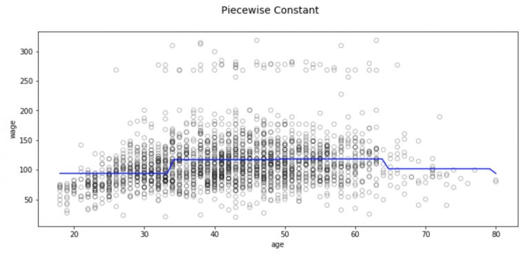
However, this piecewise method has obvious conceptual problems. The most apparent issue is that most of the problems we study will have a continuous trend that changes with the input. But this method cannot construct a continuous function for the predictor variable, so in most cases, when applying this method, we must first assume that there is no relationship between input and output.
For example, in the above chart, we can see that the fitted function for the first interval clearly did not capture the trend of wages increasing with age.
-
Basis Functions
To capture nonlinearity in the regression model, we need to transform part or all of the predictor terms. And to avoid treating each independent variable as linear, we want a more general family of transformations to apply to the predictor terms. It should have enough flexibility to fit a variety of curve shapes (when the model is appropriate), while being careful not to overfit.
This transformation that can combine to capture general data distributions is called basis functions. In this example, the basis functions are b1(x), b2(x), …, bk(x)
At this point, we are no longer fitting a linear model, but as shown below:

Next, let’s look at a commonly used basis function: piecewise polynomials.
-
Piecewise Polynomials
First, piecewise polynomials fit different low-order polynomials in different ranges of X, rather than fitting constants like step functions. Since we are using lower-order polynomials, we will not observe large oscillations in the curve.
For example, piecewise quadratic polynomials work by fitting quadratic regression equations:

The coefficients β0, β1, and β2 take different values in different intervals of X.
A piecewise cubic polynomial, when there is a knot at point C, will have the following form:

In other words, we are fitting two different cubic polynomials to the data: one applied to the data satisfying Xi < C, and the other applied to the part where Xi > C.
The coefficients for the first polynomial function are: β01, β11, β21, β31; the coefficients for the second are β02, β12, β22, β32. Each of these polynomial functions can be fitted using the least squares method.
Note: This polynomial function has 8 degrees of freedom, with each polynomial having 4 (since there are 4 variables).
The more knots used, the more flexible the resulting piecewise polynomial becomes, as we use different functions for each interval of X, and these functions are only related to the distribution of the data in that interval. Generally, if we set K different knots in the range of X, we will ultimately fit K+1 different cubic polynomials. Moreover, we can actually use any low-order polynomial to fit a segment of data. For example, we can change to piecewise linear functions, and in fact, the step functions used above are 0-order piecewise polynomials.
Now let’s look at some necessary conditions and constraints that should be followed when constructing piecewise polynomials.
-
Constraints and Splines
When using piecewise polynomials, we need to be very careful because there are many restrictions. Take a look at the figure below:
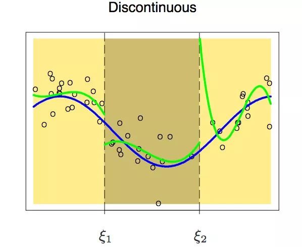
We might encounter a situation where the polynomials on either side of the knot are discontinuous at the knot. This should be avoided because polynomials should generate a unique output for each input.
The above figure clearly shows that at the first knot, there are two different values. Therefore, to avoid this situation, a constraint must be in place: the polynomials on either side of the knot must also be continuous at the knot.
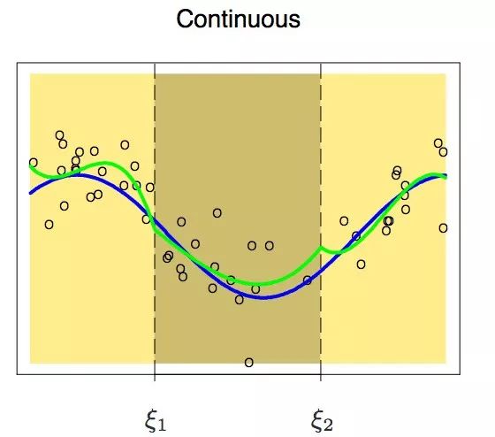
After adding this constraint, we obtain a set of continuous polynomials. But is that enough? The answer is clearly no. Before continuing to read on, readers can first consider this question and see if we have missed anything.
Observing the above figure, we can see that at the knots, the curve is still not smooth. To achieve a smooth curve at the knots, we add another constraint: the first derivative of the two polynomials must be the same. One point to note is that each time we add a constraint to the piecewise cubic polynomial, it is equivalent to reducing one degree of freedom. This is because we reduce the complexity of the fitting of the piecewise polynomial. Therefore, in the above problem, we only used 10 degrees of freedom instead of 12.
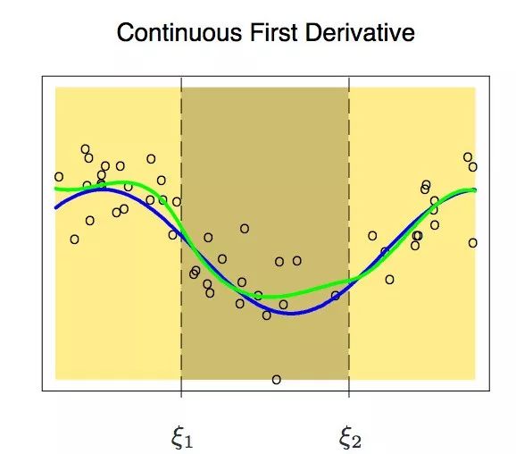
By adding the constraint regarding the first derivative, we obtained the figures shown above. Because of the newly added constraint, its degrees of freedom decreased from 12 to 8. But even now, the curve looks much better, but there is still room for improvement. Now we will add a new constraint: the second derivative of the two polynomials at the knots must be equal.
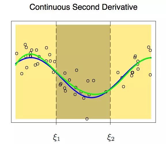
This time, the result looks much better. It further reduces the degrees of freedom to 6. Polynomials that have m-1 continuous derivatives at knots are called splines. So in the figure above, we have actually established a cubic spline.
-
Cubic Splines and Natural Cubic Splines
Cubic splines are piecewise polynomials with a set of additional constraints (continuity, first derivative continuity, second derivative continuity). Typically, a cubic spline with K knots has 4+K degrees of freedom. Higher-order splines are rarely used (unless smoothness is of great interest).
from patsy import dmatrix
import statsmodels.api as sm
import statsmodels.formula.api as smf
# Generate a cubic spline with three knots (25,40,60)
transformed_x = dmatrix(“bs(train, knots=(25,40,60), degree=3, include_intercept=False)”, {“train”: train_x}, return_type=’dataframe’)
# Fit a Generalized Linear Model on the dataset
fit1 = sm.GLM(train_y, transformed_x).fit()
# Generate a cubic spline curve with four knots
transformed_x2 = dmatrix(“bs(train, knots=(25,40,50,65),degree =3, include_intercept=False)”, {“train”: train_x}, return_type=’dataframe’)
# Fit a Generalized Linear Model on the dataset
fit2 = sm.GLM(train_y, transformed_x2).fit()
# Make predictions on both splines
pred1 = fit1.predict(dmatrix(“bs(valid, knots=(25,40,60), include_intercept=False)”, {“valid”: valid_x}, return_type=’dataframe’))
pred2 = fit2.predict(dmatrix(“bs(valid, knots=(25,40,50,65),degree =3, include_intercept=False)”, {“valid”: valid_x}, return_type=’dataframe’))
# Calculate RMSE values
valuesrms1 = sqrt(mean_squared_error(valid_y, pred1))
print(rms1)
-> 39.4
rms2 = sqrt(mean_squared_error(valid_y, pred2))
print(rms2)
-> 39.3
# We will use 70 points for plotting
xp = np.linspace(valid_x.min(),valid_x.max(),70)
# Make some predictions
pred1 = fit1.predict(dmatrix(“bs(xp, knots=(25,40,60), include_intercept=False)”, {“xp”: xp}, return_type=’dataframe’))
pred2 = fit2.predict(dmatrix(“bs(xp, knots=(25,40,50,65),degree =3, include_intercept=False)”, {“xp”: xp}, return_type=’dataframe’))
# Plot the spline curves and error graphs
plt.scatter(data.age, data.wage, facecolor=’None’, edgecolor=’k’, alpha=0.1)
plt.plot(xp, pred1, label=’Specifying degree =3 with 3 knots’)
plt.plot(xp, pred2, color=’r’, label=’Specifying degree =3 with 4 knots’)
plt.legend()
plt.xlim(15,85)
plt.ylim(0,350)
plt.xlabel(‘age’)
plt.ylabel(‘wage’)
plt.show()
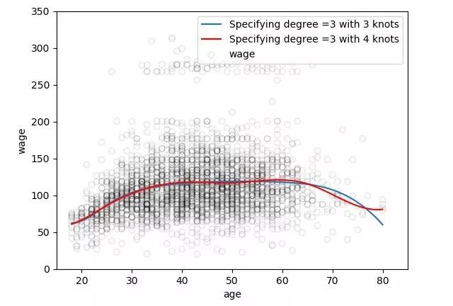
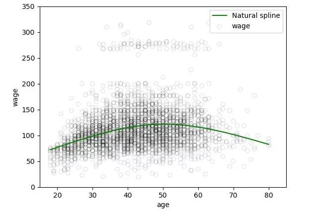
As is well known, polynomial fitting data often performs poorly near the boundaries. This is very dangerous. Splines have similar issues. Those polynomials that fit data beyond the boundary knots yield results that are more unexpected than the corresponding global polynomials in that area. To extend the smoothness of these curves beyond the knots at the boundaries, we will use a special type of spline called natural splines.
Natural cubic splines have an additional constraint: they require that the function is linear beyond the boundaries. This condition reduces the cubic and quadratic parts to 0, decreasing the degrees of freedom by 2 each time, with a total reduction of 4 degrees of freedom for both endpoints, ultimately reducing k+4 to k.
# Generate natural cubic splines
transformed_x3 = dmatrix(“cr(train,df = 3)”, {“train”: train_x}, return_type=’dataframe’)
fit3 = sm.GLM(train_y, transformed_x3).fit()
# Make predictions on the validation set
pred3 = fit3.predict(dmatrix(“cr(valid, df=3)”, {“valid”: valid_x}, return_type=’dataframe’))
# Calculate RMSE values
rms = sqrt(mean_squared_error(valid_y, pred3))
print(rms)
-> 39.44
# Select 70 points for plotting
xp = np.linspace(valid_x.min(),valid_x.max(),70)
pred3 = fit3.predict(dmatrix(“cr(xp, df=3)”, {“xp”: xp}, return_type=’dataframe’))
# Plot the spline curve
plt.scatter(data.age, data.wage, facecolor=’None’, edgecolor=’k’, alpha=0.1)
plt.plot(xp, pred3,color=’g’, label=’Natural spline’)
plt.legend()
plt.xlim(15,85)
plt.ylim(0,350)
plt.xlabel(‘age’)
plt.ylabel(‘wage’)
plt.show()
-
How to Determine the Number and Position of Knots
When fitting a spline curve, how should we choose the knots? One feasible method is to select areas with rapid changes, because in these places, the coefficients of the polynomial will change quickly. Therefore, we can place more knots in areas where we believe the function value changes rapidly, and fewer in more stable areas.
However, while this method is somewhat effective, in practice, knots are often selected in a uniform manner. One method is to specify the desired degrees of freedom, and then the software automatically places the corresponding number of knots at the uniform quantiles of the data.
Alternatively, another choice is to change the number of knots and repeatedly test which scheme yields a better curve.
Of course, there is also a more objective approach—cross-validation. If we use this method, we need to do the following:
-
Take away a portion of the data
-
Select a certain number of knots to fit the remaining data
-
Use the spline to predict the previously removed portion of the data
Repeat this process until all data has been removed once. Then calculate the overall RMSE for the cross-validation. This process can be repeated for different numbers of knots, and in the end, we choose the K value that minimizes the RMSE.
-
Comparing Spline Regression and Polynomial Regression
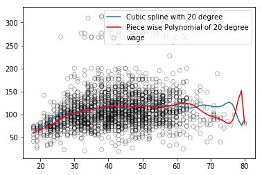
Generally, spline regression tends to perform better than polynomial regression. This is because polynomial regression must use very high-order terms to fit a more flexible model to the data. However, spline regression achieves this by increasing the number of knots while keeping the order unchanged.
Moreover, spline regression tends to produce more stable models. It allows us to add more knots where the function changes rapidly, and conversely, fewer knots in areas where the function changes smoothly. Polynomial models, if they require more flexibility, will sacrifice stability at the boundaries, while cubic natural splines balance flexibility and stability well.
Conclusion
In this article, we learned about spline regression and some of its advantages compared to linear regression and polynomial regression. There is another method of generating splines called smoothing splines. This method is similar to Ridge/Lasso regularization, where the penalty combines the loss function and the smoothing function. You can read more about it in the book Introduction to Statistical Learning. Or if you are interested, you can try these methods on a dataset with many variables to experience the differences firsthand.
Translator’s Note
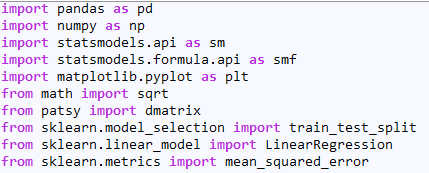
Summary of all packages needed for the experiments in this article:
Original Title: Introduction to Regression Splines (with Python codes)
Original Link:https://www.analyticsvidhya.com/blog/2018/03/introduction-regression-splines-python-codes/
Translator’s Profile

Zhang Yi, a junior at Communication University of China, majoring in Digital Media Technology. Curious about data science, amazed by the new world it creates. Currently exploring and learning, hoping to be brave and passionate, learning the most interesting knowledge and making like-minded friends.
Recruitment Information for the Translation Team
Job Content: Requires a meticulous heart to translate selected foreign articles into fluent Chinese. If you are an international student in data science/statistics/computer-related fields, or working overseas in related fields, or confident in your language skills, you are welcome to join the translation team.
What You Can Get: Regular translation training to improve volunteers’ translation skills, increase awareness of cutting-edge data science, overseas friends can keep in touch with the development of technical applications in China, and the background of THU Data Team provides good development opportunities for volunteers.
Other Benefits: Data scientists from well-known companies, students from prestigious schools such as Peking University and Tsinghua University, and overseas students will become your partners in the translation team.
Click the “Read the Original” at the end of the article to join the Data Team~
Reprint Notice
If you need to reprint, please indicate the author and source prominently at the beginning of the article (originally from: Data Team ID: datapi), and place a prominent QR code of Data Team at the end of the article. For articles with original identification, please send [Article Name – Public Account Name and ID to be Authorized] to the contact email to apply for whitelist authorization and edit as required.
After publication, please provide the link feedback to the contact email (see below). Unauthorized reprints and adaptations will be pursued legally.

Click “Read the Original” to embrace the organization.