Author: Eighth Galaxy – Gugu
Email: gu2001yi@163.com

Import Libraries

import numpy as np
import xarray as xr
#import cmaps
import pandas as pd
#from eofs.standard import Eof
import matplotlib.pyplot as plt
from scipy import signal
from sklearn import preprocessing
#from scipy.stats import pearsonr
from scipy.stats import linregress
import datetime as dt
import cartopy.crs as ccrs
import cartopy.feature as cfeature
import cartopy.mpl.ticker as cticker
from cartopy.util import add_cyclic_point
import matplotlib.patches as patches


g = xr.open_dataset('D:\SSTdata\sst.mnmean.nc')
print(g)
sst = g['sst'].loc[g.time.dt.month.isin([6,7,8])].loc['1954-01-01':'2003-09-01'].loc[:, 88:-88, 0:358]#Select time and range
sst_lat = g['lat'].loc[88:-88]
sst_lon = g['lon'].loc[0:358]

sstx = np.array(sst).reshape(50,3, 89, 180)
sstx[np.isnan(sstx)]=0    #Replace NaN with 0
sstx=np.array(sstx).mean(1)
ssty = signal.detrend(np.array(sstx).reshape(50,89, 180),axis=0,type='linear')+np.array(sstx).mean(0)#Detrending

ssti= np.zeros(50)
for i in range(0,50):
    ssti[i]=np.mean(ssty[i,22:28,61:121])#Calculate Sea Surface Temperature Index (this calculates for the North Pacific region)

path = "D:\NCEP\NCEPdata\hgt.mon.mean.nc"#Read geopotential height field
f_z = xr.open_dataset(path)
z =np.array(f_z.hgt.loc[f_z.time.dt.month.isin([6,7,8])].loc['1954-05-01':'2003-09-01',500]).reshape(50,3,73,144).mean(1)
lat = f_z.lat
lon = f_z.lon
print(z.shape)

s,r,p = np.zeros((73,144)),np.zeros((73,144)),np.zeros((73,144))
for i in range(len(lat)):
    for j in range(len(lon)):
        s[i,j],_,r[i,j], p[i,j],_ = linregress(ssti,z[:,i,j])
Plotting
fig = plt.figure(figsize=(12,10))
proj = ccrs.PlateCarree(central_longitude=180)
leftlon, rightlon, lowerlat, upperlat = (120,240,15,60)
img_extent = [leftlon, rightlon, lowerlat, upperlat]
ax = fig.add_axes([0.1, 0.1, 0.8, 0.6],projection = proj)
ax.set_extent(img_extent, crs=ccrs.PlateCarree())
ax.add_feature(cfeature.COASTLINE)
ax.set_xticks(np.arange(leftlon,rightlon+30,30), crs=ccrs.PlateCarree())
ax.set_yticks(np.arange(lowerlat,upperlat+15,15), crs=ccrs.PlateCarree())
lon_formatter = cticker.LongitudeFormatter()
lat_formatter = cticker.LatitudeFormatter()
ax.xaxis.set_major_formatter(lon_formatter)
ax.yaxis.set_major_formatter(lat_formatter)
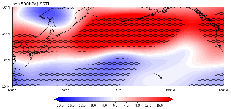
ax.set_title('hgt(500hPa)-SSTI',loc='left',fontsize =14)
c1 = ax.contourf(lon,lat, s, zorder=0,levels =np.arange(-18,18,1) ,
extend = 'both', transform=ccrs.PlateCarree(), cmap=plt.cm.bwr)
c1b = ax.contourf(lon,lat, p,levels=[0,0.06,1], zorder=1,hatches=['...', None],colors="None", transform=ccrs.PlateCarree())
position=fig.add_axes([0.26, 0.15, 0.45, 0.02])
fig.colorbar(c1,cax=position,orientation='horizontal',format='%.1f',)
plt.show()
Image: hgt Regression Sea Surface Temperature Index

The End
Complete
Code
#Import Libraries
import numpy as np
import xarray as xr
#import cmaps
import pandas as pd
#from eofs.standard import Eof
import matplotlib.pyplot as plt
from scipy import signal
from sklearn import preprocessing
#from scipy.stats import pearsonr
from scipy.stats import linregress
import datetime as dt
import cartopy.crs as ccrs
import cartopy.feature as cfeature
import cartopy.mpl.ticker as cticker
from cartopy.util import add_cyclic_point
import matplotlib.patches as patches


g = xr.open_dataset('D:\SSTdata\sst.mnmean.nc')
print(g)
sst = g['sst'].loc[g.time.dt.month.isin([6,7,8])].loc['1954-01-01':'2003-09-01'].loc[:, 88:-88, 0:358]#Select time and range
sst_lat = g['lat'].loc[88:-88]
sst_lon = g['lon'].loc[0:358]

sstx = np.array(sst).reshape(50,3, 89, 180)
sstx[np.isnan(sstx)]=0    #Replace NaN with 0
sstx=np.array(sstx).mean(1)
ssty = signal.detrend(np.array(sstx).reshape(50,89, 180),axis=0,type='linear')+np.array(sstx).mean(0)#Detrending

ssti= np.zeros(50)
for i in range(0,50):
    ssti[i]=np.mean(ssty[i,22:28,61:121])#Calculate Sea Surface Temperature Index (this calculates for the North Pacific region)

path = "D:\NCEP\NCEPdata\hgt.mon.mean.nc"#Read geopotential height field
f_z = xr.open_dataset(path)
z =np.array(f_z.hgt.loc[f_z.time.dt.month.isin([6,7,8])].loc['1954-05-01':'2003-09-01',500]).reshape(50,3,73,144).mean(1)
lat = f_z.lat
lon = f_z.lon
print(z.shape)

s,r,p = np.zeros((73,144)),np.zeros((73,144)),np.zeros((73,144))
for i in range(len(lat)):
    for j in range(len(lon)):
        s[i,j],_,r[i,j], p[i,j],_ = linregress(ssti,z[:,i,j])

#Plotting
fig = plt.figure(figsize=(12,10))
proj = ccrs.PlateCarree(central_longitude=180)
leftlon, rightlon, lowerlat, upperlat = (120,240,15,60)
img_extent = [leftlon, rightlon, lowerlat, upperlat]

ax = fig.add_axes([0.1, 0.1, 0.8, 0.6],projection = proj)

ax.set_extent(img_extent, crs=ccrs.PlateCarree())
ax.add_feature(cfeature.COASTLINE)
ax.set_xticks(np.arange(leftlon,rightlon+30,30), crs=ccrs.PlateCarree())
ax.set_yticks(np.arange(lowerlat,upperlat+15,15), crs=ccrs.PlateCarree())
lon_formatter = cticker.LongitudeFormatter()
lat_formatter = cticker.LatitudeFormatter()
ax.xaxis.set_major_formatter(lon_formatter)
ax.yaxis.set_major_formatter(lat_formatter)
ax.set_title('hgt(500hPa)-SSTI',loc='left',fontsize =14)
c1 = ax.contourf(lon,lat, s, zorder=0,levels =np.arange(-18,18,1) ,
                 extend = 'both', transform=ccrs.PlateCarree(), cmap=plt.cm.bwr)
c1b = ax.contourf(lon,lat, p,levels=[0,0.06,1], zorder=1,hatches=['...', None],colors="None", transform=ccrs.PlateCarree())

position=fig.add_axes([0.26, 0.15,  0.45, 0.02])
fig.colorbar(c1,cax=position,orientation='horizontal',format='%.1f',)
plt.show()

If there are any issues with the above content, please feel free to criticize and correct~
Send to the backend:Eighth Galaxy
to join the Eighth Galaxy group chat
Please do not reply with any words other thanEighth Galaxy~

Edited by: Zhou You